
Designing for the user interface is more than just adding images and colors. A designer must take into account the fonts within their design. Design is subjective but that doesn’t mean you can use any font. You might like Comic Sans or Papyrus, but they are not good for readability or user experience in your design.
You may think Helvetica is boring, but it’s a readable font. UI/UX designers spend a lot of time thinking about how each font will affect the user’s experience with a product. They need to find the right balance – choosing a font that is aesthetically pleasing and easy to read, but also one that will compliment the product’s design. This blog will look at 5 things to remember when selecting fonts for your next UI/UX project.
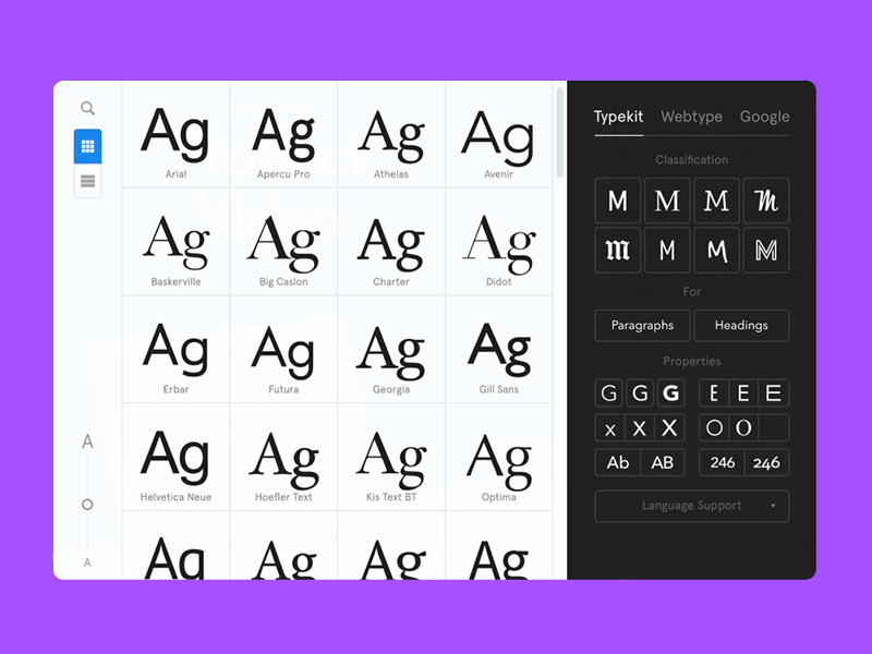
This is very helpful, To create a design pleasant for users’ perception, all its elements should be well organized and clear to navigate. Clear typographic hierarchy makes text legible and easy to scan, dividing it into various types such as headings, subheadings, body copy, captions, and others. The differences between the types of copy are set by regulation of family, sizes, width, and colours of fonts.
Consider Legibility
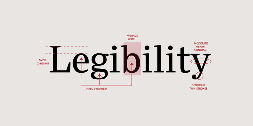
The importance of having a clear and legible interface can not be understated. Legibility is key for typefaces – people should be able to read your text easily, without having to spend extra time trying to decipher it. If it’s difficult for people to read, they will simply move on and won’t be able to use your product. So avoid using fancy or decorative fonts for large bodies of text, as they can be quite strainful on the eyes.
Stick to using them only for headlines and titles instead. Look for one with high contrast and clear letterforms. Having legible fonts helps to create a consistent and cohesive look for your design. If your fonts are illegible, your design will look chaotic and unprofessional. So your goal should be to create a positive and user-friendly experience for your audience.
Stick to a Few Fonts
While it can be tempting to have a bunch of different fonts in your design, try to stick to two or three fonts at most. When it comes to fonts, less is definitely more. Each font conveys something different and demands attention. Stick to a small handful of fonts that you can use consistently throughout your design. This will create a cohesive look and feel for your design. Try playing around with different sizes for the fonts you already have.
Think About Tone
When it comes to fonts, the tone of your UI/UX design can be just as important as the words themselves. Think about the overall tone you want to convey with your design. Is it serious or playful? Formal or informal? Elegant or edgy? Once you’ve decided on the tone, you can start narrowing down your font choices. For example, if you are designing a fun and friendly app, you might want to use playful fonts that convey a sense of whimsy.
Maintain the Hierarchy
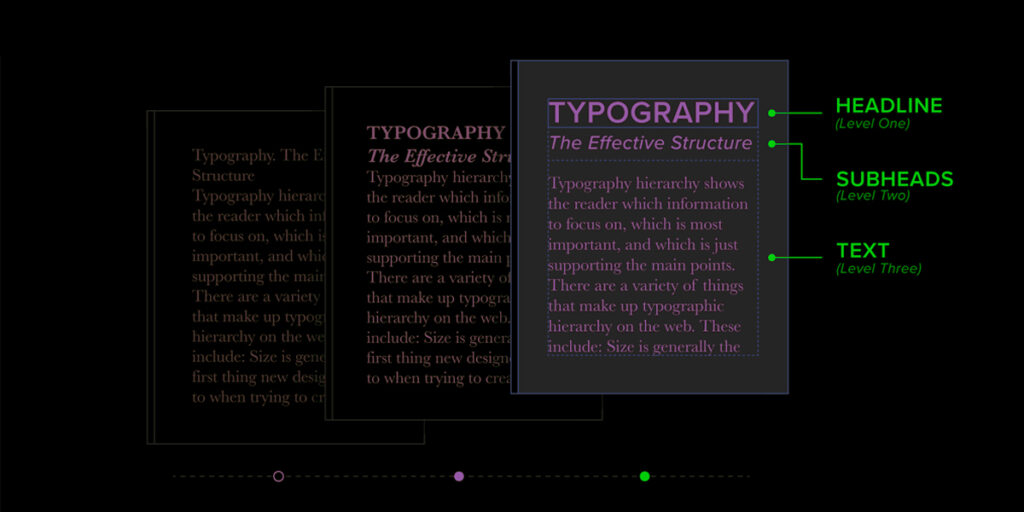
The hierarchy of your font is just as important as the hierarchy of your design. The most important part of your message should be the largest and the least important the smallest. You can use different fonts to create this hierarchy and make your message more readable. You may want to use different fonts for the main content area and the sidebar. The hierarchy of fonts is important because it helps users to find the information they need quickly and easily. By prioritizing information and making it easy to scan, interfaces can be more user-friendly and prevent users from getting frustrated or lost.
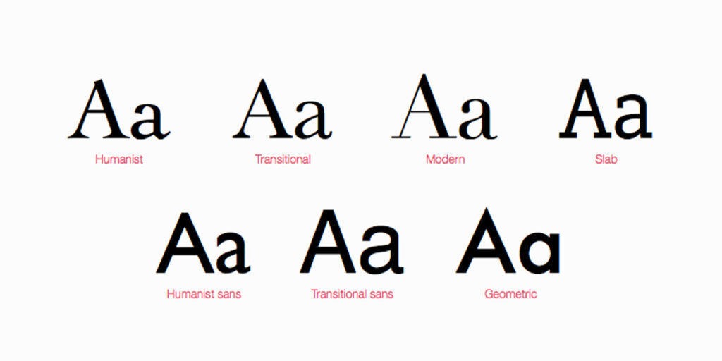
Serif or Sans?

Do you want to go for a classic look with serif fonts, or a more modern feel with sans serif fonts? San fonts tend to be more modern and minimalistic, while serif fonts can give your design a more traditional or sophisticated feel. Serif fonts tend to be more readable, making them ideal for longer texts and interface design. Sans serif fonts are more versatile and can be used for both body text and headlines.
It’s crucial to take your target audience into account while deciding the fonts. For readers who have visual impairments, Sans is beneficial for them. And also it’s good for small children. Some of the eBay Sans serif fonts are Arial, Helvetica, or Verdana. These fonts are clean and easy to read which is important for any design.
Remember the Contrasting Differences
Finding the perfect font pairing can be tricky but it’s worth taking the time to find complementary fonts that work together harmoniously. A good rule of thumb is to choose two typefaces that share one similarity but are otherwise vastly different. For example, a classic combination is choosing a serif font alongside a sans serif font. Another pro tip is to experiment with mixing and matching different font weights – this can add an extra level of interest and dynamics to your design.
When it comes to UI/UX, one of the most important aspects to consider is the font. Fonts are used to guide users through the design and increase usability. It’s important to remember that fonts are a visual representation of an idea.
You may be wondering, how do I pick the right font for my design? We hope this guide has helped show you a few things to look out for and keep in mind when browsing through the different fonts you can use to make your UI/UX designs stand out.
FAQS About How to Choose UI UX Design Fonts
Which font family is best for UI?
The selection of font family for UI design depends on the specific project and design aesthetic. However, some common considerations include the readability of the font, the overall aesthetic of the UI, and the compatibility of the font with the UI’s existing design. In general, sans-serif fonts are often seen as being more readable than serif fonts, so they are a good choice for UI design.
Is Helvetica a good website font?
Helvetica is one of the most widely used typefaces in the world. Due to its versatility, Helvetica has more than 1000 variations. Helvetica lends the website a crisp, contemporary, and minimalistic vibe when used in bold against a simple white background. If you are looking for a font that will make your website look sleek and modern, then Helvetica may be a good option for you.
How do I choose the right font size?
For body text in a document, a font size of 10-12 points is typically used. This is large enough to be easily readable, but not so large that it will take up too much space on the page. For headlines or titles, a larger font size, such as 14-16 points, may be used to help them stand out. The best way to choose a font size is to experiment with different sizes and see what looks best for the specific document.
How many font styles are good to be used on the entire site?
When choosing fonts for your website, it’s best to stick with two or three at most. This will help create a cohesive look across your site and make it easier for visitors to read. A good rule of thumb is to use one font for headings and page titles, and another for the main body text.


