
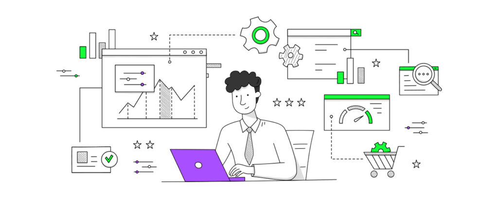
Learn the best practices & design principles for creating an effective and visually appealing dashboard UI design.
Every enterprise, big or small, relies on a dashboard to help maintain high-level visibility over their key performance metrics. A dashboard is a user interface that aggregates & displays essential information about the business, helps managers monitor & track their company’s health. Let’s explore the main elements of dashboard UI/UX design to ensure a seamless user experience & get the most out of the data.
What is a Dashboard?

Users can interact with a dashboard to get important information by viewing data visually. In order to provide decision-makers with insights, a way to track key performance metrics, these visualizations frequently incorporate graphs, charts, tables, maps & other visual components.
A crucial aspect of data analysis and business intelligence is dashboard design. An efficient dashboard should be user-friendly, straightforward & give users the data they need to make wise decisions. The greatest dashboards offer a clear & succinct perspective of the data and are created with the end-user in mind.
Dashboards come in many different varieties & serve a variety of functions. A financial dashboard might, for instance, have graphs & charts that display sales, costs, and profits over time. Data about website traffic, social media engagement & advertising expenditure may be included in a marketing dashboard. Patient information, including vital signs & medical history, may be included on a healthcare dashboard.
What is the Importance Of Dashboard UI & UX Design
There is no denying the significance of dashboard UI and UX design. It’s commonly known that effective design fosters an emotional bond with consumers & promotes adoption. However, dashboard UI and UX design is important for reasons other than merely aesthetics & user interest.
User interface components including font, color, iconography, and layout are the main focus of dashboard UI design. The visual structure and organization of the dashboard must be clear & simple to understand for users to easily access data. By giving consumers pertinent & useful insights, a well-designed dashboard may assist users in making wise decisions.
A well-designed dashboard may help businesses save time and money. Decision-makers may rapidly spot trends & take informed decisions without having to spend hours looking over spreadsheets by presenting data in a simple & concise manner. Better business outcomes as well as enhanced productivity & efficiency can result from this.
UX design focuses on giving the user a delightful & engaging experience by carefully taking into account their requirements & use case. Users may feel more secure and in charge of their data if their dashboard is simple to use and browse. Increased consumer pleasure & loyalty may result from this which may ultimately result in higher profits & organizational expansion.
In summary, the importance of dashboard UI and UX design cannot be overstated. A well-designed dashboard can help organizations save time as well as money, make informed decisions, increase user satisfaction & loyalty. As such, investing in dashboard design should be a top priority for any organization that wants to stay ahead of the competition & succeed in today’s data-driven world.
Top 5 Dashboard Design Principles and Best Practices

Dashboards are becoming a crucial tool for organizations in today’s data-driven world to track their performance & make wise decisions. However, creating an effective dashboard can be difficult because it calls for finding a balance between showing pertinent information & maintaining a user-friendly layout. The top 5 dashboard design principles are listed below to assist you in producing a dashboard that is both functional as well as aesthetically pleasing.
Principle #1 – Keep It Simple
The first principle of designing a dashboard is to keep it simple. A dashboard can easily become cluttered when there is an abundance of data & information. However, a cluttered dashboard might make users confused and make it harder for them to find important information. To keep the dashboard organized and simple to comprehend, concentrate on the metrics & data that are the most pertinent.
For instance, you could want to incorporate KPIs like revenue, sales growth & customer acquisition rate while developing a sales dashboard. However, adding too many indicators may result in an overwhelming as well as challenging to read dashboard. As a result, it’s crucial to prioritize the most significant data elements & highlight them on the dashboard.
Principle #2 – Use Visual Hierarchy
Visual hierarchy is the perceived arrangement of elements in a design that guides users’ attention. The right application of visual hierarchy in dashboard design aids users in understanding the layout of the dashboard & locating crucial information fast. To create levels of relevance & assist consumers in sorting through data, employ font size, colour & spacing.
For the most crucial measurements, you might choose a higher font size & for less significant data, a smaller font size. Similarly, you can highlight & call attention to particular data points by using various colours. Effective usage of visual hierarchy can improve the dashboard’s usability & intuitiveness.
Principle #3 – Highlight Key Metrics
Dashboards display a number of metrics simultaneously, making it challenging for users to distinguish between key & non-key metrics. In order to solve this, focus should be placed on the metrics as well as data points that are most important to the user. Users may quickly discover the most crucial information & take appropriate action by emphasizing essential indicators.
For instance, you could want to emphasize indicators like website traffic, conversion rate & cost per lead while building a marketing dashboard. By doing this, you may assist marketers in concentrating on the most important KPIs and aid them in making data-driven decisions that promote company success.
Principle #4 – Use Consistent Design Elements
Consistency is essential in dashboard design. Using a consistent layout, style & typography throughout helps users to navigate the dashboard intuitively. This consistency creates a sense of familiarity, strengthens brand identity & makes the product easier to remember & use.
For instance, you may establish a consistent visual identity for the dashboard by using the same font family & color scheme throughout. The header, footer & body of the dashboard, for example, can all have the same uniform design. You may develop a dashboard that is aesthetically beautiful and simple to use by staying consistent with the design aspects.
Principle #5 – Provide Multiple Data Views
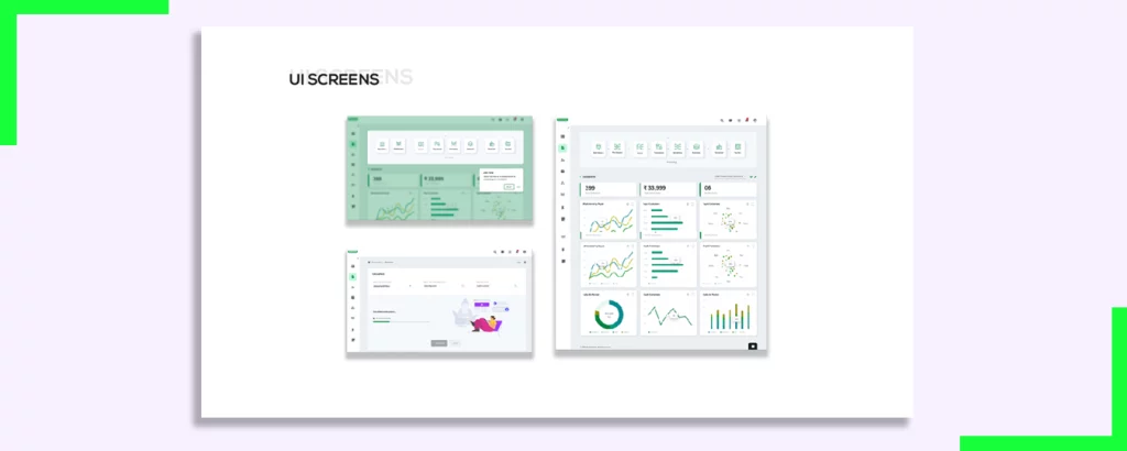
Offering multiple views of the data can assist users in identifying trends and patterns they might miss in a single view. For instance, the addition of graphs, charts & maps can ease comprehension & enhance data analysis. By allowing users to customize how they view data, you can provide a simplified experience & help them gain insights in a more meaningful way.
For example, you can offer users the option to view data in different time frames, such as daily, weekly, or monthly. Similarly, you can provide different types of visualizations, such as bar charts, line graphs, or pie charts, to help users understand the data from different perspectives. By providing multiple data views, you can create a dashboard that is flexible and adaptable to the user’s needs.
In conclusion, designing an effective dashboard requires careful consideration of the user’s needs & preferences. By following these top 5 dashboard design principles, you can create a dashboard that is both functional & aesthetically pleasing & helps users make data-driven decisions that drive business growth.
What are Dashboard UI Design Principles?
Dashboard UI design principles play a crucial role in enhancing the users’ experience and boosting their productivity with dashboards. A good UI design can make the difference between an intuitive & user-friendly dashboard or a confusing & difficult-to-use interface.
When designing your dashboard, it is essential to keep in mind the following dashboard UI design principles:
- Color Coding: Utilize a color scheme that is visually appealing & guides the user’s eye to important information without being overwhelming. Color should enhance dashboard legibility & structure. Choose colors that complement each other & avoid using too many colors that may confuse the user.
- White Space: Space optimization is a crucial element of good UI design. Blank spaces between text, bars & graphics make the dashboard visually appealing as well as enable users to understand the data presented. However, too much white space can be distracting and make the dashboard look empty. Finding the right balance is key.
- Typography: For headers and body content, use a clear typeface and a large font size. Use the font family and weight to distinguish between important data points and less important or general information. It is also essential to choose a font that is easy to read & does not strain the user’s eyes.
When designing a dashboard, it’s critical to take the consumers demands into account. With the users goals and objectives in mind, the dashboard should be designed. Relevant, simple to grasp, and usable information should be delivered. Users should be able to access the dashboard on a variety of devices with various screen sizes by making it responsive.
One more important factor to keep in mind is the layout of the dashboard. The layout should be intuitive, easy to navigate and the user should be able to search the information quickly. It is also important to prioritize the information presented on the dashboard, placing the most critical data points at the top & making them easily accessible.
Finally, it is essential to test the dashboard design with users to ensure that it meets their needs & expectations. User feedback can help identify areas for improvement & ensure that the dashboard design is optimized for the users’ experience.
What are Dashboard UX Design Principles?
Dashboard UX design focuses on how users interact with and use the dashboard, including understanding data exploration & using its features. Usability & user experience are critical in designing a dashboard that is intuitive, easy to use & informative. Here are some dashboard UX design principles worth considering:
User Feedback: Provide users with feedback for the actions they take within the dashboard. It helps users understand if they have done the right thing & this instant feedback makes data analysis faster.
One way to provide user feedback is to use visual cues, such as color changes or animations, to indicate when an action has been completed successfully. For example, if a user filters data, the dashboard can highlight the filtered data in a different color to show the user that the filter has been applied. This type of feedback helps users understand the impact of their actions & encourages them to explore the data further.
User Customization: Allow users to create custom layouts & visualizations that tailor the dashboard to their specific needs. Such functionality is particularly important for power-users who want to get the most out of the data.
User customization can take many forms, from allowing users to change the color scheme of the dashboard to creating custom charts & graphs. By giving users the ability to customize the dashboard, they can focus on the data that is most important to them & make the most informed decisions possible. This level of customization also helps to increase user engagement and satisfaction with the dashboard.
User Assistance: Provide users with an intuitive & helpful set of instructions & metaphors to navigate dashboards. Dashboards should provide users with clear and concise instructions on how to perform analysis & interpret the data.
User assistance can come in many forms, from tooltips that explain the purpose of a button to tutorials that walk users through the dashboard’s features step-by-step. By providing users with clear & concise instructions, they can quickly become proficient in using the dashboard and get the most out of the data. Additionally, using metaphors, such as using a car dashboard as a reference point, can help users understand complex data concepts & make the dashboard more accessible.
By focusing on user feedback, customization, and assistance, dashboard UX design can create a dashboard that is both user-friendly & informative. These principles can help ensure that users can find the data they need quickly, explore it in depth & make informed decisions based on the insights they gain.
Key Takeaways For Successful Dashboard Designs

Dashboard design is a crucial aspect of data visualization & a poorly designed dashboard can adversely impact your users’ experience. To create successful dashboard designs, keep in mind the following best practices:
- Design with the user in mind
- Prioritize data clarity
- Keep designs simple & crisp
- Design to support user workflows
- Ensure usability and accessibility
- Use an appropriate mix of colors & fonts
By following these principles, you can significantly enhance the end-user’s dashboard experience & deliver data in a format that is intuitive, engaging & easy to understand.
FAQs on Dashboard UI Design Best Practices & Design Principles
Q: How can I make my dashboard accessible to users with disabilities?
A: Accessibility is a critical consideration for inclusive design. To make your dashboard accessible, adhere to web accessibility standards such as WCAG (Web Content Accessibility Guidelines). Some key practices include:
- Providing alternative text for images & icons to assist users with visual impairments.
- Ensuring keyboard accessibility for users who cannot use a mouse.
- Designing with sufficient color contrast to aid users with visual impairments.
- Providing clear & concise instructions for screen readers.
Q: Should I include real-time data in my dashboard?
A: The inclusion of real-time data depends on the context & purpose of your dashboard. Displaying real-time data may introduce complexities such as ensuring data accuracy and managing system resources. Evaluate whether real-time data is essential for your users & assess the feasibility & potential impact on performance before incorporating it into your dashboard.
Q: How do I determine which metrics to include in my dashboard?
A: Selecting the right metrics for your dashboard requires a clear understanding of your users needs & goals. Start by identifying the key performance indicators (KPIs) that align with the objectives of your application or business. Consider conducting user research or consulting with stakeholders to gain insights into the most relevant metrics. Prioritize actionable & meaningful data that can help users make informed decisions.


