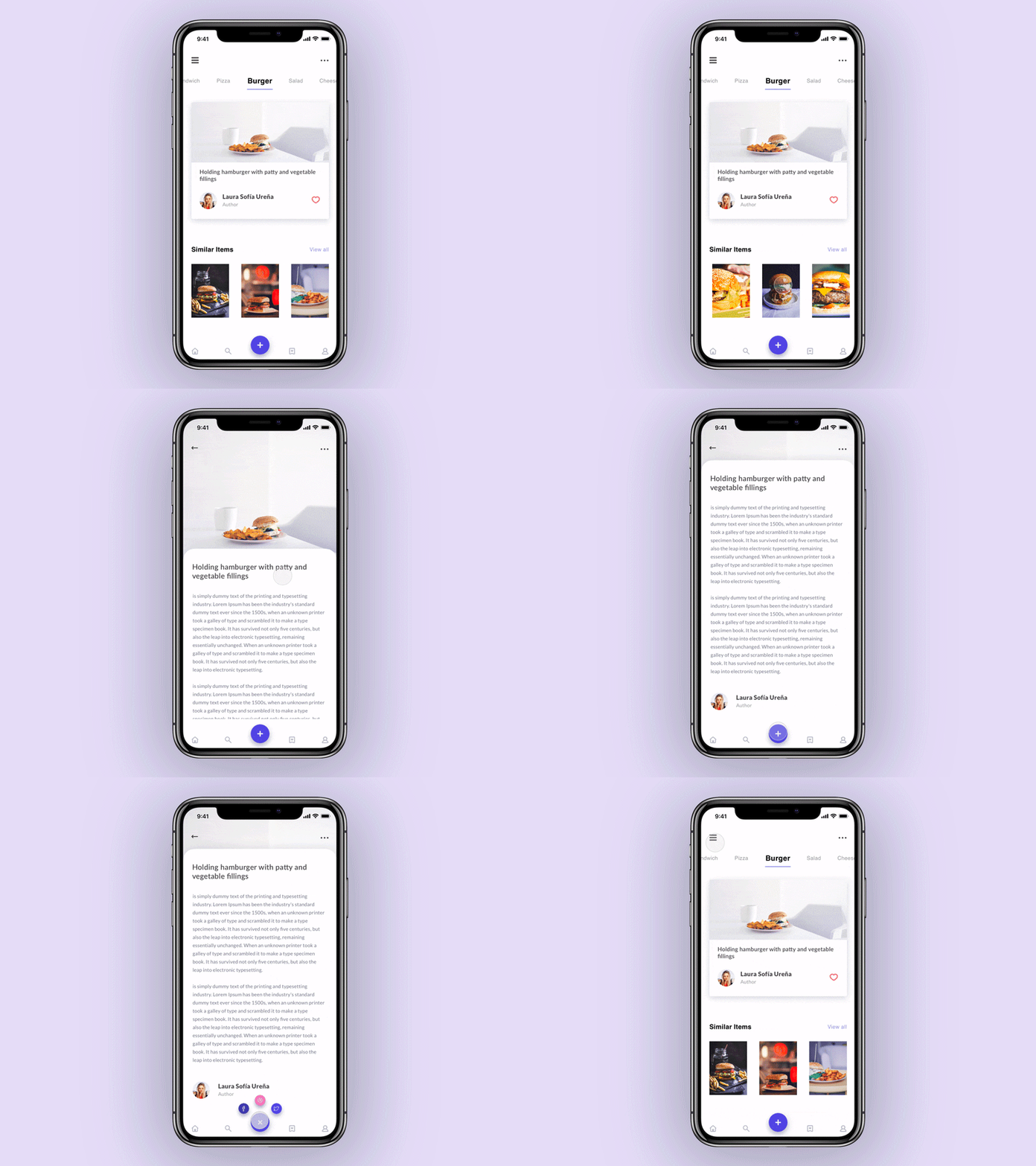
Mobile App UI UX Design: Introduction
One has to be living under a rock if their Mobile App UX design is not mobile-friendly yet.
With the emergence of smartphones, mobiles have become a technological touchpoint for everyone. From the researcher to the learner and from the entertainment fanatic to the window shopper. While we are in an era where apps are released before websites, it is extremely important that the mobile interface is as seamless as it can get.
However, each of us would surely be able to recollect at least one such incident where amidst a discussion with our peers, we quickly logged onto a website, searching for something and were never able to toggle between different tabs or the font was so tiny that we ended up opening a different webpage altogether. Now, this is a major Mobile App UX design failure.
Problems like this can have terrible effects if not solved immediately. Because what we need are conversions and not leads that leave with a negative experience. This also negatively impacts the SEO score of the website or a negative review in the app store or the play store.
Hence, while there is so much that we can do to enhance the user experience, here are some common mistakes that one can avoid and convert leads into conversions.

Lengthy Load Time in Mobile App:
If a user is accessing your website or app on his/her phone, there is a very high chance that he/she is using mobile data and has multiple applications running simultaneously on a pea-sized ram.
Now, in such a scenario if your interface is very data-heavy, it is sure to test your user’s patience.
Here is what you can do to ensure optimal UX and minimal load time for your users:
- Analyse and broadly classify the devices that are used according to their specifications.
- Have just the right amount of graphics. Videos or images that are very data-heavy might take more time to load.

Responsive Mobile App UX Design Interfaces:
It is important that we understand that mobile phone users are different from users accessing using a personal computer.
Those working on a larger screen might be more interested in knowing the details all at once. However, too much data on a mobile screen would simply make navigation and interaction difficult.

Similarly, mobile phones can have varying screen sizes. Hence, it is important that an interface is responsive enough to fit multiple screen sizes and offer its users comfort while browsing on the website or the app.

Gated Content:
Users are on your website to consume content.
However, with the current air of repeated security threats, how many would actually sign up on a website and leave their credentials?
As a service provider, we might love to collect data and keep a track. But the users, not so much.
Instead, try providing content for free. This also adds to the credibility as a user can associate his purpose with the website. You can further ask for details while providing higher value content.

Long Forms:
Let us admit it. None of us is very fond of filling forms.
Thus, why would even a user gladly fill a form without a strong purpose in mind? That too on a tiny mobile screen with fumble fingers!
Thus, it is important that we skip them until and unless it seems very important.
For instance, if it is an e-commerce website, one would not need an address if no purchase has been made. Thus, ask for address details only when a purchase is completed and delivery has to be made.
If you think forms just cannot be skipped, have you tried incorporating audio-based typing?
Tiny Font Size:
This is a tiny mobile screen and tiny font will hurt the eyes.
Even if it is easy to read, is it big enough for easy navigation? Not everyone is going to be using a stylus and finger-touch is not always accurate.
The last thing any of us want to do is to irritate our users because they land up on the wrong webpages!
Thus, ensure that the text, as well as the navigation tabs, are of a reasonable size.

Lack of Automation and Integration:
This tiny device is capable of many things.
Imagine a cab booking app where you physically have to fill in every address in detail before booking a cab. Integrated maps do feel like a saviour, right?
Similarly, integrate logging in with google or Facebook during transactions. This not only saves time but also eliminates the need of remembering multiple platforms.
If a user needs to log in with a One Time Password or an OTP, request access to messages.
This helps in further improving the user experience.
Experience Degrading Pop-Ups:
Ever came across that pop-up that occupies your entire screen and the close option is too tiny to reach? On Mobile App UX Design like these, I usually just shut or uninstall.
But honestly, none of us wants to be the website or the app.
Thus, invest in design: have prototypes, test them before launching and redesign if you find any glitches.
Similarly, many websites also have an overlapping slider and a chatbot tab right on top of the bottom scroll.
Missing Onboarding:
A walk-thru or app onboarding is very important to retain users.
Use a tiny 10-second onboarding to demonstrate navigation in the app. Explain how the process works and what goes where and how the app architecture. You can also explain what each icon or tab means.
This is especially important for apps providing off-beat services that users may not have experienced before.
Vague Tabs and Icons:
Users visit your website or app for a purpose.
Your app serves them better if they are familiar with its icon and location.
Take Instagram for instance. Most teenagers can navigate through it in their sleep.
It is 2022. We are all stuck in lockdown and spend most of our time switching apps and websites and still find it difficult to come across may apps and websites that offer optimum mobile-based user experience.
In a world dominated by mobile phone users, it should be the topmost priority to deliver seamless user experience for the masses.
What are the other elements that you think a user should pay attention to Mobile App UX design and mobile phone responsive websites? Do let us know in the comments section.
FAQs For Mobile App UI UX Design
How important is UX UI Design on Mobile Apps?
UX UI design on mobile apps is quite important in order for the apps to be successful. A good interface will help users have a convenient user journey.
What are the two benefits of responsive UI?
The benefits of responsive UI are better user experience and maximizing content or information
What is a responsive User Interface?
A responsive user interface (UI) is one that is able to adapt to the needs of the user, providing an optimal experience no matter the device or screen size. In order to achieve this, responsive UI design must take into account a variety of factors such as layout, content, and navigation. By carefully considering these elements, designers can create a UI that is both easy to use and visually appealing, no matter the context.


![How a UX Researcher Can Save A Lot of Time and Money? [Read this Before Hiring] How a UX Researcher Can Save A Lot of Time and Money?](https://www.yellowslice.in/bed/wp-content/uploads/2023/12/Feature-Image-370x245.jpg)
