
Have you ever seen a user interface that looks so realistic you want to reach out & touch it? Neumorphism, the UI design trend of 2024 creates just that.
Our world is increasingly becoming digital. There is hardly any aspect of life that is untouched by the digital revolution we are going through.
Technological advancement has put our lives on the fast track where everything is available at the click of a button (by the way, even the button is digital). In such a transformational era, businesses are constantly looking for new ways to keep up with the changing trends so that they can meet the evolving demands of their customers.
Today, a vast majority of businesses operate online and their websites become the first, and sometimes the only mode of interaction they would have with their customers. So, it is imperative for such businesses to provide a user experience that is second to none.
To keep their interest intact and keep them coming back for more, businesses rely heavily on visual appeal and usability. No wonder then that a digital revolution like Neumorphism has taken the world by storm.
According to Google Trends, interest in the term “Neumorphism” has steadily increased since it was first coined in 2019.
What is Neumorphism Design?
Neumorphism is a trend that was introduced by designers a few years back and has continued to make its presence felt. And if design and industry experts are to be believed, it will continue to be one of the hottest trends in 2024 as well.
The reason is pretty simple, Neumorphism adds more life to websites, mobile apps, and UI design, something every single business is looking to do these days. It’s a bridge between real life and digital life and makes operating on digital platforms more real by combining many UX design elements and technical aspects.
Neumorphism is a design trend that tries to blend the digital and physical worlds, giving depth and texture to interfaces.
Creative Bloq
What do the User Data Suggest?
User data suggests that this trend has changed the way you look at apps and websites. A simple application can be made to look a lot more relatable and attractive by using Neumorphism and it sure is going to be better in the years to come.
It seems that 2024 will be a definitive year for this design trend as a lot of things are in store for the consumer not only in terms of digital design but with respect to material design as well.
However, before we get into the year to come, let’s first find out the roots of Neumorphism and why the world is going crazy about it.
Pros and Cons of Neumorphism
| PROS | CONS |
| Visual freshness | Difficulties for people with visual impairments |
| You can use neumorphism selectively based on the concept | Neumorphism kills the intuitiveness |
| Ability to mix several modern styles | Neomorphism dictates its own rules in the user interface |
The Origins of Neumorphic Design
Neumorphism is nothing but a take on Skeuomorphism – a concept popularized by Apple’s Steve Jobs that mirrors real-life objects to show a graphical user interface. The Recycle Bin icon is a good example of Skeuomorphism where a dust bin icon is used to show that this is where all your unwanted, deleted, files go.
The Steve Jobs Angle
Back in 1984, in the early days of Macintosh, it was one of the first kinds of computer that used graphical user interface and Skeuomorphic Design was a huge part of the UX design philosophy of Apple at that time.
This came to existence because Steve Jobs believed that relatability and familiarity with the icons or designs to their real-world counterparts will help users understand the functioning of Macintosh better.
And it did work. Over the years, Apple mastered the art of developing Skeuomorphism by creating icons and symbols that resembled real-life objects to the last detail. By the time they launched Mac OS X, they had already developed a full-fledged visual language, complete with glittering icons, symbols, and drop-down menus thanks to their emphasis on new ideas as well as insightful and dynamic thinking.
With the advent of smartphones, things became overly dependent on the small screen, and the world realized the limitations of Skeuomorphism where it was not always possible to relate an icon or symbol with a life-like object.
Secondly, the minor detailing of such designs was not clearly visible on small screens. which brought the new trend of Flat Design – which was nothing but the basic most representation of symbols using flat lines and curves, preferably with a solid background color. This flat design was easy to create, and simple to understand.
But as the digital world is, things constantly evolve. And new Skeuomorphism was soon knocking on the design doors that was later termed as Neumorphism – a combination of Skeuomorphism and flat design.
Striking a great balance between hyper-realism, and minimalism, Neumorphism utilizes colors, shadows, textures, complete with raised shape and rounded edges to create a visual hierarchy intended at making things life-like without being over the top.
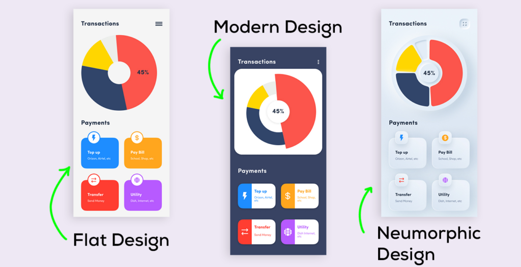
Neumorphic design vs Modern Design Vs Flat Design
How did a combination of Minimalism and Skeuomorphism result in Neumorphism?
Neumorphism can be said to be something in between Skeuomorphism and minimalism. But it’s a little more subtle in nature and design. Unlike the other two, Neumorphism has adopted more clinical and simpler lines in the design.
The result is a cleaner and more solid look. Neumorphism uses a perfect combination of lines, shading, and highlighting to create more life-like-looking objects. Neumorphism might create designs that are more realistic, but only enough to still make them look like they belong to the virtual world. This is what makes Neumorphism a stand-out amongst other design trends and probably will outlast others into 2024 as well.
Of course, that is not all about Neumorphism. There is a lot more to this amazing design trend. This design trend has evolved beautifully from what it was initially to what has become in the current design world.
This evolution has happened slowly, but quite perfectly. The focus is not only about creating lifelike designs and creating a perfect amalgamation of realism and virtual elements but there is a renewed focus on the color scheme as well. The color palette of the entire screen is what brings newness to Neumorphism. This is what is helping it deliver a whole new experience to the users😲.
It is often believed that the fascination with Neumorphism began with the emergence of the black screen, which was seen as an alternative to the glare of the white screen.
In a black backdrop, it was important to make clearly defined lines so that the buttons can be differentiated from the screen. The farther the fascination with the black screen went, so did Neumorphism.
How Neumorphism Works in UI Design?
Neumorphism is mostly about subtle designs, simpler lines, and a solid look.
So, how do you create an interface that dazzles with such a simplistic approach?
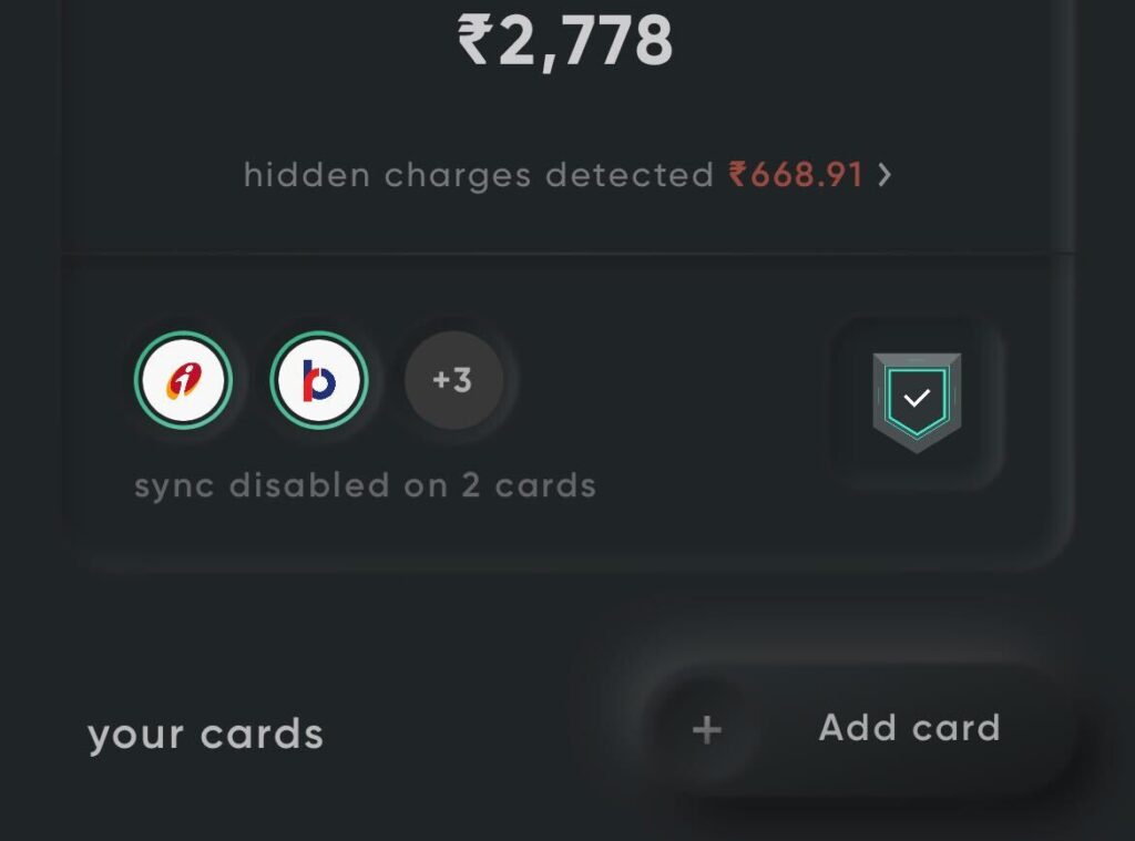
It’s the game of shadows and shades that Neumorphism uses to create very realistic buttons and objects. It gives the users a distinct feel. As you reach out to operate them, you can almost get a sense that you might be able to feel the object when you touch the screen. That is what makes Neumorphism so interesting.
Most commonly, the background color and the color of the button/object are the same. This is to create a visual effect that the buttons are coming out from inside the background by using shadowing.
The result is soft and protruding-looking buttons that give a sense of calmness to the users. These effects are completely created through HTML and CSS using gradients, fill, stroke, and sometimes even inner shadows through natural code.
In UI design, static buttons or objects are best designed through Neumorphism. This is because Neumorphism heavily depends on shadowing to create lifelike effects and it might not be possible for buttons that either need to shift or move or change their shapes based on user interaction.
Neumorphism, a Long-Term Bet?
Why Neumorphism is going to continue as one of the most popular UI design trends is its ability to create very realistic buttons that still look like they belong to the virtual world.
The user demands and sensibilities have been evolving quite prominently in the virtual world. It is all about providing the right experience apart from providing top-notch usability. Any trend that doesn’t combine these two important user needs is going to fade away eventually. But that is not the case with Neumorphism.
Neumorphic UI Elements
Don’t be surprised, there’s still more to Neumorphism
Apart from providing lifelike, relatable, and engaging designs that play on the work of soft shadows as well as dark shadows, Neumorphism has added some really interesting UI Neumorphic elements to its repertoire to make it more engaging and beautiful. Some of the most prominent neumorphic elements include –
Neumorphic Shapes
Shapes that are easily accessible are used and reused to create a familiar, repetitive experience. This helps users to better recognize buttons and objects faster
Neumorphic Representation
The representation of buttons and objects is very subtle in Neumorphism, which is just the opposite of its predecessors. This makes the same old elements look like they are completely new. Giving a new lease of life to anything old, and making it aesthetically pleasing is the classic function of Neumorphism
Neumorphic Effects
The effects used in Neumorphism are never over the top, giving them a feeling of simple yet effective designs thereby proving to be the main benefit of this design trend.
The Yellow Slice Take on Neumorphic Trend
Neumorphism, for all its glory and design capability, has its own advantages and disadvantages. The biggest advantage of using Neumorphism in UI design is that it brings an amazing sense of simplicity and visual calmness to objects and buttons. It can turn anything simple into something extraordinary.
However, the downside of using minimal elements such as a neumorphic button or a simplistic recycle bin icon is its usability, and more importantly accessibility. The issue is that there is very little margin for using different colors in the interface.

The way Neumorphism works provides no scope to work with vibrant and range of colors. A Neuromorphic UI must rely on the monochromic color palette to make an effective design. So, a lack of colors can be a downside. But it really appeals to the classy users – much like those of Apply products.
Yet another area where it falls short is due to the poor screen resolution.
Any neumorphic design is best viewed on high-definition screens owing to the multiple UI components and there is a large section of the population that still doesn’t use those kinds of smartphones or monitors.
So, these subtle components might not have the best visual appeal in those cases.
All said and done, Neumorphic UI designs remain a timeless classic.
Their subtle design and minimalistic approach appeal to all those who like classy matter and even those who like to keep things simple.
It looks beautiful and makes your UI work effortlessly. Simplicity never goes out of style, and this is the reason why Neumorphism will continue to rule the UI dynamics even in 2024.
Though this trend is taking UI Design to the next level, we should even look in to cons of Neumorphism as well. According to W3, there are millions of people who are dealing with a few disabilities, which I think we must consider while Designing. The disabilities where Neumorphism alone does not support such as Visual, Cognitive, and physical. Visual- Neumorphism can be hard on Vision Loss, Blindness & Colour blindness. Cognitive- I think Neumorphism might make users think a lot, as it says ” A good UX/UI does not make, users think. Cognitive & learning disabilities impact how people process information. Physical- Neumorphism can create confusion for e.g. can i click? what should i select? is it clickable? So to conclude, though this is the most used and best design trend we shall take other thoughts in to consideration as well while pushing one new trend.
– Pooja Kulkarni (UX Designer)
The Best Example of Neumorphism Design is Cred App

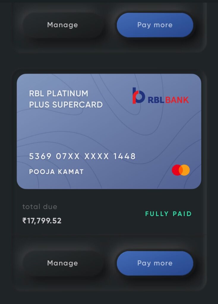

For the Cred App In the pneumatic layout used, the card appears to blend into the background, but the button in the upper right is out of the background.
This feels soft to the eyes, which is exactly what the user wants. As you can see, the button on the top right looks like it’s pushed out if it’s not selected, and pushed down if it’s selected.
This new morphic technique gives you the sensation of playing and squeezing bubble wrap. The tab design above on the reward screen is minimal and well thought out. Use the same bottom navigation bar expression for selection. In this way, tabs imitate what we all know well.
Turns the light on and off. The selected tabs are lit while the unselected tabs are dimmed. This friendliness is important for the user to feel connected to the app.
FAQ’s about Neumorphism Design
Why Neumorphism Design is considered to be a trend that will continue to rule in 2024?
Neumorphism peaked in 2020, a year when the entire world went through a transformational change. The UI designs created under Neumorphism are simple, subtle, and minimalistic.
But what makes those designs attractive is their ability to take things to the next level and make the buttons and objects look quite lifelike, while making them look like they belong to the virtual world. A simple play of monochromatic color palette and box-shadow, Neumorphism is a classy choice for all those who like easy usability and simplicity.
The design world is evolving in such a way where subtlety is being awarded over jarring, in-your-face colors. And this is one of the major reasons for Neumorphism being an ongoing trend in 2024.
How did Neumorphism evolve and what are its main characteristics?
Neumorphism evolved from Skeuomorphism, a design movement that believed in creating life-like objects by imitating them.
It all started with Apple’s design philosophy of creating symbols that resembled real-life objects so that the users could connect with them easily.
It went a step ahead with Neumorphism where soft UI elements and tender-looking designs evolved to provide the users a more simple and effective experience.
The main characteristics of Neumorphism are the use of simple and flat lines and the heavy use of box shadow to create buttons in the same color as the background. At times, two shadows are used to make them look like they are appearing from the back.
What are the pros and cons of Neumorphism Design?
The biggest advantage of using Neumorphic designs is that they are simple and relatable. They seem very lifelike, and still do not cross the limits of belonging to the virtual world.
Their simplistic designs help many designers to create aesthetically pleasing and cohesive experiences. And it also hastens the process of conceptualization, building, testing, and iterating new screens. Their soft visual appeal makes them more enticing and interactive.
The downside, however, is that the use of monochrome colors might pose usability as well as accessibility issue to those with visual impairments like color blindness.
That apart, Neumorphic designs don’t look good on screens with low resolutions. So, until a user has a good smartphone or an expensive monitor, the designs will fall flat. But, overall, Neumorphic designs are here to stay in 2024 and beyond for their lovely concept and simplicity.


