Here’s how our team at Yellow Slice helped AnyDukaan improve the UI/UX design of their app to allow easier and higher conversions.
AnyDukaan is an online grocery retail platform that connects local vendors to their target buyers online. Their main goal is to empower local grocery store vendors to reach their customers while competing with online shopping giants like BigBasket and Amazon. It has two different apps to cater to buyers and sellers of products and groceries respectively.
AnyDukaan to redesign their existing app while working together with their in-house designer.
To take up the task, we first had to understand what their existing app was like.
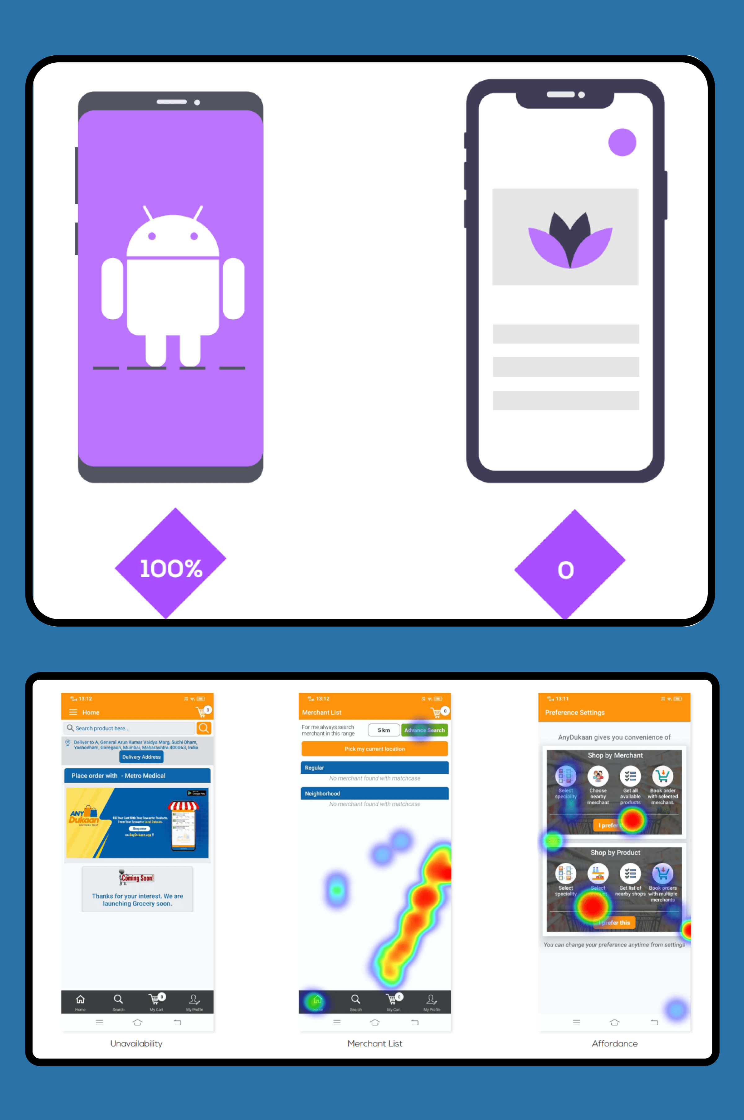
Heuristic Analysis of the current AnyDukaan app showed a lot of opportunities for improvement. We realized that the usability, discoverability, and overall user experience improved by folds. And we communicated the same with our acquaintances at AnyDukaan.
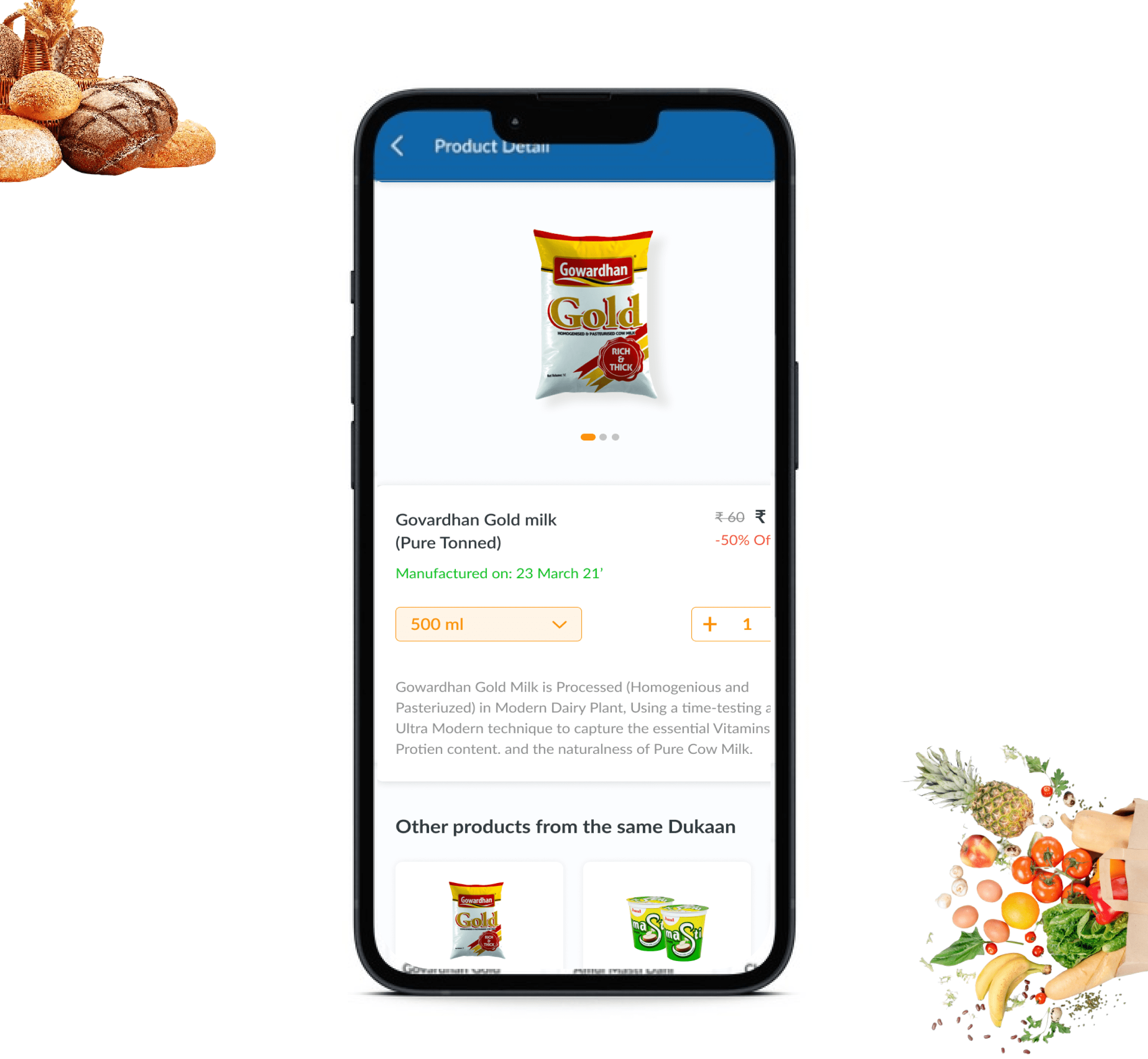
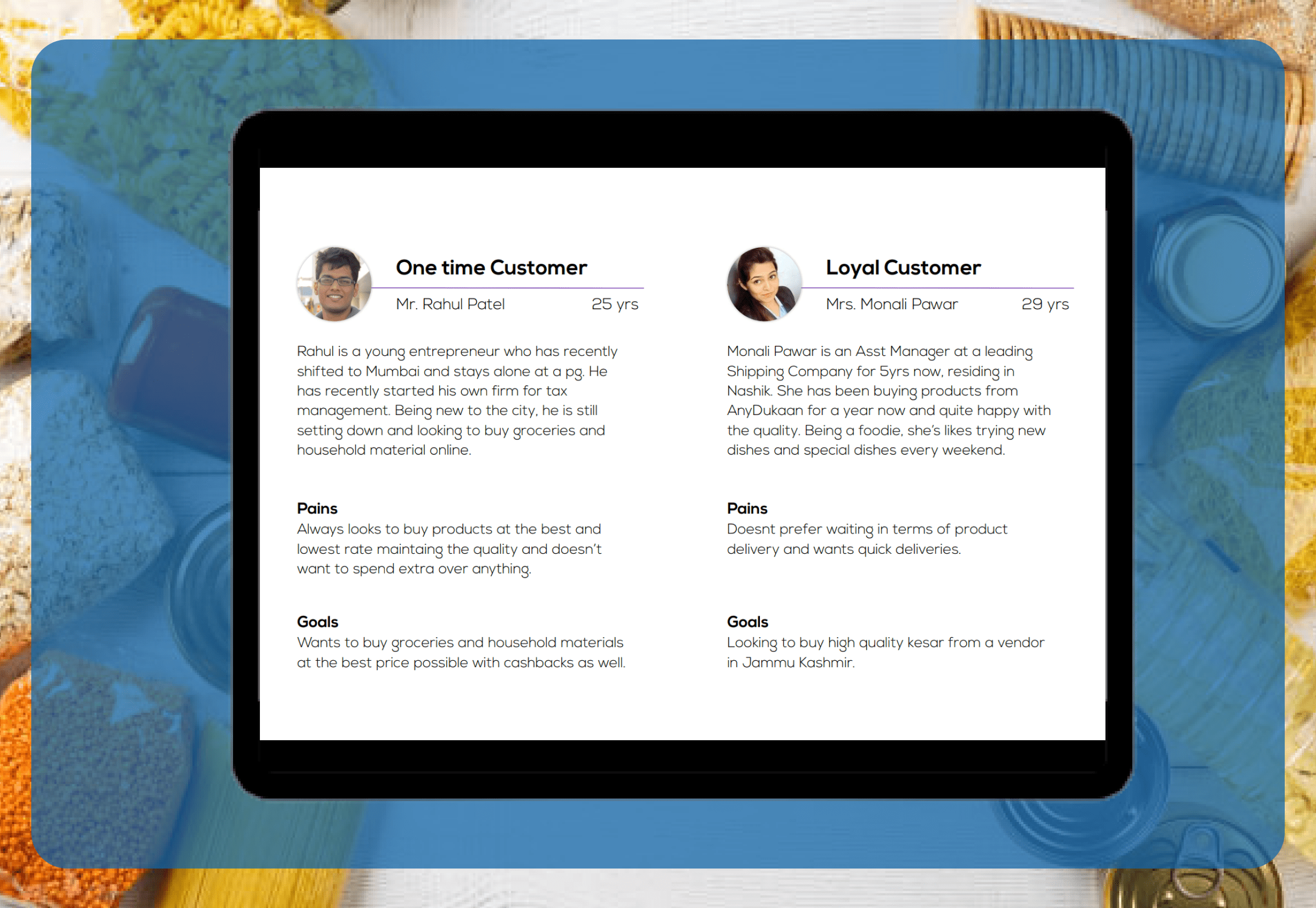
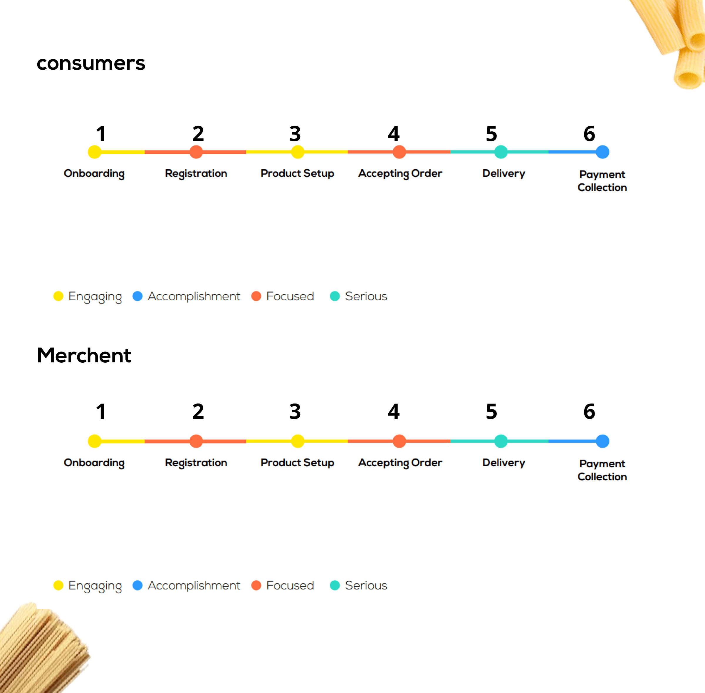
After a thorough analysis, we gained a clear understanding of user behavior and pain points. This data helped us in building a strategy for the app. Based on that, we also derived the customer and merchant flow based on which the designs would be made.
User insights of our clients showed that both of their apps are mainly created for Android users. Apart from that, a detailed heat map showed us where the majority of its users tapped. This was important as it gave us insights into what features and buttons most app users tap on. Making these features and buttons easily accessible can increase user engagement in the app.
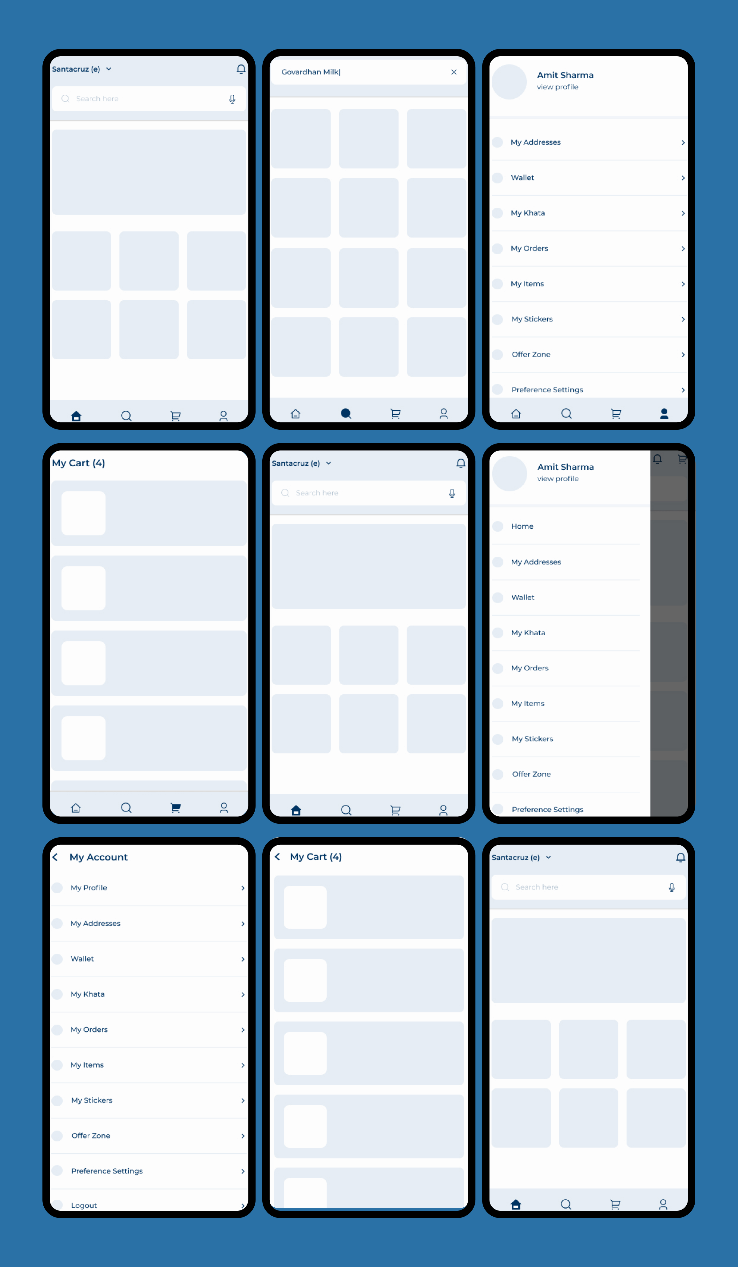
With all the information gathered, we were able to create the following wireframes for the apps.
While implementing our designs, we had to keep in mind that the primary user persona was that of a Full-time User since the number of users would be way higher than the secondary user persona which was a Part-time User.
Based on this knowledge, we came up with a range of design features.
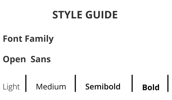
To ensure high readability and legibility, we chose the Open Sans font family for both apps.
Since the users were already familiar with the existing app, we used the same color scheme as the previous one.

We changed the icon style from regular flat icons to icons with a strong border to give them a clean, uniform look.
Old UI:

New UI:

With all the above changes, here are the screens we designed.
Old UI:
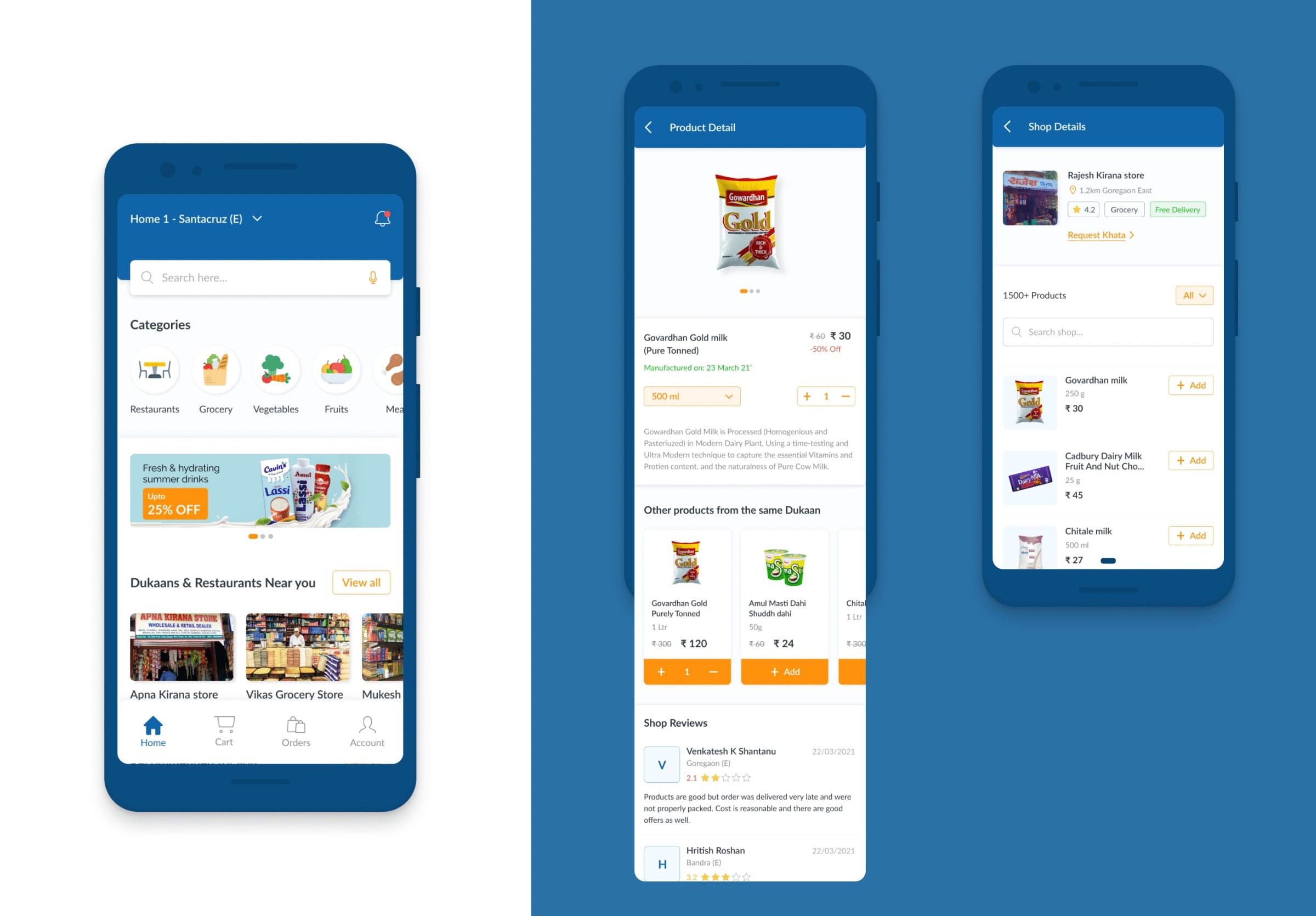
New UI:
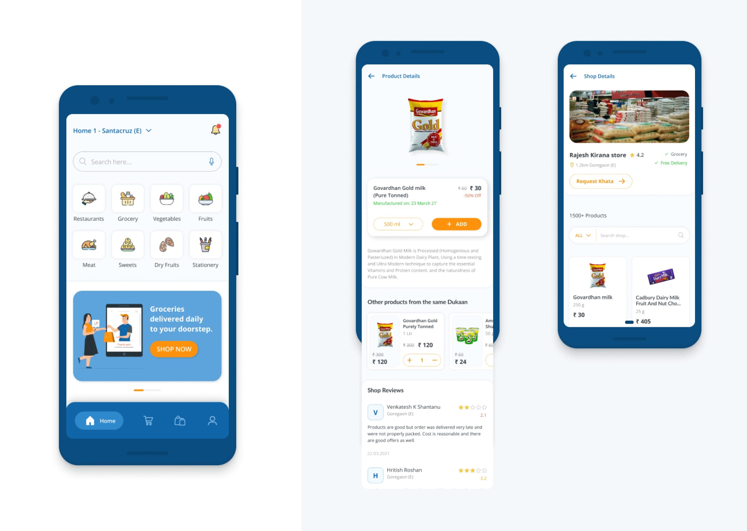
Old UI:
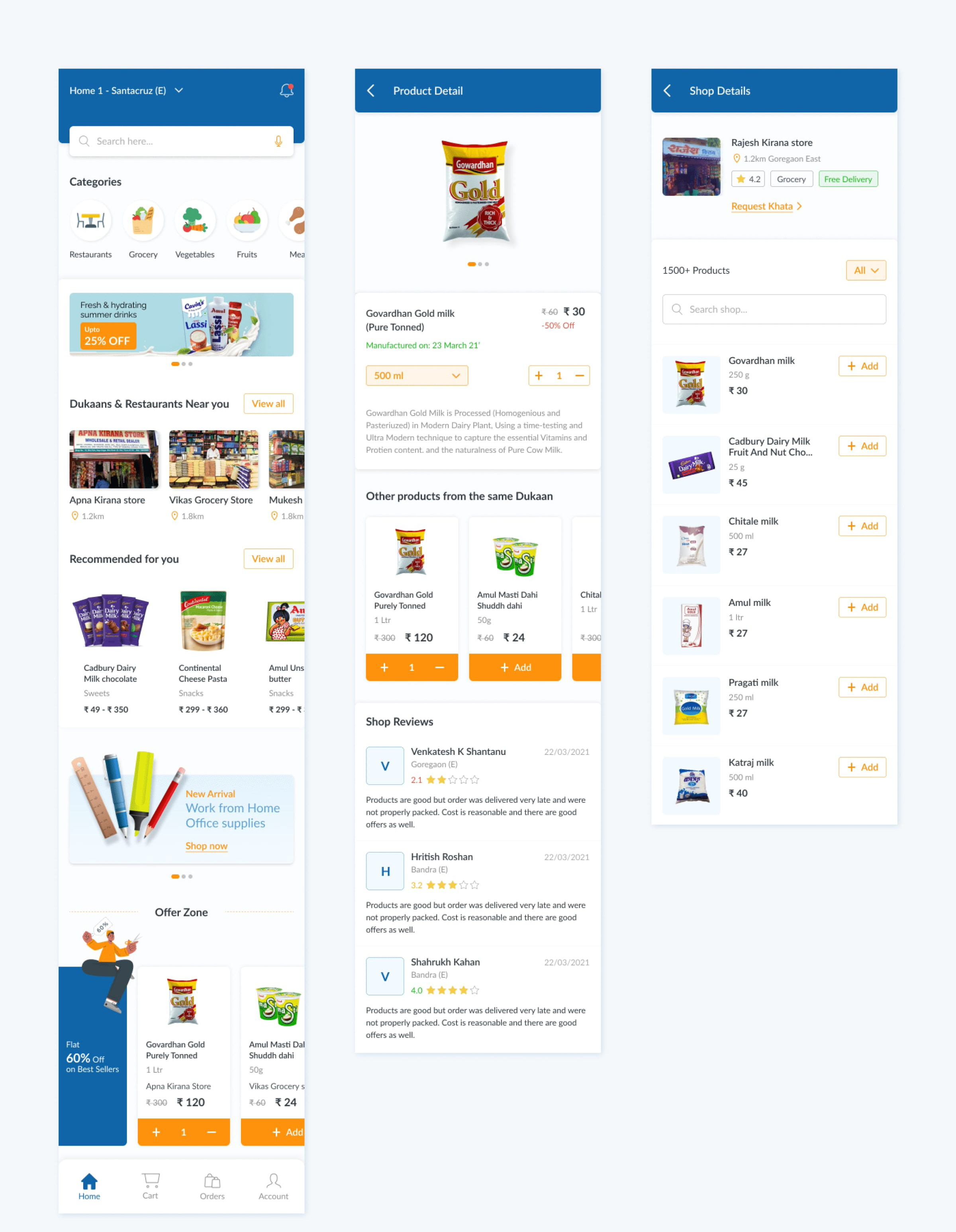
New UI:
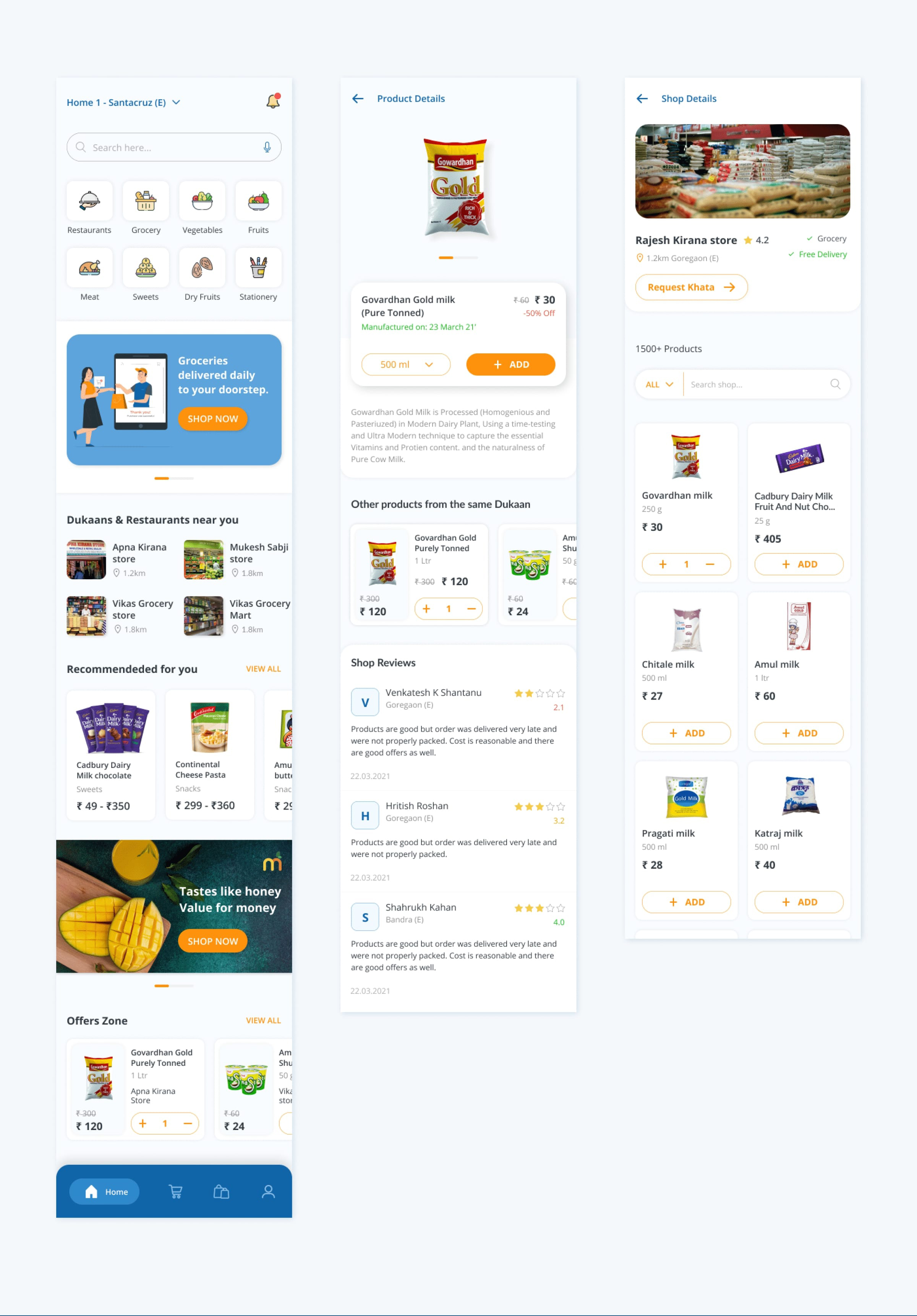
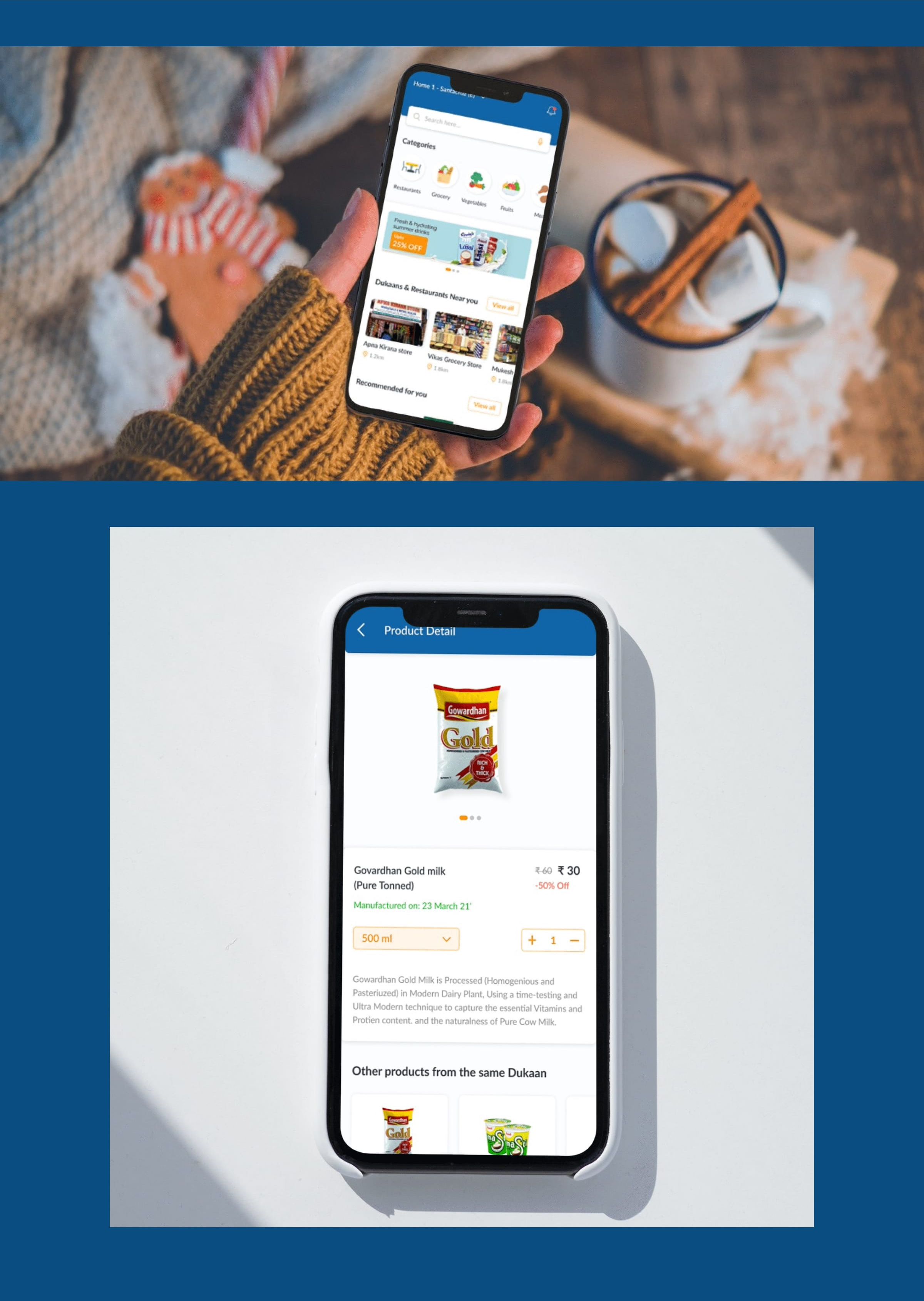
The User experience was made to streamline the purchasing process while ensuring that the interface is clean and legible for the users. Here are all the changes we made to the existing apps.
| HOME SCREEN | |
|---|---|
| Old UI | New UI |
|
Flat 2D Icons with no
uniformity.
|
Bright, uniform icons with strong borders
|
|
Slide view to show nearby merchants
|
Clean column view to include more data/screen
|
|
No separators for products
in the “Recommended for You” slide
|
Created cards for each
product to easily distinguish them on the home screen.
|
|
Product-wise offers in
“Offer Zone”
|
Added Offer Cards to
highlight
|
| PRODUCT DETAIL SCREEN | |
| Old UI | New UI |
|
No easily visible “Add”
button on the product page
|
“Add” button right below the
product image for higher visibility.
|
| SHOP DETAIL SCREEN | |
| Old UI | New UI |
|
No visible button for
features like “Request Khata” in Shop Details
|
Added easily visible buttons
on useful features.
|
Want to learn more about our latest projects? Connect with us if you have a project that needs UI/UX design consultation.
Follow us on Instagram and LinkedIn for more updates on our services.