Factura UX

Factura Case Study: Promoting brand aesthetics by designing a nature-inspired portal and website

We helped software brand Factura create a website and portal that reflects its brand aesthetics. Here’s how we went about it.

PROCESS

Project Duration:

When a new brand is born, people recognize it with some things more than just their product or service. A brand’s voice, ideology, values, and aesthetics are what sets it apart from its competitors. These brand attributes reflect in all the places where users can interact with the brand. Whether it is on social media, website, product packaging, or the product/service itself (if it is an online product).

Factura Softwares realized this and while designing their brand, they also approached us to design their website and portal to match their nature-inspired brand aesthetics.

About Factura

Factura Softwares offers a range of business productivity solutions to manage business operations with ease. They offer management solutions for different aspects of a business right from HRMS and Finance, to Contract Management and Customer Relationship Management.

Their brand inclines strongly toward natural and organic aesthetics which reflects in their brand identity elements such as logo and colors.

Problem Statement

Factura had already worked with us to avail our branding services, furthering that, they wanted us to design their website and portal to match their nature-inspired brand aesthetics.

Designing the Solution

SOAK

We had already worked with the brand so we were familiar with the brand’s identity. Now, we had to translate it into their website and the portal screens.

THINK

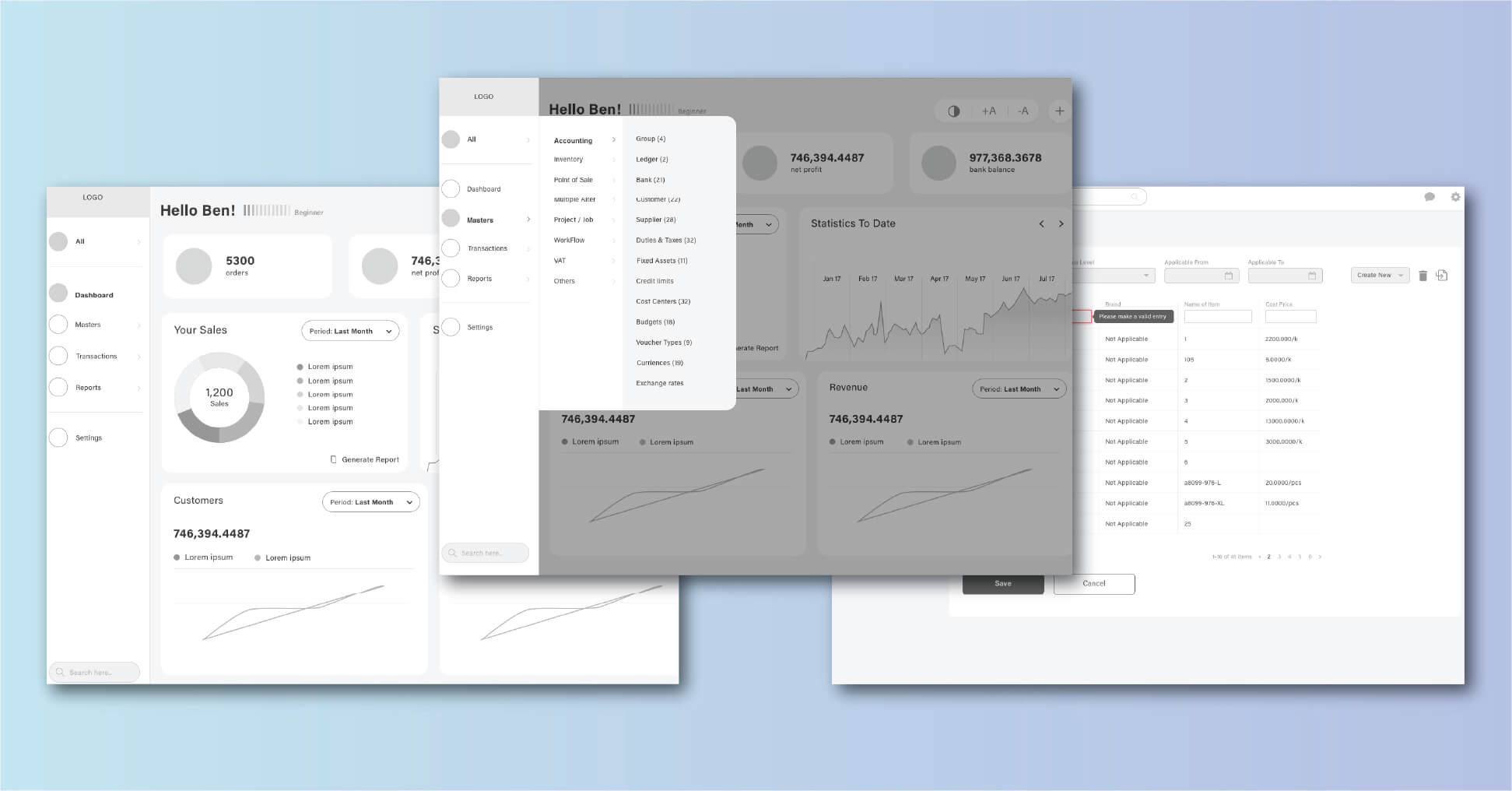
A meeting with the stakeholders made us understand the brand and what its customers may expect from it. Based on it we came up with the design strategy and wireframes.

Wireframes

Factura Brand Analytics

EXECUTE

Once the wireframes were ready, we went on to create the UI elements that we will then use in creating the website and the portal. We followed the same colors and typeface as the brand

Iconography

We created minimal yet strong icons with gradient colors to give a modern yet clean look to the interface.

Icon Design of UX & UI Design for Factura

Illustrations

Faceless illustrations with organic-shaped (shapes found in nature) backgrounds were created to align with the brand’s idea.

Visual Design of UX & UI Design for Factura

UI Screens

No. of Screens:

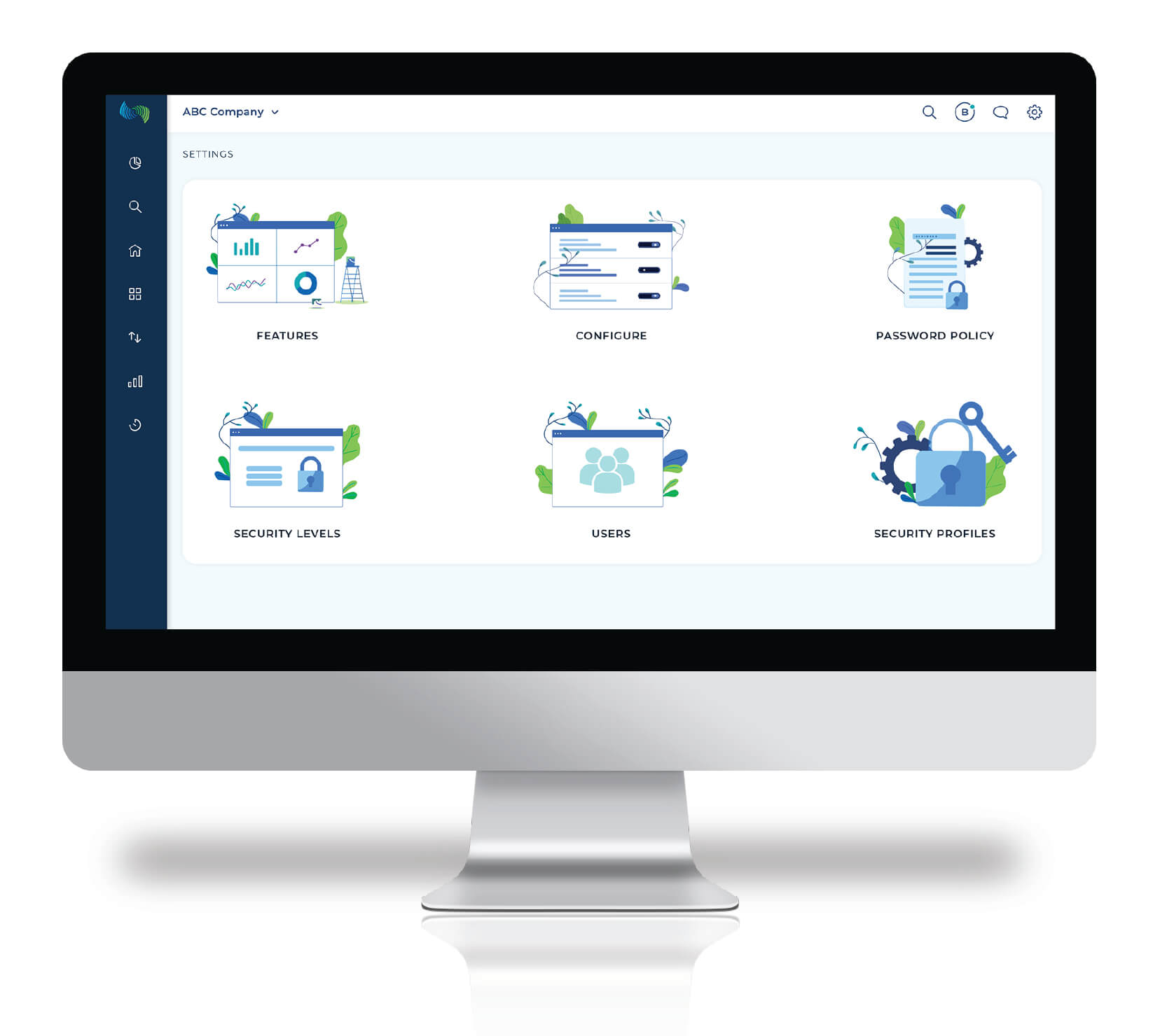
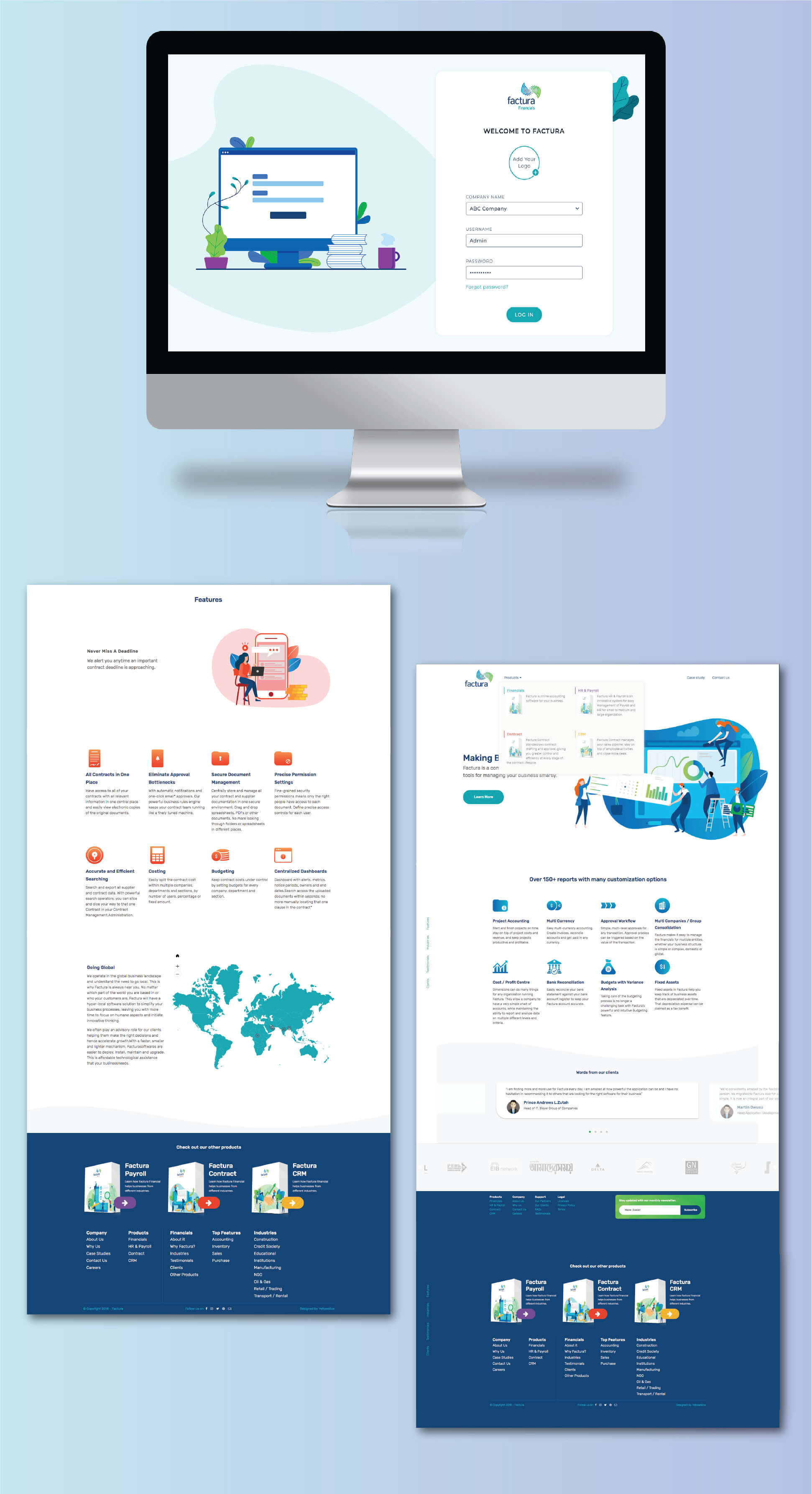
With the elements designed, it was time to frame the UI screens. With the concept given by our client, we came up with the following screens for the website and portal.

UI Screen Design for Factura
Application with the UX & UI Design for Factura

Results

While we used the brand color palette of Factura Softwares, we were able to create designs inspired by nature using design techniques such as the use of certain shapes & elements of nature or adding gradients to colors.

Our goal to connect the brand identity with both its website and the online portal was achieved successfully.

Do you have a business that wants a boost online? Our UI/UX design and branding solutions can help you gain the unique identity that you are looking for. To know more, book a call with us for a quick consultation.

Contact Us
X