

The case study illustrates how Yellow Slice’s UI design solutions helped Finolex create an app that improves communication between electricians, dealers, and customers
Finolex is India's largest manufacturer of electrical and telecommunication cables and wires. Finolex is a name trusted by many Indian households for its product quality and safety of use.Finolex wanted to leverage this trust and help the electric technicians and contractors connected with it, find an additional form of income.
That is how they created the app, Finolex Electrician. It allows registered electricians and electric dealers to communicate directly with customers to help solve their electrical problems.
Design the user interface of their app to ensure that it can be used by people with the minimum knowledge of digital communication and also work as a platform for consumers to find electricians when needed.
We needed to design the UI for an app that offered transparent communication between Finolex, its electricians, and the customers.
To understand what we were going to offer its users, we needed to first understand its users. Hence we started by creating the user persona for the app.
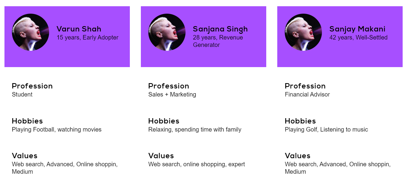
Apart from the general public, our target audience was also going to be electricians who may or may not be digitally tech-savvy. Hence, we needed to design the interface in such a way that it doesn’t need much training for them to use the app.
With that in mind, we created the workflow for the app.

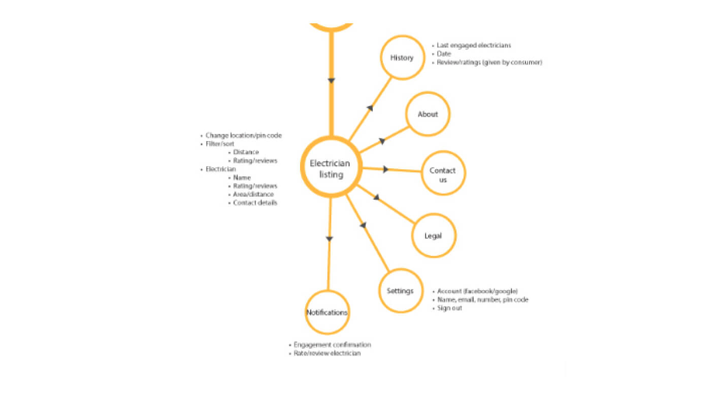

Once we had organized the UI components and the workflow that will be used for the app. It was time to implement our solution.
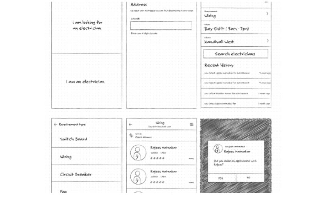
We used the following icons and avatars to flesh out the user interface.
We designed the following UI screens using the elements decided previously. While designing, we focused on using simple and interactive design elements with bold typefaces. The minimalist, monochrome interface improved legibility and ensured that the user does not get confused by any additional element within any screen.
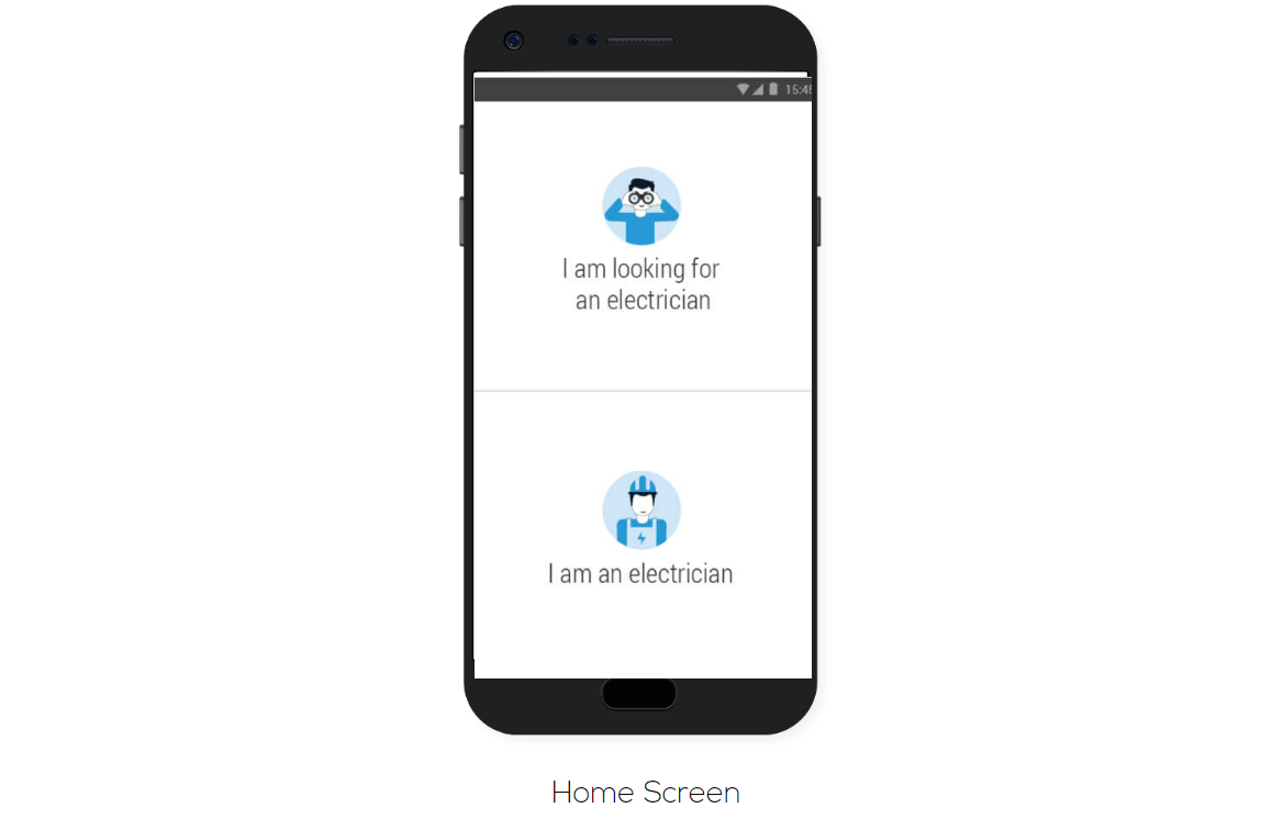
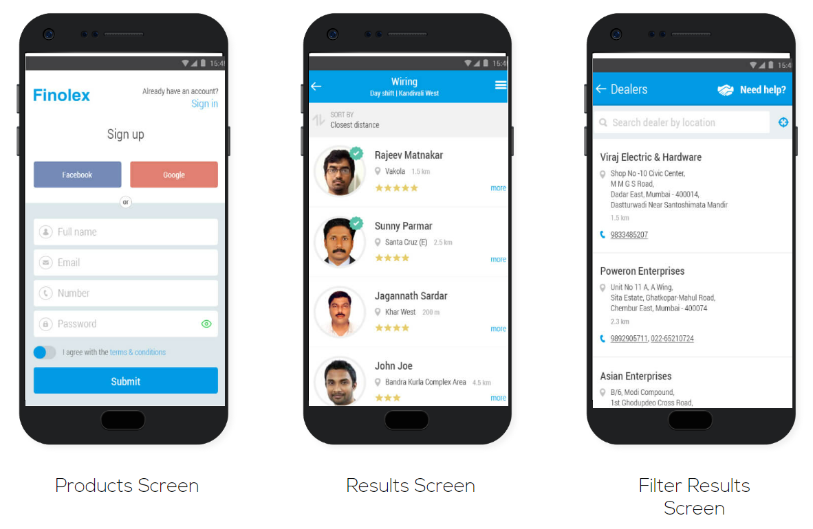
The monochrome blue-coloured interface reflects the brand’s identity and values. Sans Serif font throughout the interface gives a professional look to the app. Regardless of who uses the app, the interface ensures that they go through the shortest of learning curves and start using the app to its full potential promptly.
Do you want our designers to create a UI/UX design solution for your brand? Consult us through a quick call to know how we can boost your brand.
Follow us on Instagram and LinkedIn for more updates on our services.

Website visit

Customer engament
Website visit
Customer engament
