

Papa Cream is an ice cream brand that specializes in making nitrogen-based ice creams. To establish its brand identity, Papa Cream wanted Yellow Slice to come up with a logo and other branding assets that would reflect the brand values.
To create branding assets that connect with the youth and young adults.
To sell indulgence. To have the consumer experience the nuances of unique flavors and creations with our fresh, gourmet, hand-crafted ice creams using the highest quality of ingredients.
The inspiration was taken from the ice cream cones and coated chocolate toffees that instantly take a person to their memories of eating ice cream.

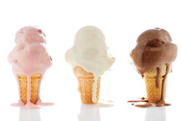

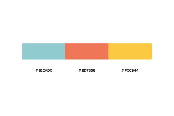
Soft, bright, and pastel colors were used for creating the brand assets as these colors resemble popular ice cream flavors and can easily be related to ice cream.
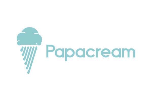

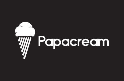

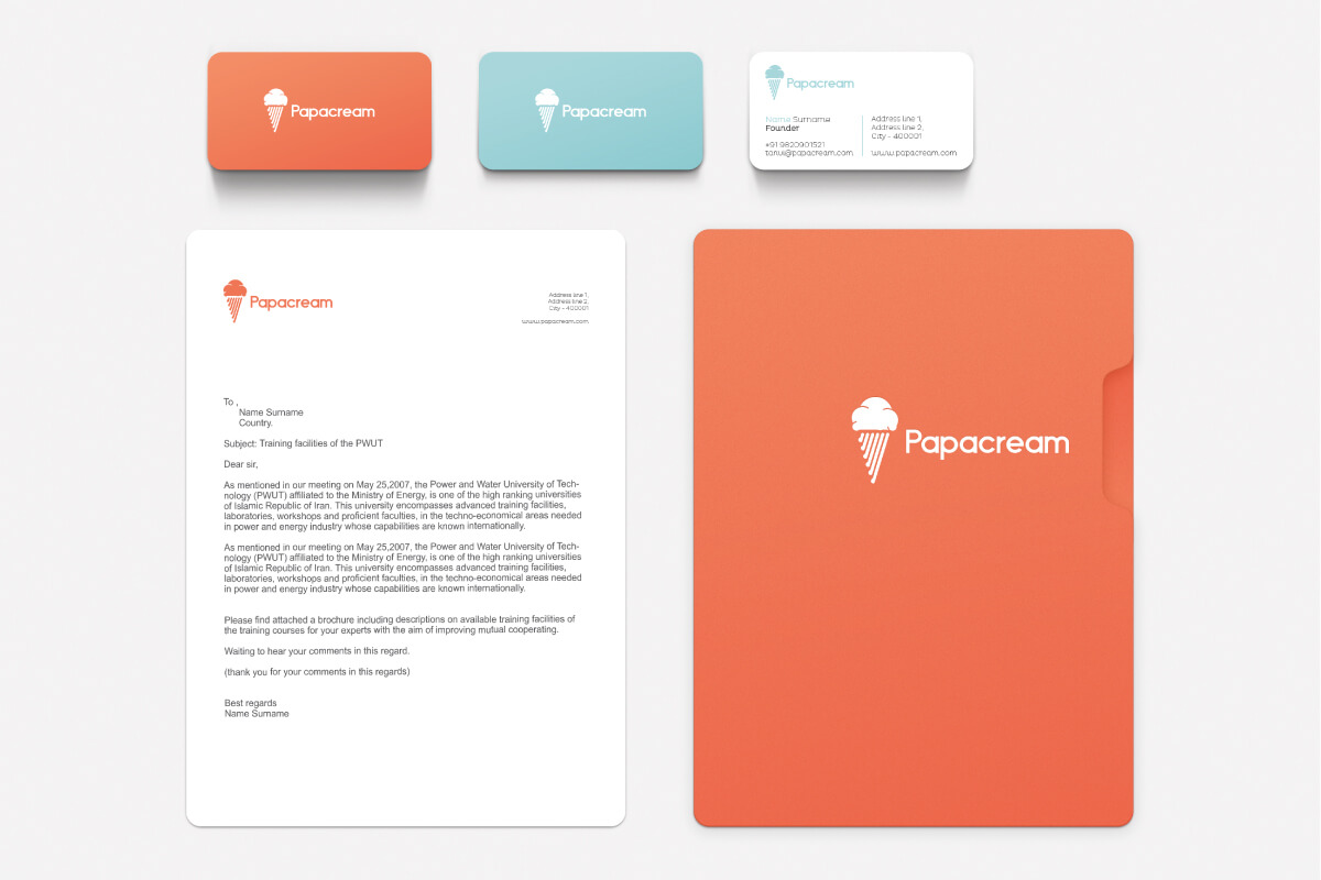
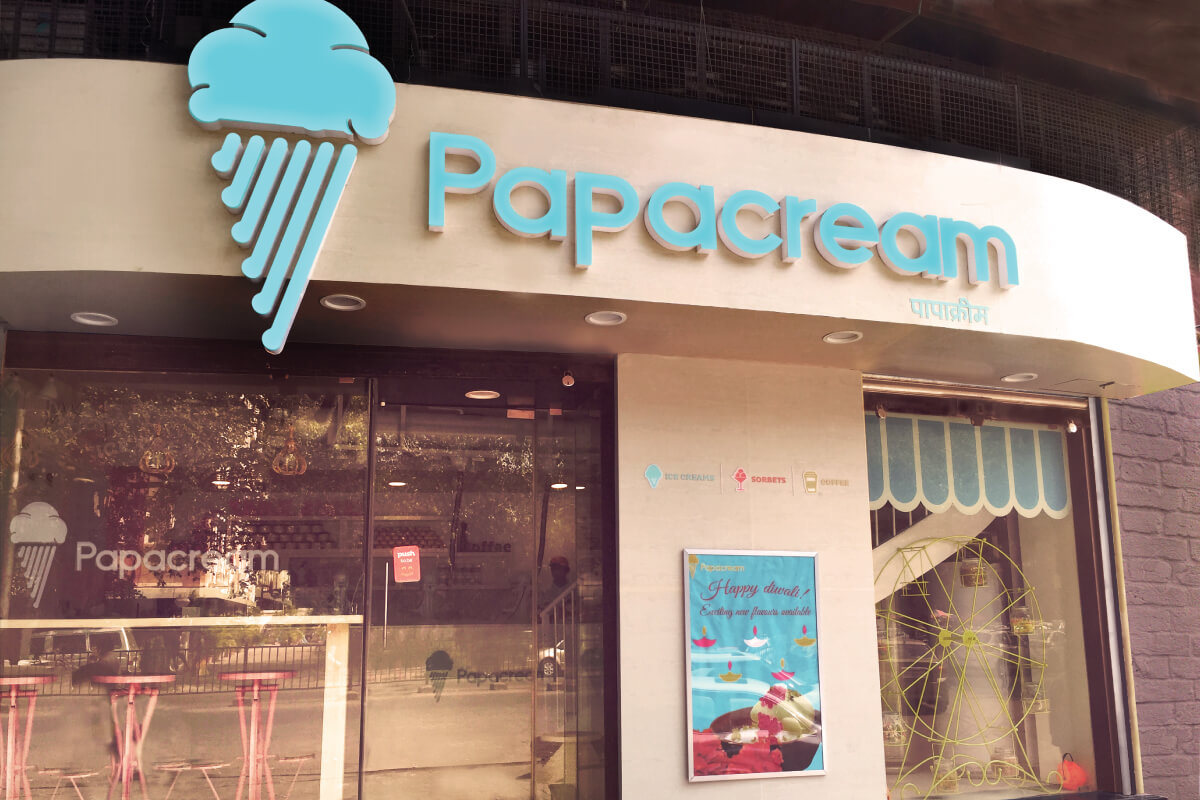
For the logo, two things were very clear. One, that there needs to be ice cream and second, it needs to show the product specialty – nitrogen-based ice cream. The idea was to represent quality ice cream that takes the consumer on a dream trip on top of the clouds. Adding that to the idea that nitrogen in its gaseous state looks like clouds made cloud a prominent element of the logo. From the cloud, we explored further toward raindrops and set them in the shape of a cone. That’s how the Papa Cream logo came to be. The same logo was used to design the menu card, store design, and packaging design.

Website visit

Customer engament
Website visit
Customer engament