Making humor readily available is in demand. Read how we helped Buzzhawker design the UI & UX for their app to make their clients have a good time.
People across the globe love a good laugh. It helps to relieve their stress and keeps their minds healthy. There are many platforms that offer humorous content to the audience. However, the funny thing about humor is that it is often highly subjective to people. For people from different geographical and cultural backgrounds, jokes and their relevance is different
We got to work with one such client who served funny, humorous content to the Indian masses. A personalized entertainment platform was what they were looking for.
Buzzhawker is an online platform for general audiences to share and consume humorous content. Humor that gives you ecstasy and ‘buzz’ is what BuzzHawkers are after. They take ‘Make in India’ seriously and promote ‘Desi’ ( Indian ) humor.
Buzzhawker wanted us to create a platform where they can execute and enhance personalized Indian humor to their audiences and keep them engaged.
To understand how to achieve our goal, there were a few things that we needed to know.
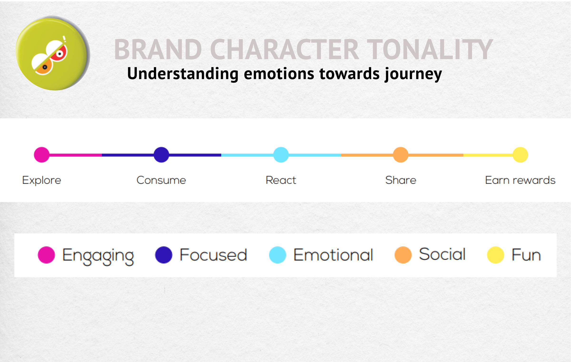
The first thing we needed to come up with is for ways to keep the audience engaged with the content and more. Understanding the requirement, our designers deep-dived into how we can create Buzz Hawker as a standout brand, with a mission to keep the users involved with the platforms.
The idea was to give endless desi humor to a wider range of audiences. For that, the content and execution needed to be enticing. We researched our target audience who consumes such content through different mediums such as Instagram Reels, Youtube Shorts, and similar others. Our findings led us to a few conclusions:
Based on our research of the product and its users, we designed the following wireframes.
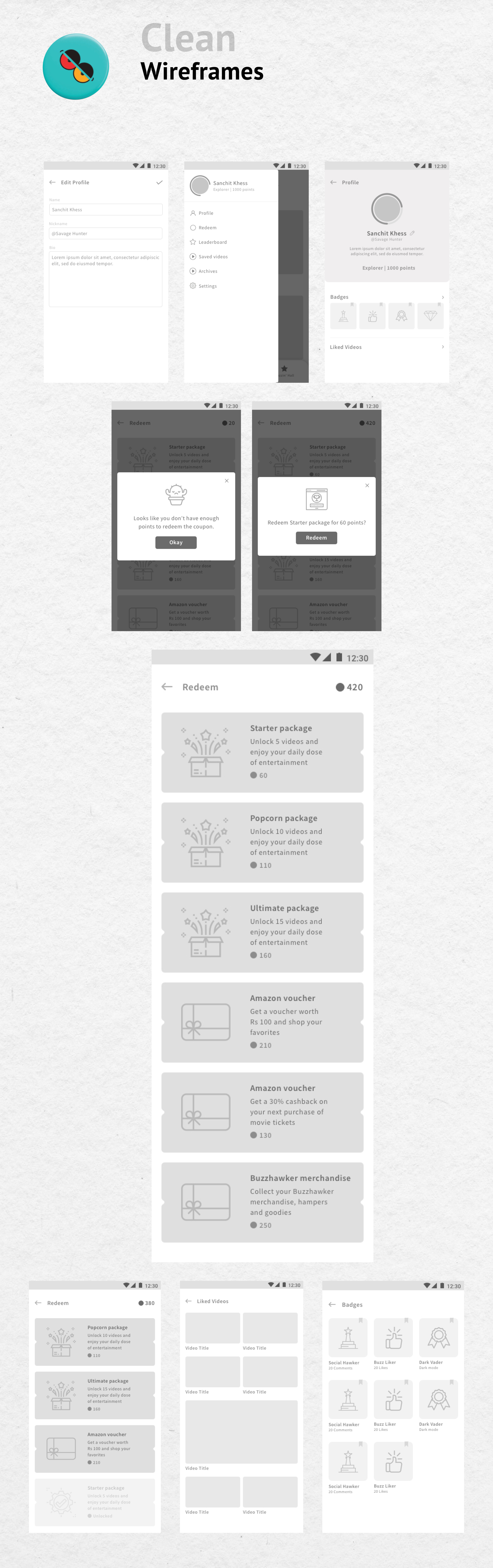
Once the wireframes were ready, we built a prototype that helped us define strategies, documentation, sitemaps, etc. Before that, we also had to test the navigation to ensure a smoother user flow.
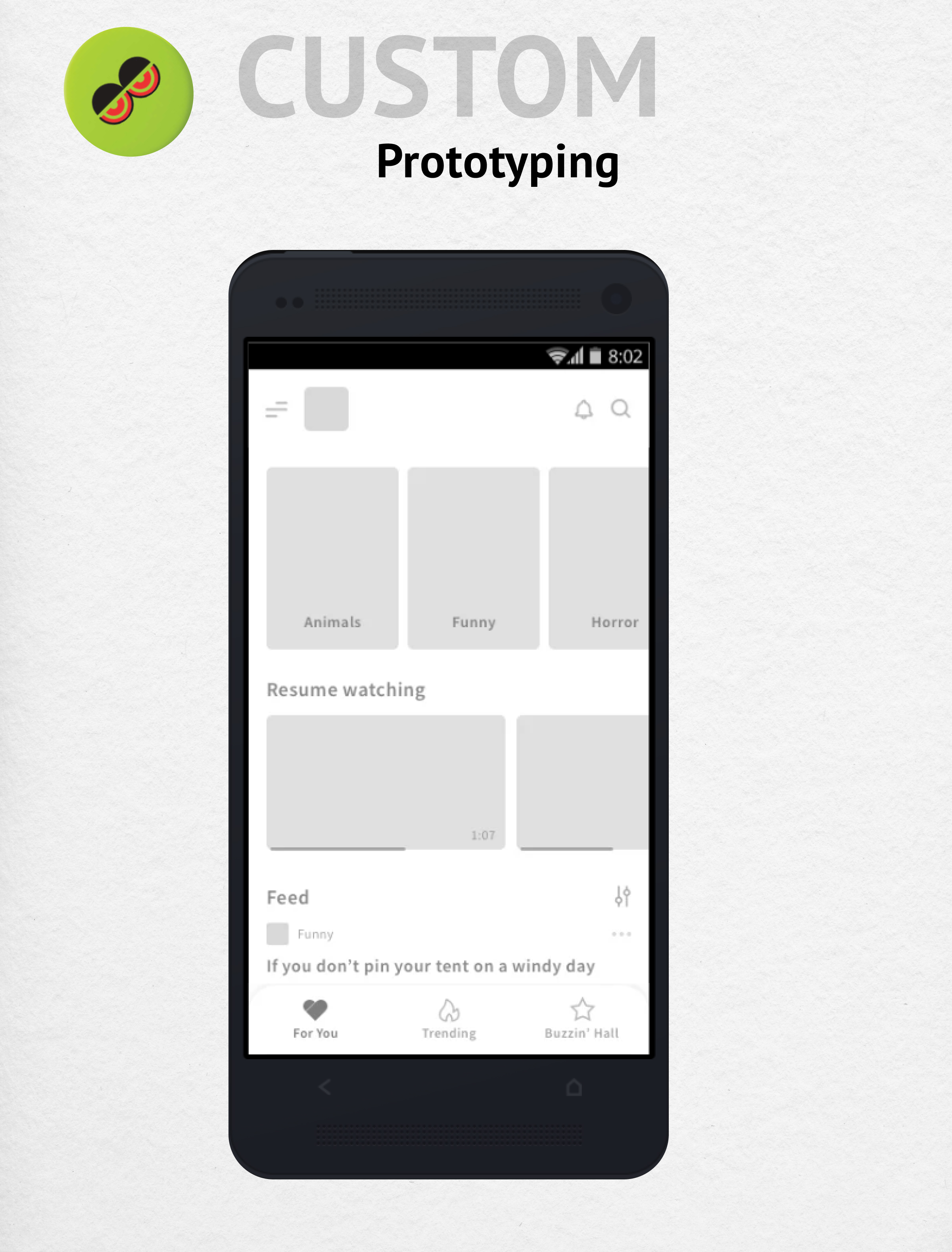
We led the project with a mobile-first approach as most of our client's audience would use their mobile phones to consume content. Based on the same approach, we create a responsive website and a mobile app.
On the desktop website, we added features like preview play that allowed the users to preview video content before they click on it. This helped users to choose the video they want to watch without consuming too much data.
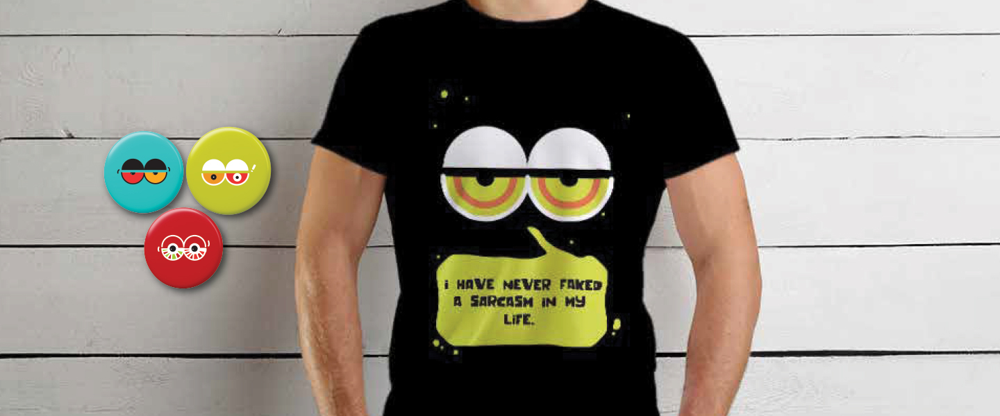
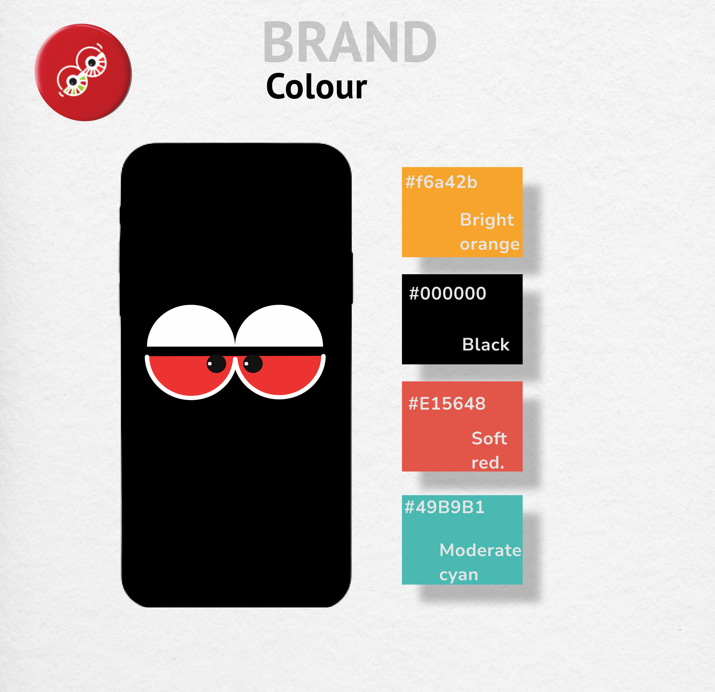
Since the brand personality was loud, funny, and entertaining, we chose to go with bright colors on a darker background giving it a modern, comfortable feel.
The icons were a reflection of Indian pop culture but used the line art style to give them a modern, clean look that resonated with the audiences.
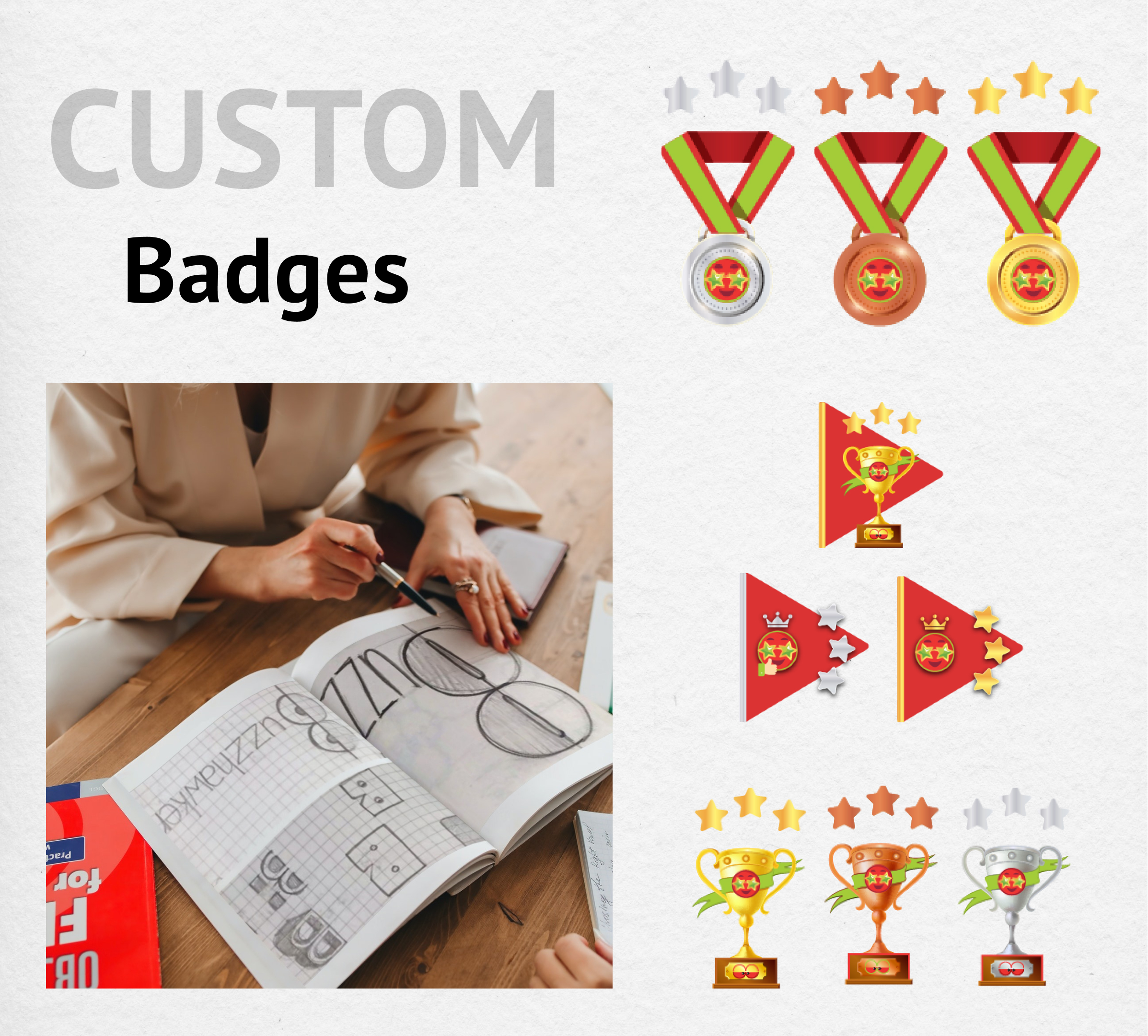
We also incorporated badges as a part of the experience. These badges worked as a gaming element to increase user interactivity and engagement. Along with this, the reward system ensured that the users have things to look forward to.
The idea was further expanded so that as the user matures, the content suggested to them would be more personalized and aligned with their interests. Apart from that we also made changes to the UI which was darker before.
The platform was a smooth content consumption platform with interactive elements that kept the audience engaged for longer. Elements like the reward system attracted users to keep coming back to the app.
Give your customers the best online experience with the help of Yellow Slice UI/UX design consultancy agency. Schedule a call with us to set up a quick consultation.
Follow us on Instagram and LinkedIn for more updates on our services.
