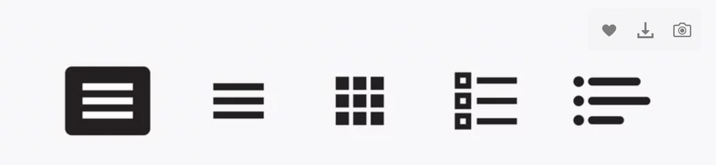
The burger menu is a type of navigation menu that masks navigation links from the homepage. The user has to click on the burger icon to see the menu and explore the other pages from there. This is denoted by a menu icon, which comprises three horizontal lines piled on top of one another—like layers of a hamburger.
Users know that those three horizontal lines will direct to an index of links (also known as a navigation drawer) in the layout of a sliding menu. The index will appear on the top of the homepage and list a series of links to other pages on the website.
The burger menu is commonly employed in mobile applications as it is extremely beneficial for smaller screens. Nevertheless, it is also valuable for desktop websites—for example, if multiple pages need to be linked in the navigation bar.
FAQs
Q1. Can the burger menu be used on desktop websites?
Burger menus are generally less common on desktop websites compared to mobile applications. However, they can be used on desktop websites, primarily for hiding secondary navigation items or reducing clutter in the header area.
Q2. How is a burger menu different from a traditional menu?
A traditional menu is a visible or static menu that displays navigation options on the screen. In contrast, a burger menu hides navigation options behind an icon until the user clicks on it to help declutter the interface.
Q3. What are the disadvantages of using a hamburger menu?
Hamburger menus hide navigation options, reduce discoverability, confuse users who may overlook them, require extra taps, lack accessibility, and provide inadequate visual cues, hindering usability and understanding.
