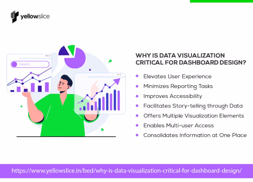
Why is Data Visualization Critical for Dashboard Design?

Abu Hurrera Nagori
What picture comes to your mind when I say dashboards? A screen filled with graphs, bar charts, and pie charts, right? This means you clearly arent caught up with the evolution of dashboard designs and modern dashboard visualizations. New-gen dashboards are far ahead of this with data visualization techniques being introduced to them. So its no longer the boring data being presented in dull two-dimensional, monochromatic charts.
New dashboard designs are visually engaging, interactive, and interceptable. They are easy on the eyes and mind too. It presents the insights you need in a tidy fashion, meaning you wont spend much time getting the information out of it.
How do Dashboards Help Decision-makers?
If the whole purpose of dashboards lies around presenting data in a consumable format, why not gamify it to the next level? This is where data visualization techniques help. With data visualization dashboards, you dont show numbers and stats, you tell a story. A story that everyone can quickly get on board with. You get every insight without missing anything.
Does this mean data visualization is a new thing? No. It has always been there. It just got better for users to have a smooth and seamless experience.
So, what makes data visualization a crucial factor for dashboard designs? If this question has been bugging you, read the whole article as we jot down the purpose of dashboards and the importance of dashboard visualization.
What is Data Visualization and How Does it Work?

Data visualization is the core function of dashboards that turns raw, humongous data into easily understandable information. Here are the other ways it helps in dashboard visualization.
For example, consider a marketing team that regularly tracks customer engagement, ad impressions, leads arrived and converted, cost spent, etc.
Rather than checking each application, the team decides to get a centralized dashboard built to see every metric in one place. They contact a data visualization partner to get this done. The partner now aggregates the teams data sources through APIs, structures the data, performs slicing and dicing of data, and presents a multi-faceted view of multiple datasets in graphical format.
The team is more productive now as no one wastes time preparing wasteful reports. The new dashboard visualization tool is 100% effective for them.
This is what happens in a typical data visualization design process.
Importance of Data Visualization in Dashboard Designs

Wondering how data visualization impacts dashboard designs? The following are the reasons why data visualization is critical for dashboard designs.
Elevated user experience
Implementing data visualization improves user experience and makes it seamless. This is because dashboard designs go through multiple iterations to make it perfect for end-users and are created keeping in mind what users want. It is simplified with all the details at the same time humanized to be like a copilot for users while making decisions. From adding the right fields to making everything accessible, data visualization acts as the key to simplifying users interaction with the dashboard.
Minimizes reporting tasks
Every manager spends an average of 3 to 4 hours preparing reports. This gets shared with the team who again spends an hour observing and understanding the insights. But with a data visualization dashboard, no one has to prepare reports. Dashboards are self-explanatory and automated. They show you the past and current performance levels, helping to uncover hidden patterns and trends. So, the chaotic reporting task gets its goodbye for good as one can prepare and share performance status on the go.
Improved accessibility
No one has to wait for a month to know the KPI numbers. They can see changes in real-time with the help of intuitive dashboard designs. For example, a cold calling professional can see his/her dashboard to view conversion status, number of hours, and other crucial metrics related to their job. This helps them apply instant action to rectify flaws and skyrocket stats.
Story-telling through data
Data visualization helps you capture the crux of the story and communicate it visually through dashboard designs. This is because each dashboard is created with its own purpose and vision. Metrics and their interrelationships are carefully studied. Everything is pre-decided from the type of the visualization chart to the color of the dashboard. So, it gets easier to approach the data as a story for fast and impactful interpretation.
Multiple visualization elements
No two dashboard designs are the same these days - all credits go to the advanced data visualization tools. From traditional bar charts to unconventional waterfall charts, there are plenty of options to visualize data. Also, you can add multiple types of charts within the same dashboard if you have to highlight differences. Another great thing these visuals are interactive and can be animated. For instance, you can click on a line chart and see the lines move forward tracing the trajectory. Similarly, a pie chart can expand into a 3d object, showcasing each of its elements. There are more such cool design options. Depending on user requirements, they can be incorporated.
Such experiments further enhance user experience and make collaboration more doable.
Multi-user access
Every user mustnt have the same level of access. That applies to dashboard visualization tools as well. For example, a departmental manager and a user may have different numbers to chase. There are certain numbers that users cant access in any way. With data visualization, its possible to customize dashboards for each user based on the metrics they must access. This will ensure the privacy and regulatory measures your company has to adhere to.
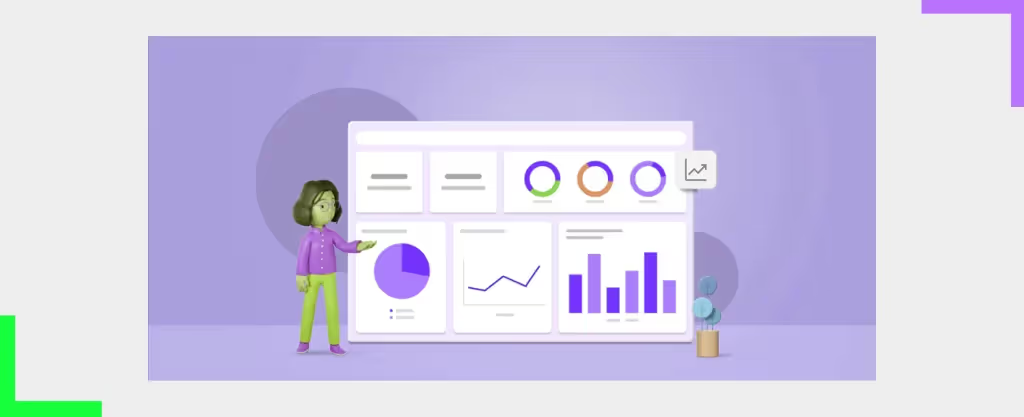
Everything at one place
It can be painful to go through multiple dashboards or reports to understand and extract the performance indicators. Even more painful to communicate that with others. But visualization dashboards can present everything on a single screen. It can sum up the important numbers on top with detailed graphs below. One look at it and you can tell whats happening. To state an example, a company can view its entire sales metrics in a single dashboard. Each graph can point to one of their sales channels and their track records. This can be highly beneficial for companies that follow multi-channel, complex sales operations. They can easily compare what is giving them results and what isnt. Similarly, these metrics views can be customized for any functional area and any department to help them analyze data side-by-side.
This approach of presenting data in a snackable size is made possible with data visualization techniques.
Final Thoughts
Data visualization is the backbone of dashboard designs that make the magic happen and drive the numbers. By applying the right visualization techniques you can create dashboards that stand out while also being effective in use.
Dont know where to start? Reach out to us to design modern, interactive, and visually pleasant dashboards that help you decide faster. We study your business requirements, analyze your data points, and create dashboards that exactly capture these needs. We have successfully transformed many businesses by bringing in aesthetic innovation and making that a part of their boardroom. Read our success stories here.
Have a unique requirement? Send us that to unlock your path to the new way of observing data.
FAQs about Dashboard Design
1. What are the benefits of dashboard visualization?
Dashboards help you visualize complex data and break it down into easily recognizable patterns, trends, and stories. This helps leaders make right decisions at the right time without having to go through huge records of historical data.
2. What are the types of visualization in dashboards?
There are multiple visualization types in dashboards including pie charts, bar charts, line charts, scatter plot charts, bubble charts, histograms, heat maps, and many other creative forms like this.
3. Who can use visualization techniques?
Visualization techniques are used by business owners, marketers, departmental managers, and other stakeholders to predict the future based on past data and make effective decisions.
4. Where is visualization used in dashboard designs?
Visualizations are used to design business reporting tools or dashboards to present data in a graphical manner.


Let's create something amazing!
Let's discuss your vision and how we can bring it to life with impactful design solutions.
.avif)
Good design starts with Sliced Newsletter
Subscribe to the Sliced newsletter and get the best of research, UX writing, product psychology, CX, and design systems, right in your inbox.
