Zerodha has played a vital role in making stock trading accessible to every Indian. The brand has not only offered a platform for mobile trading but also ensured that its users are educated about the stock exchange and the ins & outs of trading shares.
The Kite App by Zerodha is its online shares trading platform that has over 10 Million downloads only on the Google Play Store and boasts a strong rating of 4.1 stars on the app platform. The app remains a strong contender against its competitors.
Despite that, we saw significant reviews mentioning the different features, usability, and issues concerning the overall user experience of the app.
So we asked our designers at Yellow Slice to give the app a go and share their insights on its user experience.
Conducting the UX Review for Kite By Zerodha
To review the Kite App by Zerodha, our designers employed the UX principles and a quick competitor analysis. We checked if the app aligns with the mobile UX design principles that make the user experience more enjoyable or not. And whether it is offering the top features and functionalities that most of its industry competitors are providing their users.
With these two parameters, we found the following insights.
Expert App UX Review
After a brief understanding of the app and its UX, Yellow Slice’s UX head, Anthony Fernandes, shared his insights. These are as follows.
What can be improved?
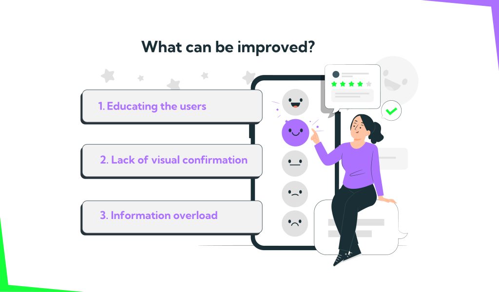
- Educating the users
There needs to be some focus on helping people invest their money. India post-COVID (especially tier 1 and tier 2) has become much more financially sound. And that means people know that FDs and basic mutual funds aren’t enough to build wealth. With the pandemic and inflation, people have realised that it is important to secure their wealth and have a second income source.
- Lack of visual confirmation
The portfolio looks visually very boring. It doesn’t give the user a feeling that they are creating wealth in visual form (e.g. how much their money has increased ever since they started investing). Visual messages have a stronger connection with the user’s emotions so this also helps accelerate the investment cycle of the user.
- Information overload
The screens can confuse a new user with how packed they are with features and elements. For an investment platform, this can potentially cost them users (especially the first-timers) because of the lack of confidence.
With these points in mind, Anthony suggested the following improvements.
How can we improve it?
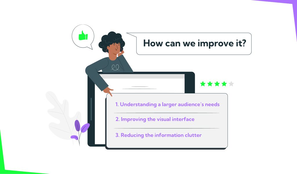
With an upgraded UX strategy, these issues can be addressed and solved. The Yellow Slice UX experts suggest the following changes.
- Understanding a larger audience’s needs
There is a larger pool of people interested in investing, so Kite can target them as well with a function to educate them. This will help them confidently make informed decisions for every stock they want to invest in. Information like stock-related news, past performance ratio of people, purchasing vs. selling, and other performance metrics give users more confidence.
More care needs to be taken so that it doesn’t come off as if the app is promoting one stock over the other. However, providing enough information to help users make an educated guess should be good.
2. Improving the visual interface
For an investment platform like this, gaining user confidence is of utmost importance. Designing features that visually showcase how their portfolio is doing can give users a sense of confidence through design. With more confidence, people will start engaging more with the app and investing more as well.
3. Reducing the information clutter
Creating separate experiences on the same application for low and high-risk investors can help. This would reduce the overwhelming feeling that low-risk investors get from using the app.
Furthermore, improving the navigation for easier discovery of investment opportunities can help the user find more areas to invest in. The interface can also be simplified by offering personalised tips to users based on their investment bandwidth (for example, if a user normally invests small amounts, recommend stocks that cost 100 – 200 that are easier to enter vs those that cost 2000 – 3000). Personalisation will also increase app engagement and user retention.
Endnote

Zerodha has been a game-changer in making stock trading accessible to every Indian. They’ve provided a mobile trading platform, Kite. The app is hit with over 10 million downloads on the Google Play Store and a strong 4.1-star rating.
Despite its success, it has room for improvement as can be seen from the user reviews about its features and usability. So, Yellow Slice decided to take a closer look at the user experience and come up with actionable insights. Want to get a comprehensive UX audit of your app? Click on the button below to schedule a quick consultation call with our experts.