The Fundamentals of Visual hierarchy in UX design

Omkar Phopale
Creating a visual hierarchy in UX design is the basis behind any successful product development. It ranks significant factors to direct a users engagement and make data more effortless to consume. The most crucial information is readily surfaced through color and contrast, texture, shape, orientation, positioning, and size. This visual hierarchy assists in creating a focal point to provide the user with an access point to begin consuming structures and directs them to the most vital data.
So, what constitutes a powerful visual hierarchy in user experience design? Different products need diverse methods, and you should keep your company objectives in mind. Developers and creative teams need to collectively decide which UI (User Interface) features deserve importance and prioritize them as per their functions and requirements.
Furthermore, by evaluating the user requirements and the business purposes, you and your workforce can effectively prioritize visual content and make your product stand out and be more effortless to use. Keep reading the article below to read more about visual hierarchy and its significance in UX design.
What do we mean by the visual hierarchy in UX design?
Visual hierarchy principles define how online platforms rank components comparable to each other, considering how relevant or important the information is. In simpler terms, visual hierarchy assists in organizing design factors and influences the ranking you like your users to view them.

Using regulations like scale, dramatically contrasting colors, balance, and more, you can assist in establishing each component in its appropriate place and make the most crucial elements stand out from other elements.
What is the significance of visual hierarchy in UX design?
Visual hierarchy can play a pivotal part in preparing your data architecture to assist online users in navigating the product effortlessly. It can drastically decrease the effort required to engage with your online product.

UX (User Experience) design is all about releasing conflict and improving the functionality of a product, and paying close attention to visual hierarchy is a fundamental way to accomplish this. Below are some of the visual hierarchies in UX design principles and how they work to impact the navigation of your content.
- Using scale and size to pull focus

Sizing is a fundamental but essential principle that can give features more significance than others and assist in drawing the viewers eye towards a specific area. By expanding the scale of an element, you can instantly attract users' attention. You want to be cautious, however, not to broaden multiple elements or improve the size in a way that might reduce the significance of other on-screen elements.
- Using contrast and color to make elements stand out

Colors and contrasts can be employed similarly to dimensions and weight to give precedence to your user experience design details. Brighter shades usually grab the viewers attention more than non-saturated, dull colors.
Likewise, shades with higher contrast will look heavier and more proximate to the viewer, giving them more sense of significance. In addition, using one luminous shade as a focal point draws attention, no matter where you put that element in the hierarchy of your balanced design.
- Play with a diverse perspective

Most website and mobile application interfaces are created to be two-dimensional and can usually look flat. By playing with diverse perspectives, you can form an illusion of space and separation in your online elements that will assist you in focusing on the important areas in your designs.
You can provide the illusion of perspective by increasing the size of certain elements concerning those around it, making those elements appear closer to you. In addition, adding a parallax movement impact to your elements to move faster or slower than those around them, including drop shadows or implementing a blur over a backdrop or other layer, can also dramatically impact the user experience.
- Composition and visual hierarchy tools
Composition is related to jointly laying out your UI (User Interface) elements, striving for alignment, powerful unity, and consistency. It guides online users in comprehending the association between the way things appear and how they operate.
In addition, an effective visual hierarchy with a uniform layout assists online users in navigating a product and moving their eyes on what they should concentrate on. An uncluttered composition is approachable and aids in getting into the flow. It removes the excessive mess and does not leave the online audience guessing.
- Typography
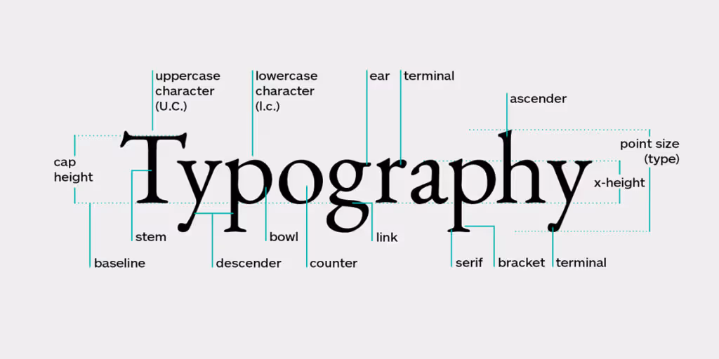
Typographic hierarchy is usually ignored in interaction design which is a significant mistake. It plays a considerable role in directing users' attention towards the expected outcomes, fostering better user communication.
It indicates the order of importance in your content designs and removes ambiguity, making your user interface more challenging to scan and delaying the user interaction.

When building hierarchy via typography, experts usually suggest employing three levels to systematize your content designs. When appropriately implemented, you will usually find a headline, a sub-headline, and a body text.
- Leverage white space
White space is usually deemed a lost chance or lost area for many. Whitespace is one of the most overlooked design regulations and one of the most significant. Whitespace refers to an unoccupied part of real estate with zero graphics or text layered on top. Thats significant because a background graphic image has deemed whitespace as long as nothing is included.

So if you fail to plan content for some blank space in your design, you risk ending up with a clogged up and disorganized design. In addition, whitespace serves as a visual separator by directing a user's attention through a structure and amplifying what's necessary. It provides comfort, positive and negative space, and a more effortless way to scan a web page.
- Mobile UX
With smartphones evolving as a dominant medium for online users to enjoy the various online platforms, it is crucial to consider the smaller screen size's limitations. Furthermore, mobile users should be able to witness and choose certain elements they like with ease.
The most effortless way is to make your actionable elements stand out more by altering the size and contrast. Furthermore, you should make your text easy to read for online users to fast comprehend what is occurring and if they like to tap on a button, make the controller's area large enough for them to easily choose that action. Additionally, it is better to avoid small buttons that remain very close and make the user accidentally push the wrong button.
- Regulations to arrange a design

Employing key principles and grids to design your layout keeps all components uncluttered and aligned, assisting the viewer in following a simple hierarchy that doesn't disrupt the user experience. With this, the users' eyes will understand where to follow, and each group of elements can remain closely associated due to their grouping or alignment along with these guides.
Procedures like the golden ratio endeavor to achieve this, but you can also split important elements away from these rules to improve their visual hierarchy. It can also help your designs feel more dynamic and fun.
- Screen alignment

When you align design elements along the identical path, you can assist them to feel related to each other, making it more effortless to scan the other comparable content around it.
Furthermore, by aligning the content in every column, there is no need to keep column borders because your human eye perceives this column with the data alignment.
What is the importance of viewing patterns?
Do you know that each individual owns a subconscious viewing habit that they generally employ to watch content? This pattern may be diverse for each individual and might vary slightly based on the content theyre considering.

Still, the two most prevalent viewing patterns individuals utilize are the Z and F patterns. These content viewing patterns serve a special purpose based on the kind of content youre creating. Planning your online content to flow with these patterns will assist viewers in having a more useful online experience. Here are the two most prevalent content viewing patterns.
- The Z pattern
The Z pattern pursues a track from down to the lower left, top left to top right, and across to the lower right. This design is reasonably used for content that is not content or text-heavy. Planning your content to stream with this pattern will assist your readers in scanning through every detail fast and get a sense of where you put the significance of each element.
- The F pattern

The F pattern for content viewing is predominantly used on text-heavy web pages such as blog posts and articles. In this pattern, viewers generally scan websites from the top right to the top left, then down to the next sequence from the left side to right, and so on. It is equivalent to the approach most of the western world takes.
Principles - Visual Hierarchy
PRINCIPLE NO.PRINCIPLEPrinciple 1Reading patternsPrinciple 2Size mattersPrinciple 3Space and texturePrinciple 4Typeface weight and pairingPrinciple 5Color and tintPrinciple 6Direction
The bottom line
All in all, a strong visual hierarchy in UX design assists you in placing significance on specific parts of your design. However, to make the most of your clear visual hierarchy strategy, it is essential to focus on the most important design elements that will help take your design towards success.
FAQs For Visual Hierarchy in UX Design
What are the Visual Hierarchy tools in UI Design?
Visual hierarchy is a strategy wherein the content of the product, website, or app is organized for consumers. This makes the content easier to understand as the importance of the content is made clear with the help of visual hierarchy. Font style, color, and contrast play important roles in Visual hierarchy.
What is the Meaning of Visual Hierarchy?
Visual hierarchy is a structure that follows a certain way how content/information is delivered on websites and digital platforms in a way, where users' eyes are guided without confusion.


Let's create something amazing!
Let's discuss your vision and how we can bring it to life with impactful design solutions.
.avif)
Good design starts with Sliced Newsletter
Subscribe to the Sliced newsletter and get the best of research, UX writing, product psychology, CX, and design systems, right in your inbox.
