
User Interfaces (UI) are a crucial element in the success and acceptability of apps and websites. And since user interfaces are about looks and design languages, it is susceptible to change in prevailing trends & fashion. Over the years, various evolving styles have influenced the UI ecosystem. Skeuomorphism eventually gave way to flat, minimalistic designs. Then came Neumorphism, which was inspired by objects in the physical world. The latest trend that has taken the UI world by storm is Glassmorphism.
Glassmorphism UI is the latest trend in user interfaces and is rapidly growing in popularity. One of the more mainstream applications of this design appeared in Apple’s macOS Big Sur which rolled out in 2020.
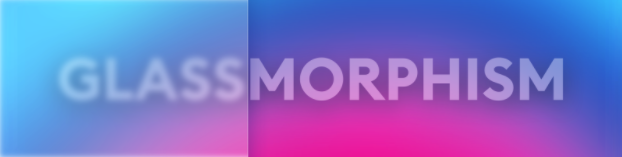
What is Glassmorphism?
As the name indicates, it has a transparent, glassy look. It is possible for users to see through layers. These layers can help to introduce hierarchy in the structure. The features of this new UI style – as enumerated by Michal Malewicz in his blog are as follows:
- Transparency- As explained above, this design resembles a virtual glass, with background blur.
- A multi-layered approach which looks like the objects are floating in space.
- The blurred effect is accentuated with vibrant colours.
- A subtle border on the translucent objects.
Chart with quick tips to design Glassmorphism:
| TIPS | WHAT ARE THEY? |
|---|---|
| Tip #1 | Make the effect |
| Tip #2 | Choose the right background |
| Tip #3 | Set the correct transparency |
Major Instances of Glassmorphism Through the Years
The beginnings of background blur dates back to 2013, when Apple first introduced it with iOS 7. It was a whole new design esthetic and the minimal, flat look was accepted well. The new notification tray was semi-transparent, and the user could see the objects behind the tray with a blur. If the tray was pulled slowly, the icons blurred gradually and that made for a very interesting, dynamic look which had not been seen before.
While the background blur on iPhones has been rolled back, Apple has brought it back on the desktop with macOS Big Sur. As always, the blur effect can be controlled by the user through system settings. But the background bour and the glassy look has grown in popularity and has influenced other companies and their products as well.
The Fluent Design System, innovated by Microsoft, employs Glassmorphism as well. It is organically built-in into Fluent, and they call it The Acrylic. This is part of the look-and-feel of all modern Windows desktop interfaces.
How Glassmorphism is Taking the UI Industry by Storm
Since both Apple and Microsoft adopted this design esthetic on their respective desktop operating systems, it will be more widely adopted in the months to come. App and website interfaces have already started choosing Glassmorphism, and users are lapping it up. This trend is already picking up and 2024 will see an upsurge in this.📈
As our lives get more and more intertwined with apps and digital ecosystems, a dynamic design language helps in keeping the users engaged and inspired. New designs come around every few years and transform the UI industry. For sometime, it was minimal, flat designs. Then Neumorphism ruled the roost – and now, it’s Glassmorphism. It’s a fun design system which is being lapped up by both users and designers. With it being an integral part of macOS, Microsoft Windows and iOS environments, new Glassmorphism apps are constantly being desgned for the respective app stores.
With newer design systems being invented from time to time, UI designers have to be at the cutting edge of these changes in order to stay relevant. And with the wider adoption of Glassmorphism across different operating systems and app ecosystems, it is imperative for a UI practitioners to learn how to implement this element in their own designs, going forward.
Dribble, a platform to highlight the work of designers across the globe, is already inundated with designs made with this new sensibility. It’s a clear indication not only of its popularity, but also how so many designers across the board are actually learning and implementing it.
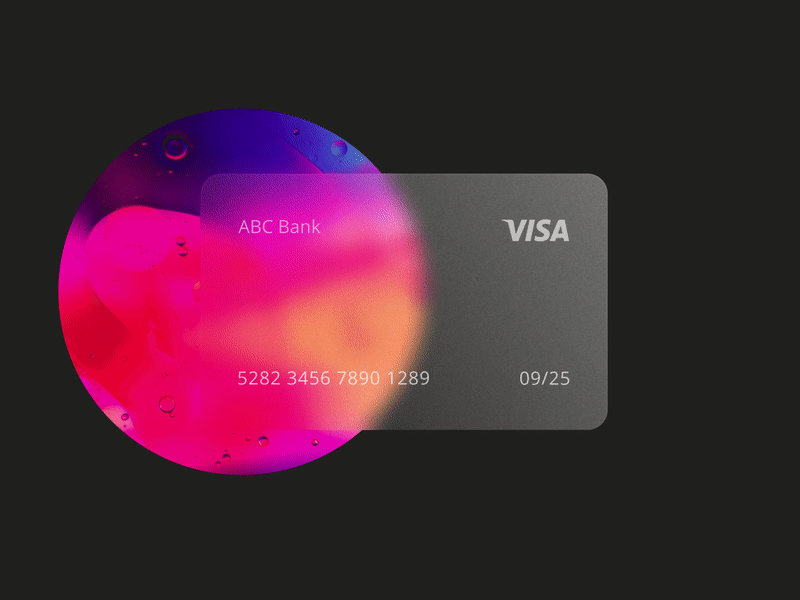
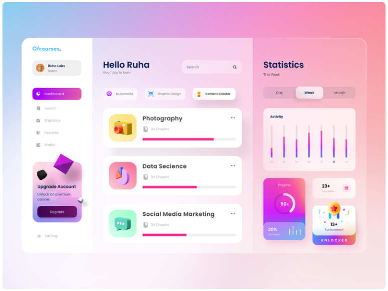
Here are some great Glassmorphism design examples from Dribble which highlight the three major attributes of this style – transparency (frosted-glass), vivid or pastel colours and light border.
How to Create Glassmorphism Effect?
Glassmorphism is actually a play between background blur, shadow and transparency. The idea is to achieve a balance between these three elements. Since it is a card-based interface, the objects closer to the user will attract more light, which increases its transparency. In other words, the “card” or layer on top will be more transparent, and the deeper we go, the lesser the transparency. A subtle shadow is added around the contours of the cards to give the impression of extra depth.
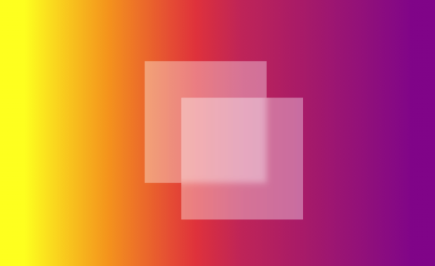
The style works best when multiple translucent layers appear over a colourful background. The transparency, however, is not complete. Only the fill needs to be transparent, not the entire shape. That would create the desired effect.
The background also needs to be chosen with care. A colourful background works best under Glassmorphism. Which is why iOS 14 and macOS Big Sur both use vibrant, colourful default wallpapers.
In conclusion, new design languages will keep cropping up as time passes. But whether these systems see wide adoption will depend on how intuitive and popular they are. And by the looks of it, Glassmorphism seems to fit the bill perfectly.
FAQs For Glassmorphism in User Interfaces
What is Glassmorphism Design?
Glassmorphism is a style that, uses properties and the look of glass to make the design look more appealing. It gives a translucent or transparent look and feels to its elements.
What is the Glassmorphism effect?
The Glassmorphism effect is a visual effect that makes elements on a user interface appear to be made of glass. This effect is often used to give a “clean” and “modern” look to an interface. The Glassmorphism effect can be achieved through a variety of methods, including using transparency, gradients, and reflections.
How Glassmorphism Is boosting the UI Industry?
Glassmorphism is a relatively new design trend that is quickly gaining popularity in the UI industry. This effect is created by layering semi-transparent elements on top of each other to create a sense of depth and dimension. This technique can be used to create a variety of different effects, from subtle transitions to dramatic light effects. Glassmorphism is particularly well suited for mobile app design, as it can help to create a more immersive and interactive experience. This trend is also becoming popular for web design, as it can help to add a sense of sophistication and luxury.


