
A great landing page design highlights the value proposition and contributes to increasing the conversion rate of the webpage.
Landing pages are where you can target your visitors to convert them into qualified leads or paying customers. The best landing pages are ones that showcase a perfect balance of design and copy. The sole purpose of creating a landing page is to offer an entire web page with important information crucial for the audiences to make conversion decisions.
Regardless of what you sell on the internet, landing pages are necessary to let your customers get the first impression of your brand. In this blog, we will be discussing the best landing page designs that you can take inspiration from to increase your website’s conversion rates.
But before that, let us first understand the different types of landing pages most businesses use to attract and convert their visitors.
Types of Landing Pages
As you may know, conversion types can be different, ranging from signing up for your newsletter to buying a product. Based on that, the landing page copy and design also changes. Landing pages can be created for all the following types of conversions:
For Downloadable Content or Online Tools
Landing pages can be used to offer gated content like Ebook or Whitepaper in exchange for the viewers’ information including emails. Apart from that, depending on the type of your business, a landing page can also gate an online tool like a credit score calculator, SEO audit, design prompt generator, etc.
Subscription to Receive Online Content
If you regularly upload new articles to your blog, you may want your viewers to subscribe to your newsletter. A landing page can be a way to attract people into signing up for your newsletter and other content they may be interested in.
Online/offline Event Registrations
Is your brand hosting a seminar or a webinar and wants interested people to join in? A dedicated landing page is a great way to let your audience know about it and register themselves for the event.
Free SaaS Trials
SaaS providers can easily capture high-interest leads by offering a free demo of their software. A well-designed landing page gives all the information necessary for their audiences to sign up for the free trial and take a step closer to converting as paying customers.
Online Courses
With the increase in online learning, more businesses are offering online courses on topics relevant to their business and products. For people interested in joining the course, the landing page helps provide all the important information so that they can easily sign up for the course.
Products for E-commerce
Product landing pages are landing pages for e-commerce websites and platforms. Here the conversion metrics are quite straightforward, a visitor is converted if they purchase the product from the website.
These and many other business-specific conversions can be tied to a landing page dedicated to the information related to what value you offer your audience.
While creating a new landing page may not be the most popular choice amongst marketers, a report by Omnisend suggests that it offers whopping 23% higher conversion rates.
With that said, let’s check out the top landing page designs we came across and why each of them made it to the list.
10 Best Landing Page Designs
Now that we have understood the types of landing pages, it is time to check out some best landing page examples that we love.
Starting with,
1. Airbnb
Why we love it
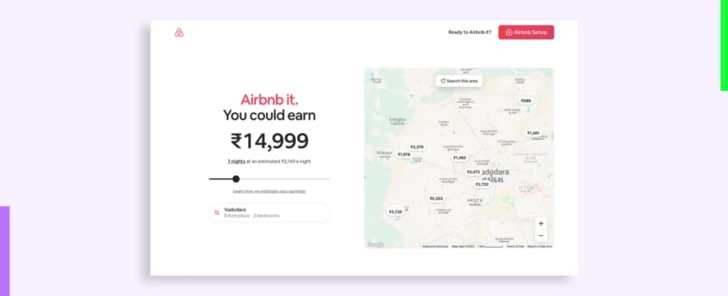
Airbnb has created an exciting landing page for hosts who want to join them and earn a little extra income.
The landing page flaunts a minimal design with brand colors added with black on a white background. Since they already know the motivation of their target audience, they place their value proposition right at the beginning with “Airbnb it. You could earn” and then an estimated earning calculator based on the location, time, and nightly charges.
This instantly lets the visitor know that if they sign up to become a host, they will earn this much. Besides it, they have placed a map of the location to let the current prices other hosts in their area are receiving by connecting with Airbnb.
Apart from that, they have also included a competitor comparison (without naming the competitors), an FAQ section dedicated to hosts, and a link to connect directly with super hosts (host mentors) for any other questions.
This minimal page aptly includes all the information necessary to make conversion decisions for their target audience.
PS. While they have included footer navigation, if you look closely, most of it will link to details that hosts may need to make the decision. Clever!
2. LinkedIn Marketing Solutions
Why we love it
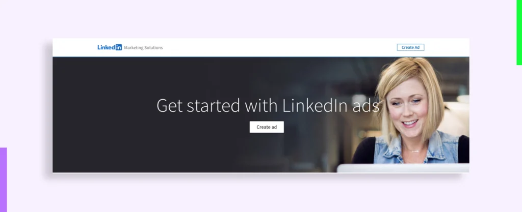
LinkedIn knows its audience like the back of its hand, they know what they are good at and how that can help their clients.
If the big banner with huge fonts and a CTA that clearly states what LinkedIn can help their clients with does not make you start LinkedIn Marketing Solutions, then the numbers that follow will.
The whole page reflects its audience which exudes sophistication and professionalism. To help visitors easily locate essential information like how to start using LinkedIn ads, the page highlights the table with a differentiating green color that isn’t used anywhere else across the page.
This landing page is an ideal example of adding only the hyper-crucial information for users to make conversion decisions. No content fluff, no image fluff, and did you count how many times the CTA is reiterated throughout the page? It ensures that if the user wants to get started, they will not have to scroll the page to reach the CTA button.
3. Hootsuite
Why we love it
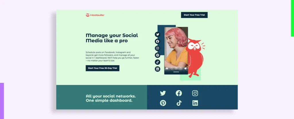
Hootsuite makes great use of its brand colors across the page but what makes it awesome is the screenshots paired with graphic elements that allow users to know what they will get if they click on the CTA button and start using the product.
If you scroll down, you will also see client testimonials from their prominent clients with their names, position, and the organization they work for. This brings credibility to the testimonial and adds another reason for the visitors to convert.
For those who want to skip the trial and directly purchase the subscription, the pricing table conveniently offers a 20% off discount.
This is one of the best examples of landing page design with a great mix of design, copy, and marketing techniques all focused on increasing conversions.
4. MailChimp
Why we love it
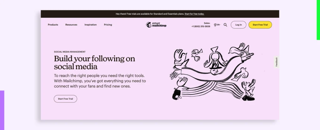
Remember how we talked about custom illustrations, this product landing page design has them all.
The first illustration on the hero image shows a man managing and juggling birds (symbolic of messenger birds or Twitter, whichever suits you) and that visually showcases what the Mailchimp product is created for.
The illustration style is consistent throughout the page and effectively aids the content to engage the user further. That’s why this page makes it to our list of top landing page designs.
5. Malabar Gold & Diamond
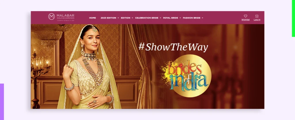
Why we love it
The landing page header showcases the brand tagline “Show the way” & “Brides of India” followed by an inquisitive copy in a decorative cursive script that matches the overall brand personality. If you scroll down further, a lead generation form is divided into two columns making it look visually smaller and hence perceivably quicker to fill.
Malabar has targeted the people who are soon going to get married through this landing page and to showcase their diverse collection of jewelry designs, they have divided it into different types of bridal jewelry allowing their audience to choose who they want to be on their big day. The visual representation increases audience engagement and compels them to take action. Moreover, the floating chat button at the right bottom corner ensures that answers are always available to any questions their audience may have.
6. Salesforce
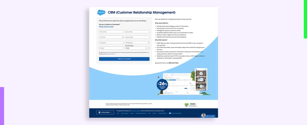
Why we love it
SaaS products created by Salesforce are used by businesses to streamline their operations. Keeping in mind their target audience. In this simple and clean design, more weight is given to the copy and so the design conveniently takes a back step with clear white background with brand colors for the CTA buttons to highlight the content.
However, if you scroll down, it shows a tiny but clear image that showcases the benefits of using the SaaS product along with a trust badge that assures client data privacy. All these act as more reasons to sign up for the action if one is truly looking for the software.
7. Practo
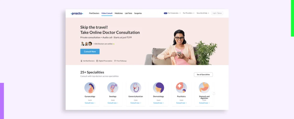
Why we love it
Practo has created different landing pages targeting different customers. This particular page targets people who want a doctor’s consultation and Practo offers an easier way to do it. The header lists all the important details that a visitor may need to know to take the decision– type of consultation, means, and charges.
This is really important because if a visitor at the purchase stage stumbles upon this landing page, they will need precisely this information to convert. The highlighted CTA button clearly suggests what the visitor wants instead of ‘Register Now’ or ‘Get Started’, the UX copy writes ‘Consult Now’ suggesting user action.
8. Swiggy
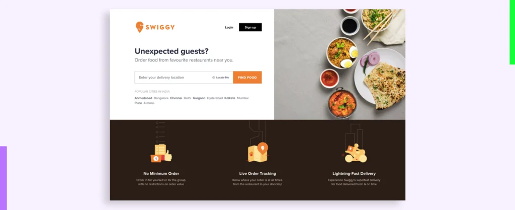
Why we love it
Clean and straightforward are the two attributes that we may give to this landing page. Right from the heading copy and subtext to the image on the right, everything has only one goal, to get the visitor to order food from Swiggy.
Scrolling down shows the benefits of ordering from Swiggy followed by app promotions for those who would like to order from an app.
9. Razorpay
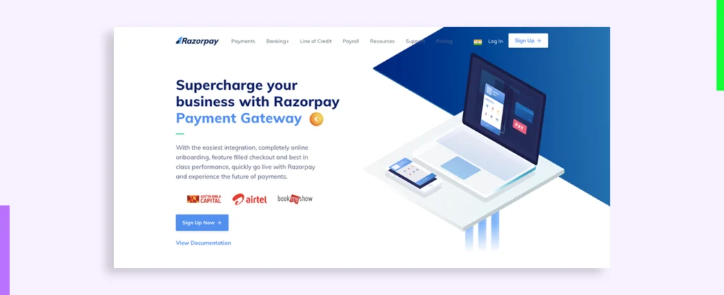
Why we love it
The Razorpay website landing page design exhibits a professional layout with brand colors, geometric designs, and custom illustrations that fit its brand image. An image loop under the header subtext shows its clients that currently use the product and directly under it is the CTA.
One thing that comes off differently is the tiny animation of the currency coin near the heading copy. It displays all the currencies Razorpay can work with. It cleverly addresses the main concern of its clients (most of which are MNCs, if the image loop is to go by).
As it is a fintech platform, they have also added a direct link to the documentation involved further streamlining the decision-making process for their audiences.
10. Paisabazaar

Why we love it
What do people need to know the most about when getting a loan? Understanding the audience, Paisabazaar has cleverly kept a static image with the benefits of using the portal listed on it. Whereas, the other half screen scrolls to let the user read through the terms and conditions of the service.
As you can see, while the traditional loan-taking process involves a lot of paperwork, Paisabazaar virtually asks you only for your mobile number. This is how you can make your audience comfortable to convert without overwhelmingly long forms.
FAQs on Landing Page Designs
How should landing pages be designed?
The focus of a landing page is on converting visitors into quality leads or paying customers. For the same, you need to first understand who your target audience is, what problems they face, and how your product, service, or offer can help solve their said problem.
Once you have that information, it becomes easier to strategy the design and UX copy of the landing page for your business.
What is the landing page UI?
Landing page UI refers to the user interface of the page that users first land upon from various sources including social media, search results, outbound links, and emails.
What is the best landing page design for lead generation?
When designing a landing page, follow the best website landing page design best practices. That, when paired with compelling copy and a robust marketing strategy can help increase lead generation for your business website.
What are some landing page UX best practices?
Landing page UX best practices include design practices that ensure user engagement to lower the bounce rate of the landing page. These include:
- Removing Footer Navigation
- Ensuring clear visibility for value proposition
- Design bold CTA buttons
- Let the audience know what they are signing up for
- Highlight social proof
Conclusion
Creating a separate landing page for your highly targeted audiences offers you many benefits as opposed to sending all the traffic to the homepage. A landing page gives your visitors focused information that compels them to make conversion decisions.
This article shows some of the best examples of landing page designs that are highly converting and attention-grabbing for their audiences. Use these examples to take inspiration from and create landing pages that bring in more leads for your business.
How Can Yellow Slice Help 🚀
Yellow Slice design agency offers you effective landing page design services with expert insights on your audience with UX research. We help you with creative landing page designs based on data from audience research. With more than 14 years of experience in the UI/UX design industry, we measure the success of our designs with KPIs that bring our client’s business growth before and after design enhancements.
Want us to design for you? Send us a message to get a quick call back for a project consultation to know how our design solutions can elevate your business.


