
In the present-day scenario of an ever-increasing number of apps, websites, and mobile UIs, vying for the users’ attention, the textual aspect of the design is as important as the image/video aspect, if not more. And hence, honing their typography skills has become exceptionally important for UI designers across the board.
After all, typography is no more limited to the meager selection of font styles and line spacing, or about making the text legible, but is also a ruling factor in the way the intended user perceives the UI design aesthetic.
We bet you don’t need us to tell you that once a design fails to attract or retain the user’s attention, its actual utility and functionality have very little use. Simply put, typography in UI design can make or break the future of a website, mobile app, or even a mobile UI!
Now that we know why is typography important in the world of user interface design, let us go ahead and understand the various elements of typography, in addition to the available tools that you can put to use in order to offer an unforgettable experience to the end-user.
What is Typography?
As relayed by the Oxford Dictionary typography is the art or work of preparing books, etc. for printing, especially of designing how the text will appear when printed.
Now, we all know that the world of print and manuscript writing is far behind us, and the new era is all about websites and mobile applications. Hence, the definition of typographic has an upgrade.
Typography in UI design can be defined as the art of choosing, organizing, and using typeface(s) that ensure that the copy is legible, readable, and scalable. In addition to the same, the typography skills of a designer must also ensure that the chosen typeface has a favorable visual impact on the user, thereby improving the interface conversion rate.
Elements of Typography
In order to create exceptional typography that can truly enhance the chances of a website or application becoming a raving success, one must first understand the various elements that good typographic design entails.
Fonts
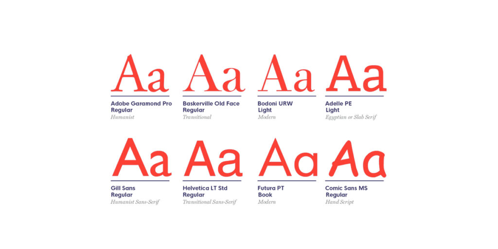
A font can be defined as a collection of letters with the same weight, width, and style. When it comes to fonts, here are the 7 most common fonts that form the primary choice of designers in the mobile and website UI arena –
- Serif font
- Sans serif font
- Slab serif font
- Script font
- Decorative font
- Comic font
- Retro font
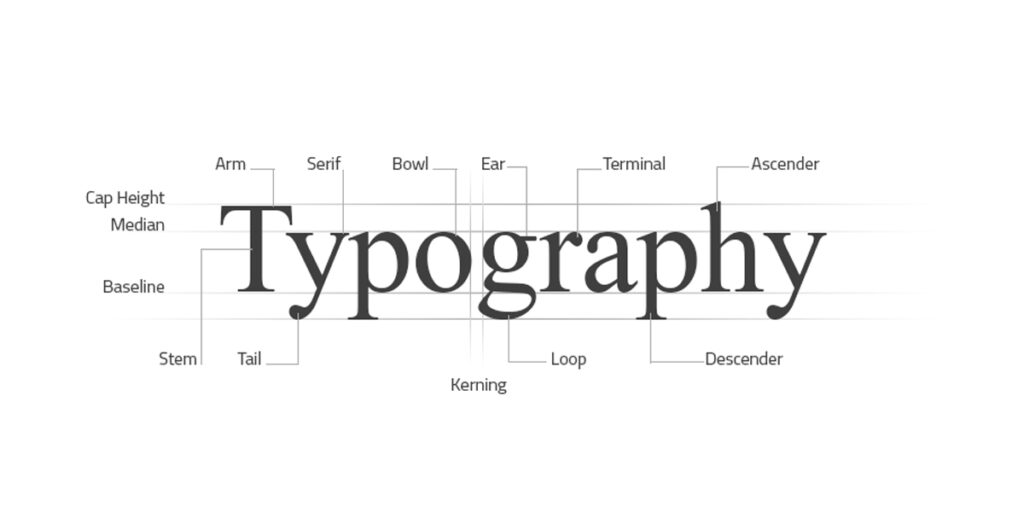
Typefaces
A Typeface can be defined as a family of related font types. For instance, the serif typeface comprises all fonts that contain a ‘serif’ i.e. a small line or stroke attached to the end of a larger stroke. On the other hand, fonts under the umbrella of Sans Serif typeface do not contain the extra downward vertical stroke, making them appear to be more modern, and easier to read on a digital screen. It is due to this very reason that most present-day graphic designers are shying away from using serif typefaces.
Letter and Line Spacing
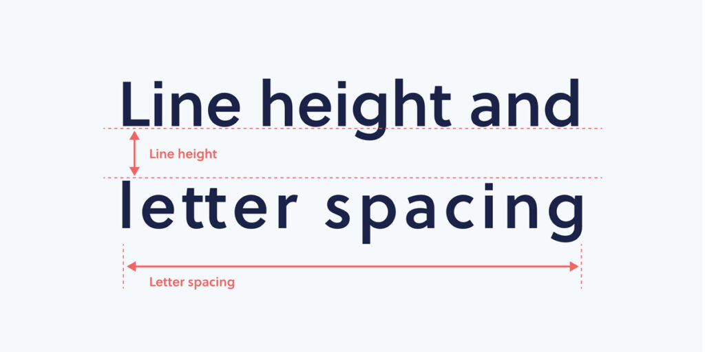
As indicated by the name, this element is all about the physical distance between two letters and two lines. In order for the text to have seamless readability, the letter and line spacing should be just adequate – not too much, nor too little.
Font Weight, Height, and Size
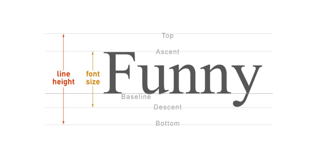
In order for a font to be uniform, every letter of the font needs to have the same width, height, and size. The letters should also have a similar font-weight. For the uninitiated, font-weight refers to the “value” assigned to a font, in order to determine how bold or light the text will appear.
Only when all of these elements align, can the typography be considered good.
Importance of Good Typography
When it comes to creating a compelling and aesthetically appealing UI for website and/or mobile applications, typography plays a crucial role, and entails numerous benefits including but not limited to the following-
Typography Acts as a Visual Communication Tool
Typography entails the use of one or more display fonts. Any user visiting a website or viewing an app screen first scans the page in order to find the exact information they are looking for. Only if they find the design elements and texts legible and engaging enough, do they actually stay on the page and continue to use it. Even if the user chooses to stay on the page, informative and fairly clear typography is required to ensure that they consume the content in an intended manner.
Typography Adds to the Readability, and Accessibility of the UI
Good typography forms the basis of an immersive user experience, by enhancing the user’s ability to read, consume and navigate through the content in a rather seamless manner.
Typography Helps Set a Consistent Tone
It should come as no surprise that choosing typefaces and other elements of typography can help create a consistent tone for a brand. For instance, an app designed to be used for toddlers should use fonts that are colorful, fun, and eye-catching. On the other hand, a website with lawyers as its target audience is bound to use plain and simple typography which sends the message across without causing any distractions whatsoever.
Typography Distinguishes the Website/App from others
While the typeface is largely restricted to the target audience that a website/app is designed for, when combined with the brand message, color palette, and overall design concept, the typography helps make the website/app look and feel truly unique. In fact, it is not unusual for a long-term customer/user to distinguish a brand in a crowd, simply based on the typography. Now, isn’t that truly impressive?😎
Typography Helps The Business Increase Sales
Good typography incentivizes the users to stay on the website/app for comparatively longer durations. Moreover, carefully curated typography helps draw the attention of the user to the targetted messages. This increases their chances of responding to call-to-action messages and purchasing the products or services.
Tips on Improving Typography
Now that we have outlined the role of good typography in UI design, let us go on to understand how exactly can designers curate compelling typography! Here are some tips that can prove to be of help in this regard.
Choosing Typeface According to The Business Type and Targeted Audience
Since every typeface and font is characterized by some distinct features, each of them stands a chance to give the user a completely distinguished feel. Hence, designers must choose a typeface that is fitting to the overall theme of the website/app, while also being ideal for attracting the attention of the intended users.
Avoid the Use of Multiple Typefaces
Given the impact that a typeface can create, it may be tempting to use more than just a handful. However, as a rule of thumb, you should never use in excess of two typefaces. This will help ensure a consistent look and feel throughout the website/app, thereby allowing for seamless readability with minimal distractions.
Make the Best Use of White Space and Text Space
While it may seem like a great idea to fill the interface with large amounts of text in the name of the user’s convenience, this can often prove to be off-putting. Hence, it is crucial that you make use of ample white space (aka negative space) between the elements, graphics and text such that the page looks neat, and seems inviting to the user.
Of course, this doesn’t mean that the page needs to look too empty. You have to strike the right balance in order to keep the user engaged, without getting them too distracted.
Again, the same principle applies to the various blocks of text, that form the design. The left margin, the line height, and the letter-spacing within the text should encourage ease of readability, rather than being too crowded to the point that the user gets repelled by it. As and when appropriate, try using center-aligned text, as it catches the user’s attention more easily.
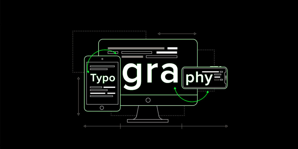
Ensure that the Typography is Scalable
A great website or app is one that is responsive on all devices alike and all OS. Hence, make sure you choose the typography that can easily scale from a smartphone to a tablet and even a computer screen. Moreover, also ensure that your team is aware of the scale guidelines for all platforms, like Android, iOS, and Web platforms, After all, the visual appeal of the content and the user interface must be equally impactful regardless of the device from which it is being accessed.
Make Use of Visual Contrast
Whether it is using a font color that is in stark contrast with the background, using upper and lowercase letters to draw attention, or simply using Bold or Italic text styles, you must take every effort possible to ensure that the important text blocks on the page stand out from the generic body text. This is especially true for headers, subheaders, as well as call-to-action buttons.
Make the Copy Animated
Animating the copy, especially banners, headers and sub-headers can not only help grab the user attention more swiftly, but can even ensure higher engagement rates. That said, keep the animations light and aesthetically pleasing, and don’t try to go over the top. If done the wrong way, the movable type text can distract the user rather than engaging them.
The Yellow Slice Take
We hope that you now have all the requisite insights pertaining to typography, use of multiple typefaces including serif and sans serif type, ideal use of white space, and other key elements of typography. For all we know, graphic designers ought to make the best of this seemingly unimportant but rather usual visual language that impacts the bottom line of any website or mobile app to a great extent.
FAQs For Typography in UI Design
What are the 3 Elements that can help me to get Good Typography?
Elements that could help you become a better typographer are fonts, letter, and line spacing, and font weight and size.
What is Typography in UI Design?
Typography in UI design is essential due to the ever-increasing number of users on websites and apps. With the help of typography, can retain users’ attention.
What is the Impact of Typography in Design?
Typography combined with the brand message, color palette, and overall design concept helps make the website/app look and feel truly unique. This gains attention from users, resulting in more website visits


