
Introduction
Understanding the importance of UI in Dashboard Design. Of Course, It is a known fact that In today’s Digital world a compatible User Design and User Experience stands first for a successful customer experience and engagement. Dashboard User Interface design should offer user friendly insights and accessibility, which is important for any business aiming to enhance the user engagement and interaction. Right data visualization and with simple design is a cornerstone for any dashboard UI design. Prioritizing relevant data to your audience with good context helps in achieving the milestone. In this article, Let’s discuss it in depth!
We will delve into the key principles of dashboard User Interface design, for a successful dashboard for the users to get engaged in.
How a Great Dashboard should look like

Dashboard is said to be a visual representation of data used to facilitate understanding for the visitors. A properly designed UI dashboard gives access to all the information to the user they look for. Information should be displayed clearly and efficiently. A great dashboard should be clear, precise, customizable and Intuitive. They should be customized based on the target audience. In simple terms it can be said as, the ultimate goal of a dashboard is to present information in a clear and understandable way to empower the users to achieve their goals quickly and easily very efficiently.
Key Principles to follow to obtain best UI Design for Dashboard
Looking to build a great Dashboard User Interface Design? Don’t miss out on the below key principles of Dashboard UI design for an successful Outcome:
1.Identify Your audience and User Needs

All Dashboard User Interface designs should be built after finding answers for the questions, “Who are the users” and “What they want”. Various User Research Methods are used by design developers to collect the required information which has a greater impact on design decisions resulting in quality of the design and user experience. These research methods are essential to know the wants and needs of users, to create a dashboard that is determined with the most important data to use. Such research methods help in knowing your target audience better. All the information gathered with the required metric and visualization determine your Dashboard UI design efficiently.
For Instance: An e-commerce dashboard UI design should be designed differently from that of a banking application dashboard. Which is where research methods help you better to know your users and understand their needs.
2. Set your Objective
Setting your objective is as important as identifying your users, Which helps in the success of your best dashboard design. No matter how creative you are, deciding your purposes in the initial stages keeps you going without any hindrance. Set your objectives and purposes clear, where you have more options handy but choose to go with one objective where your dashboard design should represent to your users.
3. Choose a Dashboard Design

A dashboard UI design with clear objectives and goals solves many problems that users face. A best dashboard design should help achieve users with their end goals more easily and efficiently, which allows users to make informed decisions. The end result should sound like a simple design with clear objectives, highlighted key points and appealing visuals. There are four dashboard User interface designs to choose from:
- Operational Dashboard Design
- Strategic Dashboard Design
- Tactical Dashboard Design
- Analytical Dashboard Design
If you’re confused about choosing the best dashboard design that best suits your needs, Don’t worry! A one stop solution to clear all your hurdles is Yellow Slice, Which helps you choose the best dashboard design.
4. Keep it Simple with exciting design Layout

In an overwhelmed world of data, keep it simple for users, with necessary information and clear data provided. Make is easy for any kind of users and visitors to make their work done and fulfill their needs. Keeping your dashboard User Interface design simple is very important as it helps users to access the information easily and quickly. A cluttered or a loaded design can frustrate users and cause them to hate the application, as human brains cannot process a vast amount of information at the same time. So avoid adding too much information which reduces the interest of users. Keep it simple along exciting design elements with clear navigation and user friendly interface.
5. Keep the Five-Second rule

As the word “five- second rule” says, build a design where the users or visitors using your dashboard looks to find information, where they should be able to attain it or learn it in five seconds. If the user had to spend more time on your dashboard to learn the information required then your dashboard is not designed efficiently enough to provide it.
Make sure “Does your dashboard provide it?” Keep in mind to follow this rule to provide information for the users.
6. Prioritize Customization

To take storytelling to the next level it is essential to allow users to build the design customized to meet their needs. This flexibility will showcase that your product design can serve any crowd, working in different niches. This eventually leads to your design being more usable and helps your customers feel the comfort.
7. Set your Dashboard Design Goals
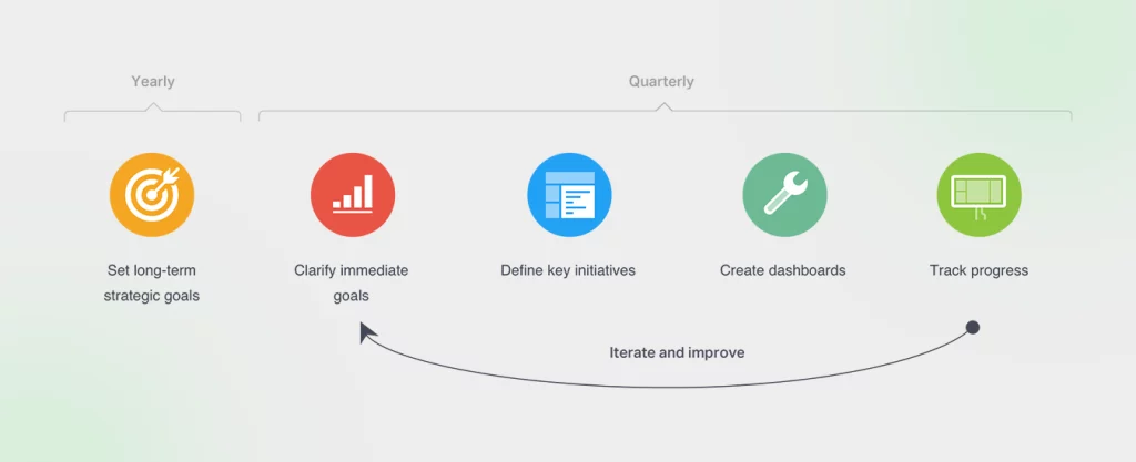
Goal Centric design helps you achieve and provide solutions for real time questions, which acts as a foundation for all great dashboard design. Choose your Dashboard design goal in such a way that it answers the question what specific problem is this design going to solve for the users. Start with proper research for clear business objectives, considering user goals, and then convey the key information that needs to be communicated.
A few questions to be asked when determining the dashboard design goals are:
- How steps do users navigate to achieve the desired goals?
- Is the interface very intuitive for the users to reach the goal on their own?
- What information does the user need to successfully navigate to achieve the user’s needs?
Case Study of RSH-JOY
Problem statement Given by RSH-JOY
RSH-JOY wanted Yellow Slice to redesign their UI design to enhance user functionality and ease the navigation
Objective:
As Mentioned above, Setting objectives is a major factor to define the success of your Dashboard. The simple objective set by yellow Slice to enhance RSH-JOY UI Design is to
- 1. Simplify the user interface to make it more user-friendly.
- 2. Enhance the navigation through UI modifications.
Steps We Followed:
Research – Though a thorough competitive analysis was not conducted, just the UI of a few competitors was analyzed to understand how the website should function
UX Designing – Sitemaps were redesigned to gain higher usability.
UI Design – UI moodboard, UI samples, and Icons and Illustrations were created to set the theme of the entire application. After client approval, UI screens were created for the application.
Site Map for UX Improvement
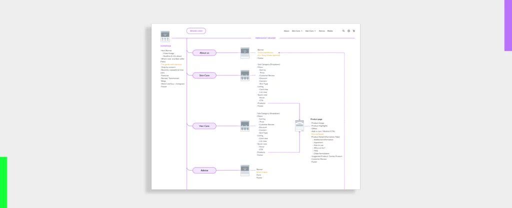
The Sitemap was redesigned to improve the usability of the application.
Old Design vs New Design
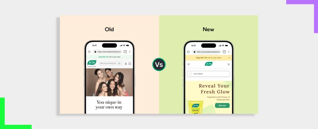
Conscious choice of selecting Typography, Color Palettes, Icons, Illustrations, UI Components and UI Screens can enhance the Overall representation of your objectives with increased User interface for ease. To know more about the approach of UI/UX success Click here.
The Wrap
Effective Dashboard design is essential for successful user engagement and sustainability in the digital competitive landscape. Spare good time in research before building a design with creativity is pivotal for a successful design. Follow the key factors mentioned above to make a dashing dashboard UI to stand out from the crowd. Applying thoughtful colors, structured layout and interactive flow helps you come up with dashboards that empower users to make informed decisions based on data. To make it very simple contact our team of Experts from Yellow Slice to deliver an effective dashboard at your fingertips.
FAQs About Dashboard UI Design
What are the benefits of a Dashboard?
Dashboard serves as a powerful tool for organizations with several benefits like gaining attention from users, displaying their data effectively, being a driving force to take informed decisions which eventually helps in gaining competitive edge in today’s competitive world. Good Dashboard design saves time and resources, and provides information at a glance.
What are best practices to maintain a Dashboard?
Below factors ensure the maintenance of a dashboard effectively:
- Frequent Updates
- Monitoring Data Quality
- Upgrades based on feedback
- Regular review and refinement
- Performance optimization
- Security Measures


