The Ultimate Guide to Design Elements in 2026: Understanding and Utilizing the 7 Design Principles
Omkar Phopale
Design Principles offer us basic ideas to create & organize our design elements in a way that makes the overall design visually appealing and conceptually helpful to the viewers.
Introduction
Design is an ever-evolving field, and designers need to stay updated with the latest trends and techniques. According to statistics, the worldwide graphic design industry is worth over $45.8 billion and is set to grow further.
As we move into 2026, understanding and applying the seven principles of design elements will be crucial for creating visually stunning and effective designs. These principles in design, which include balance, contrast, emphasis, movement, pattern, repetition, and unity, are fundamental building blocks for any designer.
In this blog, we will dive into the important design elements, exploring each principle of design with examples, understanding what it is, and how to use it in your designs.
7 Principles of Design Visual Elements and How to Use Them in 2026
1. Balance
The distribution of the visual weight of each important element in a composition is referred to as the balance principle of design. It gives a design a sense of balance, foundation, and solidity. Balance is classified into two types: symmetrical and asymmetrical.
- Symmetrical balance is accomplished by arranging items in a mirror image pattern on either side of a central axis. This gives the design a formal atmosphere.
- Asymmetrical balance is created by arranging pieces of various sizes, shapes, and colors to produce a sense of equilibrium. This produces a more vibrant and casual atmosphere.
For example, Apples website design employs balance by equally dispersing graphics and text throughout the page. They also adopt a symmetrical arrangement, which contributes to the overall feeling of balance.
You might want to begin by trying to consider the visual weight of each piece and how it connects to the other parts of the composition in your final design when using balance. You could even experiment with different configurations until you find a happy medium.
At the same time, its also crucial to think about the overall project and how a single element connects to the designs intended message or goal.
2. Contrast
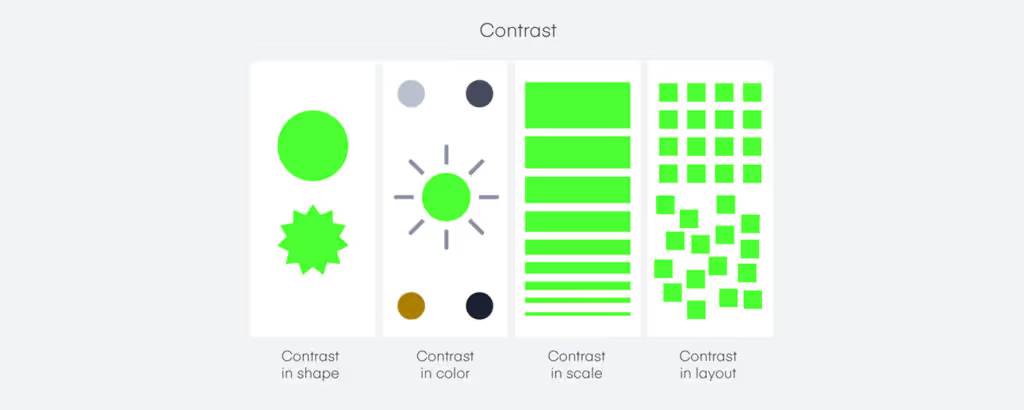
Contrast principle of design refers to the juxtaposition of opposing components (such as contrasting colors, like bright and dark, huge and little, rough and smooth) in composition to send an important message and generate visual appeal and stark difference. Among other things, it can be used to establish a hierarchy, visualize differentiation, and highlight certain features.
In design, numerous sorts of contrast may be used:
- The employment of bright and dark values to create depth and intrigue is known as tonal contrast.
- Color contrast is the use of different hues to generate visual appeal.
- Size contrast refers to the employment of different sizes to generate visual hierarchy and focus.
- Texture contrast is the use of different design textures to add visual appeal and represent difference.
Calendlys website employs contrast by juxtaposing blue highlights to a white background with eye-catching photos. This makes a big aesthetic impression and draws attention to the service dimensions.
You can try to imagine the components in your piece and how they might be organized to generate visual appeal and emphasis when using contrast in design. Another great idea is to experiment with various opposing element combinations to determine what works best.
All the while, you might want to consider how the overall visual weight of the composition connects to the designs intended message or goal. Its crucial to remember that too much contrast can be overwhelming, so use it sparingly and in ways that complement the overall composition.
3. Emphasis
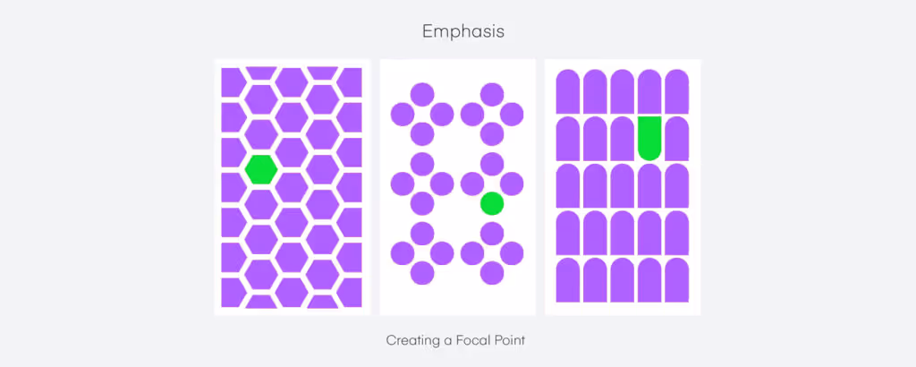
Designers understand the use of graphic design basics to call attention to a specific component, region, or feature in a composition. This is referred to as the emphasis principle of design. It can help serve as a focal point and aid in directing the viewers eye through the design.
There are numerous methods to emphasize a design:
- Contrast: Using the contrast between elements to draw attention to a specific area
- Proximity: Grouping other elements together to create a focal point
- Repetition: Repeating a specific element or pattern to create emphasis
- Alignment: Aligning elements in a specific way to draw attention to a specific area
- Size: Using size to create emphasis on a specific element
Starbucks website employs emphasis in its design by highlighting vital information, such as the name of the product, in a larger, bolder font. They also utilize bigger photographs of their items than the other elements on the website.
One of the best ways to use emphasis as one of the graphic design principles is to choose the most significant piece or region to call attention to and emphasize it with design elements such as contrast, closeness, repetition, alignment, or size.
It is also vital to evaluate the compositions balance principle of design and contrast to ensure that the focal point and emphasis are not overbearing or out of place but rather contribute to complementing the overall design.
4. Movement
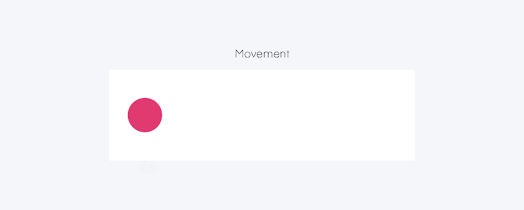
The visual flow and direction of components in a composition are referred to as a movement, which is one of the key visual design principles to send an important message. It is used to direct the viewers attention through the artwork and to generate a sense of dynamic energy.
When applied correctly, movement principle of design can add interest and excitement to a design while also helping convey a message or narrative.
There are various methods for incorporating movement principle into a design:
- One typical way to generate a sensation of motion is to utilize diagonal lines or forms. This could be accomplished by arranging important elements in a diagonal pattern or incorporating diagonal lines or forms into the elements.
- Repeating certain elements, like forms or colors, may generate movement by drawing the viewers attention.
- Contrast and diverse design elements can also be used to generate movement. Using varied-sized or colored pieces, for example, could create a feeling of movement as the viewers eye shifts from one element to the next.
- Using contrasting design textures or patterns can also help generate movement that can be visually appealing.
A great example is how OnCorps AIs website design incorporates movement by utilizing animation and scrolling effects to lead the users eye across the material. This generates a sense of fluidity and engages the user.
To effectively employ movement in certain elements of web design, evaluate the big picture and how the movement of elements may best assist the message or story you are attempting to portray.
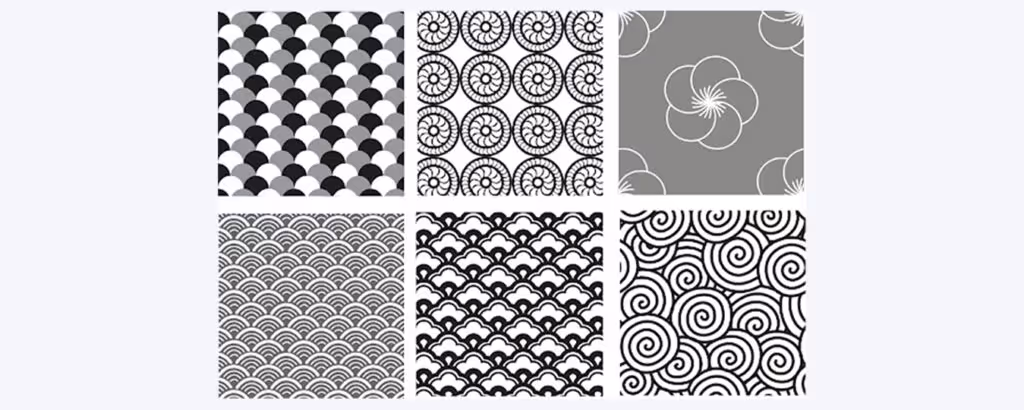
5. Pattern
A pattern is a design idea that refers to the repeating of components like forms, colors, or textures that can help create balance. It is intended to give interest and movement to a design while also creating a feeling of harmony and consistency.
For example, IKEAs website employs patterns by repeating the same design components throughout the site. They employ the same color scheme and style on all of their product pages.
- Basic design principles like geometric, organic, and abstract patterns are all examples of patterns that can be employed in the design. Geometric patterns are made up of repeated forms like circles, squares, and triangles.
- Natural features of related elements such as leaves, branches, and flowers are used to create organic patterns. Non-representational components like lines, forms, and colors are used to create abstract patterns.
- Another approach to applying a pattern with design principles is to provide depth and dimension to a design. Designers can create a feeling of depth and movement by stacking patterns and altering the parts size, scale, and orientation.
- Patterns may even be used in design to provide a background or backdrop for the design to make elements stand out. A repeating pattern can be made to add movement and flow to a design while also providing a visual foundation.
Besides this, the pattern principle of design may be used to create a focal point within a design. To direct the viewers attention to a specific region of the design, employ a strong or contrasting pattern.
6. Repetition
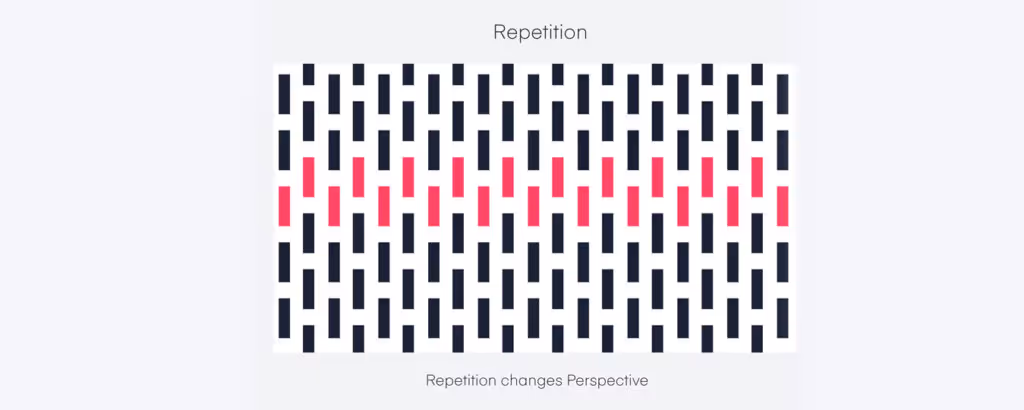
Repetition is a design elements approach referring to the repeated usage of components such as forms, colors, or textures. It is intended to give visual interest and movement to a design while also creating a feeling of harmony and consistency.
McDonalds website employs repetition and utilizes symmetry in its design by reusing pictures and colors across the site. This generates a sense of familiarity and consistency, which aids in the development of brand awareness.
In basic design principles, repetition can be used to achieve unity in a variety of ways:
- One method is to use a certain element, such as a form or color, and repeat it throughout the design. The recurring motif connects the design, creating a sense of uniformity and consistency in the viewers eyes. Repetition can also be used for a pattern or texture.
- Repetition can be employed to give a feeling of hierarchy and structure. To achieve this, designers can imbue structure and order inside a design by regularly repeating specific features.
When employing repetition principle of design, keep in mind the overall tone of the artwork, as well as how the repetition may best complement the message or story youre attempting to express.
For this reason, designers should also consider the balance between repetition and variation in varying sizes in their work.
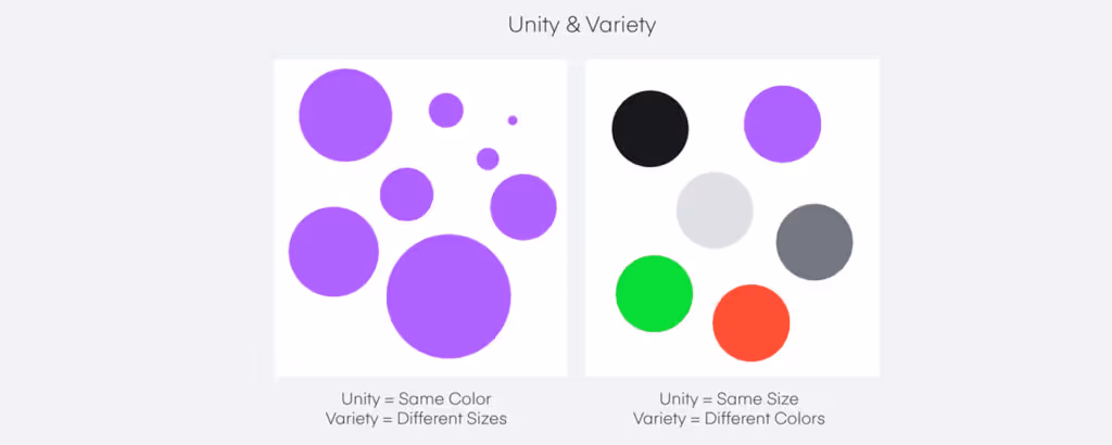
7. Unity
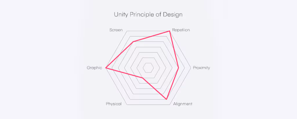
Unity is a design notion that relates to a designs repeated elements contributing to an overall sense of harmony. It is the sense that all of the parts of a design belong together and contribute to a shared purpose.
In design, unity is vital because it creates a feeling of balance and order and makes the design feel complete.
Googles website implements repeating elements of design unity by employing a uniform color palette, font, and layout throughout the site. This generates a feeling of cohesion and makes navigation simple for consumers.
There are various approaches to achieving design unity in main design principles.
- One method is to employ a constant color palette throughout the design since the colors complement each other to produce a unified appearance. Using a uniform font and layout is another approach to building unity.
- Another technique to generate unity is to combine related parts into the most important element. By doing so, designers may create a sense of belonging and togetherness. A nice example is a website where all navigation links are put together in the same location, which creates a sense of belonging and togetherness.
Achieving unity principle of design necessitates a delicate balance of consistency with symmetrical designs and variation. The trick is to employ enough repetition and likeness to create a sense of unity while also allowing for enough variance to keep the design interesting.It is crucial to note that unity does not need every piece in the design to be identical or create a visual hierarchy, but rather that they all function together to produce a coherent whole.
FAQs About Design Principles
What are the 7 principles of design?
As discussed in this article, the 7 principles of design that you should know about are:
- Balance
- Contrast
- Emphasis
- Movement
- Pattern
- Repetition
- Unity
Apart from the above, you can also explore hierarchy, proportion, variety, and harmony principle of design.
What are the basic fundamentals of design?
The principles of design can also be called the basic fundamentals of design as they give you an idea of how to create aesthetically pleasing user interface designs for your platform.
What are gestalt principles of design?
Gestalt principles of design refer to the Gestalt psychological principles that describes how human perceive things in terms of groups of similar elements and patterns to simplify complex concepts for faster understanding. These design principles help you create designs that are intuitive for human perceptions and hence inspire higher interaction from viewers.
What are UI design principles and why are they important?
UI design principles are fundamental UI design theories that helps UI/UX designers give a basic understanding of aesthetically appealing design concepts and how to replicate them within their creations.
These principles useful to make visually beautiful and easily understandable designs to achieve different tasks such as bringing audience attention to a certain element, or showing that a certain component is more important, or provide a visual direction to the content flow, and so on.
Does web design use the same design principles?
Yes, among other things, web design also uses the same design principles as discussed above to design intuitive user interfaces for websites, web portals, apps, and other digital products.
Conclusion
The fundamentals of design and other principles are necessary tools for generating aesthetically attractive and successful designs in the physical world.
Some of the major elements that may be employed to improve user experience and achieve balance, like leading the viewers attention, providing visual appeal, and creating a sense of harmony and togetherness in a design, include movement, pattern, repetition, and unity.
Paul Rand, an American art director and graphic designer, once said, Design can be art. Design can be aesthetics. Design is so simple, that's why it is so complicated." So, keep in mind that principles in design are guides rather than absolute laws, so dont be afraid to experiment and discover the ideal approach to express your concept.
How Can Yellow Slice Help ??
As a leading UI/UX design agency, we have deeply embedded design principles into our approach to design thinking. This means these fundamentals come to us naturally while we strategize your product UI design.
Want to know more about our work and how we can help your brand? Send us a message to get a quick consultation call. Meanwhile, you can check out our blog for more interesting articles such as this.


Let's create something amazing!
Let's discuss your vision and how we can bring it to life with impactful design solutions.
.avif)
Good design starts with Sliced Newsletter
Subscribe to the Sliced newsletter and get the best of research, UX writing, product psychology, CX, and design systems, right in your inbox.
