How to Select the Correct Menu Icon for the Website Navigation?
Is your website's navigation causing confusion? Choosing the right menu icon can make all the difference. This guide provides tips & tricks for selecting the perfect icon for a user-friendly experience.
A lot of times when you visit a website you will see the website has different categories or different pages to navigate through. These pages are represented using icons in the form of images. These are called menu icons. The menu icon (or hamburger icon) is the single most important visual element on any website. These make a website more appealing and give that personal touch. In recent times, the use of menu icons in the navigation of a website has been increasing.
These little strange icons have taken the internet by storm and can be found on all sorts of websites and are commonly used in mobile versions of websites and apps. You know, sometimes it happens that you want to add a menu to your website, but you are not sure what kind of menu icon to choose for your navigation. This blog will look at the different menu icons and offer some tips for what you should use for your navigation.
According to the study by The Gomez Report, 88% of online consumers are less likely to return to a website after a bad user experience.
It's beneficial content, In many cases, icons can stand up for the text, which makes them so popular in the world of modern design. They are small but vital for the efficiency rate of any application or website. They look simple but take loads of time and effort to feel that way.
- By Anuja
Did you know?
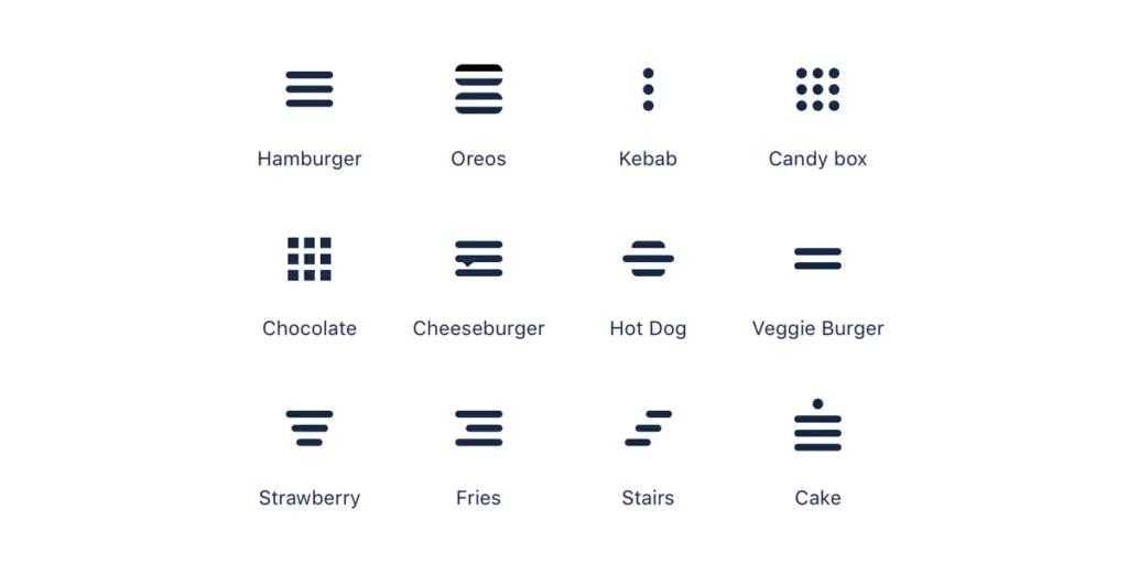
It seems interesting that the menu icons for navigation were inspired from food items.
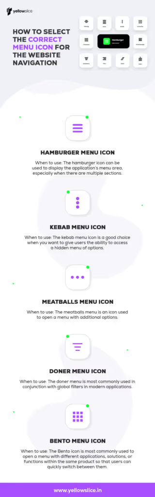
Hamburger Menu Icon
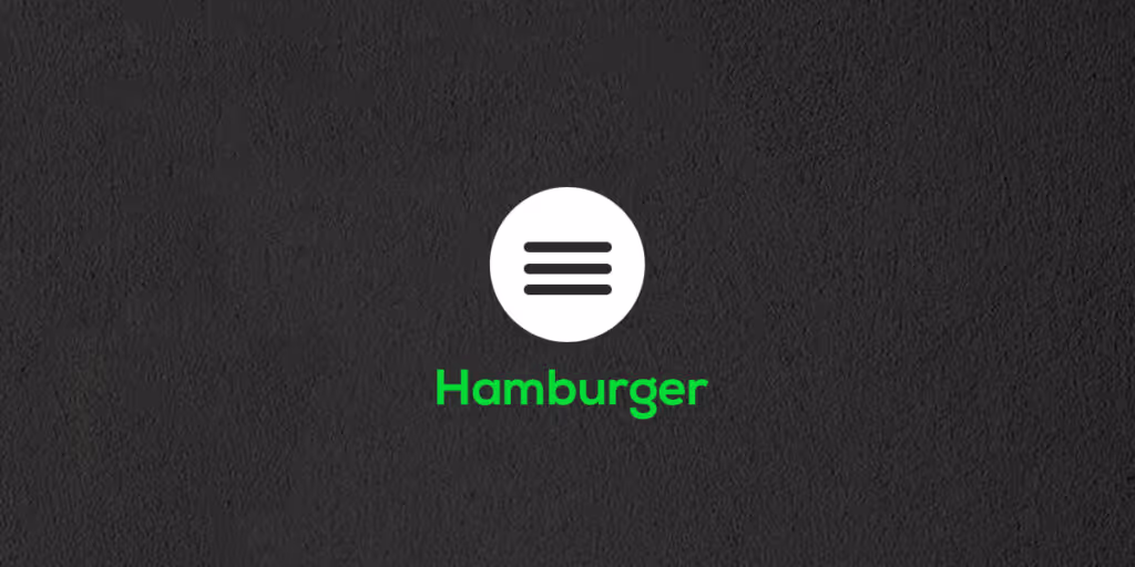
The hamburger icon is one of the most commonly used icons on websites and apps today. As its name suggests, the icon looks like a hamburger, with two buns and a patty in between. It is a three-line button that opens up a menu when clicked on. The icon is usually found in the top or bottom corner of a website or app, and it indicates to users that there is more content to explore beyond the current page or screen. The hamburger icon can be used to display the applications menu area, especially when there are multiple sections. However, it is best to avoid using the icon in the desktop view whenever possible.
The below chart indicates the pros & cons of the hamburger menu icon:
PROSCONSRecognizableMakes pages less importantCleanLow engagementSecondary accessInefficient
Kebab Menu Icon
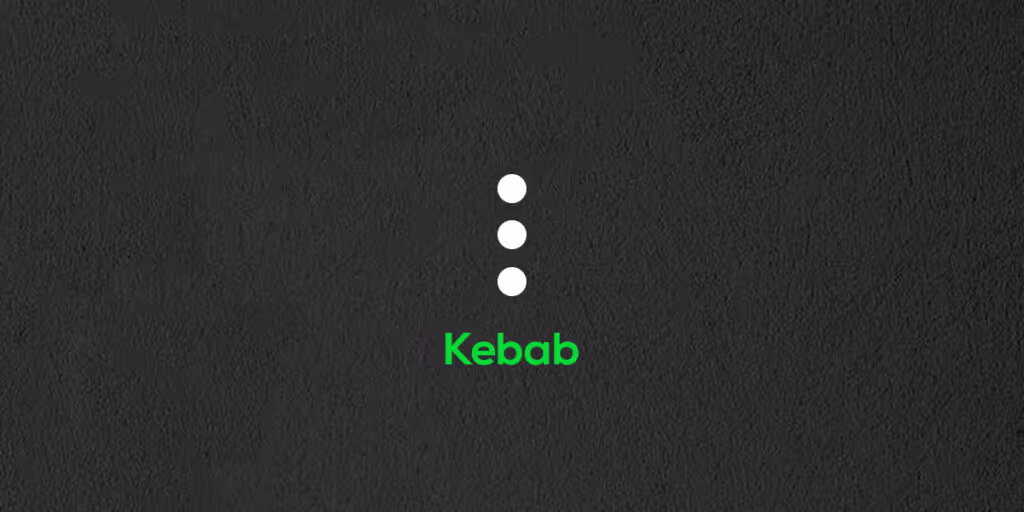
The kebab menu icon (three dots arranged in a vertical line) is a good choice when you want to give users the ability to access a hidden menu of options. When using this icon, it's important to consider the context in which it will be used. For example, if your website has a lot of content, you may want to use the kebab menu icon to give users quick access to the most important sections. Alternatively, if your website has a limited number of pages, you may want to use the kebab menu icon as the primary navigation tool, as it will provide a more streamlined experience.
Meatballs Menu Icon
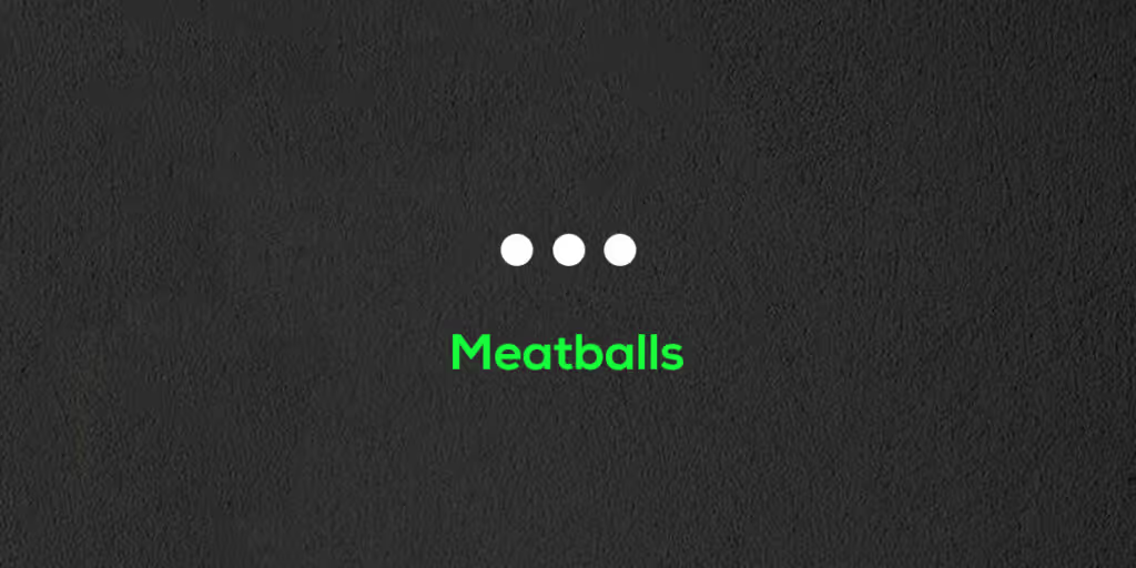
The meatballs menu, also known as the three horizontal dots menu, is an icon used to open a menu with additional options. This icon is typically located at the top-right or top-left of the screen or window. When you see this icon, simply click on it to open the menu and view the additional options! Used to open a menu or display actions for a related item, dropdowns are easy to use and repeat on webpages. Because they are horizontal, they work well with tables and other horizontally-oriented elements.
Doner Menu Icon
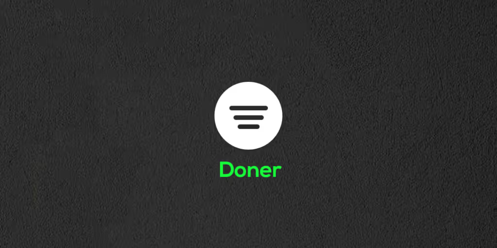
The doner menu, a popular Turkish dish-turned-filter symbol, is most commonly used in conjunction with global filters in modern applications. It consists of a vertical stack of three lines of different lengths - one long, one shorter at the bottom, and one cropped even shorter at the bottom - making it a distinct user interface element from the hamburger menu, which consists of three lines of equal length stacked on top of each other.
Bento Menu Icon
The bento menu, named after the bento boxes, is a grid-based menu of items. The Bento icon is most commonly used to open a menu with different applications, solutions, or functions within the same product so that users can quickly switch between them. This icon is typically located in the upper right-hand corner of the interface. In the Google Play store, for example, this icon can be found in the upper right corner of the screen.
Additional things to remember when selecting menu icons ??
- The icons should be easily recognizable and legible.
- The icons should be consistent with the overalldesignof the website.
- The icons should be intuitive and easy to use.
- The icons should be spaced evenly on the menu bar.
By now you should have a good understanding of how to select the correct menu icon for your website's navigation. In general, the best icons to use for navigation will be the standard arrows that are used for navigation in every browser. But there may be times when a custom icon is the best choice. What you need to consider then is the meaning behind the icon and how it relates to the content on your website.
A clear and concise menu icon can make a huge difference in improving the overall user experience of a website.
Forbes
FAQS About Website Navigation Menu Icons
What are menu icons?
Menu icons are small graphical symbols that appear on a computer screen or mobile device, typically in a list or menu, that indicate what options are available to the user. They are often used to represent different functions or options within an application or system and can be an efficient way to navigate a user interface.
What are the 3 lines on a website called?
The three horizontal lines icon is typically called a hamburger menu. This icon is used to signify a menu, and when clicked, will often reveal a list of options or navigation choices. This icon is named after the hamburger sandwich, as the three lines resemble the layers of a burger bun. It is a way to condense a lot of information into a small space.
Where can I find the navigation menu?
The navigation menu can be found in the upper-left corner of the screen. It is represented by a hamburger icon (three horizontal lines). When you click on the icon, a drop-down menu will appear, showing the various pages of the website.


Let's create something amazing!
Let's discuss your vision and how we can bring it to life with impactful design solutions.
.avif)
Good design starts with Sliced Newsletter
Subscribe to the Sliced newsletter and get the best of research, UX writing, product psychology, CX, and design systems, right in your inbox.
