
Ever wondered why certain design elements seem to belong together? In this blog, we explore the Gestalt Principle of Proximity & how it can enhance user experience in UX design.
Psychology is a complex game, and the human brain is the epitome of playing it with us, all humans on a highly individualistic basis. Even after years of research and the advancement of medical science, scientists have been able to discover only a portion of the human brain and how it functions. While the physical functions of the brain might be better understood, the psychology part of it is still pretty much a mystery.🧐
Gestalt psychologists believe that our brain perceives things in a way where it tries to make meaning out of every visual it sees. To keep things simple, when the brain sees complex structures comprising various small parts placed in close proximity of one another, it considers them as a whole. This allows it to make better sense of things rather than getting into the nitty-gritty of smaller, individual aspects.
Good design is obvious. Great design is transparent.
Joe Sparano
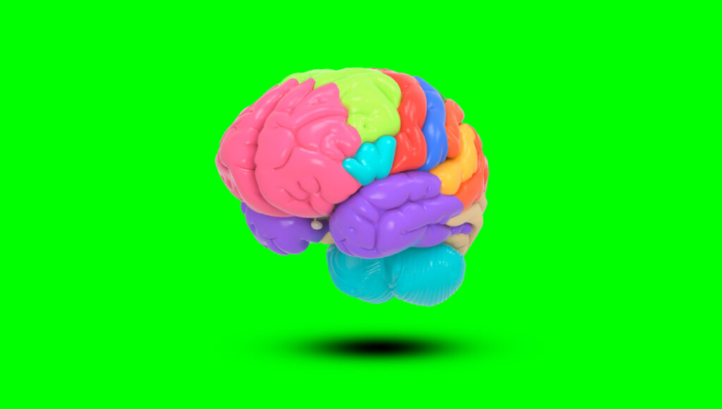
Chart of Gestalt principles of design:
| NUMBER OF PRINCIPLES | PRINCIPLE |
|---|---|
| Principle of Design #1 | Principle of proximity |
| Principle of Design #2 | Principle of closure |
| Principle of Design #3 | Principle of similarity |
| Principle of Design #4 | Principle of continuity |
| Principle of Design #5 | Principles of perception |
| Principle of Design #6 | Principle of organization |
| Principle of Design #7 | Principle of symmetry |
UX Design and Human Brain
The same is the case with UI/UX Design. Designing an app or a website is not just a matter of using the right code or making an attractive design, it is also about navigation, usability, attractiveness, and speed. The easier it is for the brain to decipher what an app or a website wants us to do, the better the design is considered. And it is not easy to implement it in the real sense as there are several factors that are involved in designing a perfect layout. This is why designers often fall back on the Principle of Proximity that helps them in creating layouts that attract the cognitive abilities and mechanism of users.
Sneak Peek into Gestalt Principles
According to the Gestalt Principal, whenever people see a complex object consisting of many design elements, they make use of conscious or subconscious methods to make sense of the image by arranging those several parts into a complete organized system. Human perception is such that it tends to see the objects placed close to each other as related objects as compared to those placed far from each other. This tendency has a long-lasting impact on how things need to be designed. Research and studies have shown that proximity is a more impactful factor in organizing things as compared to color, or shape. Even if the features, shapes, and colors differ in objects placed close to each other, people instinctively perceive objects in the said situation to be related to each other.
In a website or an app, where there are different visual elements of varying shapes and colors, this principle of proximity helps designers in the perceptual organization in such a way that they are more scannable and easily perceived by the users. This is especially useful in today’s time when the human brain spends only a few seconds scanning for what they are looking for before moving on to other apps/websites. If your website is not designed in a way that emphasizes visual perception, chances are you will lose several users.
Depending on the application, the Gestalt Principle is also known as The Similarity Law or the Similarity Principle and is a mainstay in other grouping principles.

Features of Gestalt Principles
There are several aspects of the Gestalt Laws, let’s see them in detail:
Typography and Copy Of Gestalt Principles
One of the most important aspects where the Principle of Proximity works really well is content in the user interface. Users don’t usually follow a linear pattern when it comes to scanning the text. They might first read the more obvious text blocks like headings, sub-headings, highlighted text or keywords. If they find those things interesting, they will move on to read the finer details. This is why it is important to arrange the text keeping both quick visual perception and aesthetic looks in mind.
Negative space too plays a vital role here. Any piece of visual imagery, if loaded with too much text will become overbearing for the eyes. The figure-ground principle states that the vision needs breathable space so that it can absorb and process the information provided. Without any negative space, the design will become too much to take and the user might lose interest. White space also helps in organizing or grouping different design elements when needed.
This principle can be applied to text by separating them into chunks of paragraphs. They can either be small ones or big paragraphs where one idea constitutes a paragraph and so on. Such a technique is mostly used in blogs and technical content where a lot of information is being given to the reader and visual perception is crucial. Segregating content into paragraphs helps them know that the lines placed close to each other belong to one organized idea. It also gives a much-needed break to the reader and helps in a more organized reading pattern. Without para breaks, one huge chunk of text will become absolutely unattractive to the reader.
The principle of similarity states that these paragraphs can also be accompanied by corresponding images to give the reader a clearer idea about grouping. In line with the Gestalt Theory, an image of what the text is describing can be placed with it so that the user has a point of reference to understand things better. Such kind of grouping works well in long lists like menus and catalogs.
Content Blocks and Controls Of Gestalt Principles
The organization of diverse content blocks in a layout is yet another very effective implementation of the Principle of Proximity in a user interface. The text blocks can be arranged in such a way that they look correlated to each other and provide much easy and scannable navigation. Such organization can be used in all forms of digital communication including websites and apps. For example, an e-Commerce website displaying different products can have the most information about the product grouped together as one block so that the user doesn’t have to go looking for it in disparate elements of the web page. This could include the color, size, dimensions, price, availability of the product. Once the basic information has been provided, a more detailed information block can be provided slightly below it so that these two different, but corresponding pieces of information can be segregated efficiently.
As per Gestalt Theory, grouping and separating content blocks makes the overall content more organized and easier to read. Not just that, it also makes it easy to scan all the information provided quickly. This is extremely important in today’s fast-paced digital world where attention spans are shrinking and users spend around 3 seconds on a website before they move to another one if it doesn’t load quickly or if the interface is too confusing.
Importance of Using the Principle of Proximity
The more advanced technology is making things faster, the more impatient users are becoming. From a time when a website took ages to load to the era of 5G where it takes only a few seconds to download a huge amount of data, we have come a long way. However, this has led to an equally quick reduction in the wait time of the users.
Any website that takes more than a few seconds to load is considered too slow. Similarly, if a website or an app doesn’t provide easy navigation or scannable design, it is bound to have a high drop rate, meaning more and more users leave the website without completing the action. This is why UI/UX design has become an important part of website and application development. While a lot of impetus is put on creating quick and responsive websites, it is equally important to create easily scannable user interfaces. A user is always in a hurry and he visits a website or an app in search of information that he wishes to find almost immediately. If that information is not made available without having to look for it, the drop rate increases.
This is where the Principle of Proximity comes into play. By implementing this principle, developers and designers can create content that is easy to find and read. The concept of grouping related or seemingly related items together helps put important copy and content in such a way that not only can it be easily located, but all the important information can be provided in one place. This improves user interaction and hence the websites enjoy a better retention rate.
The Yellow Slice Take
Design is very intuitive, and even though it is a highly creative process, there is a definite science behind it. A reputable UI design company can help you craft a visually appealing and user-friendly interface that enhances the overall user experience. From using appropriate visuals to choosing the right color scheme, fonts, and content flow, every minute detail is well thought after to make it visually appealing and usable.
As per the Gestalt Theory, the purpose of design is not only to beautify things but also to make things more user-friendly. Implementing the Principle of Proximity is one of the ways to make the design elements more pleasing to the human eye, by enabling them to recognize patterns through an impressive UI design.
According to a study by the Nielsen Norman Group, a well-designed user interface could increase conversion rates by up to 200%.
FAQ’s About Gestalt Principles
What is the Gestalt Principle of Proximity?
The Proximity Principle is a concept that plays on cognitive psychology. Our brain is wired to work in such a way that whenever it sees something that has a lot of different elements, it tries to group things together to make it a complete system as a whole. This allows it to make better sense of the object or a visual. the Focal Point Principle states and emphasizes its importance in creating visually appealing and scannable designs. Gestalt Principles are widely used in creating effective user interfaces by grouping similar elements as it helps in creating more effective websites and applications.
How does it help UX design?
An effective website or app design is one that provides all the important information in one place so that the user doesn’t have to go looking for it. This ability to create easily scannable websites or apps can be achieved by using the Principle of Proximity. By grouping similar or seemingly similar-looking things together, you can provide content blocks to users so that all-important information is made available in one place. It is easy for the brain to decipher things easily when they are grouped together. Grouping also helps in differentiating things more effectively.
Why is it important to make more scannable websites or applications?
Today’s user has very little extra time to spend looking for things. Instead, a user expects things to be presented to him easily and quickly. This is why it is important to create user interfaces that are easily scannable and provide the right information at the right place. If this is not done, there are high chances of the user leaving your website in search of a better one.


