Best Practices for Designing Search Box and Filter Design

Search and Filter are two components that can improve your site navigation and give your users the ease to find what they are looking for faster.
Just like a website is often the first touchpoint between a prospective customer and a business, the search bar UI design element is the first point of interaction between the user and the website. This is more so when the website in question is an extensive one and has a wide range of information or products for the user to see. Having a search bar enables the user to get straight to the item/information of their interest, without wasting any time skimming through unimportant or irrelevant information.
Even so, only 16% of e-commerce websites offer satisfactory search & filter experience (source: SmashingMagazine.com) which leads to users abandoning their task on the website and switching to other.
Simply put, a search bar often facilitates a smooth, hassle-free experience for the user, thus ensuring that they spend more time on the website at every visit and keep coming back for more visits!

UI/UX Design - Search Bar Best Practices
Now that we know the importance of having a search bar, let us take a look at some of the practices for designing a Search Bar UI/UX that great designers swear by!
Chart with quick tips for best practices for search bar (box) design:
TIPSWHAT ARE THEY?BENEFITSTip #1Include a text field and a search buttonAllows users to quickly type in their search query.Tip #2Place in an expected locationEnsures that users find it quickly.Tip #3Include the search iconUseful in mobile interfaces to easily locate search.Tip #4Size appropriatelySo that it is easily accessible on any device.Tip #5Consider adding placeholder textThis increases its accessibility for special users.Tip #6Consider adding autocompleteReduces the time to type the entire search query.Tip #7Hide advanced optionsOffers a clean interface.Tip #8Design for mobileSo that your product reaches mobile users.
Make the Search Bar (Box) Design Noticeable
A search bar can only be beneficial if it is first visible. Hence, UX designers make sure that the search bar is displayed prominently. This makes it easy for the users to access the same. However, in order to further improve the usability of the search bar, it is equally important to retain an open text-entry search field.
Offer A Magnifying-Glass Icon with The Search Bar (Box) Design
It is no surprise that the visual representation of a feature tends to attract attention at a faster rate. A magnifying glass icon is a universally recognized icon for a search bar. To further enhance its noticeability, UX designers suggest that it is best to use the simplest version of this icon with minimal graphic details. Contact Yellow Slice, a leading UI UX agency, to ensure your search bar stands out from the competition.

Ensure an Apt Location for the Search Bar (Box)
As much as the prominent design of the search box plays a role in helping users spot it, the precise location of the search box is also important. If your website is heavily dependent on search, as in the case of YouTube or Amazon, it is best to place the search bar in the top center of the page, or at the top right. If not, the top left corner of the search bar can conveniently serve the purpose. The idea is to place it at the top of the page so that the user can find it with ease, without having to scroll down, and in the process, get lost.
One of these limitations is search. Searching for a product online and actually finding it in the vast abyss of virtual shelves, from across millions of product types, sizes, prices, colors, geographical variations, and many other such considerations, is actually a Herculean task.
An efficient search and filter criterion can make all the difference in conversion.
1. One atmost important rules in search box design is its placement. The intention is to make the search function easily noticeable.
For eg, this is the main commonly known example that is, Google. The primary goal of Google is Search. That is why its strategically placed in the middle of the page. The second known example is Amazon. Though the primary goal is not search, the main goal isto browse through various products. So Amazon has designed the search box not full-width search box.
2. Symbol and Button- The Magnifying glass is the universal symbol for search. The main goal is search, so the best practice would be, use a simple symbol that easily represents users to search. Button helps users to recognize that there is an additional step to trigger the search action.
While designing, we must consider :
1. Size of the Button so that the user doesn't have to concentrate on a particular spot to click.
2. The user should be able to submit a search query by using the Enter button on the keyboard as well as by clicking on the search Button. Consider that many users have a habit of hitting the Enter button after typing and vice versa.
3. Clarify what users can search for. Give auto-suggestions for better search.
- by UI/UX Designer
Also, it is important to place the search bar on every single page of the website, rather than simply placing it on the home page. This way, the user doesnt have to switch back and forth, thereby enjoying a seamless experience navigating through the site.
Offer a Search Button for the Search Bar (Box)
In most cases, a search box UI design comprises an input field as well as a submit button. As simple as it may sound, it is important to ensure that both these elements stay true to their function in order to ensure convenient usability. While one way for the user to submit their query is through the Enter key, this may not be very obvious for all users. Hence, it is better to provide a prominent Submit button. As may be obvious, the Submit button should be placed right next to the search bar (on the left/right side), it is also crucial to ensure that the Submit button is large enough so that the users dont have to go through any extra trouble to spot and click the button, as and when required.
Ensure that the Input Field is Aptly Sized
There are times when the input field is too short. While such fields still allow the users to enter long queries, they inhibit the visibility of the complete text. This may not be a pleasant experience for some users. To ensure that this problem does not arise, professional UX designers suggest offering larger input fields, preferably one that can easily accommodate a 27-characters text input.

UI/UX Design - Filter Best Practices
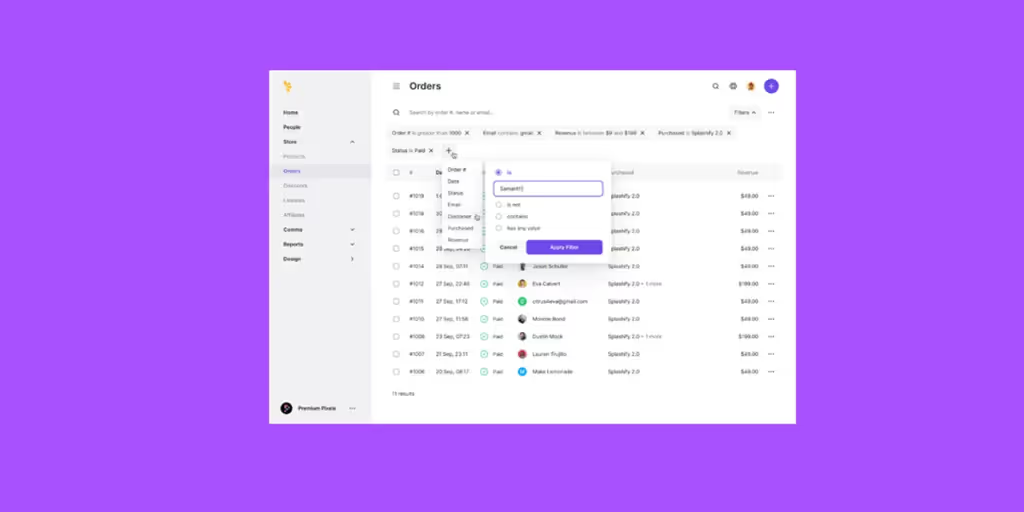
The filter is essentially a feature that limits the search results to what the user actually wants to see. Hence, if a user would normally see 200 results for smartwatch on an e-commerce website, they can limit the results by choosing the filter mens smartwatch. They can further narrow down the number of search results by choosing the name of the brand, their preferred color(s), and so on. Using the filter feature not only ensures that the users find what they want with ease, but it also takes away the possibility of the user getting overwhelmed due to an immense number of choices.

Some of the best practices used by UX design experts for the filter feature are as follows:
Limited Number of Filter Design Options Visible at Once
As interesting as the filter feature is, it is crucial to limit the number of filters visible to the user, again in a bid to ensure that they dont get overwhelmed. A good idea is to show around 7-8 filters at once and then offer the option to expand the list of filters if the user feels the need to do the same. In addition to adding to the overall user experience, this practice will also ensure that the web page looks neat and presentable, and isnt too crowded.
Prioritize Sorting and Filtering Options
Based on what the website offers, it is important to list the filter options in accordance with the users search intent. Since price is often a deciding factor when making a purchase, most users choose this filter. Hence, it only makes sense to place it at the top. Then again, gender, brand name, color, and other such aspects can be prioritized to enable quicker, and more defined search results.
Our Take on Search Bar (Box) and Filter Design
When it comes to offering the user a near-perfect experience, a well-designed search bar complete with the sort & filter feature plays a significant role. Simple tweaks in the design of these two elements are all one needs to ensure that their website becomes the preferred option for their intended users! And what could possibly be better than users getting attracted to and retained by a website, simply because of its flawless UX design?
An efficient search and filter UI/UX design criteria can make all the difference in conversion.
- One most important rule in search box design is its placement. The intention is to make the search function easily noticeable. For example, this is the most commonly known example, that is, Google.
The primary goal of Google is Search. That is why it's strategically placed in the middle of the page.
The second known example is Amazon. Though the primary goal is not to search, the main goal is to browse through various products. so Amazon has designed the search box, but not the full-width search box.
- Symbol and Button- The Magnifying glass is the universal symbol for search. The main goal is search, so the best practice would be to use simple symbols which easily represent users to search. Buttons help users to recognize that there is an additional step to trigger the search action. While designing, we must consider,
- Size of the button so that users dont have to concentrate on a particular spot to click.
- Users should be able to submit a search query by using the Enter button on the keyboard as well as by clicking on the search button. Consider that many users have a habit of hitting the enter button after typing and vice versa.
- Clarify what users can search for. Give auto suggestions for an easier and better search experience.
FAQs For Filter UI and Search Bar Design
How can Yellow Slice help for a Good Search Box?
The best way to make a search box more appealing is to make the search box design noticeable, apply a magnifying glass icon, ensure an apt location for the search bar, add a search button, and also ensure that the input field is aptly sized.
What is the Role of the Search Box?
A search box is a feature on a website that allows users to search for specific content on the site. The search box is typically located in the top right corner of the page and is often accompanied by a search button. It is an important tool for website visitors, as it allows them to quickly and easily find the information they are looking for. It can also be used to drive traffic to specific pages on the site.
What are the Best Practices for Search Boxes?
The best way to make a search box more appealing is to make the search box design noticeable, apply a magnifying glass icon, ensure an apt location for the search bar, add a search button, and also ensure that the input field is aptly sized.
What are some tips for better filter UI design?
As discussed in this article, here are some of the filter UI design tips that our UI/UX experts use.
- Prioritize sorting and filtering options so that the most important ones are easier to find for the users.
- Use a limited number of filter options to ensure a clean and clutter-free interface.
- Hide advanced filter options with a button to allow users to enable them if they want.
Apart from these, legible fonts and element sizes are given to make your filter UI design easier to access for your users.
What are search filter design patterns?
Search filter design patterns help UX designers create a search, sort, and filter pattern for the products design system. These are useful to allow users to find the products or information they are searching for easily, regardless of whether they know what they are looking for or have a vague idea of what they want.
Conclusion
Thinking of a website or product that contains a vast amount of information, without a search and filter UI component is impossible. Without the search functionality, users will have to spend too much time looking for the piece of information or product through the site even if they know exactly what they want.
In this article, we discussed why search box filter designs are important for your website. Plus, we shared some best practices that we at Yellow Slice employ to design search bars and filters.
Whether you own an ecommerce website or have a portal with a heap of information, search filter feature is a must to ensure better user experience and easier navigation.
How Can Yellow Slice Help ??
At Yellow Slice, we create human-centric designs that aim to solve user problems with data-driven strategies for creating any design plan. This means, besides your requirements and addressing your users pain points is also our priority.
We create elements, designs, maps, and flows that understand what your audience needs to keep on interacting with your business online.
Want to know how we can improve your product? Schedule a call to discuss your project.


.avif)
