Split Complementary Colours: What Are They? How To Use Them In UX Design?
Soumyadeep Auddy
Do you know there are many rules of designing and the one most violated is the color rule?
We have always been told that it is a best practice to use a contrasting color scheme to highlight the primary color.
But, what if you want to show the contrast with the same color? It seems like an oxymoron as there is no high contrast between the same colors but yet, we see it in nature. So, how do you create a high contrast between the same color?
Thats where split complementary color schemes come in. Split complementary colors are one of the most important color rules that UI UX design companies should follow. This blog is all about split complementary colors, what it is and how to use them?
Understanding Split Complementary Color Scheme

In color theory there are seven different color schemes, out of which one is split-complementary colors; a secret weapon for designers. It's not that designers don't know about them, many do, but for many designers and for many businesses, finding out about them is like learning about a new tool for getting work done.
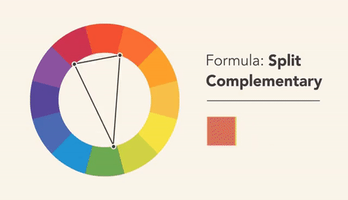
Split complementary colors in UX design are those that sit adjacent to each other on the color wheel. They are made up of a base color and the two colors that sit either side of its complement. This means they are not a mixture of two colors but a combination of 3 colors For example, red, orange, and green are split complementary colors??.
In UX design, these colors can be used to create high-contrast color schemes that are both eye-catching and visually striking. When used correctly, they can help to guide the user's eye around the screen and highlight important elements of the design.
Split complementary color scheme can be a great way to add visual hierarchy to your designs. However, it's important to use them sparingly, as too much contrast can be overwhelming. When used correctly, they can help create a visually appealing and effective UX design.
How to Determine which Colours are Split-Complementary
To find split-complementary colors, you will need to find the color that is opposite of your chosen color on the color wheel. Once you have found that color, you will then need to find the two colors that are adjacent to it on the wheel. These three colors will be your split-complementary colors.
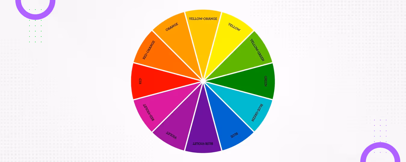
To find out which colors are split-complementary, you'll need to understand a bit about color theory. The color wheel is made up of 12 different colors including three primary colors (red, yellow, and blue), three secondary colors (orange, green, and purple), and six tertiary colors (red-orange, yellow-orange, yellow-green, blue-green, blue-purple, and red-purple).
The split-complementary colors are the colors on either side of a color's complement or each color has a corresponding color that is its opposite on the wheel For example, if your base color is blue, your split-complementary colors would be yellow-orange and red-orange.
Best Ways to Use Split Complementary Color Schemes in UX Design

To use split complementary colors in UX design include using them to highlight different elements on a page, to create a sense of depth or dimension, or to simply add a pop of color to an otherwise bland design. Experiment with different color combinations and see what works best for your particular project.
Highlight Important Elements on your Page:
When highlighting important elements on your page, you can use split complementary colors to make those elements stand out. For example, if you have a button that you want users to click on, you could make that button a split complementary color to your website's background. This will make it more visible and more likely to be clicked on.
Create a Color Scheme for your Website or App:

When creating a color scheme, you'll want to choose one color as your main color, and then two split complementary colors. These 2 nearly adjacent colors should be used throughout your design of the web page.

Reserve the accent color to draw attention to crucial information like a company logo or actions you want visitors to the site to make For example, you could use your main color for your website's background, and then use your two split complementary colors for your website's text and buttons.
Add a Pop of Color to your Design:
Adding a pop of color to your design can be done by adding a small amount of one of your split complementary colors to an element on your page. For example, you could add a split complementary color to your website's logo or to the background of your website's header. This will add a touch of color to your design without being too overwhelming.
Use them as your Primary Colors.
This means using one color as your dominant color, and the other two colors as accents. This can create a very pleasing and cohesive look.
Use All Three Colors Equally.
This can be done by using each color for different elements on your page, or by using all three colors in different shades. This can create a very eye-catching and vibrant look.
How to Create Split Complementary Colours
There is always one color, one hue, at the heart of every design, no matter what the color scheme may be. After that, you have to adjust the colors to achieve the right look and convey the right message. Designers typically work within the HSB color system (Hue, Saturation, Brightness) to do this precisely.
Step 1: Pick your Base Colour
To begin with, pick a key colour, and here we have chosen Light Green.
• Hex: #C1FF76
• RGB of the color is- 193, 255, 118
• HSB of the color is- 87°, 54%, 100%
The hue value here is 87°, which is what we'll use to calculate the split complementary colours.
Step 2: Find the Two Split Complementary Colours
On the HSB color wheel, a direct complement sits exactly 180° away from your base colour. For a split complementary scheme, instead of using that exact opposite, you shift ±30° from the complement, meaning you add and subtract 150° and 210° from your base hue.
Color 1 (hue − 150°): 87° − 150° = −63°, which wraps around to 297° → a light violet/purple
Approximate Hex: #C176FF
Base Color (87°): #C1FF76 — Light Green
Color 2 (hue + 150°): 87° + 150° = 237° → a light blue
Approximate Hex: #7681FF
Step 3: Apply the Colors in your Design
The last step is to apply the chosen colors in your design. Remember to balance all the colors with the primary color being dominant to create a soft and vibrant look.

Find Two Split Complementary Colors
To get 2 split complementary colors we have to work on the HSB color palette. And for this we will increase and decrease the hue value by 150.
Now, take the hue value of the color and first decrease it by 150 and you will get one split-complementary color.
Now, take the hue value of the color and increase it by 150, you will get another split complementary color.
Light orange - 87-150
Light green - 87
Light Blue- 87+150
You can adjust the saturation and brightness accordingly for a better contrast between colors.
Apply the Colors in your Design
The last step is to apply the chosen colors in your design. Remember to balance all the colors with the primary color being dominant to create a soft and vibrant look.
Conclusion
Split complementary colors can also be used to create a sense of depth and dimension on your page. They can be used to create a sense of movement, or to make an element stand out.
When using split complementary colors in UX design, it's important to consider the overall color scheme of your site or app. You'll want to create a harmonious balance between the colors you use.
FAQs On Split Complementary Color Scheme
What are some examples of split complementary colors?
Some examples of split complementary colors are orange and green, purple and yellow, and red and blue. These color combinations are said to be split because they are two colors that are opposite each other on the color wheel. These split complements can be used to create a variety of looks, from bold and eye-catching to more subdued and harmonious. When used in design, split complementary colors can help to create a sense of balance and visual interest.
How many split complementary colors are there?
There are 12 main split complementary color schemes, one for each color position on the standard 12-color wheel. Each scheme consists of a base color paired with the two colors sitting on either side of its direct complement.
Here are all 12:
- Red + Yellow-Orange & Yellow-Green
- Red-Orange + Yellow-Green & Green
- Orange + Green & Blue-Green
- Yellow-Orange + Blue-Green & Blue
- Yellow + Blue & Blue-Purple
- Yellow-Green + Blue-Purple & Purple
- Green + Purple & Red-Purple
- Blue-Green + Red-Purple & Red
- Blue + Red & Red-Orange
- Blue-Purple + Red-Orange & Orange
- Purple + Orange & Yellow-Orange
- Red-Purple + Yellow-Orange & Yellow
Each of these three-color combinations offers a unique balance of contrast and harmony, giving designers a wide range of options to work with depending on their brand's mood and visual goals.
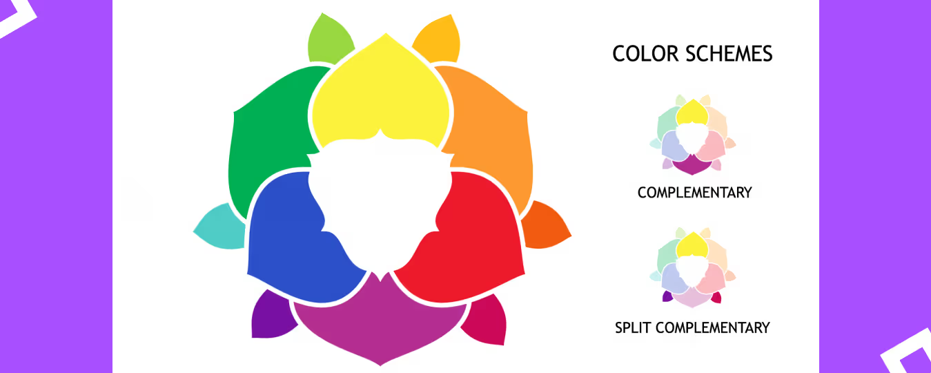
What is the difference between complementary and split complementary?
Colors opposite each other on the color wheel are complementary colors. Split complementary colors are those that are adjacent to the complementary color on the color wheel. For example, if the complementary color is yellow, the split complementary colors would be yellow-green and yellow-orange.
When should you use a split-complementary color harmony?
Split-complementary color harmonies are often used in design because they can add a touch of drama and excitement without being too jarring. This makes them a great choice for settings that need to be both stylish and inviting. When using a split-complementary color harmony, it is important to be mindful of the overall tone you want to create. If you want a more energetic and lively feel, choose colors that are more brighter and more saturated. For a calmer and more subdued look, use softer and more muted tones.


Let's create something amazing!
Let's discuss your vision and how we can bring it to life with impactful design solutions.
.avif)
Good design starts with Sliced Newsletter
Subscribe to the Sliced newsletter and get the best of research, UX writing, product psychology, CX, and design systems, right in your inbox.
