
UX Design Problems – Introduction
Do you know, we face variety of emotions when surfing the Web and it can be extremely diverse, with sheer happiness at one end and absolute frustration at the other. It goes without saying that the first one is desirable and the second one is not.
Generally, negative emotions have a stronger impact than positive emotions, particularly over the Internet. According to a PWC report, 32% of clients are likely to abandon brands they love, after a single negative experience. Apps like ‘Instagram’ passed spotlessly without these UX design frustrations. User frustrations on the web are of various kinds, and most of them can have pretty easy solutions to these UX Design Problems (User Experience Design Problems). Let’s look at some of 10 frustrating aspects that drive users crazy:
- Lack of Legibility
- Size of click targets
- Unpredictable/sudden shifts in content
- Losses due to Errors
- Back button Issues
- Scroll Hijacking
- Sign-up walls
- Autoplay
- Browser Notifications
- Cookies
Lack of Legibility
While it’s a well-established fact that video is the most-loved format on cyberspace, text still dominates most of the content on the web. And this is why the emphasis on legibility and readability of text. In many cases, the fonts are either too small or presented in such a way that renders the text illegible. Both of these have to be good to ensure a good solutions to UX Design Problems. The following things are to be kept in mind while designing the text:
- A standard thumb rule for font size is to keep it around 16 px. But screen-size also has to be taken into consideration. If the screen size is big, the font size also has to be bigger.
- Line height can be kept between 1.5em and 1.6em to ensure better readability.
- View the designs on an actual device to check optimum readability.
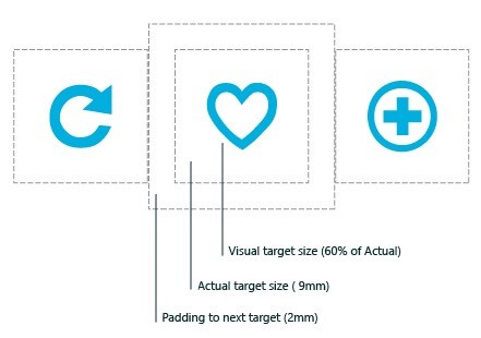
Size of Click Targets
It can be frustrating when the clickable elements on the screen are too small to click or tap. The smaller they are, the more are the chances that the user will make mistakes while navigating. Some suggestions for fixing these UX Design Problems:
- More and more devices today are touchscreen, whether smartphones, tablets or windows PCs. Hence, it’s important that the touch-targets and click-targets be finger-friendly. The average size of such elements should be 9mm x 9mm. In case of material design, it has been pointed out that the size should be 48 x 48px.
- It’s recommended that touch and click targets are surrounded by a fair bit of padding. Microsoft recommends an approximate padding of 10mm between touch targets.
Unpredictable/Sudden Shifts in Content
It often happens on many popular websites that as soon as you are going to click the link, you miss the target because a video or an ad has suddenly taken its place. This can be very inconvenient and annoying for the user. This kind of shift normally happens with dynamically loading content. Since the entire operation doesn’t happen simultaneously, the dynamic content (ad/ video) appears on the page and pushes the existing content aside.
What’s a solution to this UX Design Problem? The developer can measure the height of the dynamic content and hardcode it as a min-height for the CSS container.

Losses Due to Errors
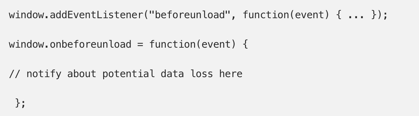
After a user fills the details in a web form and clicks the “submit” button, sometimes the same page reloads and the data on the form is lost, with a message in red that just says “Error”. This can be extremely irritating and inconvenient, as data loss often amounts to a loss of time and money💰.
It’s one of the cardinal rules of interactive design, that user data is sacred. A UX designer/ developer can use localStorage and sessionStorage for storing key-value pairs, and the data that the user has provided via the form has to be pre-filled into relevant fields, even when/if the user happens to mistakenly refresh the page.

Back Button Issues
The Back button in a browser is like an Emergency Exit. The idea is to discard an unwanted action without going through an extended process. But if there exists a possibility that the users may lose the data by clicking the back button, it’s judicious to provide a warning with a message that says “Your work will be lost“,on clicking the back button.
‘Scroll Hijacking‘ [Prominent UX Design Problems]
A scroll bar in a window is supposed to behave in a certain way. It has a job to do: to navigate from one edge to another, vertically or horizontally. But still as often, UX designers manipulate the scrollbar to behave in some way on their site. This is called “scrollbar hijacking”. Often, designers do this to highlight fancy animated effects, but just some cool animated effects do not essentially make for a great experience on the web. Instead, it gives the user the feeling of losing control and nothing is more frustrating for the user experience such a UX Design Problems.
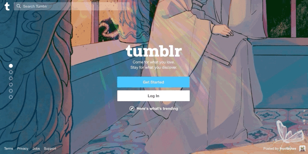
If the designer feels that scroll hijacking is indeed necessary from an aesthetic or usability standpoint, the least they can do is use a layout which is appropriate for it. Tumblr did it well on their homepage – despite using scroll hijacking, they designed the content in the form of individual slides and the user gets the impression that they are navigating between different slides, while they are scrolling.
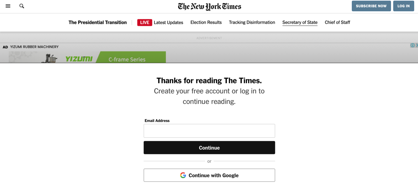
Sign-Up Walls
Some very reputed websites force users to sign up before they even start using a service – like some news websites. This stops the user from getting a feel of the service/ website, and can be quite frustrating. A very important principle to be followed for effective web design is “try before you buy”.
Users should be able to give the product or service a try, in order to make their minds about whether to buy it or not. In the context of content services like news websites, this means offering a fixed quantum of content – like articles – free, and push a sign up wall to them only when they have read enough to know they want more.
Autoplay
When a website loads up, you don’t expect a random audio clip that starts playing on its own. Same goes for video. On certain websites, videos start auto-playing, along with sound. It is a proven fact that when this happens, many users immediately quit the website almost instantly. And the enterprising ones who stick around, try to find ways to mute the sound or close the video.
Auto-play is an established practice by now, but UX designers will do well to ensure that they are muted by default. Users interested in the content may toggle it on if they so desire. Classic example of showcasing the project: Thermax
Browser Notifications
Notifications are useful features for users to get updates about their mobile apps, with information on their posts, or latest news updates etc. But lately, notifications have become a prominent UX Design Problems which is a nuisance for most users and most smartphone operating systems feature ways to turn off notifications for some or all apps. Some apps have that feature built in. Similarly, on the web there are push notifications which are meant to serve users with updates about the website. When a website asks such permission, users are often disinterested in the feature. The website designers should figure out a way to highlight the benefits for the users on the permission window, and also contain a button to toggle it off.
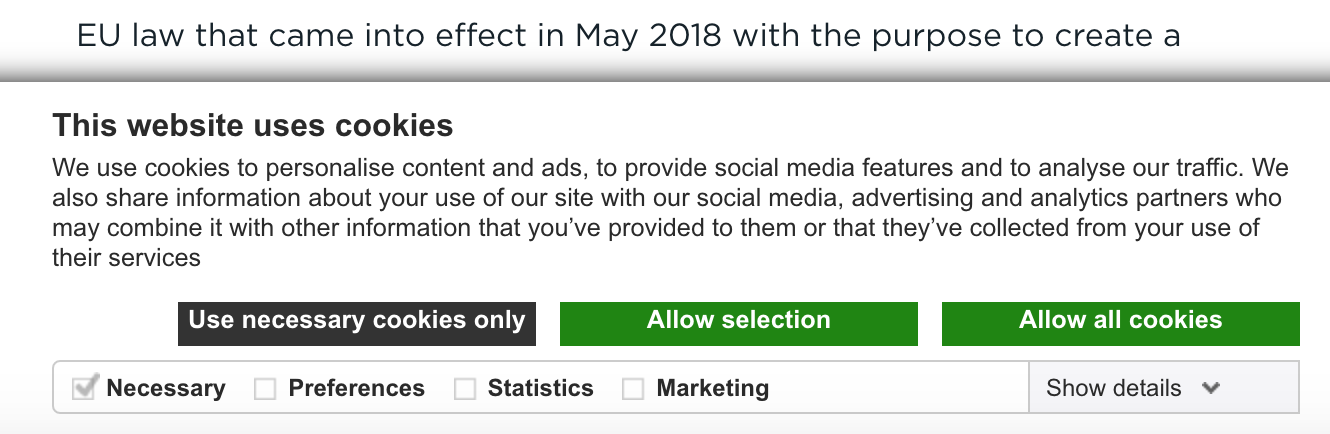
Cookies
Website cookies store personal details about the user which can be used to track their behaviour online. Privacy norms – and in some cases, regulations like the European GDPR guidelines – require websites to disclose this information, in addition to other disclosures.
In the case of certain websites, users get a window offering them the option to accept the cookies or to leave the website. These even block users till they choose either option. This can be exasperating for many users. As an alternative strategy, many other websites show an alert that reveals how cookies are being utilised and allows the users to decide whether they want to accept all cookies or only some of them. This method, while adhering to the norms, gives users more flexibility and seems more welcoming.
FAQs For UX Design Problems
What are Some Problems faced by UX Designers?
One of the challenges faced by UX designers is to contend with project deadlines and budget constraints. Another common problem is that UX designers are often not involved in the project from the beginning. This can lead to a disconnect between the design and the development of the product. UX designers also face a challenge in terms of constantly staying up-to-date with the latest design trends and technologies. This can be a difficult task, as the design world is constantly changing and evolving.
What are some UX Problems? How does it look like is there any example?
Some of the UX problems faced are lack of legibility, size of click targets, unpredictability, sudden shifts in content, losses due to errors, back button issues, scroll hijacking, sign-up walls, autoplay, and cookies.
How can UX Design Problems affect our Business
If a business does not have a good UX design, it can affect the business in a number of ways. For example, customers may have difficulty using the company’s website or app, which can lead to lost business. In addition, poor UX design can make it difficult for employees to use company systems, which can lead to inefficiencies and lost productivity. And a bad UX design can damage the company’s reputation, which can lead to lost customers and revenue.


