Designing Futures, Delivering Impact.
We blend deep insights, creative thinking, and rigorous execution to craft innovative solutions. Dive into our project portfolio to see our methodology in action.
Thank you! Your submission has been received!
Oops! Something went wrong while submitting the form.
.avif)
.avif)
Retail & E-commerce
UX Design
UI Design
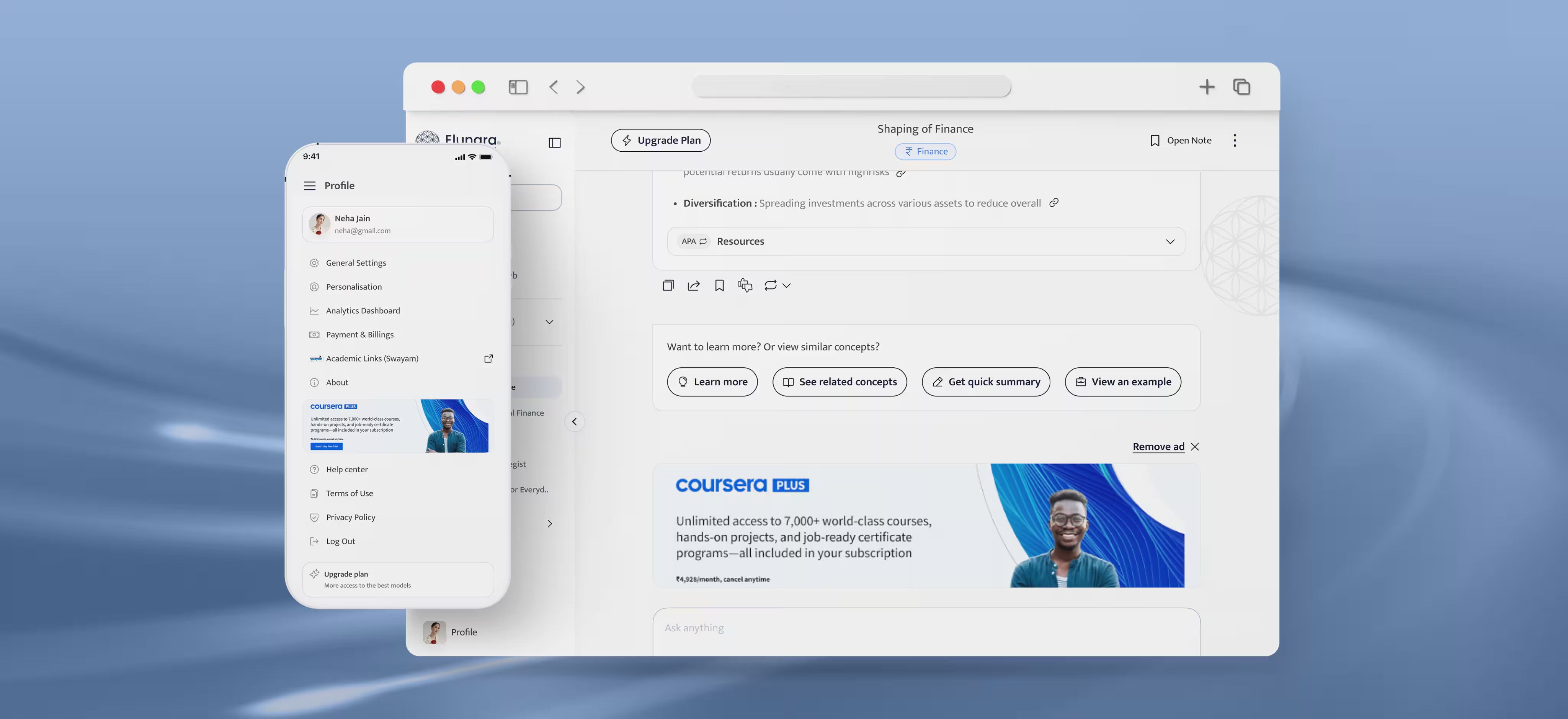
Chaayos
A café app that lets you customise your in-store order, order your beverage your way.
.avif)

Travel
UX Design
UI Design
Make my trip
India’s leading online travel aggregator (OTA) platform that has served over 5 million customers with popular hospitality chains.
.avif)
Fintech & banking
UX Design
UI Design
Shoonya
A stockbroker platform that offers “zero-commission” transactions for various financial products.
.avif)
.avif)
Enterprise & SAAS
UX Design
UI Design
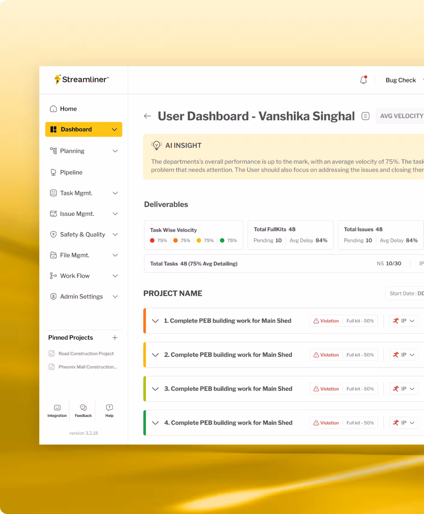
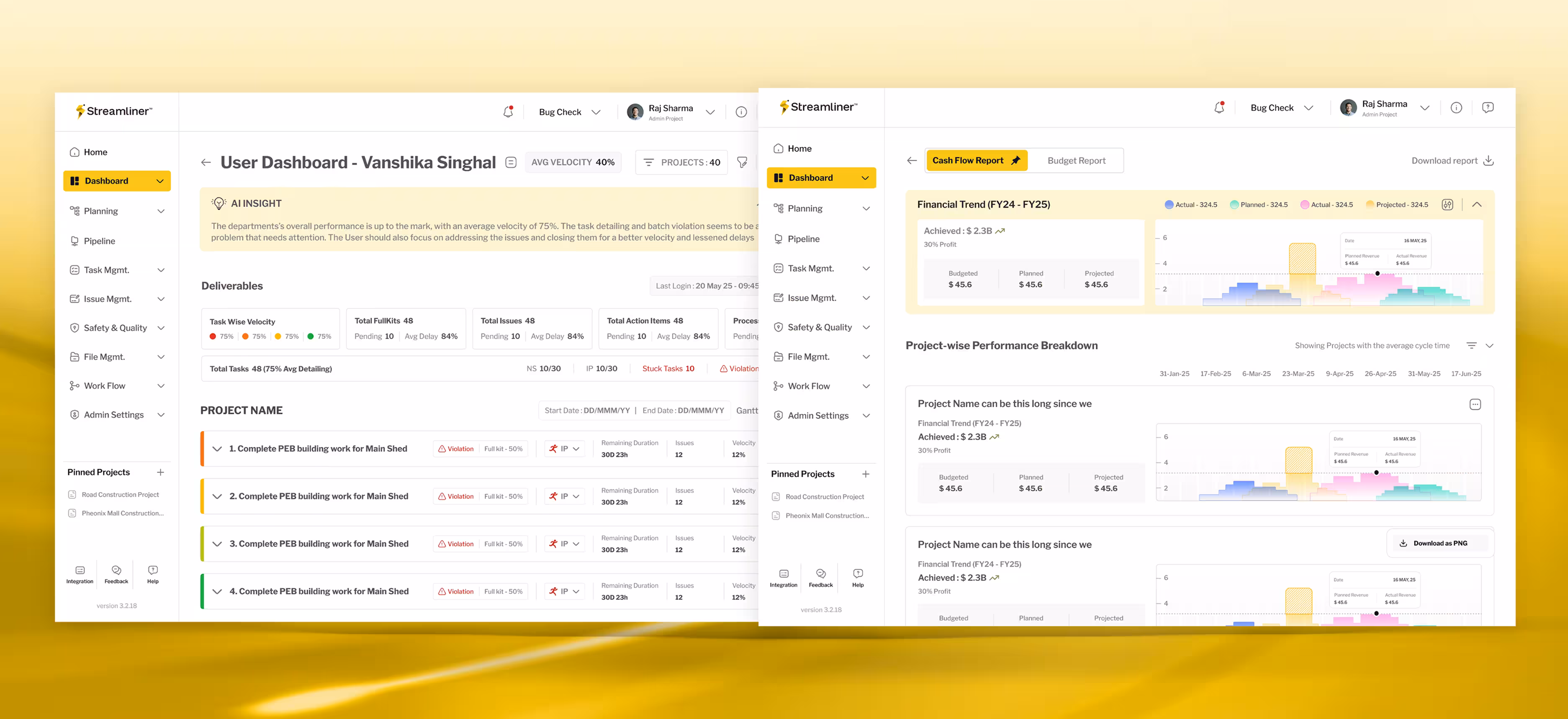
Civit Build
A construction management app that helps businesses optimise costs, improve project efficiency, and scale securely with complete data backup.
.avif)
Travel
UX Design
UI Design
Fedex
A cafe app that links to the POS system to allow users to customise their in-store orders.
.avif)
.avif)
Retail & E-commerce
UX Design
UI Design
JOY
An e-commerce app redesigned for RSH-JOY to enhance usability and navigation.
.avif)
.avif)
Edtech
No items found.
The Actor's Truth
A mobile-first platform making professional acting education accessible and affordable for aspiring actors.
.avif)
Fintech & banking
No items found.
Neoble
A professionally managed fintech platform enabling Mutual Fund investments
Fintech & banking
UX Design
UI Design
UX Writing
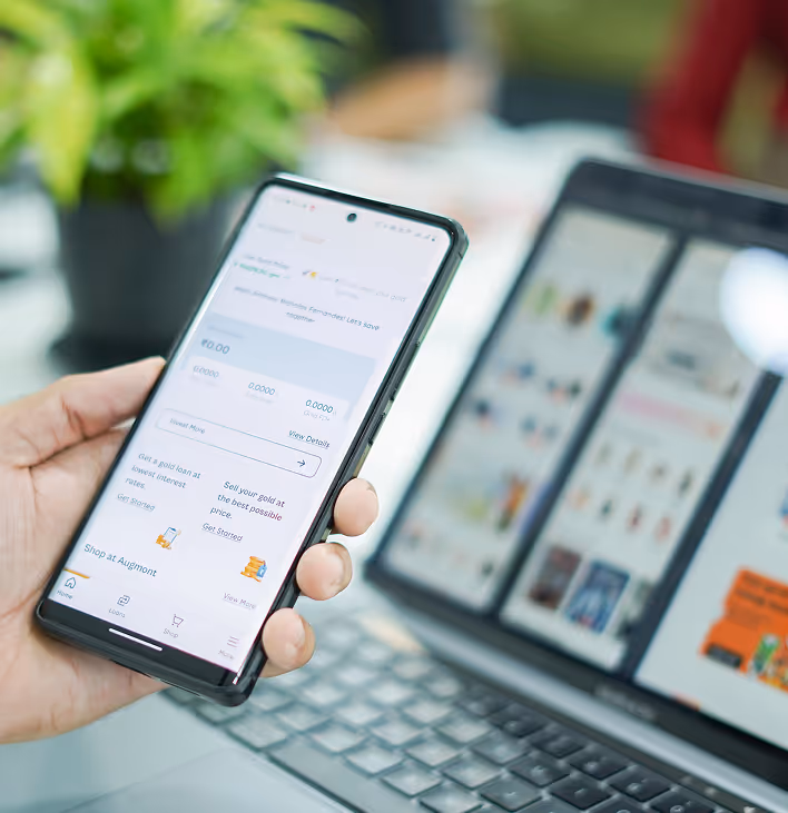
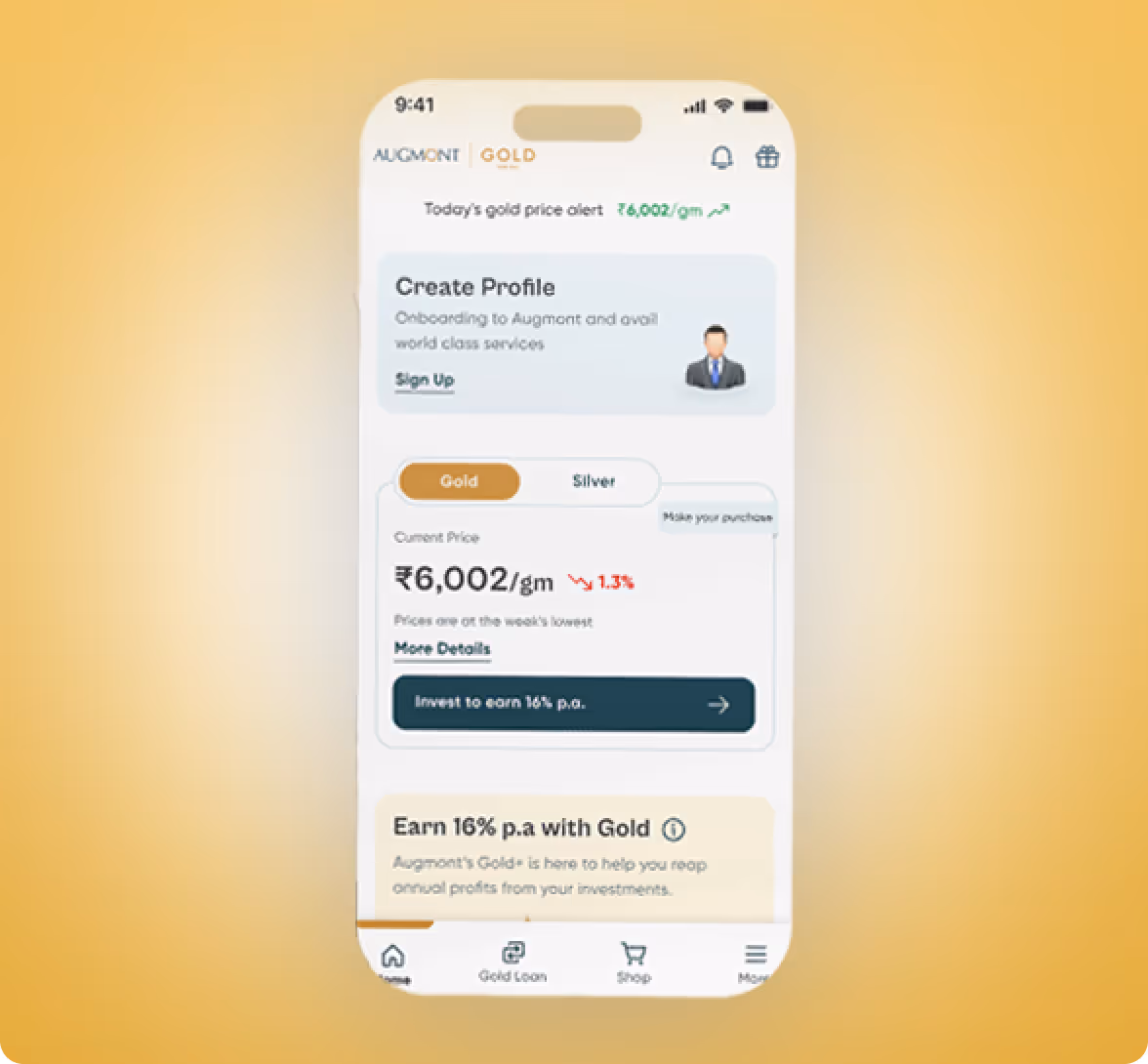
Augmont
Augmont's digital solution to trade in Gold easily and securely.
.avif)
.avif)
Fintech & banking
UX Design
UI Design
Paytm
An interactive learning platform within the Paytm platform that teaches users the fundamentals of trading.
Enterprise & SAAS
No items found.
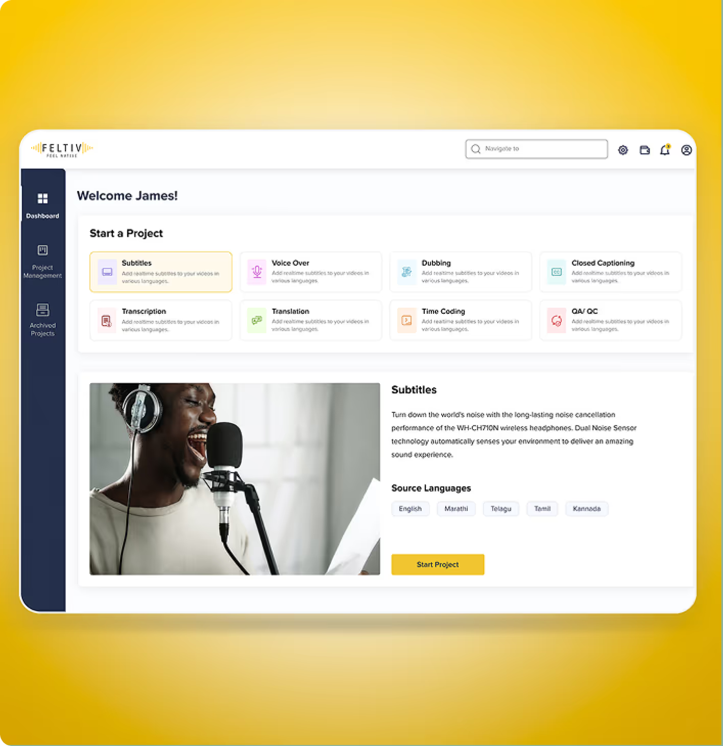
Feltiv
We restructured user journeys, created wireframes for clarity, and implemented transparent design patterns that encourage confidence and repeat use.
.avif)
Travel
No items found.
KPIT
An internal platform built to simplify travel requests, documentation, and approvals for KPIT employees.
.avif)
.avif)
Retail & E-commerce
UX Design
UI Design
URAC
A lifestyle app that helps users plan better, stay motivated, and live intentionally.
Travel
No items found.
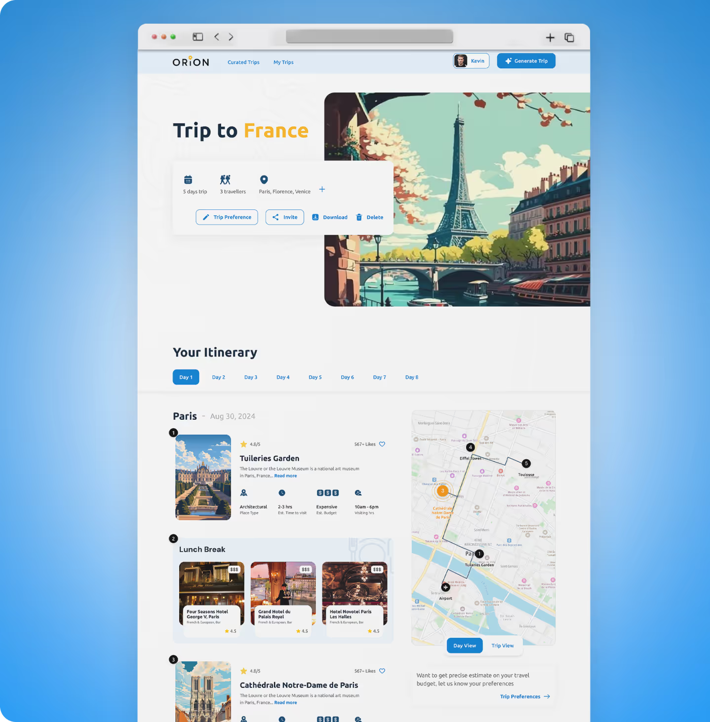
Orion
A digital MVP that helps travellers create and manage their perfect travel itineraries with ease.
.avif)
Enterprise & SAAS
UX Design
UI Design
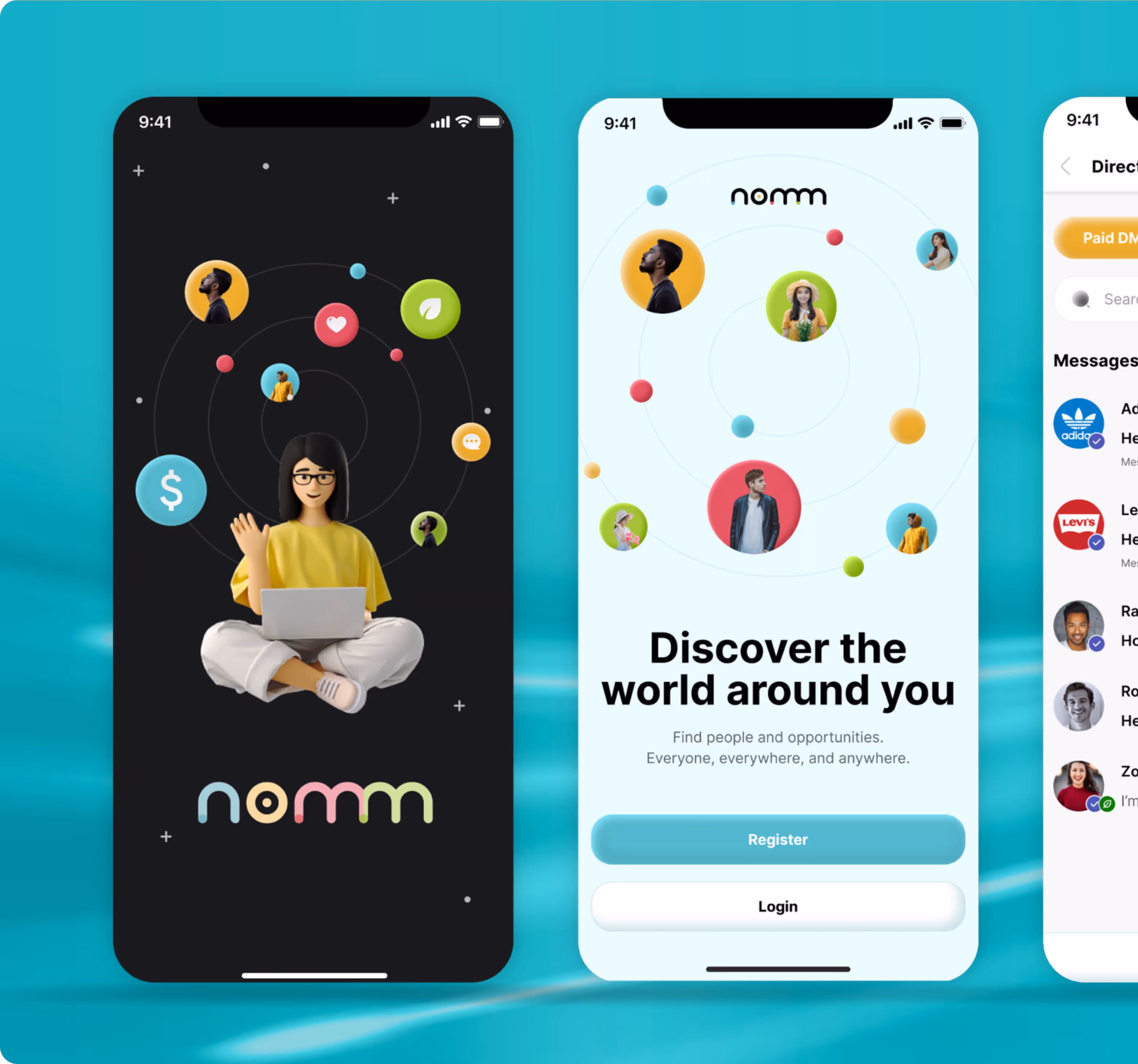
Nomm
A cafe app that links to the POS system to allow users to customise their in-store orders.
Enterprise & SAAS
UX Design
UI Design
Realization Tech
A project management platform that lets enterprises complete tasks on time with live tracking while aligning priorities.
Edtech
UX Design
UI Design
Globsyn
An AI learning companion that lets graduate students design their learning path through customisable tools and workspaces.
Edtech
UX Design
UI Design
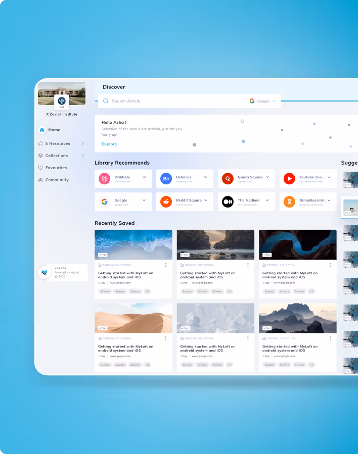
MY Loft
A UX/UI redesign to elevate My Loft’s digital content ecosystem, making academic research, reading, and content management unified and engaging.
Retail & E-commerce
Service Audits and Research
UX Design
UI Design
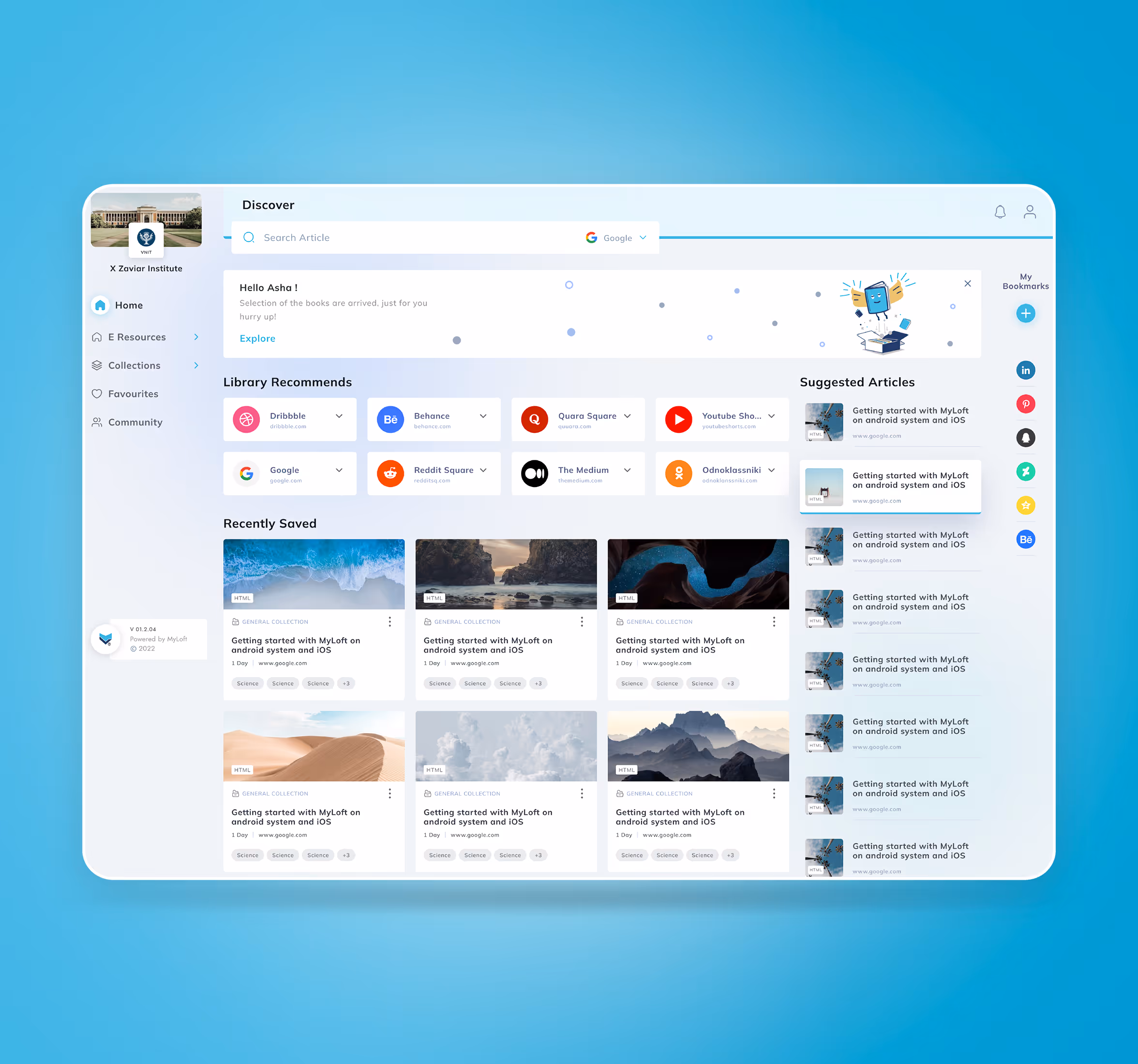
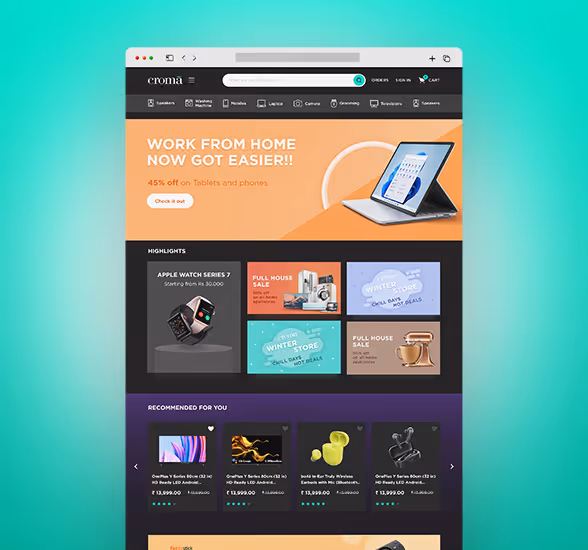
Croma
A store experience that blends digital interaction with physical retail to help customers explore and buy electronics effortlessly.
.png)
Enterprise & SAAS
UX Design
UI Design
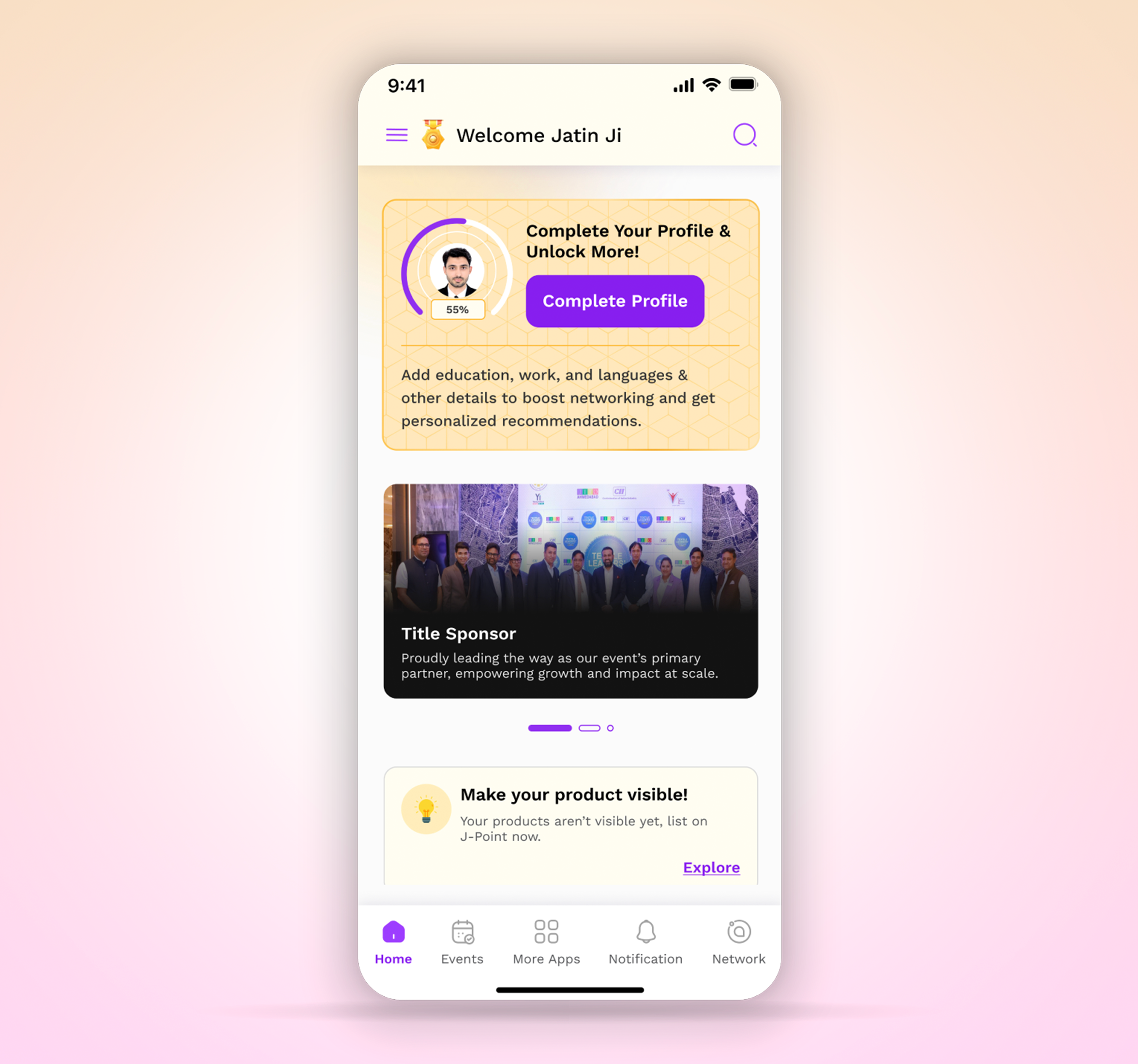
Jito
JITO (Jain International Trade Organization) is more than just a network, it's a global movement designed to uplift and empower the Jain community through business, knowledge, and service. However, achieving this vision in today’s fast-paced digital world requires a seamless, engaging, and intelligent platform that connects its members in a meaningful way.
.avif)
Enterprise & SAAS
UX Design
UI Design
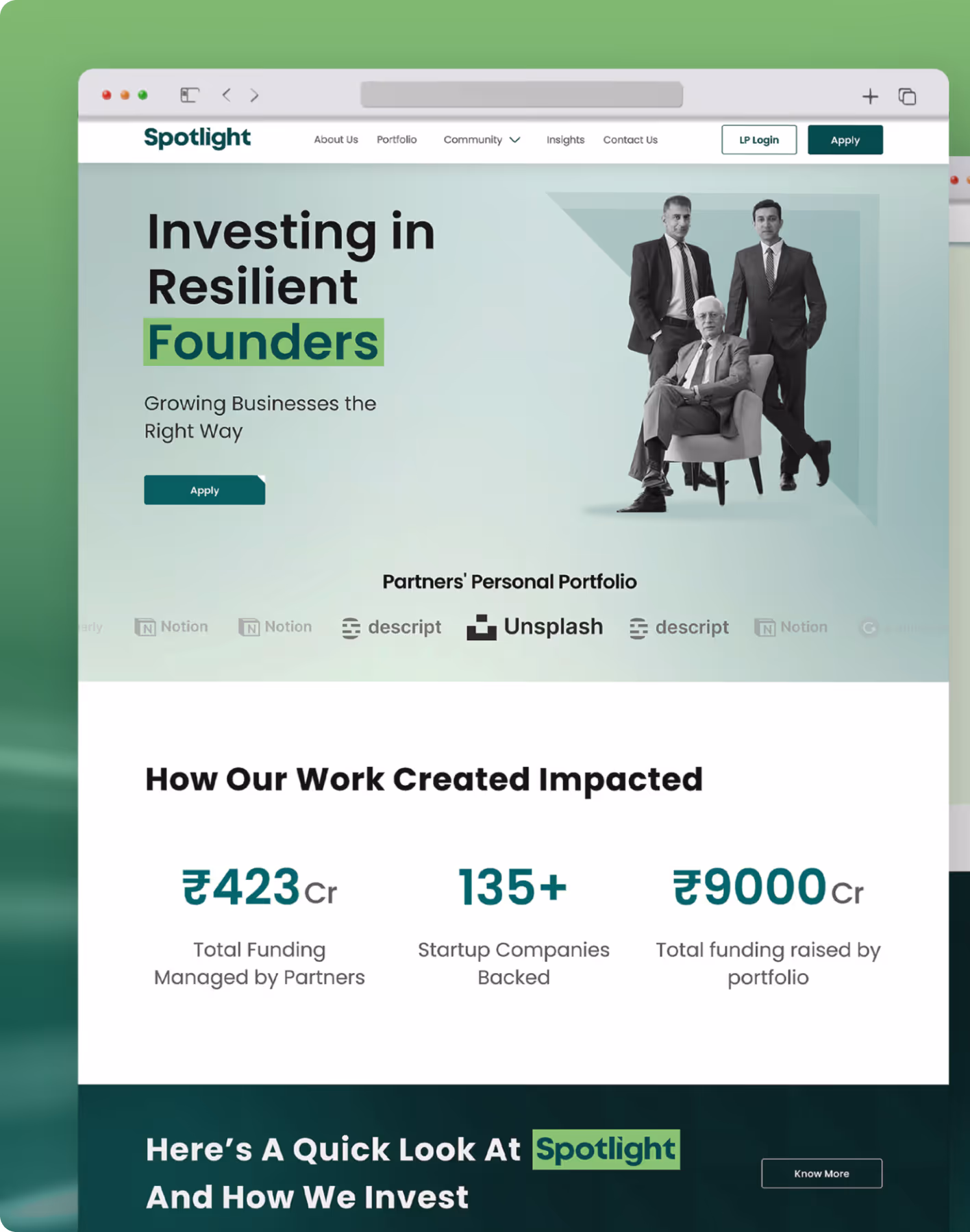
Spotlight
Spotlight is a trusted partner for resilient founders, showcasing credibility and past successes. It creates an experience addressing core challenges for founders and investors, bridging gaps in guidance and market access. Spotlight ensures a reliable, efficient ecosystem for all stakeholders.
.avif)
Retail & E-commerce
UI Design
Brand Management
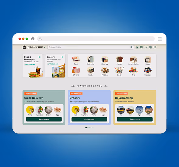
Bajaj-Hamara Mall
Bajaj Hamara Mall is an ONDC platform (Open Network for Digital Commerce). It lets you explore online shopping for electronics, appliances and groceries from top brands and sellers. It offers a unique shopping experience where you can discover a wide range of products with easy EMI plans and zero down payment on selected products.
.avif)
Enterprise & SAAS
UI Design
UX Design
Service Audits and Research
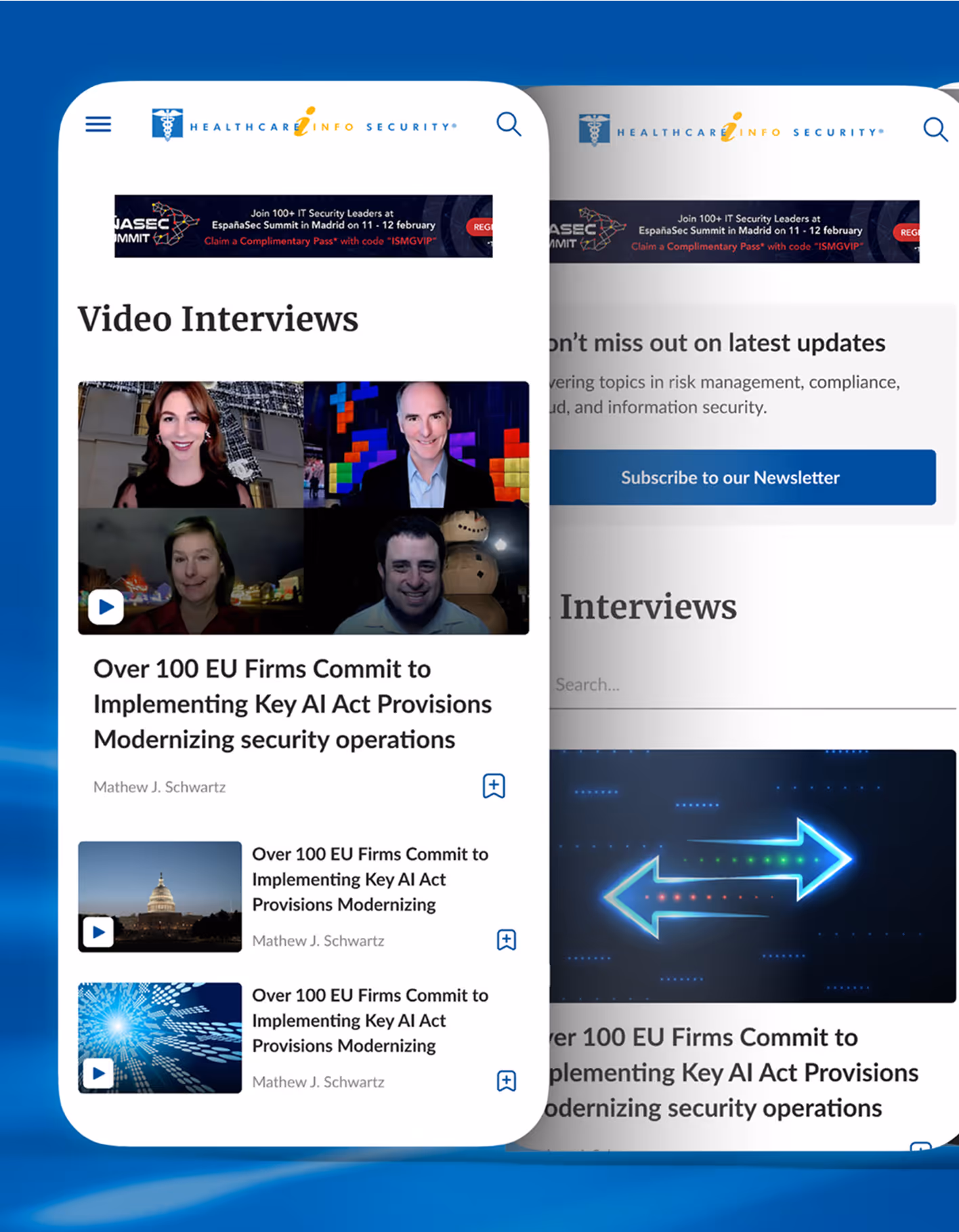
ISMG
Information Security Media Group (ISMG) is a global media organisation, they specialise in providing news, research, and education on cybersecurity, information technology, and related topics
.avif)
Fintech & banking
UI Design
UX Design
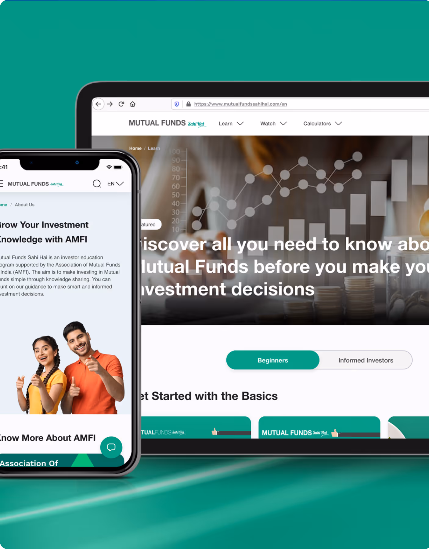
AMFI
Launched in March 2017 by the Association of Mutual Funds in India (AMFI), "Mutual Funds Sahi Hai" is a major investor awareness campaign designed to educate the public and promote mutual funds as a suitable long-term investment option. It simplifies complex financial concepts, encourages SIP investments, and has successfully increased retail participation.
.avif)
Edtech
UI Design
UX Design
Service Audits and Research
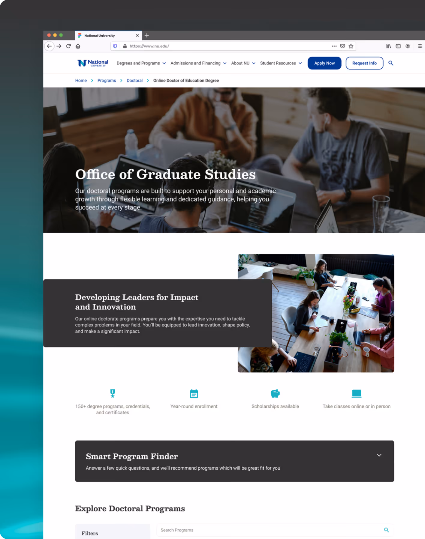
NU
National University is reshaping higher education for busy adults and working professionals. The university offers comprehensive academic, financial, career, family, and wellness support services. They empower students to succeed in the classroom, at work, at home, and beyond.
Simplifying Document Workflows with Clarity & Control
.avif)
Fintech & banking
Brand Identity
Brand Strategy
UI Design
UX Design
Service Audits and Research
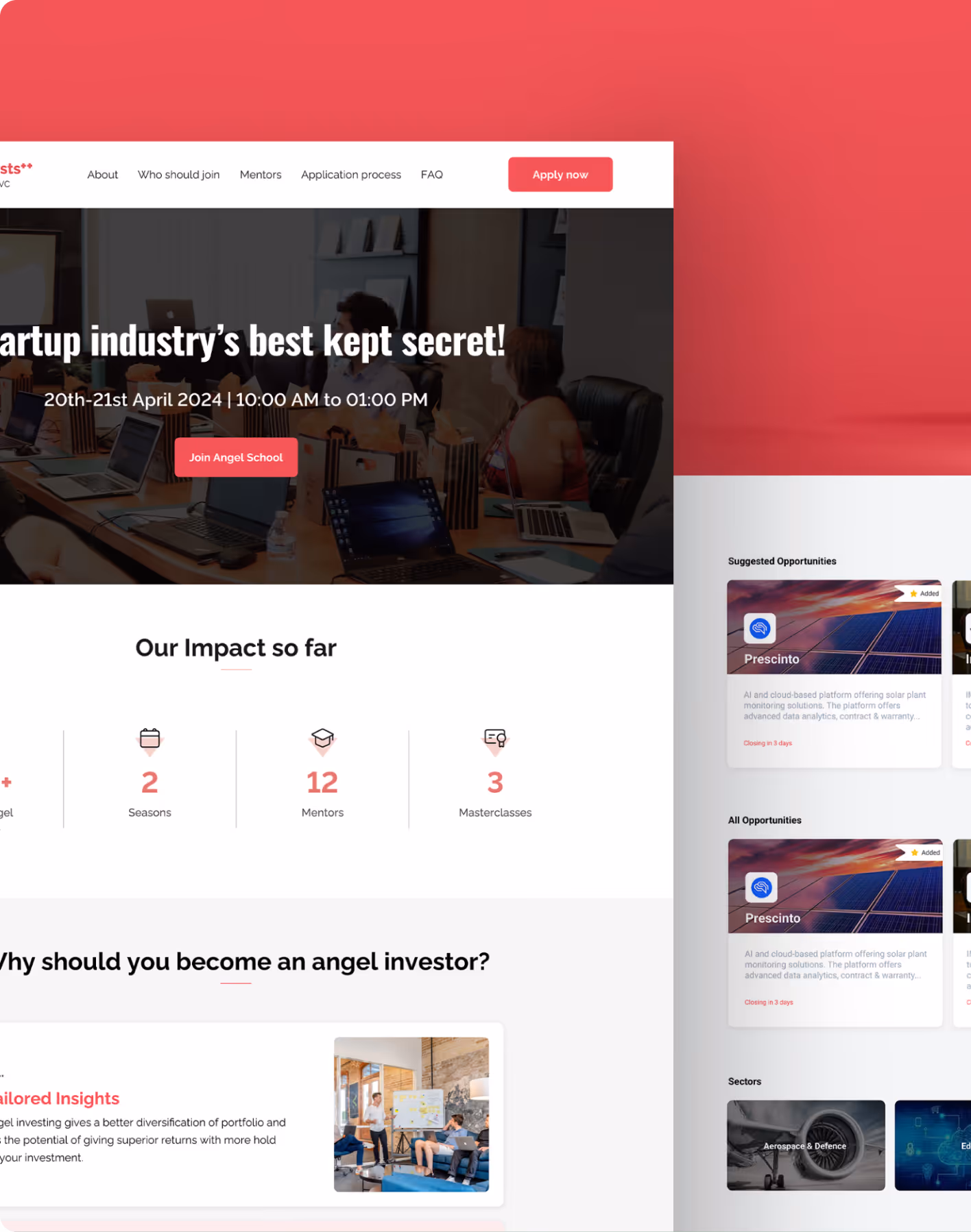
Venture Catalyst
Venture Catalysts is India’s first multi-stage venture investing platform and one of the most active early-stage seed investors in the country. Since its founding in 2016, it has backed hundreds of startups, built an expansive syndication and investor ecosystem, and helped nurture numerous unicorns and high-growth ventures.
.avif)
Enterprise & SAAS
UI Design
UX Design
Service Audits and Research
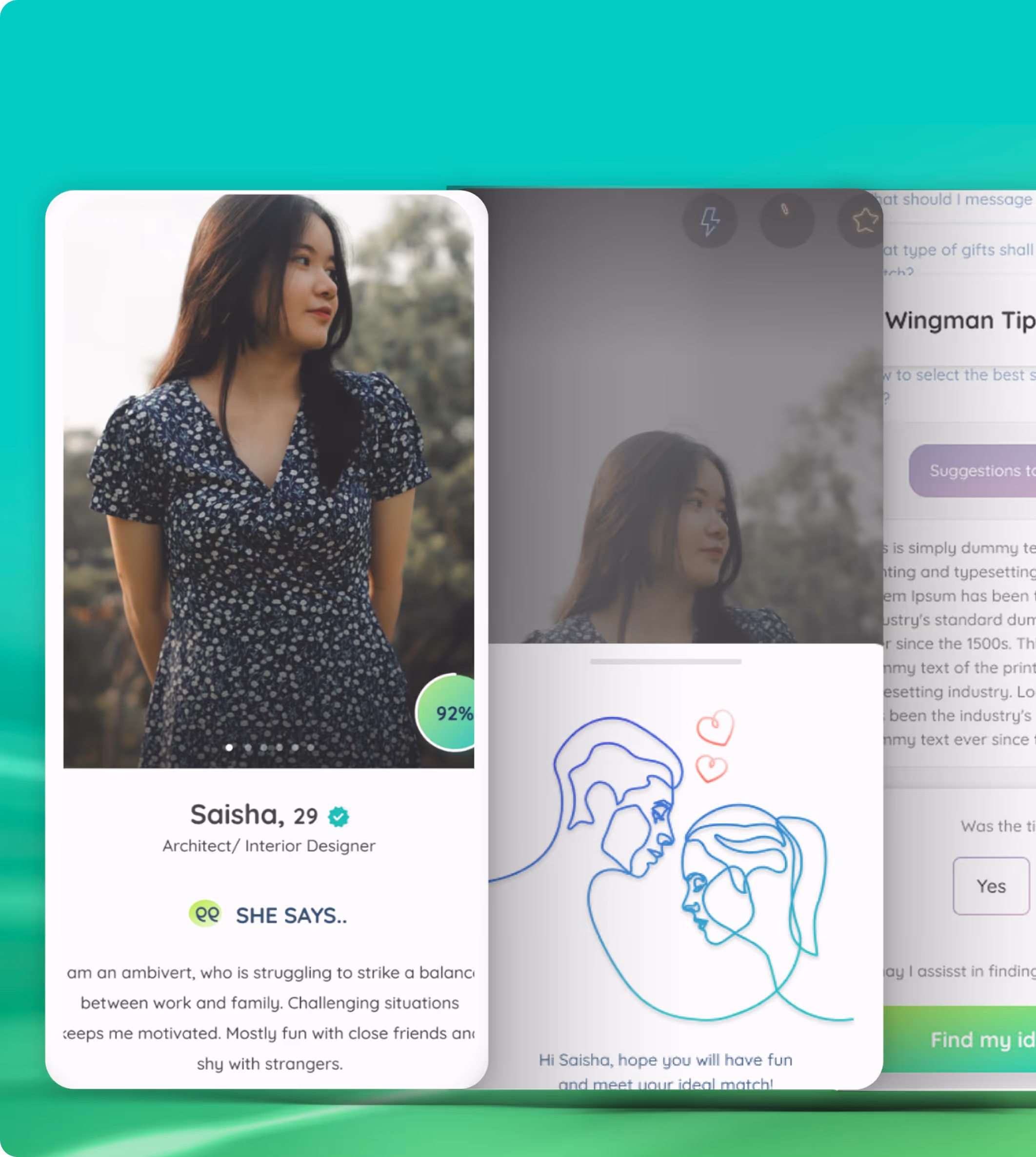
Humm Tumm
A UI/UX solution crafted to transform Hum Tum into a standout digital matchmaking platform helping users to find their romantic partners. It’s not just another dating app but incorporates entertaining features that uses the “Tree of Life” concept.
.avif)
Enterprise & SAAS
UI Design
UX Design
Service Audits and Research
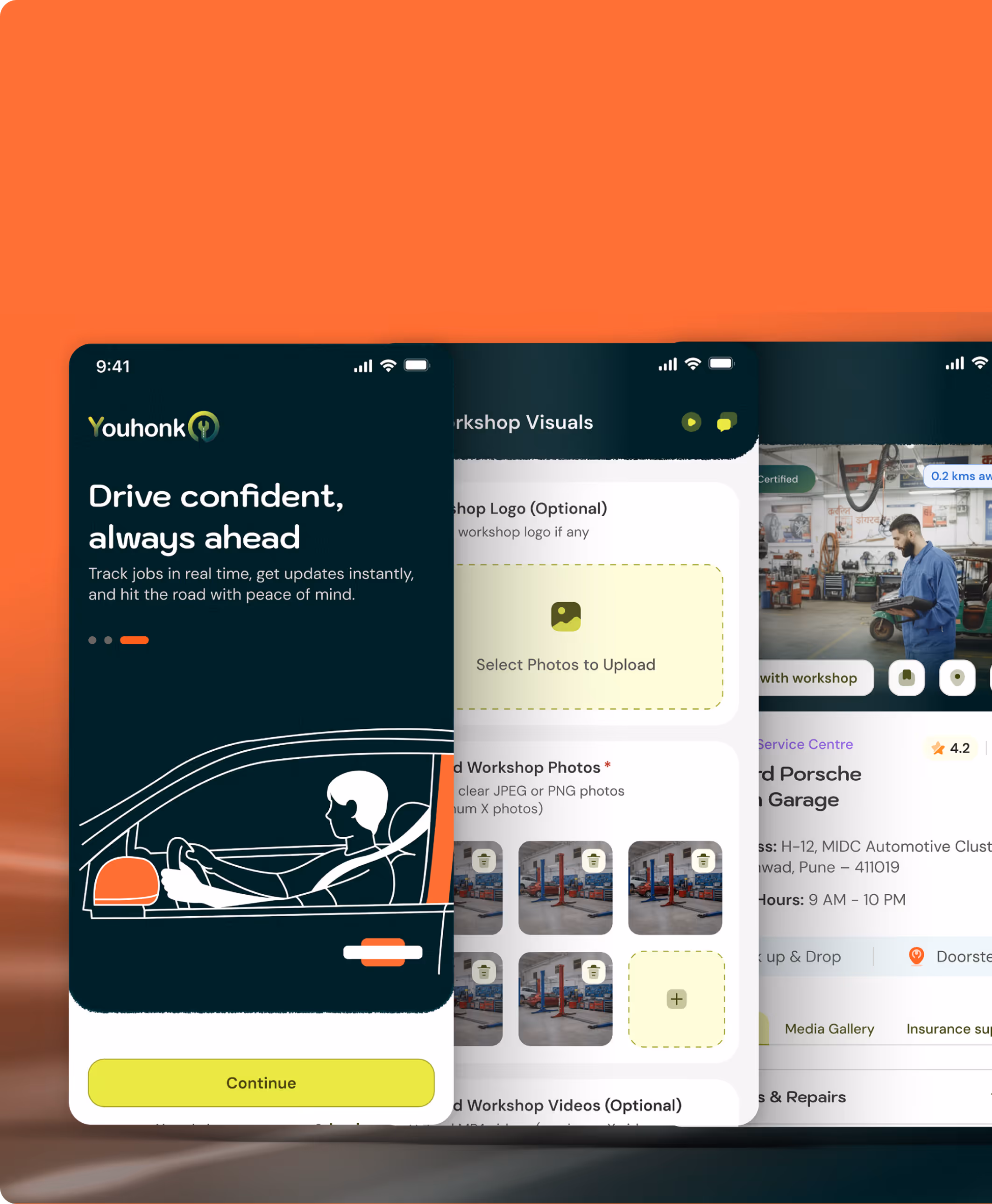
Youhonk
YouHonk is a vehicle servicing and management platform designed to simplify how users discover, book, track, and manage vehicle services, while enabling workshops to efficiently manage operations, customers and revenue.
.avif)
.avif)
Enterprise & SAAS
UI Design
UX Design
Service Audits and Research
EPICPASS
Experience the ultimate membership with Epic Pass, a Dubai-based platform bringing the future of bundled subscriptions to the present. With one yearly membership, users unlock access to multiple subscriptions and exclusive offers from 50+ trusted brands including entertainment, food, wellness, and lifestyle services.
.avif)
Enterprise & SAAS
UI Design
UX Design
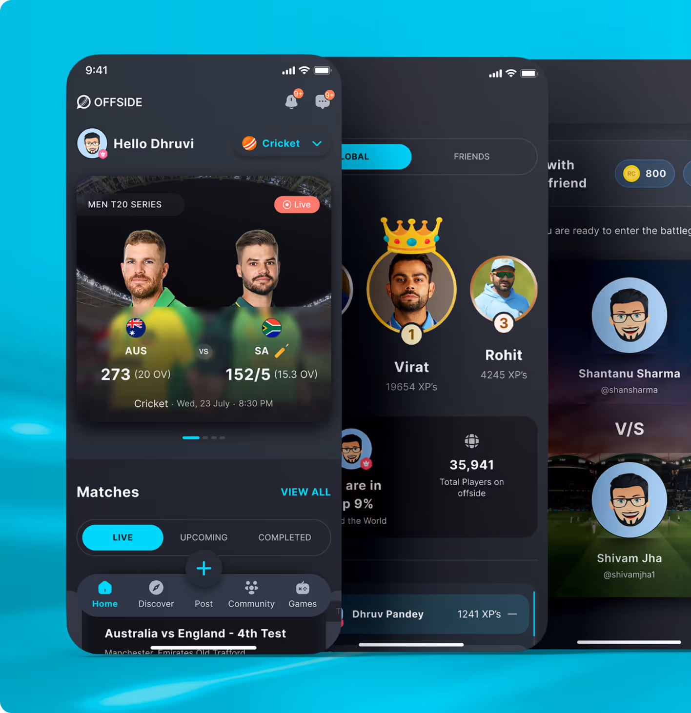
Offside
A revamped mobile and web experience to boost user engagement, retention, and community interactions around the cricket ecosystem.
Retail & E-commerce
UI Design
UX Design
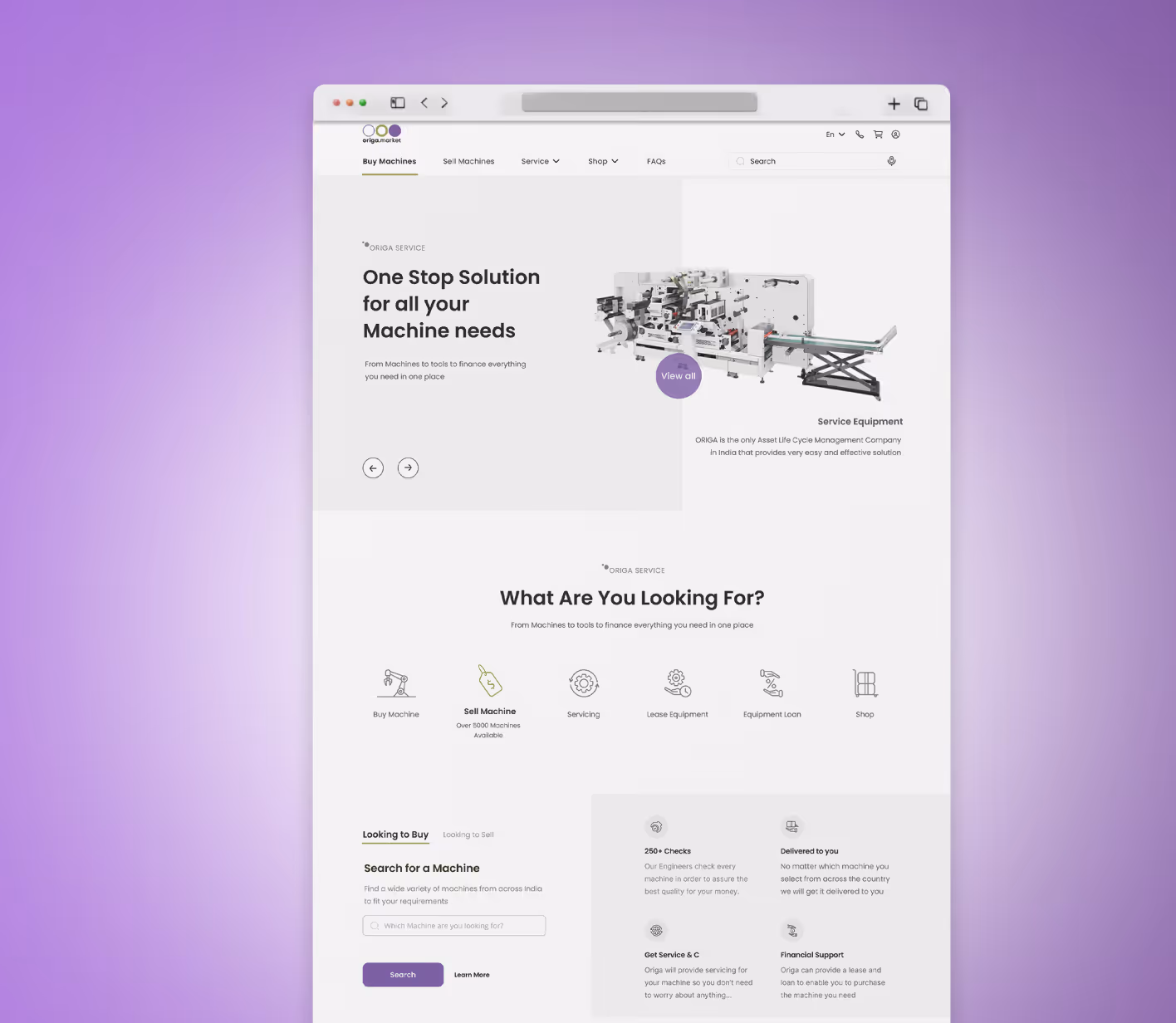
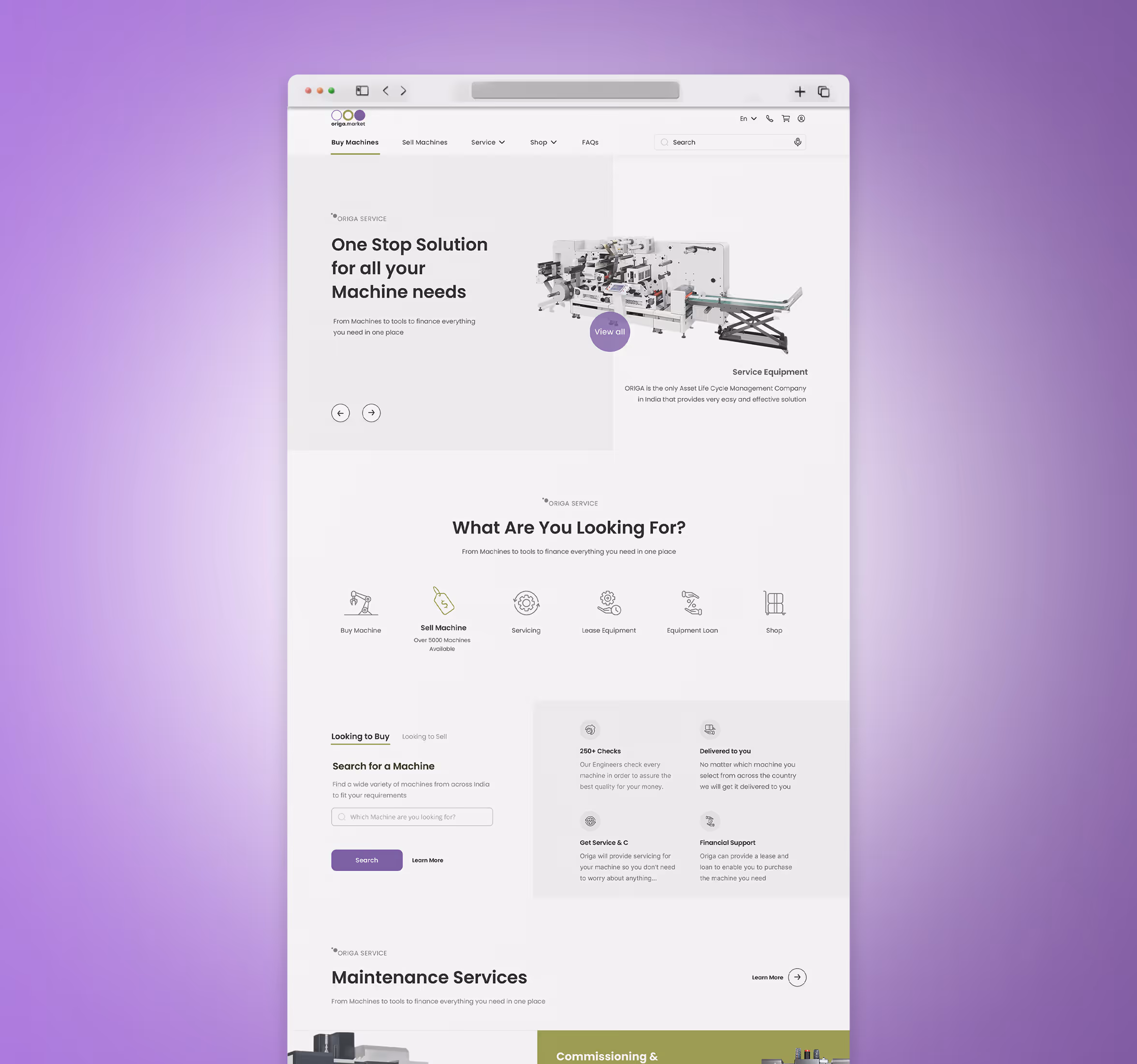
Origa
A digital design that simplifies machinery leasing and management for industrial users.
Retail & E-commerce
UI Design
UX Design
Brand Strategy
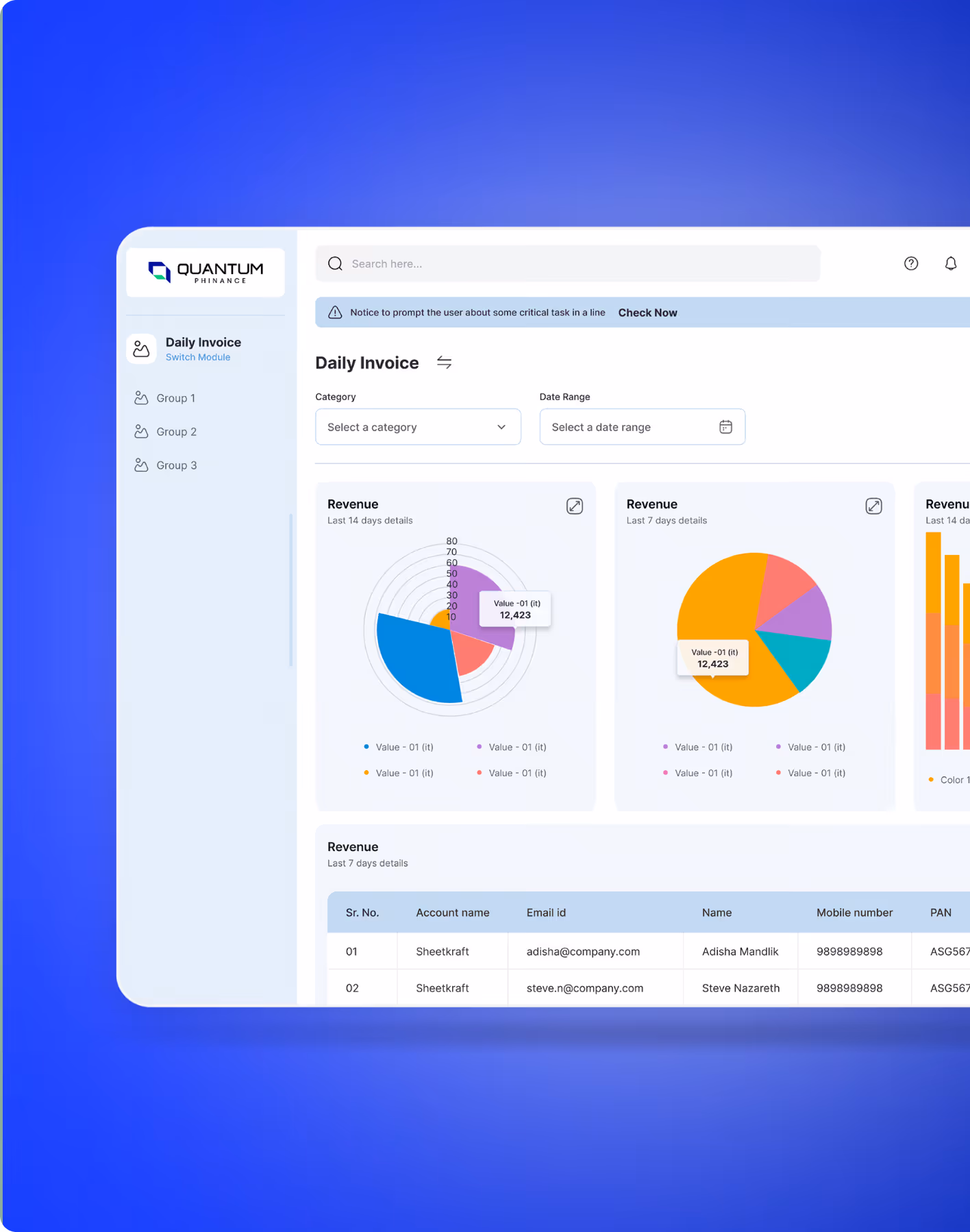
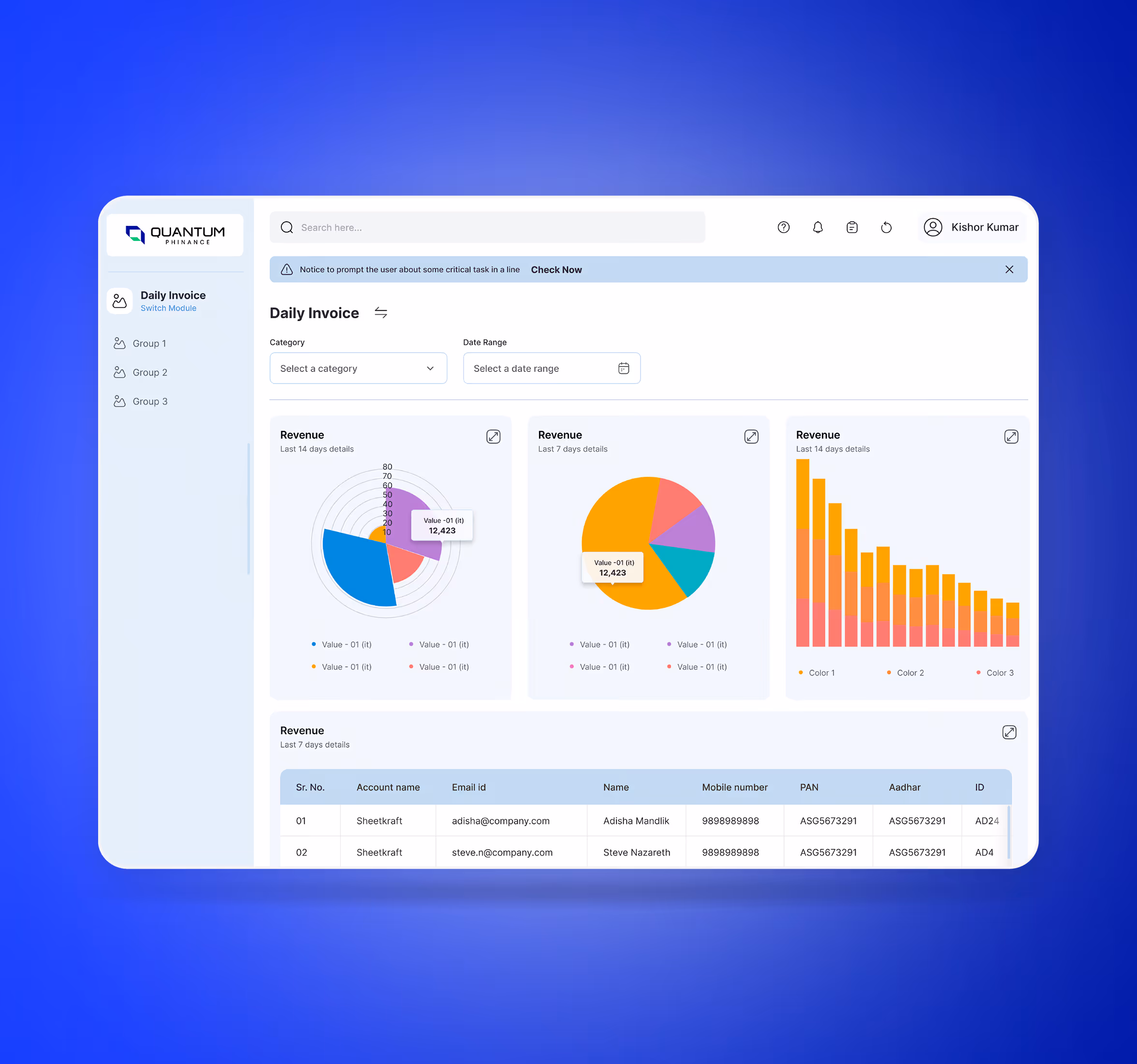
Sheetkraft
SheetKraft is a B2B e-commerce platform by JM Group that simplifies the sourcing of industrial-grade plywood, laminates, boards, and surface materials for contractors, carpenters, and businesses across India. The platform brings transparency, pricing clarity, and convenience to an otherwise fragmented procurement ecosystem.
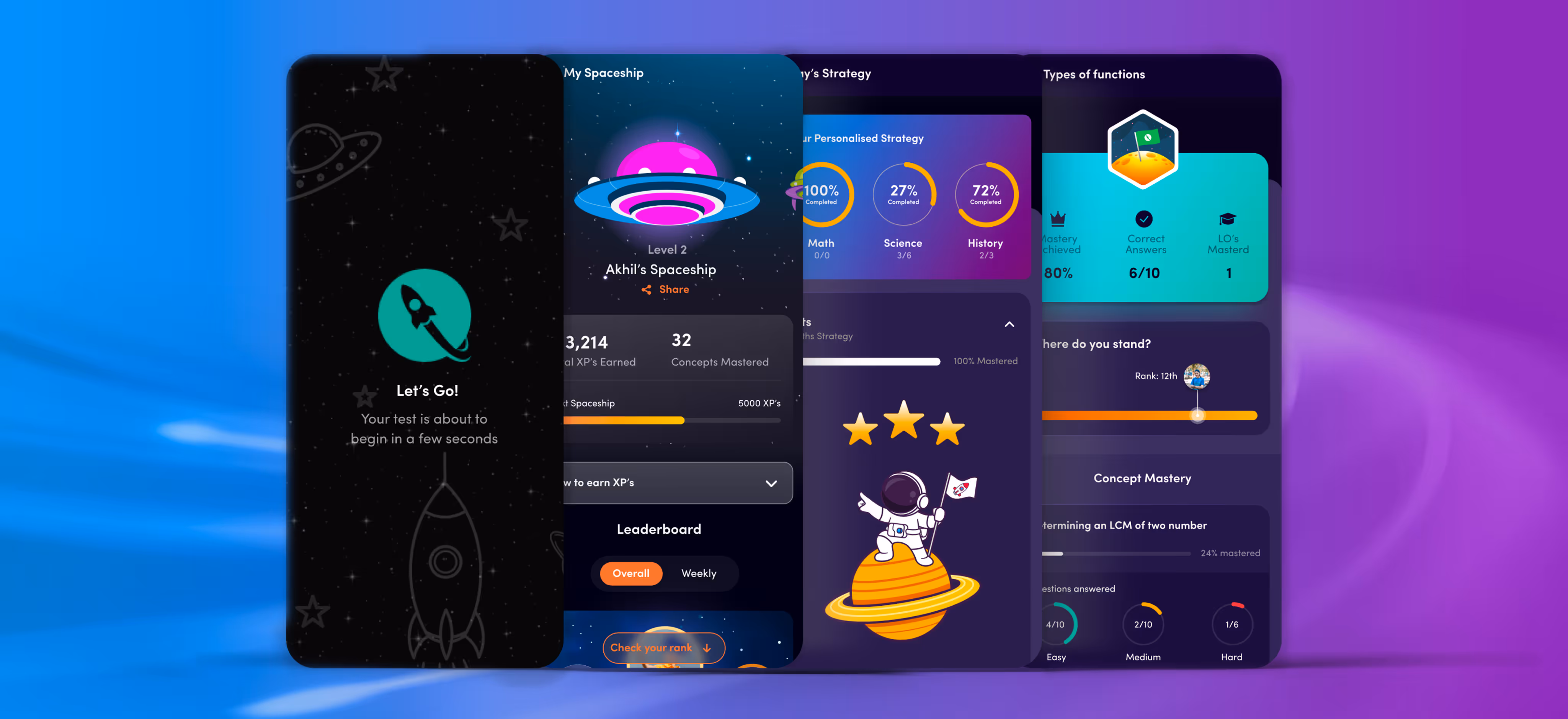
Edtech
UI Design
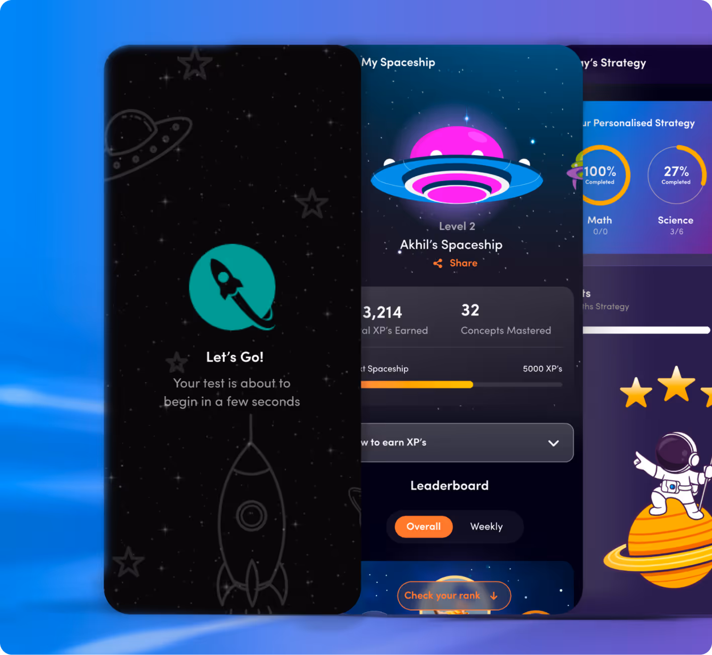
Questt
An e-learning platform for classes 8–12 with gamification and personalised analytics to help students master their weak areas and excel in exams.
.avif)
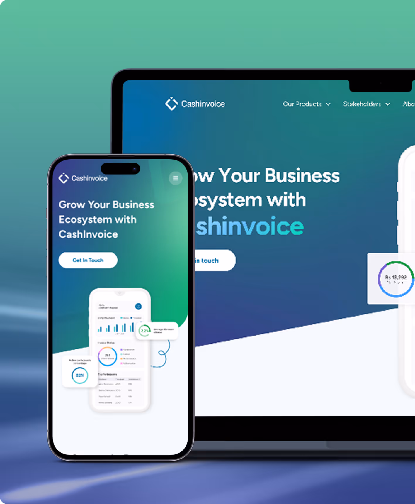
Fintech & banking
UX Design
UI Design
Cash Invoice
Modernising payable and receivable workflows for faster, clearer financial operations. Helping businesses move from manual complexity to streamlined, transparent processes that accelerate cash flow and strengthen supplier-buyer relationships.
.avif)
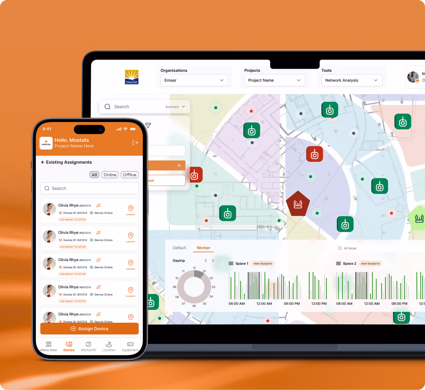
Enterprise & SAAS
UX Design
UI Design
Wakecap
Wakecap is designed to provide heavy-duty workers with a safe working environment.
.avif)
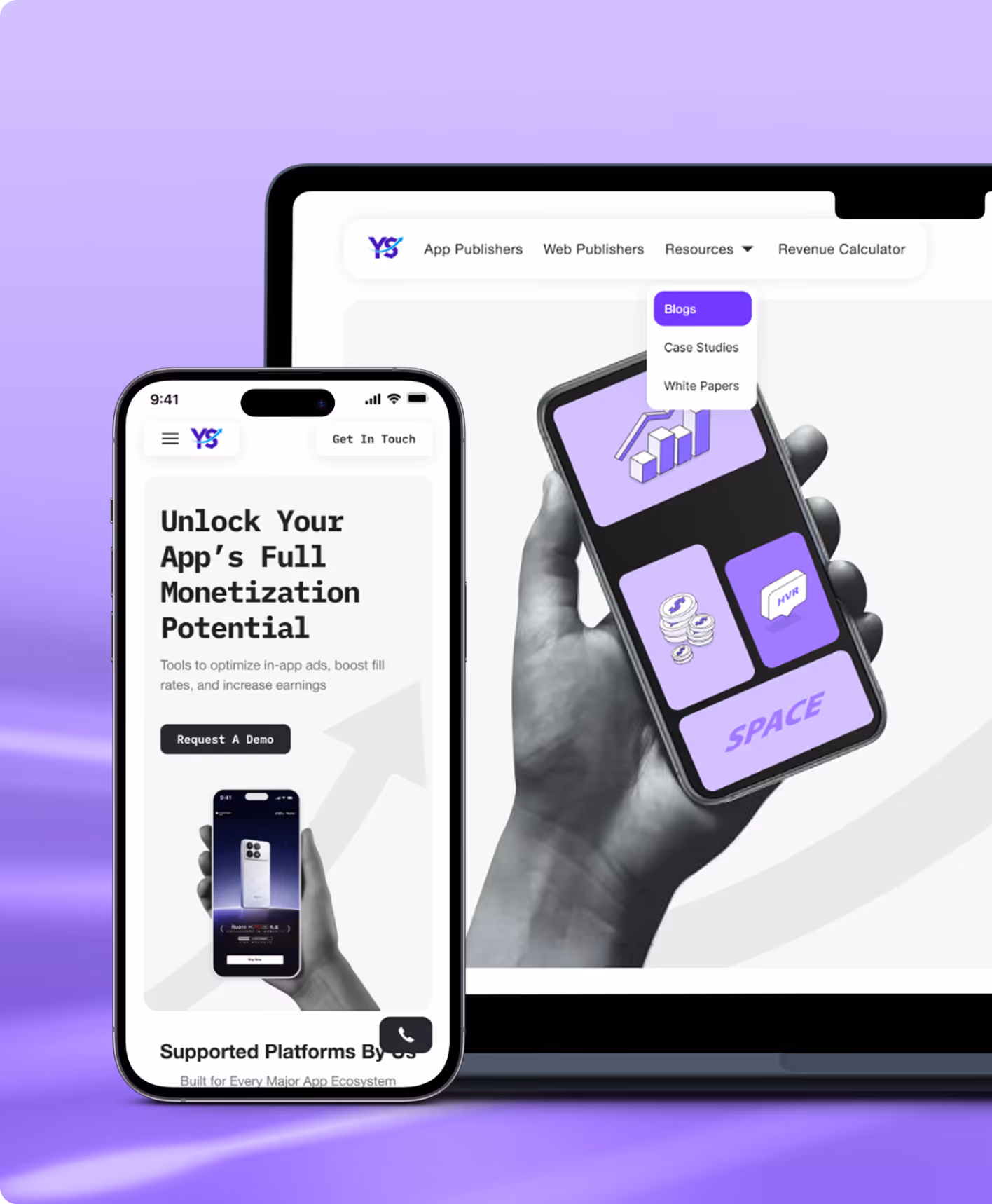
Enterprise & SAAS
UX Design
UI Design
Yield Solutions
YieldSolutions develops advanced programmatic products for digital content publishers to extract more revenue from the programmatic world. This project aimed to build a modern design that positions Yield Solutions as a trusted leader in ad-tech innovation.

Oops!
No results found.
Turn your Ideas to innovation
We design what moves people and scales products. Discover user behaviour and key aspects of product strategy.
.avif)
Stay Ahead with Slices
Good design starts with Sliced Newsletter
Subscribe to the Sliced newsletter and get the best of research, UX writing, product psychology, CX, and design systems, right in your inbox.
