From Insights to Interfaces
Strategy, Research, Design.
We partner with innovators and enterprises to create user-centric experiences that drive value
and success.

Beyond Design:
Crafting Value, Driving Success
Customer-centric products reveal how users truly think and what they expect.
Unlock User Insights
with Strategic UX Research
Data-Driven Decisions
Transforming real user needs into intuitive digital products.
Time & Cost Efficiency
Validate before you code to avoid costly revisions later.
Competitive Edge
Reveal hidden user insights competitors missed.
Custom Solutions
Design features that solve real-world user problems.
Discover Users
Uncover Needs
Our UI/UX Design company uncovers the needs behind user actions. Empathy isn’t a buzzword; it’s our blueprint.
.avif)

.avif)
.avif)

.avif)
.avif)

.avif)
.avif)

.avif)

Discover User Needs Create Value
At Yellow Slice, we don’t just assemble numbers as user data. We immerse ourselves in the users' world. DRILL Lab, our in-house research subsidiary, turns user data into actionable ideas.
Unlocking User Needs:
Empowering Brands
Want to improve your user experience?
Let’s make your UX unforgettable.
Craft Seamless Experiences.
Build Powerful Products.
Improved User Satisfaction
Craft intuitive interfaces that users love to return to.
Higher Conversion Rates
Design intuitive user flows that nudge users to act.
Reduced Support Costs
Intuitive interfaces reduce the need for customer support.
Consistent Experience
Create a unified experience across all platforms and touchpoints.
Go Beyond Aesthetics.
Design Meaningful Experiences.
Our UX/UI & Digital Product Design services delve deep to create intuitive and engaging experiences rooted in true user understanding.
Shaping Vision Digitally
Creating Impactful Products
Transform Your User Experience!
Let's Kickstart Your UX/UI Project!
Shaping Your Vision
Designing Impact
Enhanced Customer Loyalty
Build experiences that create emotional connections with customers.
.avif)
Reduced Customer Churn
Address pain points that cause customers to leave for competitors.
Comprehensive Experience
Create connected experiences across all touchpoints in the customer journey.
Streamlined Operations
Improve efficiency by aligning customer-facing and backend processes.
Optimise Interactions
Deep empathy, actionable insights. Our services unlock true customer understanding.
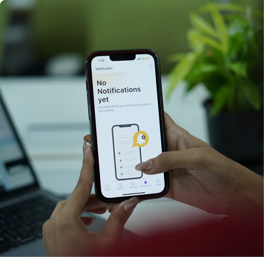
ready to Transform USER Experience!
Let’s reimagine CX that stands out.
Elevate Every Touchpoint
Build Unified Flows
Brand Recognition
Create visual identities that are memorable and instantly recognizable.
Consistent Brand Experience
Develop guidelines that ensure your brand is presented consistently everywhere
Differentiation
Stand out from competitors with a unique and authentic brand positioning.
Customer Connection
Build emotional connections with your audience through strategic storytelling.
Discover Brand Soul
We identify what makes your brand unique and express it through visuals and identities.
.avif)
.avif)
.avif)
.avif)
.avif)
.avif)
.avif)
.avif)
.avif)
.avif)
.avif)
.avif)
.avif)
.avif)
.avif)
.avif)
.avif)
.avif)
.avif)
.avif)
.avif)
.avif)
.avif)
.avif)
Trusted to Build Iconic Brands
Ready to Define Your Brand's Future?
Let’s talk about your vision and turn it into something remarkable. Together, we’ll create a brand story that defines success.
Beyond Strategy:
Bringing Designs to Life
Strategic design, expertly coded. Our front-end team ensures your vision is flawlessly executed.
Front-End Development
Pixel-Perfect Implementation
Ensure your designs are implemented exactly as intended across all devices.
Responsive & Accessible
Build interfaces that work for all users regardless of device or ability.
Maintainable Code
Ensure your designs are implemented exactly as intended across all devices.
Optimised Performance
Create fast-loading experiences that keep users engaged.
Tangible Impact,
Real Results
See how our strategic design and research services delivers measurable growth.









.avif)
.avif)
.avif)

