
The hummTumm case study showcases our UI/UX design strategy to help the matchmaking app stand out from its competitors. Read to know the details.
HummTumm is an entertainment app that uses the “Tree of Life” concept to help its users find soul matches. Unlike a simple, person’s profile, HummTumm allows its users to curate multiple aspects of their profile that showcase user personality, lifestyle, zodiac signs, emotional quotients, and more.
HummTumm to create an app that helps its users find their ideal match while also standing out from the competition like Tinder and Bumble.
To be able to come up with a design that reflects the core idea of the client, we first started by understanding how we were going to present the product in a way that motivates the users to engage with it.
The client wanted an app that would allow users to interact with each other and showcase their reflective traits and characteristics. To be able to present the features that our client had in mind, we first started a competitor analysis that gave us an idea of what the competition is offering in terms of app design and user experience. Our goal was to design something that fell in line with the trends while being interactive with the user to keep them constantly engaged.
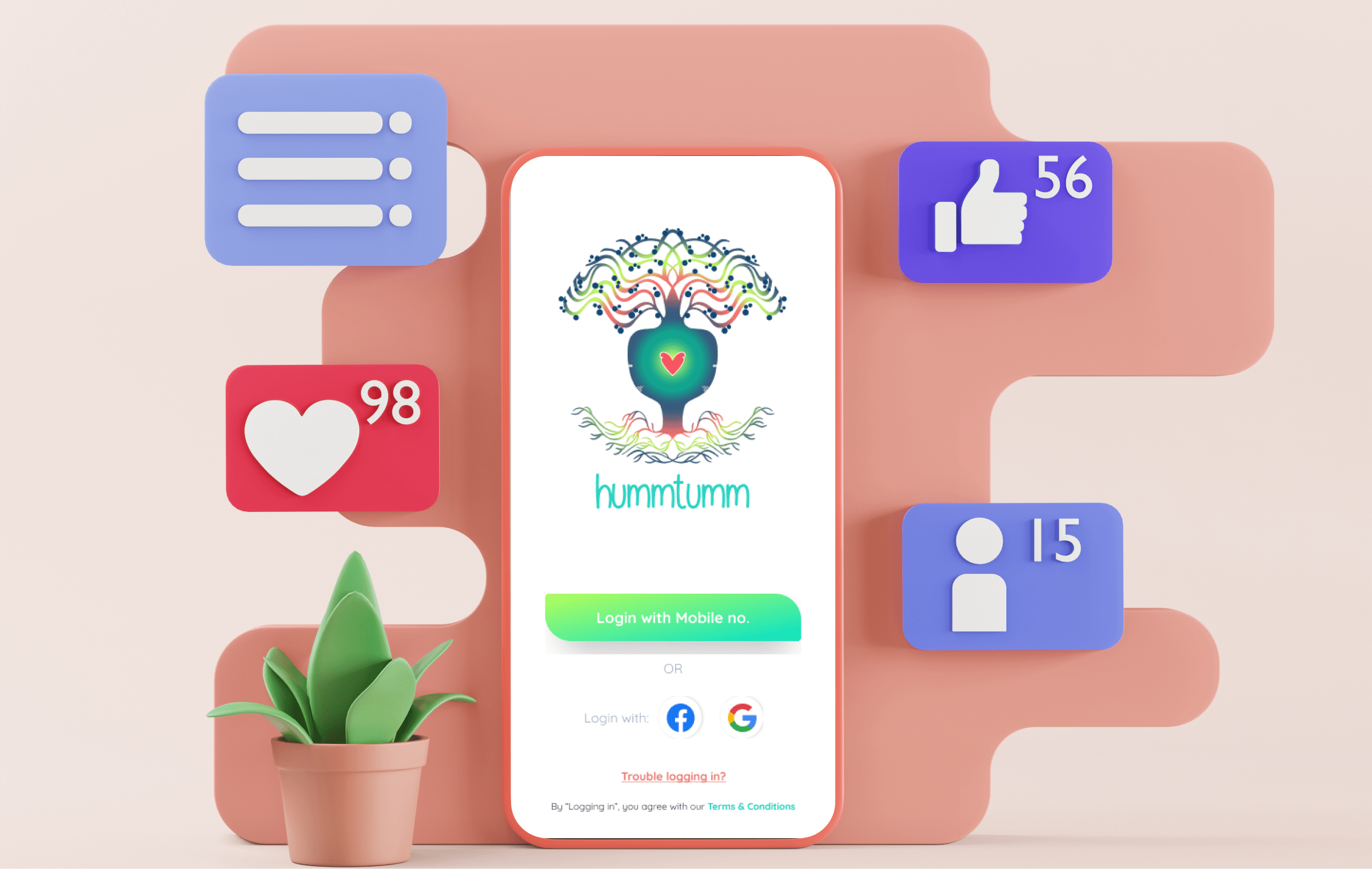
After a brainstorming session, our team members collected information from various sources. Going forward with detailed discussions, the team had to perfectly showcase the main features that make the product unique from its competitors.
We came up with two features for that:
Based on concept explorations meetings with the stakeholders and our team's insights, user personas were created to start the UI/UX designing process.
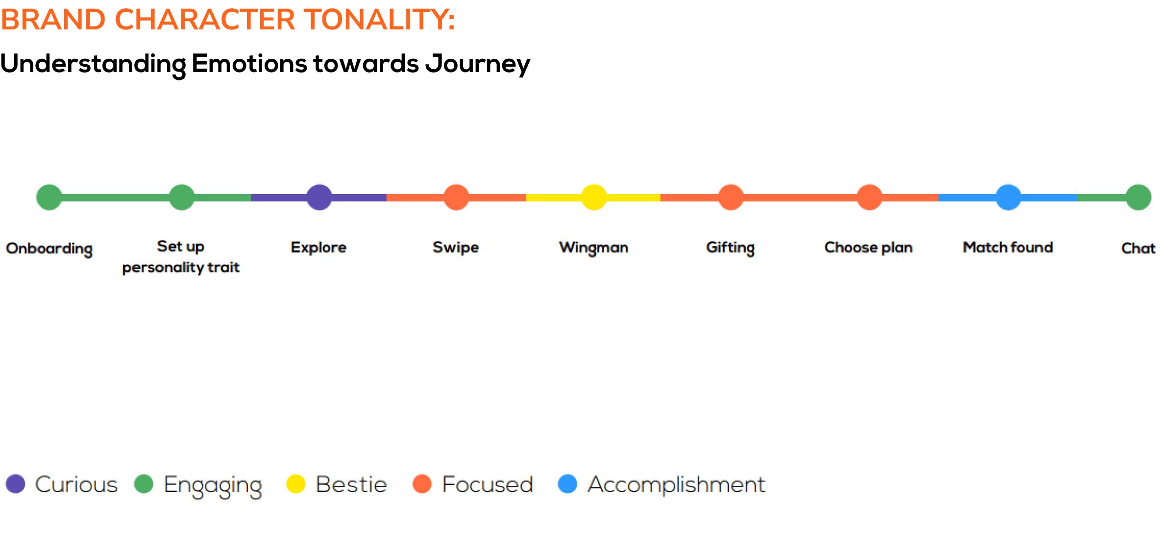
At first, the team worked on user personas for primary target group users followed by secondary user personas. This is followed by features lists, user journeys, brand character tonality, task flows, and sitemap.
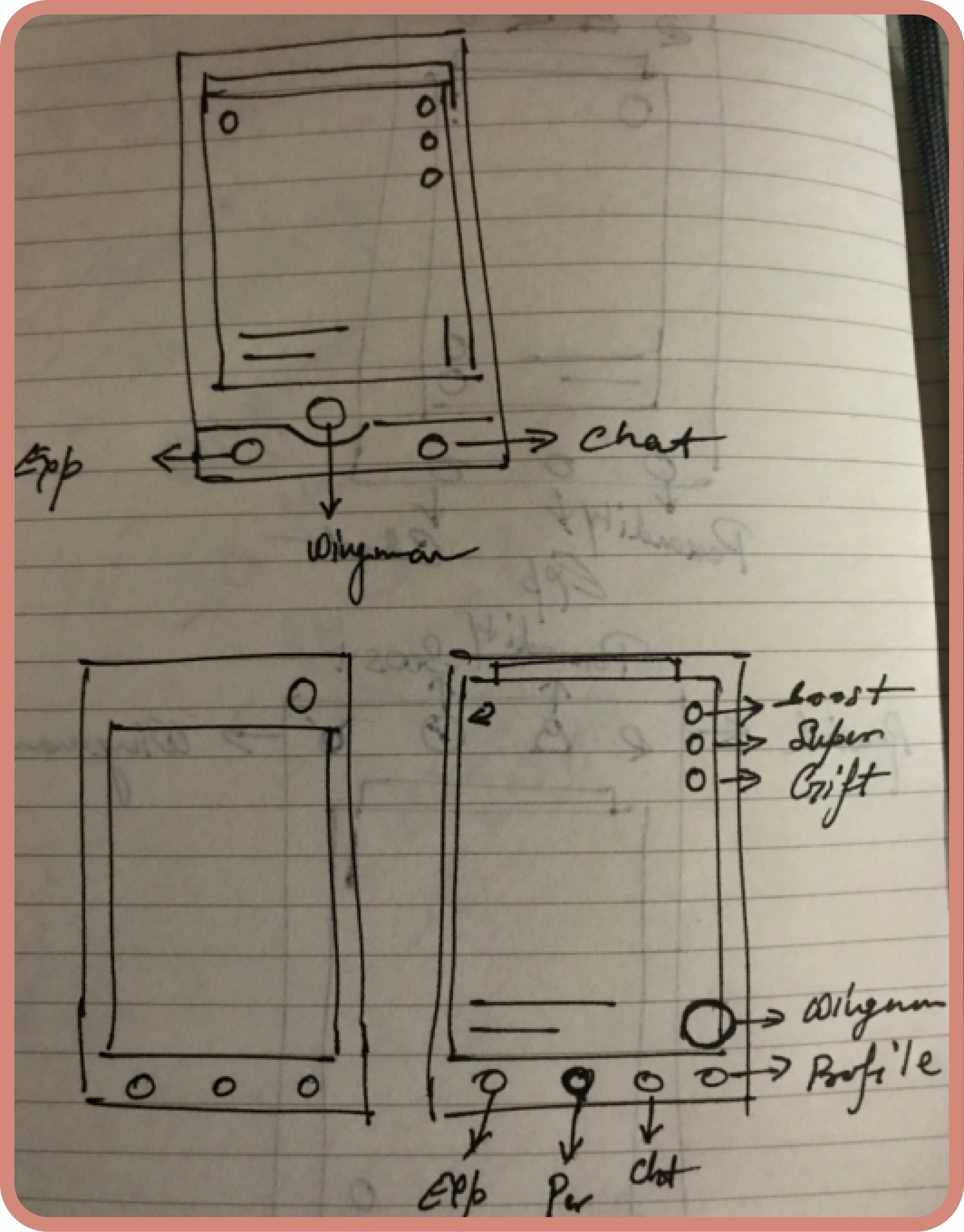
Navigation and User Testing is a crucial stage of the process where the team explores and comes up with 2 options and conducts user testing where it suggests the better option based on the results.
Next, we worked on wireframes followed by UI sample created, and lastly, the UI of all internal pages are worked on along with micro animations, icon design, and interactive prototype before handing over the product to the client
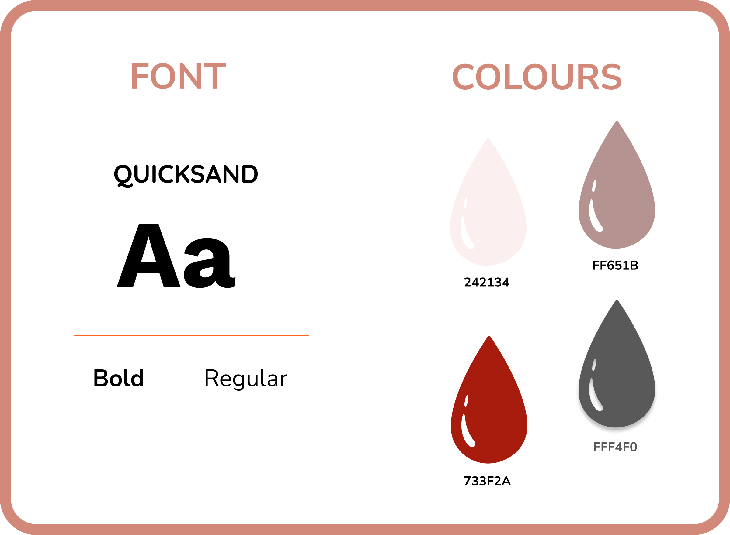
For better readability and a clean look, we choose the Quicksand font family across the app. Whereas, Red hue was used for the monochrome color scheme symbolizing the color of love and soulmates.
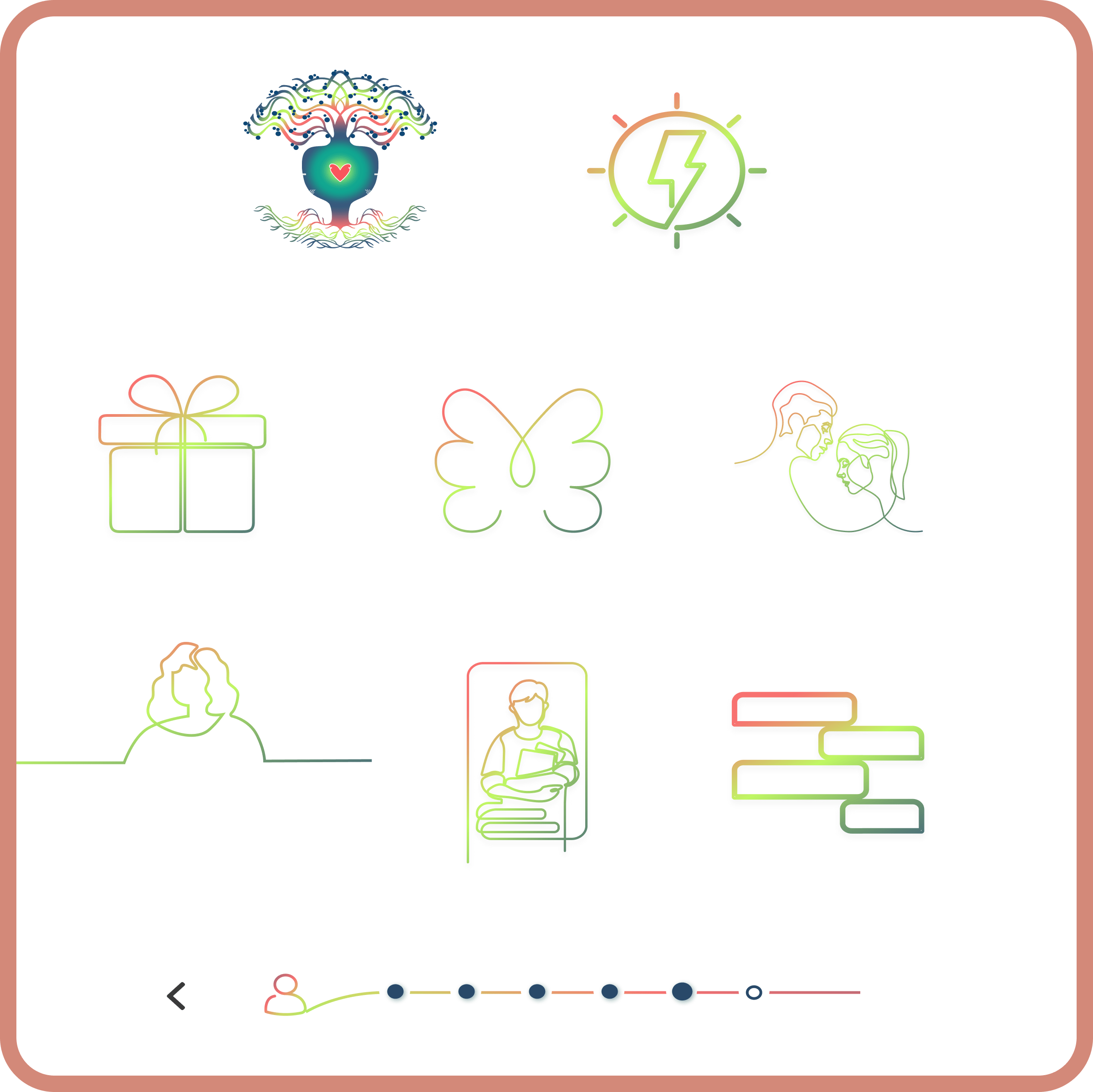
For icons of the app, we went with a bright multicolor gradient line art. This kept the interface clean and reflected the idea of a bright color explosion of the cosmos.

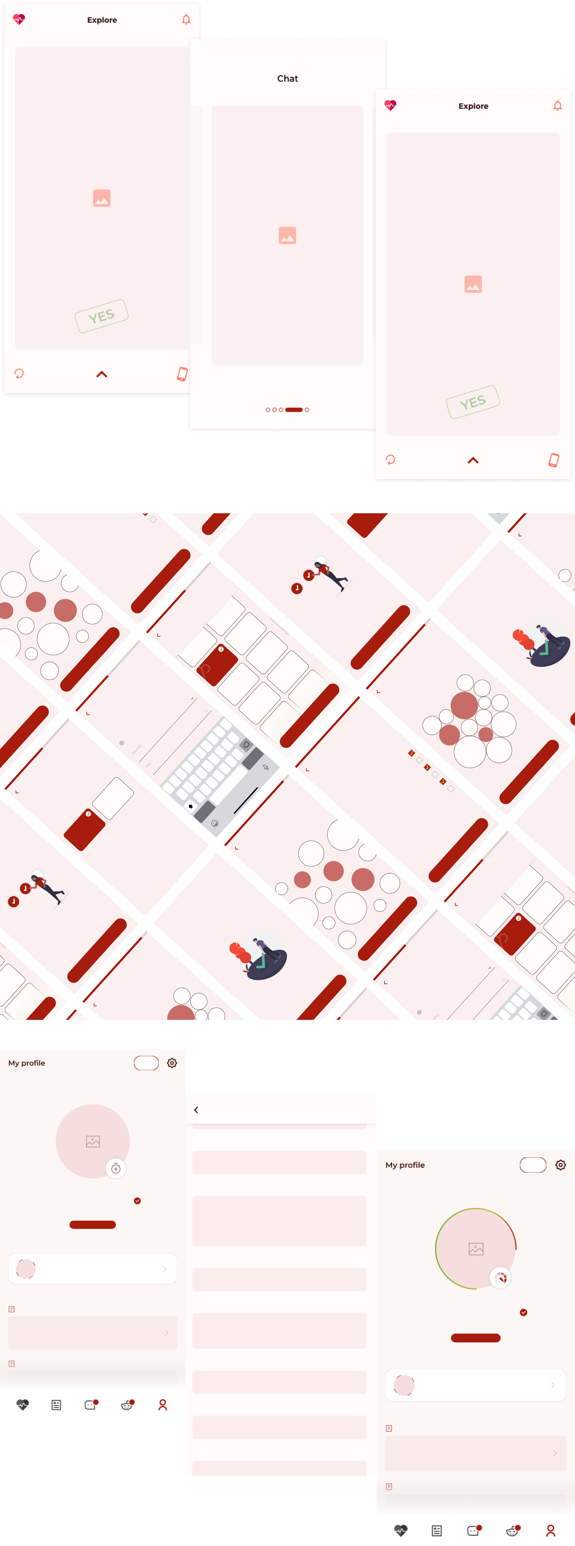
The Wingman offers great interactive support to its users. The minimalistic design enhances the user experience while using different features of the app. It has a MAYBE feature that allows users to revisit the profile and swipe right or left at their leisure -unlike other platforms where the profiles are lost once you swipe left.
Connect with us to schedule a quick consultation call if you are looking for robust and result-oriented UI/UX design solutions for your brand.
Follow us on Instagram and LinkedIn for more updates on our services.