The case study illustrates how Yellow Slice helped Go-MMT design an online ads platform to help brands from the hospitality sector manage their digital marketing efforts.
Make My Trip is an online travel aggregator ( OTA ) platform that offers online travel booking services to its customers. They have served over 5 million customers and have a worldwide presence. Users can book their journeys, stays, and activities using one platform. Currently, Make My Trip is India’s leading travel aggregation platform and has tie-ups with India’s popular hospitality chains including hotels, events, and more.
Create an ad management platform for brands that the target audiences are interested in their services while reducing the dependency on third-party ad platforms such as Google Ads.
An individual ad platform was a great way to leverage the traffic that visited their website and app while keeping the user data safe from third-party websites.
We needed to design a web application where corporate users can register and manage or run their ads on the websites and apps falling under the Make My Trip umbrella.
Our goal was to design a platform that users can quickly get used to, one that had an almost negligible learning curve.
To achieve our goal, we first started designing the task flow of the platform.
Designing the task flows for different features within the web application allowed us to understand the user flow for features within the web app.
Based on the task flow, we designed wireframes that showcased how the web application may look to its users. Multiple changes and iterations were made before designing the ones that best suited the features’ needs.

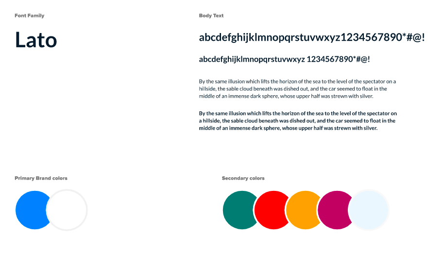
Once the wireframes were made, it was time to decide the UI elements we will be using to design the interface of the web application. The application was going to be used by professionals well-versed in digital marketing and ad platforms. And hence it needed to give them the same clarity and ease of creating ad campaigns to run on the Go-MMT platform.
We decided upon using the Lato font family for its sophisticated sans-serif style that is modern and professional.
For colors, we went ahead with the brand colors for the primary color palette whereas bright, easily recognizable colors were used as secondary colors for elements that needed to be highlighted.
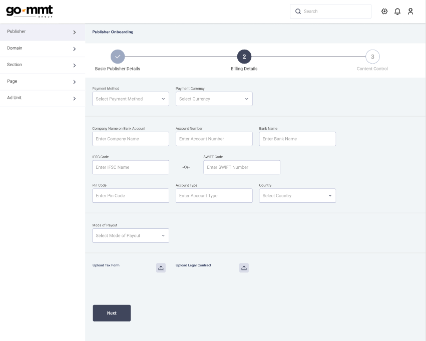
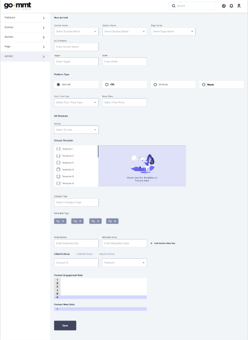
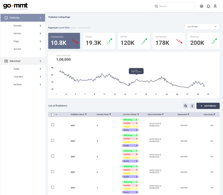
With the elements selected and designed previously, our team came up with the following UI screens for the Go-MMT web application.
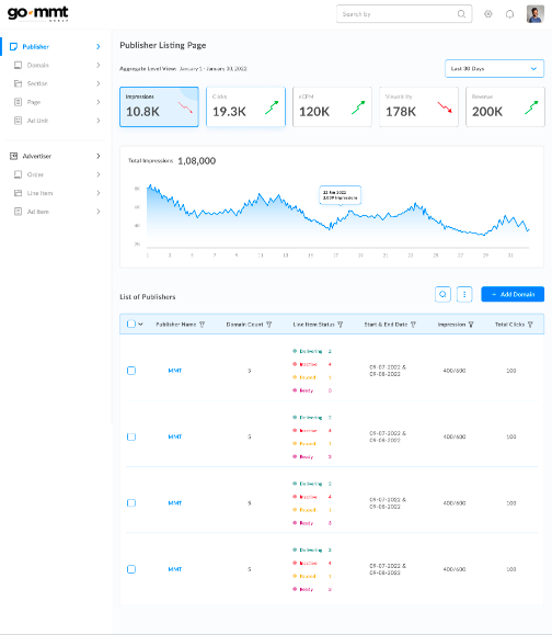
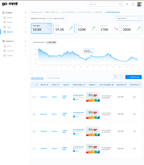
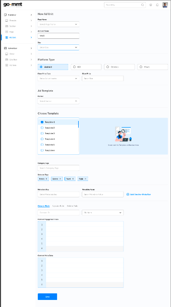
The web application used a simple, clean, and minimal design interface that brought the features and functionality of the application to the forefront. The interactive elements used in sections like template selection added to the user engagement with the app. Filters for data sets made finding the necessary information quick and easy. The onboarding form drafts ensure that the users do not have to fill in all the information again in case they leave the page halfway through.
Want to create a similar project successfully? Send us a message to get a quick call back for a project consultation.
Follow us on Instagram and LinkedIn for more updates on our services.
