
A portal for academicians, educators, and students who want to access academic books and other resources like research papers, journals, review reports, and so on.
Type
Service
Duration
Business Type
Type
Service
Duration
Business Type
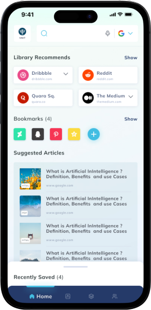
MyLOFT or My Library on FingerTips is a portal for academicians, educators, and students who want to access academic books and other resources like research papers, journals, review reports, and so on.
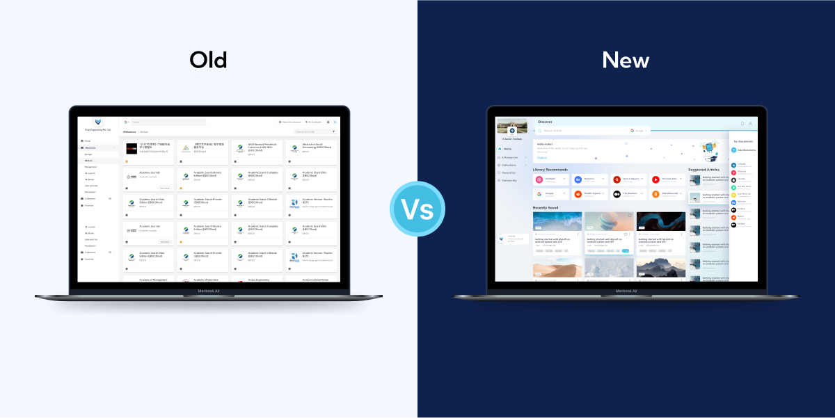
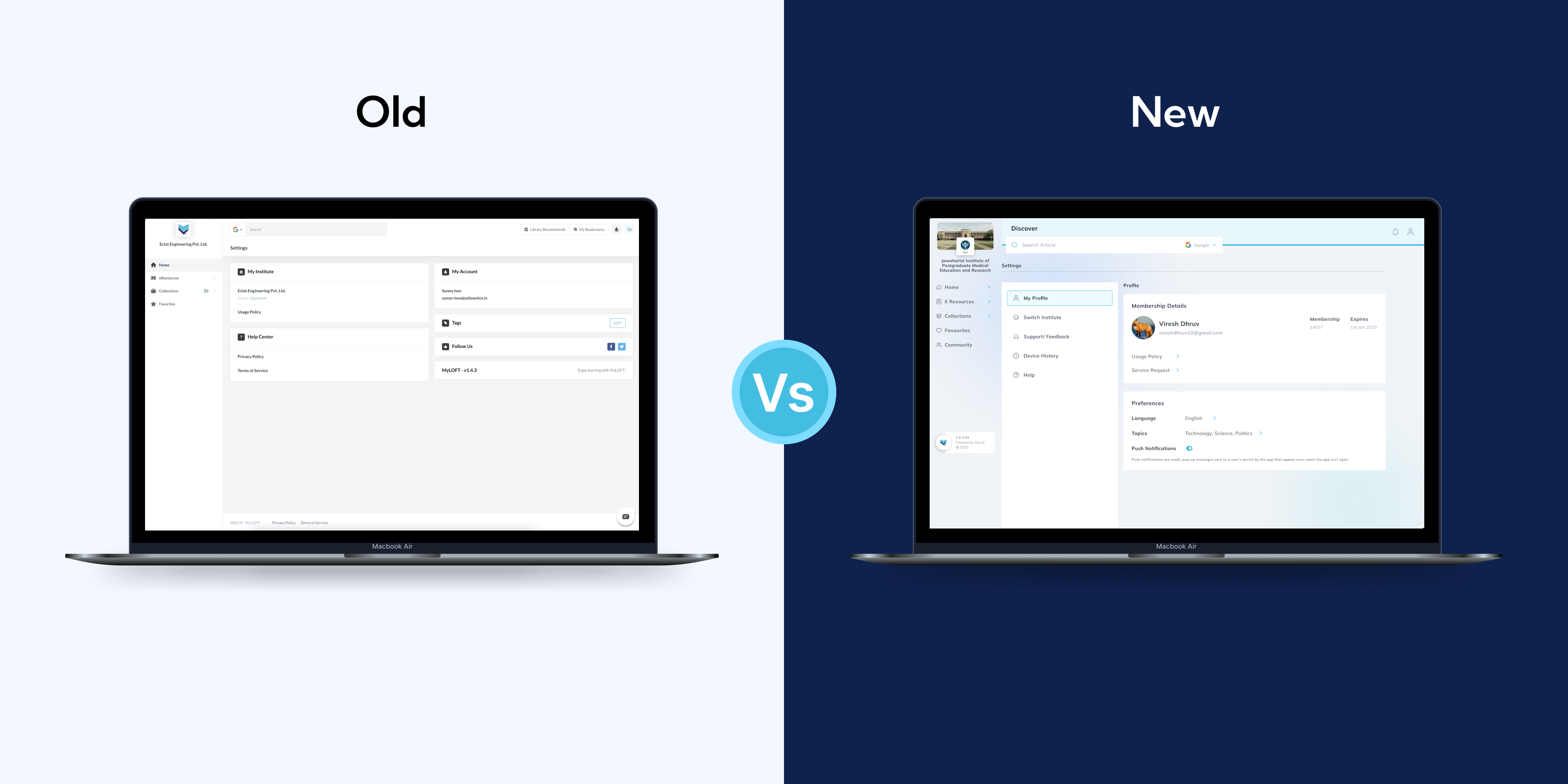
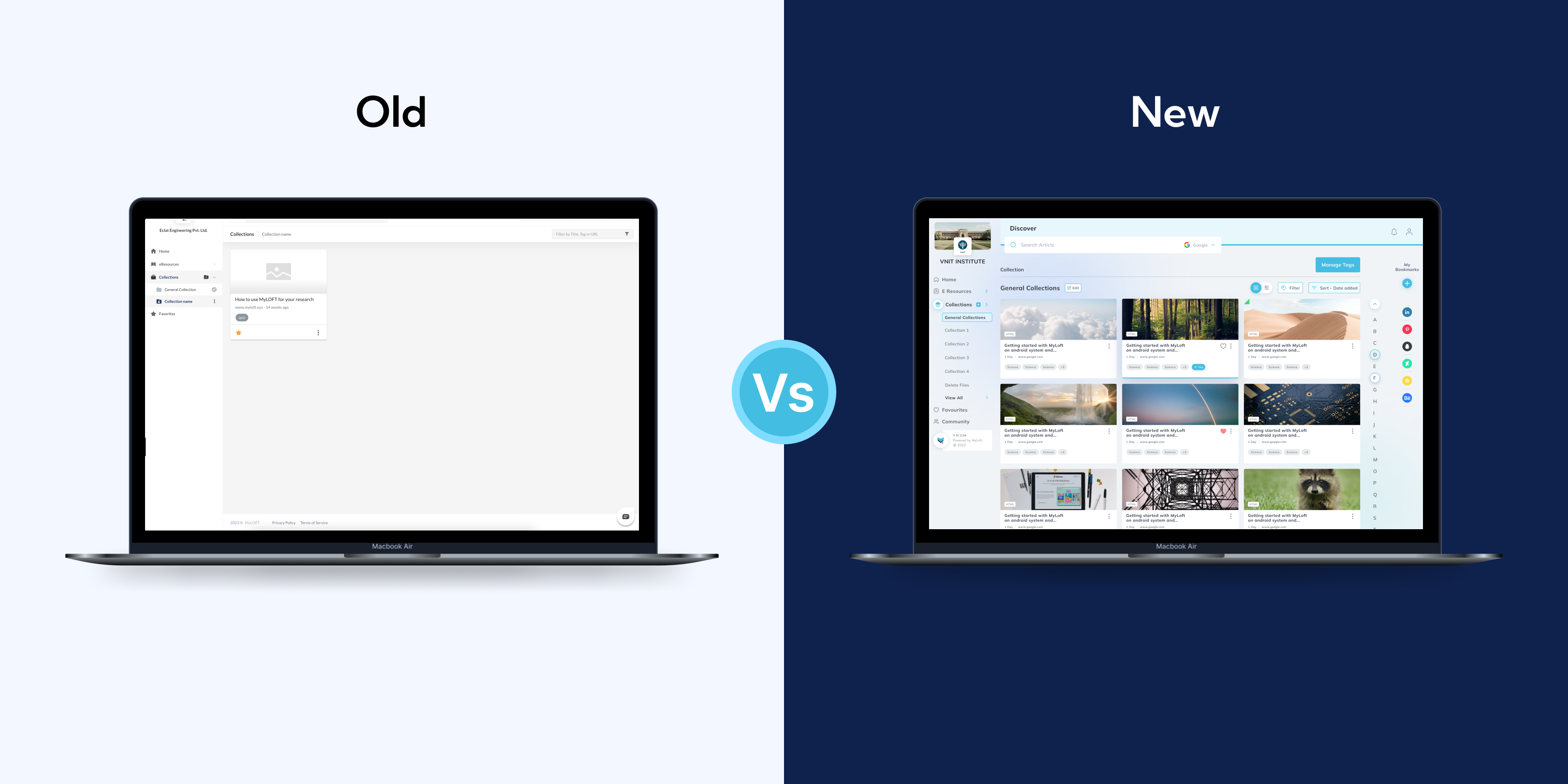
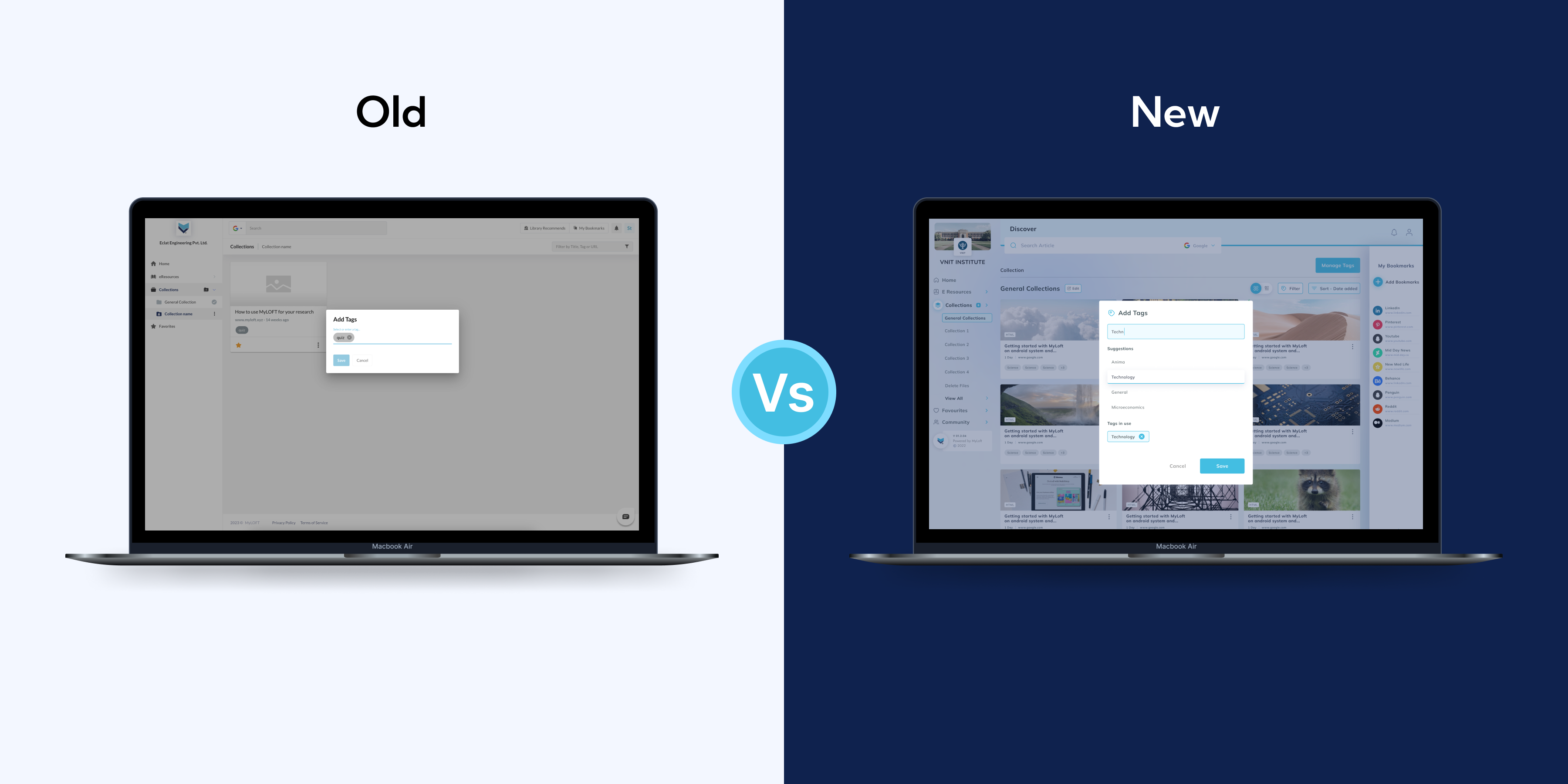
Our client from Eclat wanted us to redesign their mobile app and web plugin to streamline its user journey and improve the user experience. The app and plugin had similar features as their web portal that allows students to log in, view, organize, and read library resources online & offline.
Design thinking is a methodology that attempts to solve complex problems in a creative and user-centric way. Core features of the design thinking methodology include:
We started by conducting user interviews along with frequent meetings with subject matter experts to collect information that helped in forming user personas and a typical user journey map.

Used it for more than 1 month and went through reviews.

After understanding the user experiences, Now it's time to make it better.

An eye catchy quick-to-use interface to keep users engaged.
The client wanted us to find the gaps in the current user journey. We needed to understand the features included in the mobile application.


The client wanted us to find the gaps in the current user journey. We needed to understand the features included in the mobile application.
The client wanted us to find the gaps in the current user journey. We needed to understand the features included in the mobile application.

No weight tracker or graph, users can't see their progress.
Overly complex colors and some texts are too small, making it hard to use.
Monthly or yearly payment options are too expensive for the user to afford.
Add a weight graph, so user can keep track of their progress.
Need to create a quick to use UI with fewer colors and easily readable text.
Adding one-time payment plans so more users are willing to purchase.
The client wanted us to find the gaps in the current user journey. We needed to understand the features included in the mobile application.

The client wanted us to find the gaps in the current user journey. We needed to understand the features included in the mobile application.


Mobile App & Tablet / UX Design / UI Design

Website / UX Design / UI Design
Mobile App & Tablet / UX Design / UI Design
Website / UX Design / UI Design