
Native Ninja is a content localization service provider that helps users accomplish a plethora of tasks like dubbing, subtitling, etc.
Type
Service
Duration
Business Type
Type
Service
Duration
Business Type
Native Ninja is a content localization service provider that helps users accomplish a plethora of tasks like dubbing, subtitling, etc. The company wanted to make localization services easily accessible for its users through fast initiation, efficient collaboration, and iterations.
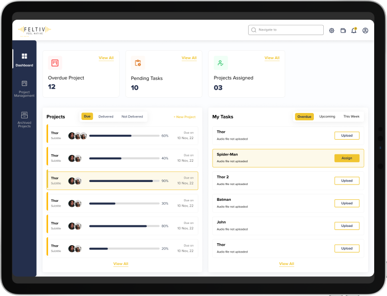
Native Ninja wanted us to redesign its website and mobile application and make it more responsive to generate higher leads on the platform.
To ensure that the project flows smoothly towards completion, we follow the STEP process which is acronymous to Soak, Think, Execute, and Proof.
The project was divided into two phases, UX designing, and UI design. We identified the target audience and recognized ways to position the product.


Task flows & sitemaps were redesigned to gain higher usability. Based on them, wireframes & emotions, and user journey maps were created.

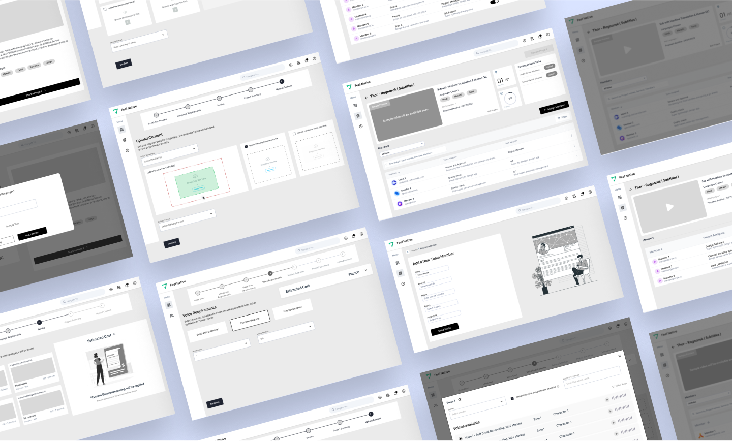
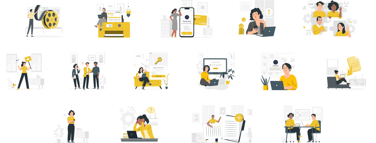
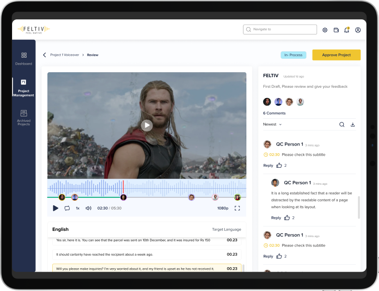
UI moodboard, UI samples, and UI dark mode samples were created to set the theme of the entire application. After client approval, UI screens were created for the website and mobile application.
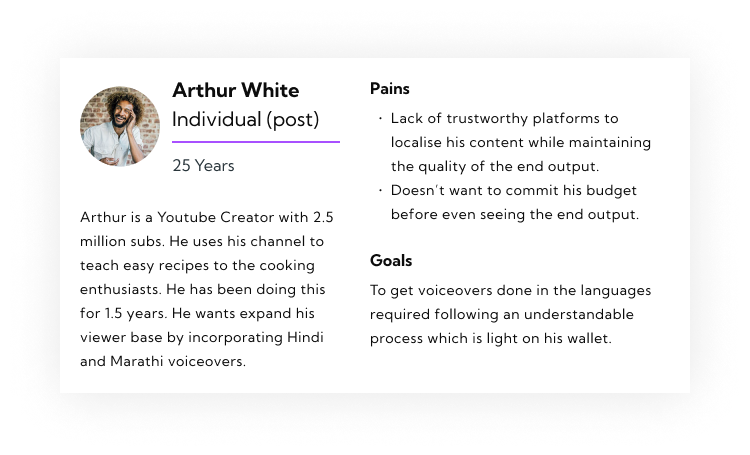
With the data & takeaways we received from the user research, user personas and use cases were created.
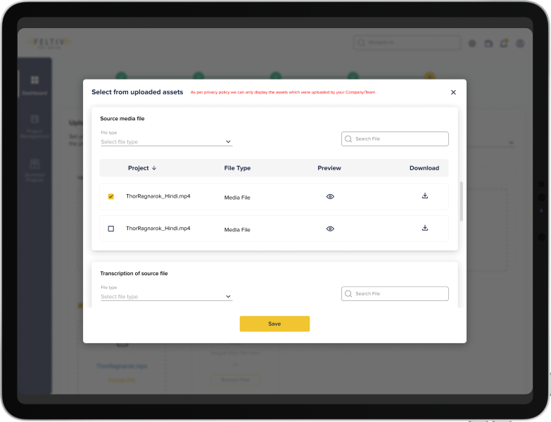
Most of their users found it difficult to collaborate with team members on existing platforms hence hampering the user journey.
Many of the users were willing to pay beforehand but the lack of plans thwarted their intentions.
Trust in the platform was a major issue
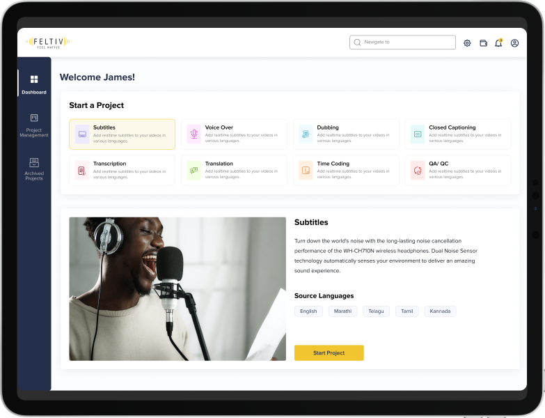
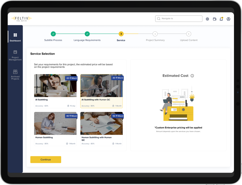
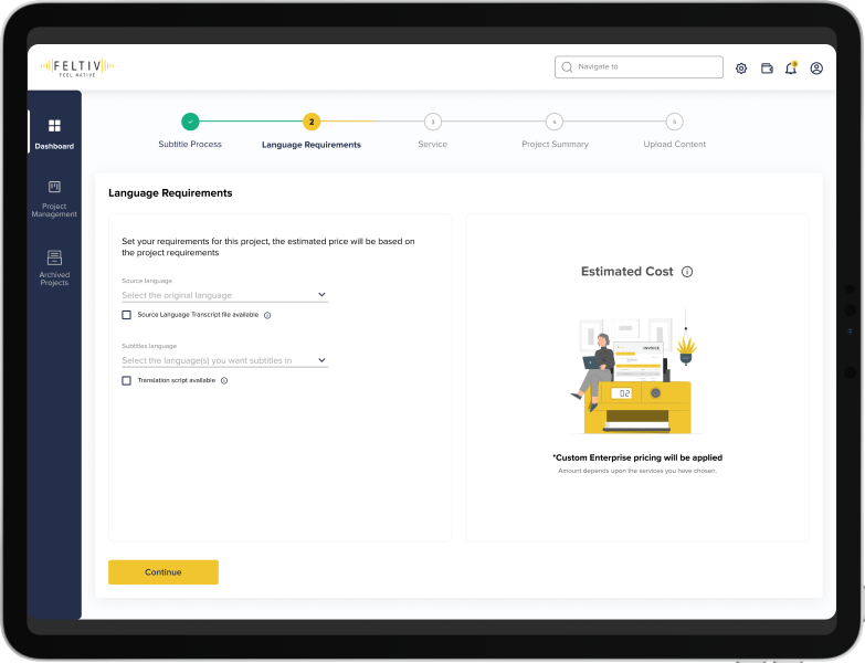
A holistic approach was taken to decode an accurate and easy service requirement including languages and AI/Human intervention.
We tackled the issue by proposing the best pricing patterns with regard to the industry standards.
We have implemented several safety features in the website and application to help it gain the trust of the users.
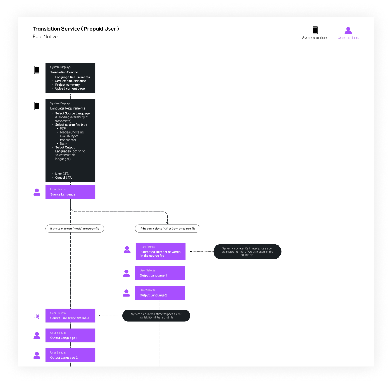
The following task flows were created to ensure optimum visibility of the best features so that users can find them easily.
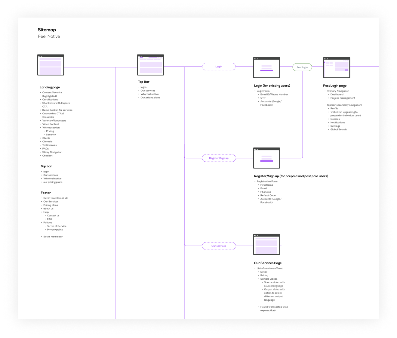
The Sitemap was redesigned to improve the usability of the application.
The client wanted us to find the gaps in the current user journey. We needed to understand the features included in the mobile application.


Mobile App & Tablet / UX Design / UI Design

Website / UX Design / UI Design
Mobile App & Tablet / UX Design / UI Design
Website / UX Design / UI Design