Designing Futures, Delivering Impact.
We blend deep insights, creative thinking, and rigorous execution to craft innovative solutions. Dive into our project portfolio to see our methodology in action.
Thank you! Your submission has been received!
Oops! Something went wrong while submitting the form.
.avif)
.avif)
Retail & E-commerce
UX Design
UI Design
Chaayos
A café app that lets you customise your in-store order, order your beverage your way.
.avif)

Travel
UX Design
UI Design
Make my trip
India’s leading online travel aggregator (OTA) platform that has served over 5 million customers with popular hospitality chains.
.avif)
Fintech & banking
UX Design
UI Design
Shoonya
A stockbroker platform that offers “zero-commission” transactions for various financial products.
.avif)
.avif)
Enterprise & SAAS
UX Design
UI Design
Civit Build
A construction management app that helps businesses optimise costs, improve project efficiency, and scale securely with complete data backup.
.avif)
Travel
UX Design
UI Design
Fedex
A cafe app that links to the POS system to allow users to customise their in-store orders.
.avif)
.avif)
Retail & E-commerce
UX Design
UI Design
JOY
An e-commerce app redesigned for RSH-JOY to enhance usability and navigation.
.avif)
.avif)
Edtech
No items found.
The Actor's Truth
A mobile-first platform making professional acting education accessible and affordable for aspiring actors.
.avif)
Fintech & banking
No items found.
Neoble
A professionally managed fintech platform enabling Mutual Fund investments
Fintech & banking
UX Design
UI Design
UX Writing
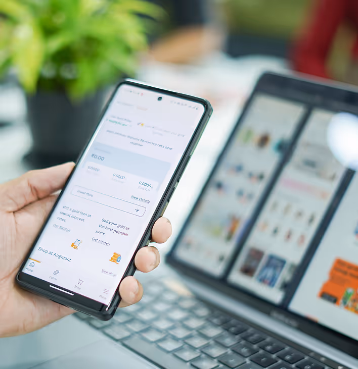
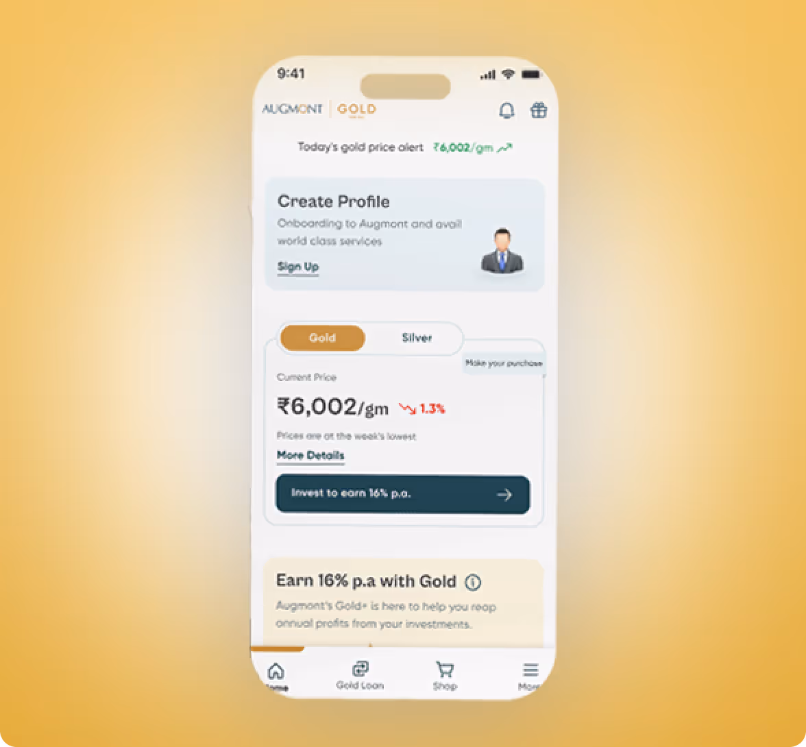
Augmont
Augmont's digital solution to trade in Gold easily and securely.
.avif)
.avif)
Fintech & banking
UX Design
UI Design
Paytm
An interactive learning platform within the Paytm platform that teaches users the fundamentals of trading.
Enterprise & SAAS
No items found.
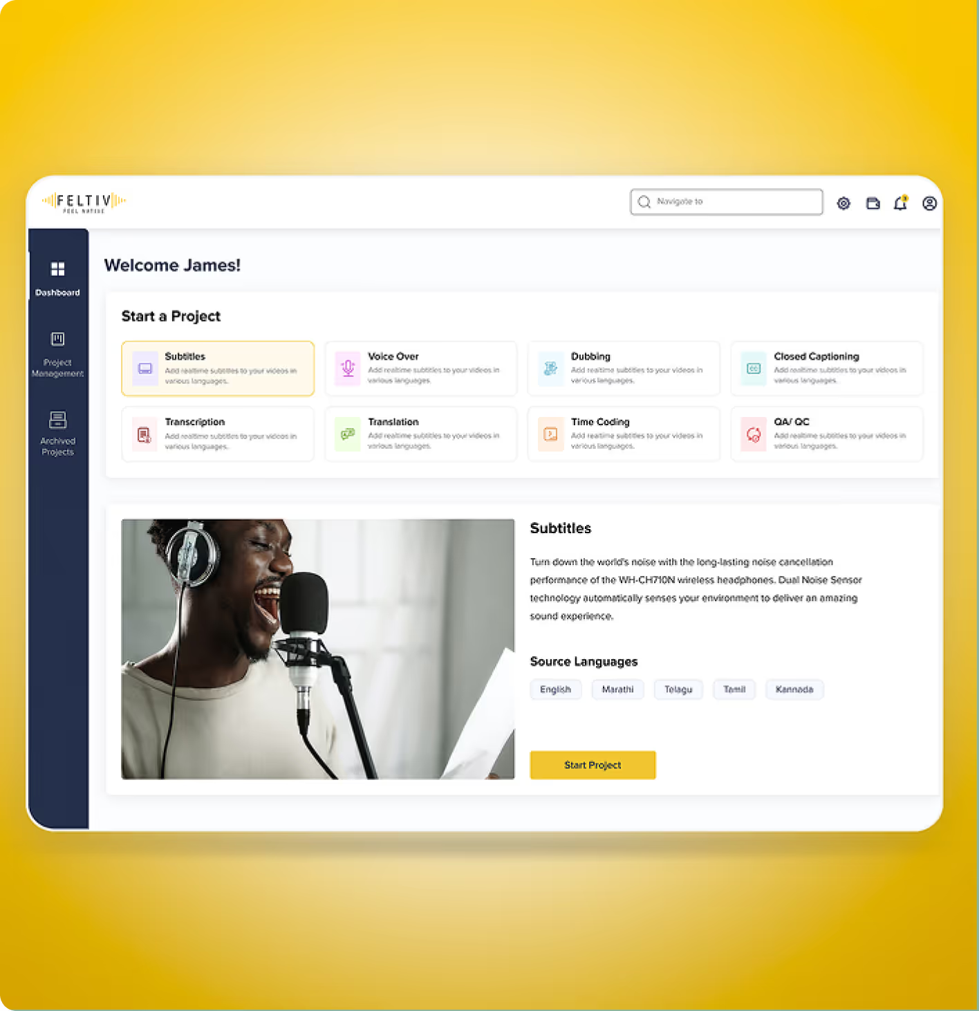
Feltiv
We restructured user journeys, created wireframes for clarity, and implemented transparent design patterns that encourage confidence and repeat use.
.avif)
Travel
No items found.
KPIT
An internal platform built to simplify travel requests, documentation, and approvals for KPIT employees.
.avif)
.avif)
Retail & E-commerce
UX Design
UI Design
URAC
A lifestyle app that helps users plan better, stay motivated, and live intentionally.
Travel
No items found.
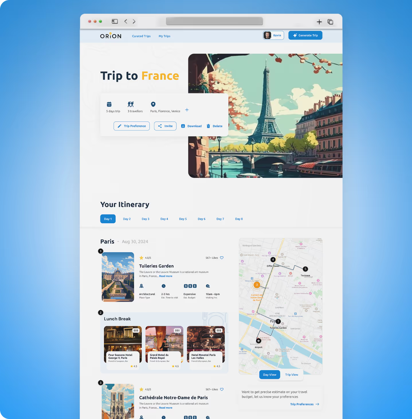
Orion
A digital MVP that helps travellers create and manage their perfect travel itineraries with ease.
.avif)
Enterprise & SAAS
UX Design
UI Design
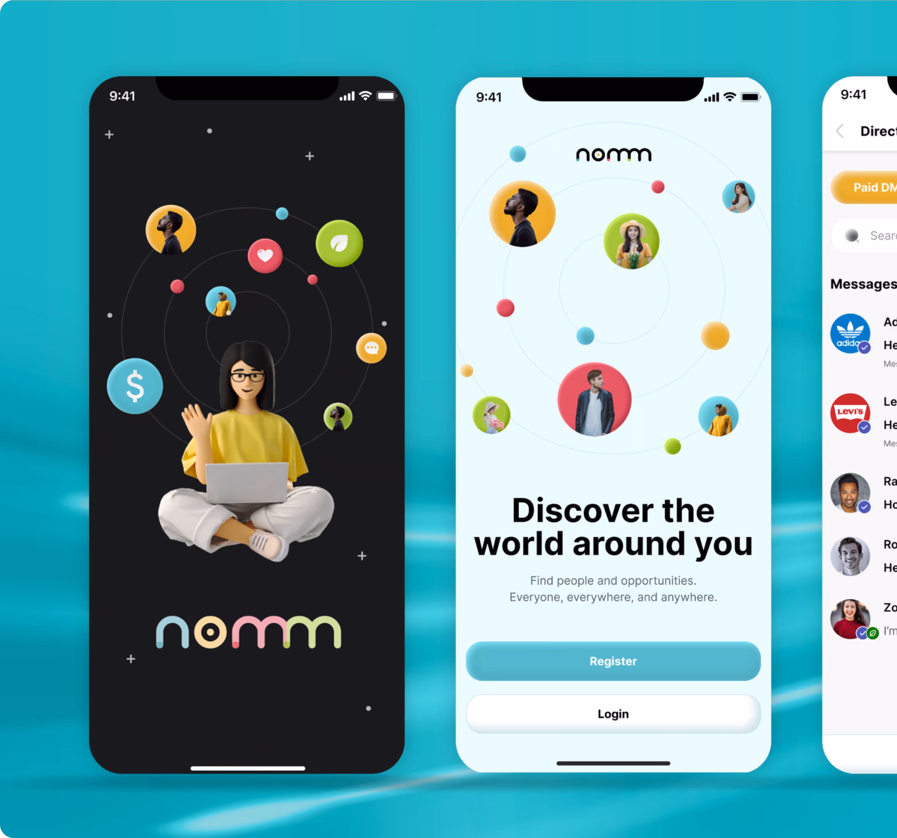
Nomm
A cafe app that links to the POS system to allow users to customise their in-store orders.
Enterprise & SAAS
UX Design
UI Design
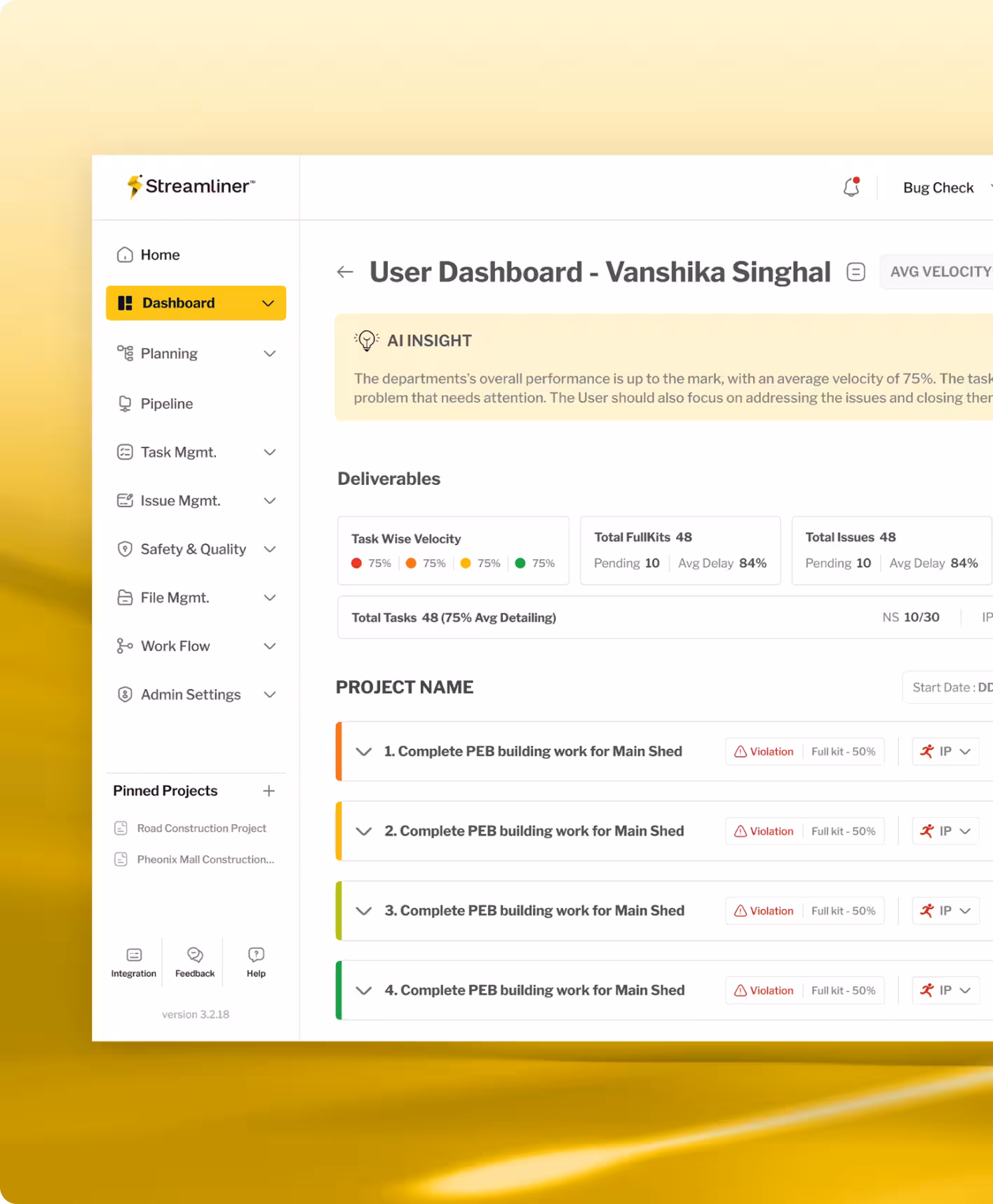
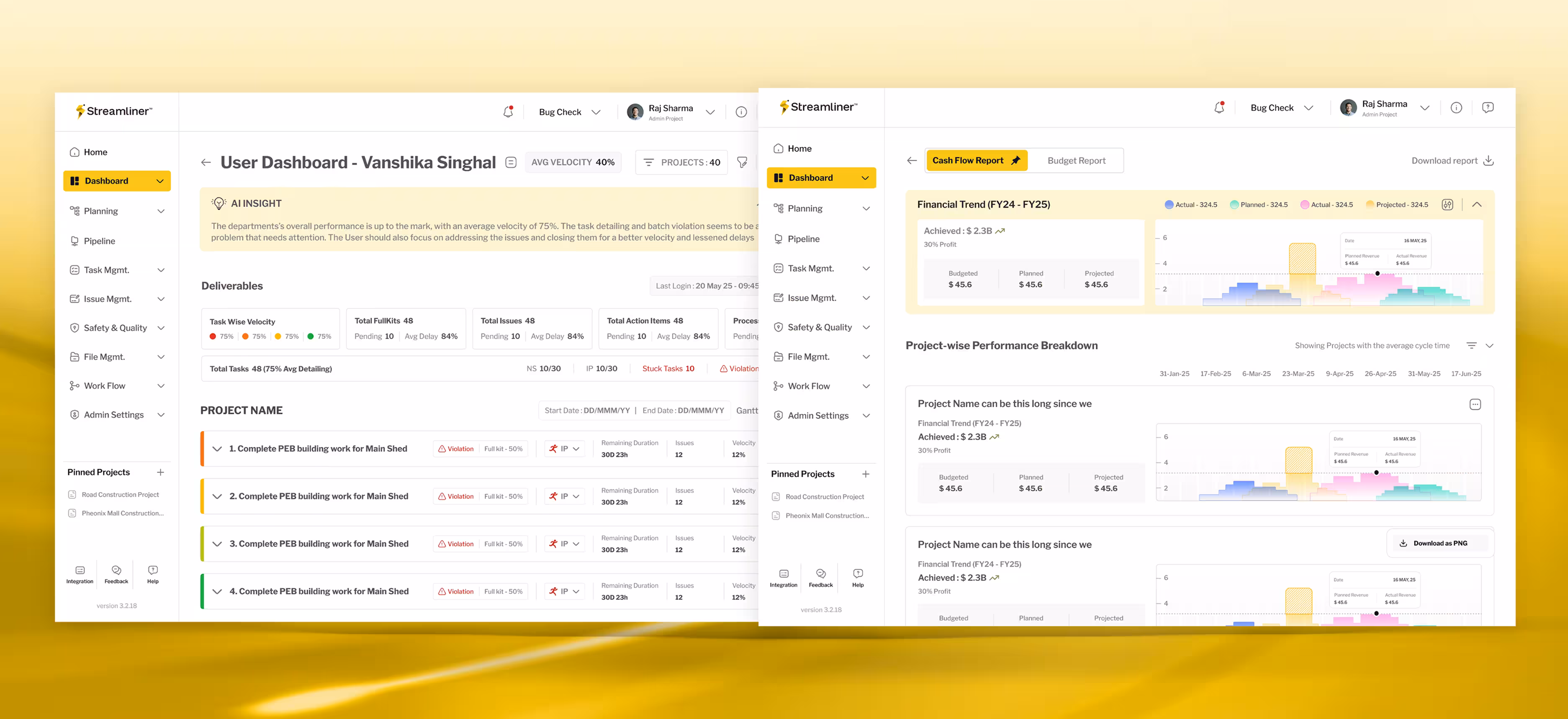
Realisation Tech
A project management platform that lets enterprises complete tasks on time with live tracking while aligning priorities.

Oops!
No results found.
Turn your Ideas to innovation
We design what moves people and scales products. Discover user behaviour and key aspects of product strategy.
.avif)
Stay Ahead with Slices
Good design starts with Sliced Newsletter
Subscribe to the Sliced newsletter and get the best of research, UX writing, product psychology, CX, and design systems, right in your inbox.
