Tame the Chaos in Your Design Process
Bring structure and consistency to your product with our design system services that streamline collaboration and scale across teams.

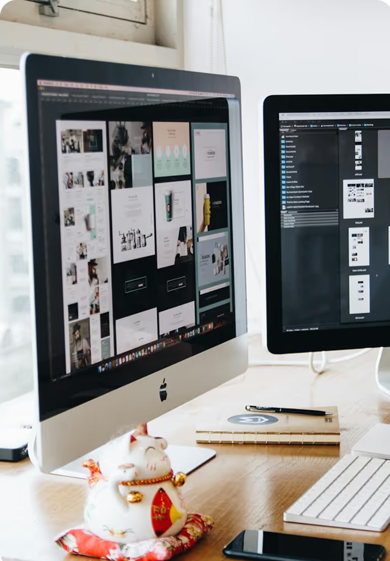
Design System
Why Invest Now?
Decades of refinement by our design system agency have shaped robust, adaptable systems, driving efficiency, consistency, and innovation in modern digital products.
Unified Design Framework
Enable Cross-Functional Communication
Accelerate Product Development
Single Source of Truth Across Teams
Design System
Insight-Led Process
Leveraging deep expertise, our design systems services unify brand identity and enhance product consistency effectively.
Goal Setting AND Alignment
Define the purpose of the design system, align with brand vision, and agree on measurable outcomes.
Inventory
Creation
Audit existing UI assets, fonts, colours, buttons, icons, while identifying gaps and opportunities for improvement.
Visual Standards Development
Establish brand-approved palettes, typography rules, and iconography for consistent application.
Component AND Pattern Building
Create reusable UI components with clear usage documentation for designers and developers.
Collaboration Tools Setup
Centralise design system assets and feedback on platforms like Figma, Penpot, or GitHub.
Testing And
Iteration
Review components with stakeholders, refine based on feedback, and adapt to evolving brand needs.
Designed Around You
Custom Solutions
One-size-fits-all? Not here. Our design system services that speak your brand’s language and scale with your product’s ambitions.
Component Library Audits
Reviewing existing UI elements to ensure consistency, reusability, and alignment with brand guidelines.
Pattern Testing
Evaluating design patterns across products to confirm usability and visual harmony.
Theme Variations
Comparing multiple style themes to identify which best fits the brand identity and accessibility needs.
Rapid Prototyping
Quickly creating and testing UI components to validate scalability and adaptability.
Token Structuring
Organising colour, typography, and spacing tokens for efficient cross-platform implementation.
.svg)
Accessibility Reviews
Ensuring components meet
WCAG standards and support inclusive design.
.avif)
.avif)
.avif)
.avif)
What you get
Design System
Our design system agency offers tailored, precise design components and comprehensive standards, ensuring lasting consistency and meaningful impact.
Design System Blueprint
A complete documentation of visual and functional elements, including colours, typography, icons, grids, and layouts.
Component Library
A centralised collection of reusable UI atoms, molecules, and organisms with usage guidelines.
Brand Consistency Guide
Detailed rules for colour, type, and icon usage to maintain a unified brand identity.
Responsive Grid Framework
Breakpoint definitions, spacing rules, and alignment specifications for all screen sizes.
.svg)
Pattern Catalogue
Common UI patterns with examples
and best practices for
implementation.
Scalability Roadmap
Clear steps for evolving and expanding the system as product needs grow.
Industry-Informed
Design System
Your industry is unique; your design system should be too. Our design system services ensure brand consistency, streamline collaboration, and support real-world product demands.
Creating accessible, compliant, and consistent digital touchpoints that empower patients and build trust in care delivery.
Designing cohesive experiences that guide users effortlessly from inspiration to booking, across every device.
Building a unified design language that keeps audiences engaged while scaling content delivery.

We help brands convert more with strategic UI and UX to create high-converting e-commerce experiences for users.

Real Impact, Real Results.
Read our client stories on the real-world impact and the stronger product outcomes of our design strategy.
.avif)
Chaayos
Redesigned POS and Chaayos app to boost user retention.
.avif)
Shoonya
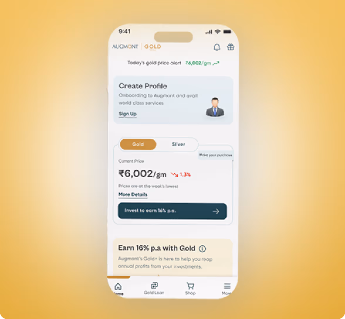
Augmont
Ready to Uncover Your Own Real Impact?

Customer Stories
See why we’re not just a UI UX design company; they see us as a strategic partner to their team.

The Yellow Slice design team deeply understood our business and product, ensuring their UI and UX design ideas were both innovative and impactful. They dedicated significant time, effort, and intent to the project, resulting in design that surpassed our expectations.
.avif)
Working with Yellow Slice has been a good experience for us at MakeMyTrip. They’ve helped us create a user-friendly website that aligns well with out brand and values. The website has improved the way we interact with potential talent online. We’re pleased with the updated design and recommend them for their creativity and effort.
.avif)

Almost 3 months have passed since the app was launched in July, before the Ganpati festival, and the registration has increased. There are metrics which significantly increased business.
.avif)

The team manifested their professionalism by always delivering on time. What stood out about Yellow Slice was their strong sense of teamwork.
.avif)

The team offered effective project management, timely deliveries, and outstanding responsiveness, agility, and creativity.
.avif)

Yellow Slice Team demonstrated exceptional creativity, showcasing innovative solutions and designs for our Chaayos website. Their diverse skill sets were evident in the seamless functionality and user-friendly interface. I appreciate their strong sense of ownership, ensuring the timely completion of tasks with a proactive approach. Their team's readiness to tackle challenges head-on shows their commitment to delivering excellent service.


We wanted a design agency with extensive fintech and BFSI product experience. Kishor's knowledge and Yellow Slice's core expertise in fintech design convinced us to move forward with them. The team's designers didn't need constant nudging and knew exactly what to do to create a better UI and UX design. We were especially satisfied with the research phase of the project.

The team is very customer-centric; they were attentive to what I wanted. I love their culture, how they uphold their value in their work, and their engagement with me throughout the duration of my project. It took time to get used to and comfortable with the project, but their willingness and effort to adapt quickly kept me going.
.avif)

YellowSlice takes the time to understand our business needs. I can count on YellowSlice for fresh perspective, innovative ideas, consistency, solutions and accuracy.

“YellowSlice takes the time to understand our business needs. I can count on YellowSlice for fresh perspective, innovative ideas, consistency, solutions and accuracy. “
.avif)
FAQs
Your common questions about our UX research services, answered.
A design system is a unified framework that brings order to digital products, much like societal rules. It aligns teams, ensures consistency, and scales design across platforms. While it takes time and collaboration to build, it empowers everyone, from junior designers to CTOs, to create cohesive, efficient, and future-ready experiences.
Design systems serve as a comprehensive framework that unifies and guides the visual and functional elements of a product or brand. It establishes a single source of truth for designers, developers and any other professionals involved in product development.
It facilitates effective communication and collaboration among cross-functional teams for an efficient design and development process.
Design systems include modular essentials like colour, typography, icons, grids, and layouts that create cohesive, scalable products. Colours communicate emotions, so their usage must be intentional. Typography sets tone; fonts influence perception. Icons reduce text, but must be consistent.
Grids ensure responsive structure, while layouts guide user flow. Without predefined rules, these elements cause clutter and confusion. Our design system services bring harmony, clarity, and brand alignment across every screen and interaction, making your product intuitive and consistent.
Atomic design is a methodology that breaks interfaces into five building blocks: atoms (like buttons or inputs), molecules (combinations with function), organisms (larger UI sections), templates (layout blueprints), and pages (final, content-filled designs). Like chemistry, each level builds on the previous one—creating scalable, consistent, and reusable UI structures.
A design system checklist helps ensure nothing vital gets missed. Start by creating a pattern inventory: buttons, forms, colours, typography, icons. Audit code variables, review text styles, spacing, and grids for consistency. Check icon libraries and implementation. Get stakeholder support, define team roles, and map decision timelines. Use this checklist as your north start before you launch.
With over 14 years of experience, Yellow Slice helps brands like Croma and MMT build and evolve their design systems. We focus on business efficiency, better UX, and cross-functional collaboration, creating systems that grow with your needs.
Start by creating a UI inventory of fonts, colours, icons, and components from past or aspirational projects. Involve designers and developers early to align on needs and possibilities. Review colours and typography regularly for consistency and relevance. Use collaboration tools like Figma or GitHub to streamline feedback, track changes, and enable real-time, cross-timezone teamwork. These tools ensure clarity, version control, and seamless collaboration throughout the design system development process.
Make Every Click User-Friendly
Your brand’s single truth starts here.
Good design starts with Sliced Newsletter
Subscribe to the Sliced newsletter and get the best of research, UX writing, product psychology, CX, and design systems, right in your inbox.
