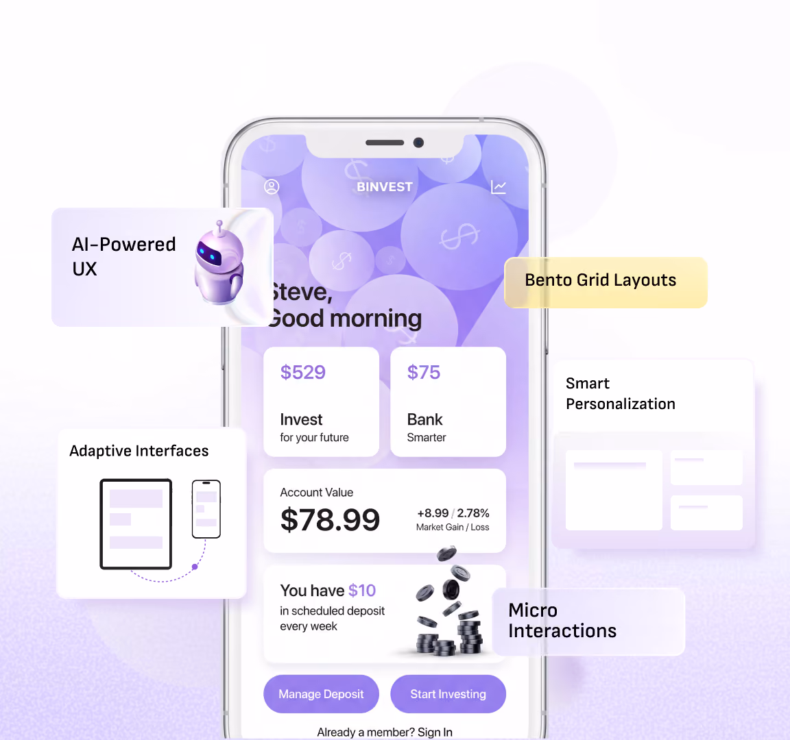
Bento Grid Layouts: The New UX Trend Explained
.avif)
Priya Kavdia
Introduction
Have you ever visited a website that feels like everything is as simple as it looks? With one click you can instantly go where you want without any confusion. That is not just a simple design; rather, it is a smart design that is made to make your everyday life easier. But today, one trend is gaining the spotlight, which is bento UI.
Inspired by those neatly packed Japanese lunch boxes, this style breaks content into clean as well as bite-sized sections. That means no clutter, just a smooth and satisfying user experience. Designers & brands are loving these bento layouts because they make complex information look sorted.
What Is Bento UI?
Bento UI is a user interface design that arranges content into separate grid-based blocks of different sizes that make information more organized as well as visually appealing and simple to navigate. Whether it is a homepage or a portfolio, this bento grid keeps things interesting without being messy.
Instead of long as well as overwhelming pages, the Bentobox website highlights what matters the most without making it look forced. Each section can hold something different like text, images, buttons or even imaginations that create a balanced layout. Therefore, it provides clear modern interfaces that make people engaged with proper clarity.
How to Create a Bento Layout (Step-by-Step Guide)
.avif)
Creating a bento layout looks fancy at first glance, but once you adapt this becomes a fun as well as logical process. Here are the steps that will help you to create your own bento box design step-by-step.
Step 1: Start with Content, Not Design
Before directly jumping into designing the very first step is to figure out what you actually want. The best way is to list out your key content such as headlines, images and features as well as CTAs. A good bento design always prioritizes content in the first place and layout in the second.
Step 2: Define Your Content Hierarchy
Making content hierarchy is very important while designing a user-centric interface. Which element becomes the spotlight must be decided attentively. That most important thing can fit in the larger block, while the less important content can fit in the smaller block within your bento grid.
Step 3: Sketch Your Bento Grid
After making a hierarchy of your content you can sketch your layout accordingly. You can arrange it by thinking of a bento box like some content in a large box and some in a small one so that everything can fit together easily. Keeping it in proper balance by being asymmetrical can give your bento layout a modern feel.
Step 4: Assign Sizes to Each Block
Not all content is equal, so your layout should clearly reflect our idea through the vision of a bento box. Use larger boxes for the important messages and smaller ones for the supporting content. This is the step that makes a bento box design visually engaging.
Step 5: Add Visual Elements
Adding visual elements means bringing your layout to life with the help of images, icons, colors and typography. Every block should be maintained in a clear manner without overstuffing it. Clean visuals are considered the secret sauce of the outstanding bento UI.
Step 6: Include Clear CTAs
Every good design needs direction. Adding buttons or links to the key blocks helps users know exactly what they need to do next without making any effort. Whether they want to sign up or to explore something along with buying that stuff, each step needs to be effortless that makes their experience memorable with your product.
Step 7: Focus on Spacing and Alignment
White spaces are considered your best friends when it comes to bento box website designing. Proper spacing between blocks ensures that your bento grid does not feel cramped as well as out of space. This alignment & spacing will keep everything smooth for your eyes in one flow.
Step 8: Make It Responsive
Your bento layout should look as good on mobile as it looks good on desktops. Making a responsive layout means your users can easily enjoy your design without thinking too much about the next step. To make experience stays smoother across devices users can easily resize blocks, which can simplify their experience.
Step 9: Test and Refine
This is the final step where you finally test your interface that you designed. By keeping bento box ideation in mind you can test it by checking various things, like if it is easy to scan or if it guides your users properly. If something feels off, you can simply make changes within the block sizes or spacing so that everything can feel on spot at the end.
Key Takeaway: If you are looking to make high-converting Bento UI for your website but are unable to decide where to start from work with a team that understands both design and user behavior. At Yellow Slice, we focus on creating intuitive plus modern experiences so that your bento layout not only looks good but also performs effortlessly.
Key Elements of a High-Converting Bento Design
- By making minimal as well as clean designs to avoid clutter.
- There must be a strategic placement of call-to-action (CTA) elements.
- Do priority-based sizing to highlight the most important content first.
- The logical grouping of related information within the individual blocks.
- There should be a clear separation between sections to avoid overcrowding.
- Fast-loading assets to keep the experience smooth.
- Ease in reading content, like proper font sizes or contrasting colors.
- Ensure alignment with brand identity through color as well as tone.
- A balanced mix of visuals along with the text to maintain the interest of users.
- You must define a user flow that naturally guides navigation.
Bento UI vs Traditional Grid Layouts
Bento UI layouts use asymmetrical and flexible blocks of varying sizes, giving them a modern, dynamic, and eye-catching visual appeal. They are highly engaging and interactive, offering significant flexibility in how content is arranged. This approach encourages creative design and results in higher engagement levels due to its visual diversity. Bento UI is commonly used for SaaS platforms, portfolios, landing pages, and startup websites.
In contrast, traditional grid layouts follow a uniform structure with evenly spaced rows and columns, making them simple, predictable, and well-structured. While they provide a more straightforward user experience, they tend to be less engaging and offer limited flexibility due to their fixed layout. Traditional grids are more rigid and conventional, leading to moderate engagement levels because of their repetitive structure. They are typically used for blogs, news websites, and basic web designs.
Benefits of Using Bento Grid in UX Design

Using a bento grid in UX design helps make things feel simpler with a clear vision. Instead of showing everything on one long page, it divides information into small sections that are quick to read. A good bento UI helps users in finding what they need faster by keeping the layout clean. With a flexible bento layout, you can show your content in a more organized way without making people look confused while using it. Therefore, bento box designs are meant to make your work easier while looking modern as well as up to the mark.
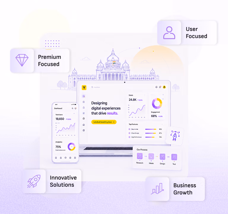
Why Choose Yellow Slice for Bento UI Design?
Choosing Yellow Slice for your bento UI designs means working with a team that understands both aesthetics and user behavior. In place of just focusing on how the bento layout looks our approach is centered around how users will interact with it. Every bento grid is thoughtfully designed to highlight key content as well as improve navigation by keeping the experience smoother across devices. By following modern design trends, our goal is to create interfaces that perform well in every aspect. Whether it is a website or product interface, our designs are tailored to meet real users' needs while aligning with your brands.
Summing Up
In the end, good design is all about making things simple & useful for users. When content is presented in an organized manner there are high chances of people loving your product. They like to explore and stay with your product without effort. Trends may come and go with time, but usability always matters the most. Focusing on user needs helps in creating an overall better experience.
Ready to upgrade your website experience? Yellow Slice creates a design that not only looks flawless but also drives real results.
FAQs about Bento Grid Layouts: The New UX Trend Explained
1. Why are bento layouts trending in UX in 2026?
These are trending as people love that content, which is very organized along with being visually appealing. They not only make your work easier but also make your experience flawless.
What are the common mistakes in bento design?
There are many common mistakes, like:
- Overcrowding sections
- Too many colors
- Poor spacing
- Excessive animations
- Poor content grouping
- Misaligned elements
2. Which tools are best for bento UI design?
There are several tools. Some of them are as follows:
- Figma
- Framer
- Adobe XD
- Webflow
- Sketch
- Pampot

Let's create something amazing!
Let's discuss your vision and how we can bring it to life with impactful design solutions.
.avif)
Good design starts with Sliced Newsletter
Subscribe to the Sliced newsletter and get the best of research, UX writing, product psychology, CX, and design systems, right in your inbox.
