Ensuring Accessibility in Fintech Apps: Best Practices and Guidelines

Gone are the days when people frequently visited financial institutions like banks for finance-related tasks. In the age of technology, everything finance-related can be managed at your fingertips on your mobile phone.Theres a growing reliance on fintech products and a global shift towards digital finance, thanks to its convenience, personalisation, and financial inclusion. COVID-19 had a considerable role to play in this. People ignore design that ignores people."This is a very profound and clever quote by Frank Chimero,, the author of the book The Shape of Design. This quote addresses a very common issue: Accessibility. How designs usually ignore people with disabilities, users who are,
- Visually Impaired
- Hearing Impaired
- Cognitive Challenged
- Psychological and Neurological Disabilities
- Elderly
- Users with Motor Disabilities and so much more disability spectrum.
Sure, these people might fall in the minority section of society, but that shouldnt isolate them from technological products, financial services to be precise. People with disabilities find it hard to navigate through fintech apps for them, they are puzzles. Fintech apps shouldnt be puzzles; users shouldnt have to solve the entire puzzle to reach their desired destination. The app's sitemap should flow in an obvious direction, enabling users to achieve their goals quickly and effortlessly.

What is Digital Accessibility?
Everybody manages finances; its not something that only non-disabled people do. Then, isnt it common sense for fintech developers and designers to design apps in a way that they create solutions for people with disabilities, too?According to the World Health Organisation, an estimated 1.3 billion people experience significant disability. This represents 16% of the world's population, which means every 1 in 6 of us experience some sort of disability or the other.When all the traditional sectors are making efforts to include disabled people, fintech, which is at the forefront of development, innovation, and empowerment, is lagging.
Challenges for People with Disabilities in Fintech
Lets address common challenges faced by people with disabilities while using fintech platforms or tech products in general:
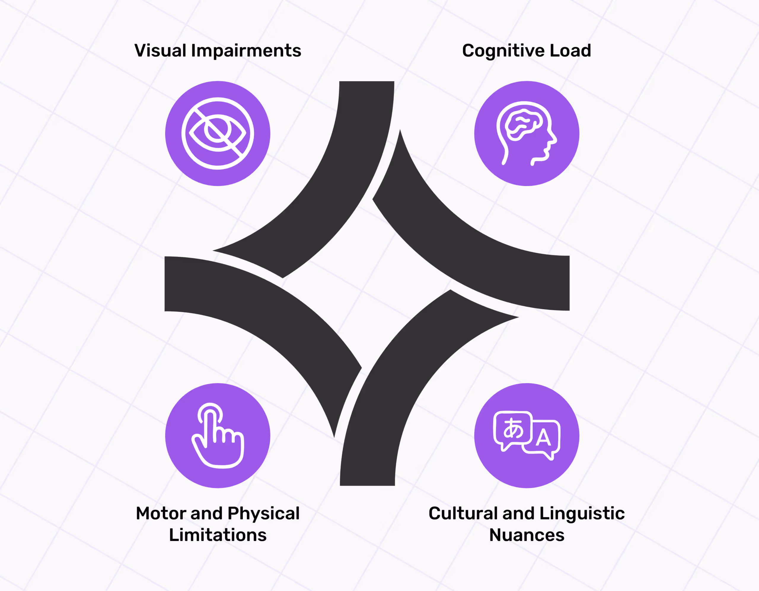
Visual Impairments
Users with visual impairments find navigating websites and apps difficult because of poor colour contrast, small font sizes, and inaccessible forms. For instance, people with colour blindness and low vision find it difficult to differentiate between colours in low-contrast colour schemes.By now, its almost given that red is the colour of cancelling an action or deleting something, and green is for approving an action or keeping something. It comes intuitively for us to act just by looking at these colours; most of the time, we dont even need supporting text to go with them.Now imagine how less intuitive the interface is for a colour-blind person who cant see these colours for what they mean. Small font sizes also make text unreadable, and users miss out on important information.WCAG compliance issues advocate the presence of alternative text, sufficient contrast, and simple CAPTCHAs for financial websites, as these enhance a website's usability.Solutions for visual impairments can exist, such as compatibility with screen readers like VoiceOver for iOS and Talkback for Android. Screen readers interpret on-screen information aloud for users with low vision.
Cognitive Load
Fintech digital products are usually packed with information to explain the critical concepts of finance. This can intimidate beginners and users with cognitive impairments or neurodiverse needs.Users who suffer from ADHD, dyslexia, or dementia find it difficult to focus, understand or retain information that may seem normal to users, but its complex for them. Cluttered layouts and complex navigation can create a cognitive overload for these users.The solution to these issues is simplifying navigation, using simple, jargon-free language, and breaking down complex tasks into small, manageable steps.
Motor and Physical Limitations
Users with motor and physical disabilities cannot perform precise screen interactions required to complete payments or account setup. Without appropriate keyboard-only navigation and accessible touch targets, it can be difficult for such users to use digital products.Platforms that rely heavily on mouse navigation or small interactive elements are not inclusive for users who need assistive technologies to use the platform. Alternative input elements like switch access devices or voice commands are the best choice for such users.A solution for users with these disabilities can be incorporating large touch targets and making the interface keyboard accessible without needing precise mouse control.
Cultural and Linguistic Nuances
A few geographical locations have a variety of linguistic backgrounds. In such regions, language translation alone doesnt help users; they need more support to access the app. Most fintech apps fail to provide multilingual support in regional dialects, so users comfortable with their native language only get limited access to these platforms.In the mobile-first world, most users are comfortable using mobile devices for all their finance-related needs. Hence, support for local languages to maximise accessibility is needed.For example, the State Bank of India (SBI) in India discovered that 72% of users over 60 struggle with understanding the information on the bank interface because of the regional language barrier and language complexity.SBI also introduced localised language options for users in rural areas not English-speaking regions. ?
Legal Standards for Fintech Accessibility
Okay, so its given that you need an accessible website, but how do you make one? Is there a rulebook to follow? Fortunately, there is a rulebook. It has three standards for website accessibility that deal with different aspects of a website.
- American Disabilities Act (ADA)
- Section 508 of US law
- Web Content Accessibility Guidelines (WCAG)
Federal agencies and some federal contractors follow these to make their websites accessible.
American Disabilities Act
ADA compliance means that a website adheres to the standards set by the American Disabilities Act. Organisations and businesses with 25 or more employees must abide by the ADA.ADA secures the rights of individuals with disabilities in public accommodations, employment, transportation, and telecommunications.
Section 508
Section 508 compliance means that your website meets the criteria required by Section 508 of the Rehabilitation Act of 1973. Organisations and businesses with 15 or more employees must abide by the Section 508. Not just private but most state governments and public entities come under this law.This law requires the online availability of public documents, electronic and information technology, and web-based training. The central aspect of this law is making certain content accessible to people with disabilities.However, Section 508 guidelines incorporate the WCAG 2.0 Level AA Success Criteria by reference, and apply the WCAG 2.0 Level AA success criteria and conformance requirements to both web and non-web electronic content.Simply put, if a website follows WCAG AA or AAA standards, your site will automatically comply with Section 508 guidelines.
Web Content Accessibility Guidelines (WCAG)
WCAG compliance means your website meets the World Wide Web Consortium (W3C) standards. These standards provide an accepted standard and best practices that are important for businesses that cater to the public because they make web content accessible to all users.The Web Accessibility Institute (WAI) publishes WCAG standards, which help designers and developers develop a framework for building accessible digital products.If a website or app adheres to specific levels of WCAG compliance, like level AA or better, it will automatically comply with Section 508.
Best Practices for Building Inclusive Fintech Apps
But what are the actionable steps to make fintech apps accessible? This section includes best practices for designing fintech apps.

Make Log-Ins Effortless and Fast
Fintech apps are mainly used on the go. When customers cant complete the action they want to perform, like making a payment or checking their account balance, they leave the app to return when they have more time to spend on the app (which can be never). This increases the app's bounce rate.From the UX perspective, biometrics is the best way to ask users to log in, as it is not time-consuming. Ensure voice and facial recognition are inclusive ways, too.However, not all businesses support this service. No need to worry; if not biometrics, the log-in process can be made easy by incorporating UX knowledge and simple UI features such as:
- Employing a few options without overloading the login screen and causing cognitive overload on the users.
- Emphasising the elements that have the primary user goal.
- Avoid creating options with similar meanings and provide straightforward functions with clear meaning to avoid confusion.
When users land on the interface, they shouldnt think twice about what process to follow to complete a task. Answers should be in front of them even before they start looking for them. Too many options on the screen create decision paralysis for users, so the CTA isnt addressed.Ideally, one screen should only ask users to perform one primary function. Make sure you know the answers to the following questions:
- Why has the user arrived at this screen?
- Whats the primary goal of this screen?
- Is it easy for the user to perform the required action?
- What could possibly confuse your users?
When you're done emphasising the primary login option, pay heed to the secondary option. What would users look for other than the login option?Users might need the Help/Support feature as they struggle with logging in and may need help. A simple Help/Support option would do, without cluttering the screen with several phone numbers and a list of branch offices.
Navigation by Sound With Screen readers
Screen readers rely on web pages' HTML structure and semantics to understand and interpret the content. They also use keyboard shortcuts, gestures, and commands to interact with elements like links, buttons, forms, or menus.
- Visual Hierarchy
You cant ignore visual hierarchy because screen readers rely on a top-down structure of headings and subheadings. A collaboration of designers and developers can help in writing out the HTML in the correct order so that the screen readers interpret the design in that order.While CSS determines the layout and appearance of a page, screen readers rely on the top-down structure of HTML on any platform (mobile or web). This structure creates a flow/map for the screen reader to follow when reading the content. Hence, for the screen reader to read the content in the intended order, designers must collaborate with developers.
- Test your design with screen readers
After you make your design compatible with screen readers, its time to test it. Use popular screen reader software such as NVDA, JAWS, or VoiceOver to understand how your web pages sound and feel for your users.You can use browser tools such as ChromeVox or the Web Developer toolbar to inspect the HTML code and accessibility features of your web pages.This software helps you fix your design in case of issues, such as missing alt text, unclear links, inaccessible forms, or hidden content.
- Follow the WCAG guidelines.
Some WCAG guidelines are dedicated to screen reader compatibility, they include providing text alternatives for non-text content such as images, icons, or charts. These guidelines ensure proper utilisation of headings and landmarks to organise and label content; links should be descriptive and unique text.Labels and instructions should be given for form fields and controls using ARIA attributes to enhance the semantics and interactivity of web elements. Content should be adapted to different screen sizes, orientations and zoom levels to improve readability.Colours, shapes, and sounds should not be the only means of conveying information, as people with disabilities will not be able to interpret data through these means.Screen readers work efficiently when the content is readable and comprehensible. Simple language, clear typography, and consistent navigation make it easy for screen readers to read the content. Content should also be compatible with current and future users and assistive technologies.
- Involve screen reader users in your design process
Sure, you can conduct user research and usability testing before and after with screen reader users. Feedback sessions with screen reader users are beneficial for gaining their insights, preferences, and expectations.However, isnt including them in the design process a good idea? To create accessible and inclusive designs, recruit screen reader users as co-designers and consultants on your design team.This allows designers to learn from the perspectives of the target audience, validate their assumptions, and create an environment of co-creation.
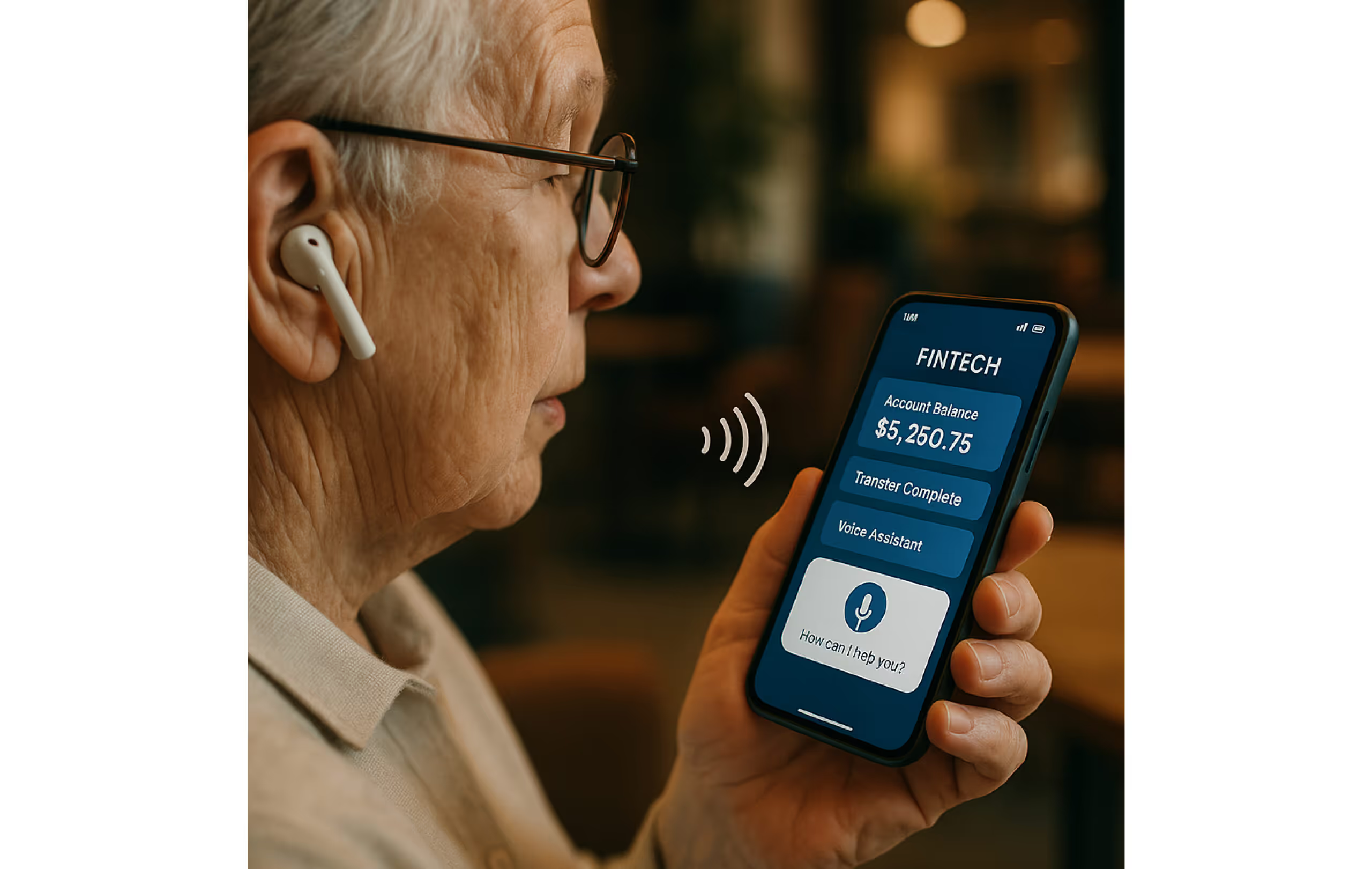
Voice Commands for Quick Access
Incorporating voice commands requires knowing who will use them and for what purpose. Then, user research will be conducted to determine what users want to achieve and how they prefer to communicate.Interviews, surveys, and usability testing are some methods for identifying potential users' goals, pain points, and preferences. Consider the diversity of your user base, such as age, language, accent, disability, or literacy level, and understand how this affects their voice interaction.
- Define your use cases.
In the next step, define the specific use cases and scenarios for when the users will use the voice interface. Decide what tasks and functions the users will use voice commands for, and ensure that these tasks align with your business objectives and value proposition.List the limitations and advantages of voice commands on your interface and convey that to the users. Also, explain how voice as a modality compares to other input methods such as touch or keyboard.For instance, voice is the ideal way to input information when using hands-free or eyes-free situations, such as driving or working out in the gym. However, voice commands are less functional for more complex and sensitive tasks, such as entering bank passwords and reviewing financial statements.
- Design your conversation
Next, you must design a conversation between your voice interface and your users. This process includes crafting dialogues, prompts, responses, and feedback to guide users through voice interactions.Decide on the tone, personality, gender, and style of your voice interface, keeping your brand identity and voice in mind. For instance, a fintech app such as Splitwise, which youngsters usually use to split the bills between them, would work fine with a friendly, casual, humorous, yet informative tone.On the other hand, a more formal, professional, and serious tone should be used for a fintech app such as Paytm, which is used by the general public and even businesses.

- Develop your voice technology
Now is the time to develop the voice technology that powers the voice interface. Choose the tools, platforms, and frameworks that will allow you to implement your voice interface's voice recognition, natural language processing, speech synthesis and dialogue management features.Make sure you know different criteria about the voice technology that you are using, such as performance, security, and compatibility. It should integrate well with your existing system and infrastructure.For instance, a cloud-based service such as Amazon Lex or Google Dialogflow is a good choice as it offers scalability and access. However, different industries have different privacy regulation standards, so ensure that the service complies with the data protection requirements of your specific industry and region.
- Test and iterate your voice interface
Now is the time to test what you have created for the voice interface. Conduct usability tests and collect feedback from real users. Analyse the metrics and insights collected. This step will validate your process and test usability, functionality, and design effectiveness.Identify any gaps, issues, or errors in the user experience. Methods you can use to collect feedback are user interviews, analytics, and voice logs. After gathering feedback, you can iterate based on the insights you gain and optimise it further.

Colour and Contrast Improve User Experience
People who can see clearly can figure out what colour represents what mood and tone when used in different elements to better understand actions. People who cant see clearly (such as the colour-blind) use contrast in colours to make sense of the elements.Sufficient colour contrast between elements can help low-vision users see and use your app. Colour contrast is essential for users to distinguish between text and non-text elements. Higher contrast makes the imagery and text easier to see, while low contrast can make it difficult for users to differentiate between bright and low-light conditions, such as on a very sunny day or at night.
- Contrast ratios
Contrast ratios represent how different one colour is from another colour thats used with it. The contrast ratio between a colour and its background ranges from 1-21 based on its luminance (the intensity of light emitted), according to the World Wide Web Consortium (W3C). The ratio commonly lies between the range of 1:1 to 21:1.The higher the ratio (the more significant the difference between the numbers), the greater the relative luminance between the colours.
- Clustered elements
Design elements that are clustered together require the user to distinguish them. Some non-text elements, like button containers, should have a contrast ratio 3:1 between their container and background colours.Elements that stand alone, like the Floating Action Button, are apart from other elements on the screen. They dont benefit from the 3:1 contrast between themselves and the background elements.
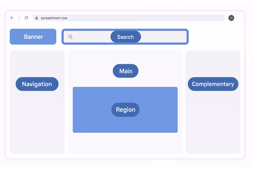
Role of Landmarks and Headings in UX
Effective content placement and UI layout can improve navigation and comprehension. In web accessibility, landmarks are large blocks of content that establish the high-level structure of the design layout.They're a set of Accessible Rich Internet Applications (ARIA) roles that provide easy access to, and essential meaning for, common content areas of a web page. This includes distinct regions of a webpage, such as the header, navigation, main content, and footer.In ARIA (Accessible Rich Internet Applications), these landmarks help Assistive Technologies (AT), like screen readers, navigate and understand the page's structure.This is done so the audience understands the content in a predetermined order, and the design gets translated into a linear experience. This improves the accessibility and readability of the digital content.
- Identifying landmarks and headings
There are eight landmark roles: navigation, search, main, banner, complementary, content info, region, and form.Navigation: This section contains lists of navigation links (where users can go within the website). Multiple subheadings are usually present, so they need labelling.Search: Use the search field for a quick search. Main: The main content area should only be one, as defined by UX.Banner: Typically, the header and content are repeated from page to page, often containing navigation and toolbars. There should be only one.Complementary: A sidebar or aside from the main content that can stand alone without the main content.Content info: Typically, the footer contains information describing the site and its content (for example, copyright). There should be only one.Region: Content regions are important content blocks. They can be nested inside the main landmark. Regions should be labelled with names that make the purpose of that region clear.Form: Takes and stores user info.
- Add accessibility labels
Add clear and specific labels to landmark roles that appear multiple times (typically regions or navigation). This will help users differentiate information.Labels should be added to all regions and landmarks where a label can better explain the meaning, such as to explain the contents or purpose of a sidebar.
- Define Headings
As mentioned above, headings help maintain the page's hierarchy. Identify headings based on content hierarchy, and dont be swayed by visual styling.Headings should not skip a level; for instance, they should not go from H1 to H3 and ignore H2. There are 6Hs available (H1-H6), so make sure you use all of them in sequential order. Remember that in a single-page title, theres only one H1.
Why Target Size Matters
Users who cannot see the screen or struggle with small touch targets while tapping elements need accessible target points.
- Touch and pointer target sizes
Touch targets appear on the screen and respond to user input. They extend beyond the visual bounds of an element; for example, an icon may appear to be 24 x 24dp, but the padding surrounding it comprises the entire 48 x 48dp touch target.On most platforms, touch targets at least 48 x 48dp in size, which results in a physical size of about 9mm, regardless of the screen size.The recommended target size for touchscreen elements is 7-10mm. Large touch targets enhance accessibility for a wide range of users.


Let's create something amazing!
Let's discuss your vision and how we can bring it to life with impactful design solutions.
.avif)
Good design starts with Sliced Newsletter
Subscribe to the Sliced newsletter and get the best of research, UX writing, product psychology, CX, and design systems, right in your inbox.
