Mobile UX Checklist for Higher Retention
.avif)
Priya Kavdia
Introduction
Did you install an app while thinking it looks intuitive and suddenly delete it five minutes later? This one-time opening comes with a messy onboarding UI that does not let you fit in properly in the UI/UX world. The end result is either you win your users or you lose them. If your onboarding screens UI feels confusing as well as cluttered at the same time, no one will stick to it for long. Users today expect things that are fast and user-friendly, making their experience effortless. You must strategize properly, meaning from making smooth navigation to making a smart app testing checklist, every little detail plays an important role in keeping your users intact.
Why Mobile UX Directly Impacts Retention

Mobile UX plays a huge role in deciding whether the users will stay or leave. If an app feels slow or boring users will not think twice before uninstalling it. According to some data, "53% of users leave an app/site if it takes more than 3 seconds to load, 79% of users stop using those apps that are confusing to use and 28% of users uninstall an app within one month due to its poor design as well as usage."
Thus, a smooth experience starts right with the proper onboarding UI that helps users build trust with the app. Good UX is not only about the design; it is about users keeping coming back to your website.
15-Point Mobile UX Checklist for Higher Retention
Making your users download the app is only half the battle you won. The real challenge is making them stay longer. A great mobile experience is built by thoughtful designs and smart decisions along with continuous testing. This 15-point checklist will cover everything you need to improve retention.
1. Keep Your Onboarding UI Simple & Goal-Oriented
- Focus on clarity instead of explaining every feature.
- Avoid unnecessary steps or distractions that make things complicated.
- Use minimal text with strong visuals, which make things clearer.
- Ensure users understand the app within seconds.
- Use simple language that users can understand instantly.
2. Use Progressive Disclosure in Onboarding Screens UI
- Reveal features step by step instead of all at once.
- Introduce advanced features later in the journey of using the app.
- Use visuals in place of long text descriptions to maintain the interest of the users.
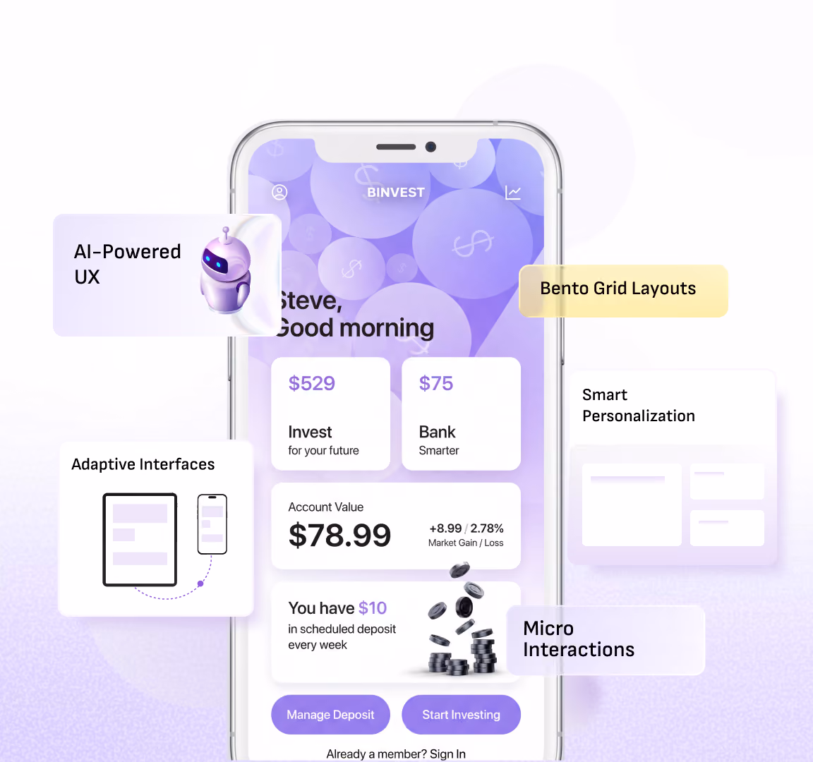
- Break content into small sections, like in Bento UI, which makes it easy to use.
- Limit onboarding screen UI to a maximum of 3-5 screens.
3. Optimize App Load Speed
- Keep the load time of the app/site within 2-3 seconds.
- There must be smooth transitions between the screens.
- Regularly test performance under the different conditions.
- Optimize performance for low network conditions too.
- Minimize unnecessary animations that slow down the performance.
4. Design for Thumb-Friendly Navigation
- Design layouts for one-hand usage, as maximum people are used to it.
- Place important actions within easy thumb's reach.
- Maintain the proper spacing between touch targets to avoid extra touches.
- Ensure buttons are large enough to tap easily.
- Avoid placing the key elements in the top corner that can create difficulty.
5. Use Clear and Actionable Call-to-Actions (CTAs)
- Write CTAs that clearly describe the next action without any confusion.
- Use contrasting colors to make buttons stand out among others.
- Keep CTA text short & direct.
- Avoid multiple CTAs on the single screen.
- Guide your users step-by-step through actions, which makes it user-friendly.
6. Maintain Visual Consistency
- Keep fonts and colors as well as icons consistent to avoid out-of-place situations.
- Follow a design system that makes it visually appealing.
- Use uniform placing along with layout patterns that are easy to use.
- Ensure branding is consistent within the screens.
- Avoid mixing too many styles that can make it look cluttered.
7. Personalization in Onboarding UI
- Ask user preferences during the onboarding screens UI.
- Customize the content based on the user behavior.
- Make users feel the app is tailored for them.
- Continuously refine personalization over time so it looks engaging all the time.
- Adapt UI elements based on the user choices.
8. Minimize Input Fields
- Ask only for the essential information.
- Use autofill to save user effort.
- Enable social login options.
- Break the long form into the smaller steps to make it simple to use.
- Allow users to skip non-critical inputs.
9. Use Microinteractions for Feedback
- Add subtle animations to confirm user actions.
- Provide instant feedback on the tap & gestures.
- Make interactions feel responsive with each click.
- Keep animations smooth so that they do not distract the users attention.
- Highlight the completed actions visually to avoid any confusion.
10. Handle Errors Gracefully
- Use friendly error messages to make people understand their error easily.
- Provide solutions in place of only warnings, as it makes it user-centric.
- Avoid technical or confusing language to keep things simpler.
- Allow easy correction of mistakes that keep experience effortless.
- Reduce the frustration of the users with the helpful guidance while using the app.
11. Seamless Navigation Flow
- Ensure there are no dead ends in the app.
- Provide clear back navigation options.
- Maintain a logical user journey so that users can interact more with the app.
- Keep transitions smooth as well as intuitive.
- Help users always know where they are to make their experience memorable.
12. Accessibility Optimization
- Maintain the proper contrast ratios for readability.
- Support font size adjustments as per their preferences.
- Design for visually impaired users too, which makes them feel included.
- Make the app usable for the wider audience instead of a small number of users.
- Ensure the buttons are easy to interact with to avoid frustrations.
13. Offline Functionality (Where Possible)
- Allow limited usage without internet connection in some places.
- Notify users regarding the connectivity issues for a better experience.
- Sync data automatically when back online to avoid hassle.
- Reduce the dependency on the constant internet connection.
- Improve the usability in low internet connection areas too.
14. Regular App Testing Checklist Implementation
- Test across the iOS as well as Android devices for better results.
- Validate the onboarding screens UI flow.
- Conduct usability testing with the real users for a perfect experience.
- Identify and resolve bugs regularly to improve the performance for the users.
- Keep updating your app testing checklist regularly.
15. Continuous UX Improvement via Analytics
- Track the user behavior using the analytics tools.
- Use heatmaps to understand the interactions better.
- Analyze session recordings for insights.
- Improve UX based on the real data for a real-time experience.
- Monitor the drop-offs in onboarding UI.
Advanced Onboarding UI Strategies
- AI-driven personalization: Use an onboarding UI that will adapt in real time based on user behavior as well as preferences.
- Interactive Onboarding Screens UI: turn your static onboarding screens UI into interactive experiences that encourage the users actions.
- Zero UI or Minimal UI Onboarding: Reduce frictions by minimizing minimal inputs & automating the onboarding process.
- Gamified Onboarding Experience: Use progress indicators as well as rewards to make the onboarding UI more engaging and fun.
- Behavioral Triggers and Nudges: Guide users with timely prompts along with the reminders based on their actions or inactivity.
- Continuous A/B Testing: Regularly test different onboarding UI variations to optimize user engagement with higher retention.
- Social Proof Integration: Build trust early by showcasing ratings, reviews or user activity within the onboarding screens UI.
App Testing Checklist for Maximum Retention
1.Ensure all features work smoothly in one flow without any bugs.
2.Create an onboarding UI that communicates by helping users to get started.
3.Put strong security measures in proper place to ensure users data stay safe.
4.Check app performance across different internet speeds to keep it steady.
5.Design navigation that feels effortless so that users can use it freely.
6.Study user behavior to understand where they face confusion and improve it.
7.Keep content concise as well as scannable to absorb information easily.
8.Regularly test new updates to ensure they do not ruin the user’s experience.
Common UX Mistakes That Kill Retention
.avif)
- Unclear first impression
- Length onboarding
- Asking too many questions early
- Unresponsive interface
- Complicated user journeys
- Overloaded visual designs
- Lack of user guidance
- Inconsistent UI patterns
- No feedback on user actions
- Ignoring real user behavior
- Poor content readability
- Weak visual hierarchy
- Limited device optimization
- No continuous improvements
How Yellow Slice Improves Mobile UX
At Yellow Slice, improving mobile UX is not only about making apps look good; rather, it is about making them work perfectly for the real users. Our team focuses on creating intuitive onboarding UI that helps users in understanding the product instantly. We simplify the complex user journeys, which gives them a seamless experience across devices, screen sizes and different layouts. Yellow Slice helps brands to boost engagement along with retention. As our approach is always centered around users needs that makes their experience effortless and keeps users coming back.
Final Reflections
In the world where users have endless options, the only difference that occurs is your UX. A thoughtfully designed onboarding UI that is well structured as per the user’s needs creates reliable journeys from the very first interactions. When the onboarding screens UI is clear, users feel more comfortable using it in the long term. Thus, a user-friendly app or website is the only one that makes their experience effortless without any confusion.
If your app is not retaining users, it is time to fix the experience. From optimizing onboarding UI to refining every touchpoint, Yellow Slice helps you build high-retention mobile UX. Let’s turn your app into something users keep coming back to.
FAQs about Mobile UX Checklist for Higher Retention
1. What is onboarding UI in mobile apps?
Onboarding UI in mobile apps refers to the initial set of screens that introduce users to the app’s features and guide them on how to get started quickly. It helps users to understand the app’s value so that they can take their first action with ease.
2. How can onboarding screens UI improve user engagement in 2026?
In 2026, onboarding screen UI improves user engagement by using personalization, interactive elements and real-time guidance to create a more engaging first-time experience.
3. How often should you update your app testing checklist?
You should update your app testing checklist regularly, especially after the new feature is released as well as design changes, to ensure consistent performance along with user experience.

Let's create something amazing!
Let's discuss your vision and how we can bring it to life with impactful design solutions.
.avif)
Good design starts with Sliced Newsletter
Subscribe to the Sliced newsletter and get the best of research, UX writing, product psychology, CX, and design systems, right in your inbox.
