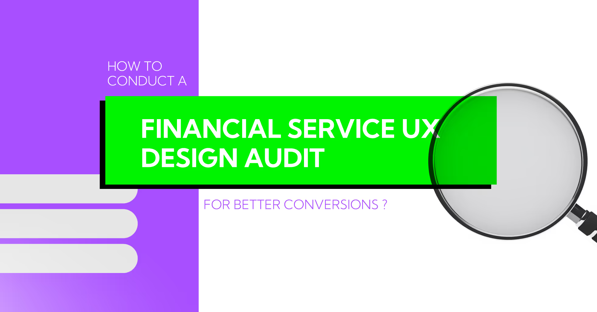
How to Conduct a Financial Service UX Design Audit for Better Conversions
Yellow Slice
Did you know that a report by Signicat states that up to 63% of fintech users abandon apps during onboarding due to the process being confusing or taking too long? Imagine losing more than half of your potential customers before they even complete registration. It is a very competitive market where conversion rates vary between 20% and 33%, thus every little improvement in UX can possibly trigger a huge financial impact.This is why a fintech UX design audit isn't just a good to have, it's a necessity. By examining the whole customer journey from onboarding to transactions, you will be able to find resistance points, streamline flows, and ultimately convert the unsure users into loyal ones. You can find out more about it in our blog post below right now.
What is Fintech UX Design Audit?
A fintech UX design audit is essentially a comprehensive performance and experience evaluation of your financial app. It is a systematic evaluation of all the interactions with your app that determine the users experience to pinpoint what is easy and what is difficult to use as well as what is driving users away.Fintech UX audits are different from general UX audits since they involve the particularities dealing with: security issues, the flow of money, and the users trust in the system. And also, A fintech UX audit ensures the RBI guidelines:
- User journeys for onboarding and KYC follow RBI-compliant communication and flow
- Every interaction in the financial sector assures clarity, consent, and transparency.
- Guidelines on security like OTP verification, transaction alerts, and protection of data are all clear and comforting.
- There are no interactions that cause confusion or emotional discomfort related to money transfer.
This audit will guarantee that your app has not only good usability but also leaves users with a feeling of security, trust, and satisfaction.
Key Benefits:
- Detect UX defects in the initial stages
- Facilitate feature adoption and onboarding flow
- Enhance conversion rates and minimize drop-offs
- Establish the trust of users and the apps credibility
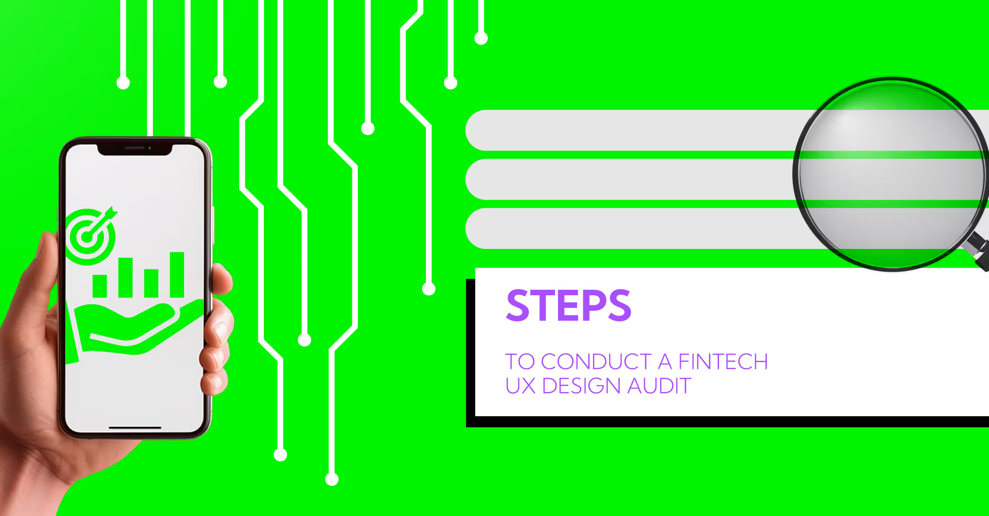
Here are the steps to conduct a Fintech UX Design Audit
Step 1: Define Your Audit Goals
Before you perform the audit, it is absolutely necessary to properly state the purpose of the audit. The goals will function like a compass and the audit will subsequently pinpoint the most pertinent areas of the application.
Main Common Goals for a Fintech UX Design Audit:
- Enhance the anti-fraud security system
- Reduce the number of canceled payments or transactions that fail
- Raise the level of user interaction with app functionalities (like investing, saving, budgeting)
- Let the trust of the users be built up by showing the security measures that are being undertaken
- Conduct the interactions through mobile first, since most fintech application users do so via smartphones
Ways to Set Goals that are Effective:
- Analyze Metrics: Go through the current analytics to determine the critical places where users are dropping off or the features that have the least engagement.
- Understand User Pain Points: Gathering users' opinions through surveys, app store reviews, or customer support tickets is one way to educate yourself about their difficulties.
- Prioritize Impact: Make a selection of the problems that have the most significant impact on income, user trust, or basic functionality and work on them
Example: If the analytics indicate that 40% of the users drop out during the onboarding process, then your goal might be to decrease onboarding drop-offs by 20% during the next 3 months.
Step 2: Collect User Data
The entire process of Fintech UX audit can be successful only if proper data is used. User behavior analysis provides the information on where the friction is coming from, the root cause.Data Collection Categories:
- Analytics Data: The use of Google Analytics, Mixpanel, or Amplitude brings to light user behavior patterns like drop-offs, and time spent, and frequent navigation paths, etc.
- User Feedback: Surveys, app store reviews, and support tickets yield user perspectives that are hard to measure. Inquire of the users what aspects they find most puzzling or that they get easily annoyed with.
- Session Recordings: Hotjar, FullStory or Smartlook show actual interactions in real time, indicating where the users are facing issues or quitting the process.
- Heatmaps: Distinguish which areas attract users' view and which areas get no attention at all. This information is useful in improving the structure, placing buttons, and making the content visible.
Tips for Effective Data Collection:
- To collect data on the different user habits over a sufficiently long period of time, a minimum of 24 weeks will be needed.
- Segregate the users according to their age, gender, or the app version they are using in order to identify the problem in detail.
- Using both qualitative (feedback, recordings) and quantitative (analytics) methods gives a well-rounded comprehension.
Example: Users can be seen scrolling through the dashboard endlessly while the session recordings reveal that they have not completed a transaction. It indicates that there is a problem with the layout or the information has been organized poorly.
Step 3: Evaluate Onboarding Flow
Each new users onboarding experience is the deciding factor for the whole journey. Simple yet long procedures can make users abandon the app quite easily.Audit Checklist for Onboarding:
- Are the forms short and to the point?
- Is the verification process quick and safe?
- Is the onboarding process clear in terms of app's value?
- Are there tooltips, guidance, or tutorials offered for the complicated features?
Advanced tip: Think of progressive onboarding, where advanced features come in slowly as the users become familiar with the product, rather than bombarding them right at the beginning.Example: The same budgeting application could first show users how to connect a bank account, and only then to monitor expenses or set certain limits. Thus, the app not only keeps users connected but also works to prevent cognitive overload.Onboarding testing with actual users or conducting A/B tests can show which flow gives the highest completion and conversion rates.
Step 4: Review Navigation and Information Architecture
The navigation system in place is a determining factor for the efficient completion of tasks. A badly designed menu or a not very clear hierarchy will surely annoy the users.Audit questions below:
- Can users get to their accounts, payments, or investment options in no time?
- Do all the screens have the same menus?
- Are actions logically grouped and unnecessary complexity avoided?
Example: When a user has difficulty locating the transfer funds option, your audit should recommend a more explicit menu label or a shortcut on the dashboard.Pro Tip: Strive for validation of your information architecture by carrying out tree testing or card sorting with users. This will make sure that users do not have to guess where to find the things they need.
Step 5: Check Form Design and Input Fields
Forms are the points of user interaction with the most confidential information. If there are mistakes in these areas, users might get irritated or give up on the transaction.Audit Checklist:
- Are field labels easy to understand and use?
- Is the error message telling the user how to correct the mistake?
- Is the form made user-friendly on mobile devices by enabling easy typing?
- Can someone who has made a mistake change it without going through the whole process again?
Example: Inline validation (immediate feedback as users fill fields) reduces errors and improves completion rates.
Step 6: Assess Visual Design and Branding
The way the design is done has a direct impact on the trust and credibility of the product. Users usually determine the quality of a fintech app based on its visual appearance.Points to Review:
- Use of colors, fonts, and icons is the same everywhere
- The information is prioritized in a very clear way
- Buttons and CTAs are very easily recognizable
- The dashboard is laid out neatly
Tip: Go ahead and see if your visual design can be understood and build confidence with real users.
Step 7: Test Accessibility
Making your app accessible means that everyone, including people with disabilities, will be able to use it. Although such features are usually neglected in the financial technology area, it is still one of the most critical parts of the user experience (UX).Main Audit Points:
- Color contrast: Make sure that even those with color blindness can read the text.
- Font sizes: It is good practice to let the user choose the text size for their better reading.
- Screen readers: Check the app's complete voice-activated navigation.
- Navigation: Already equipped with the keyboard or touch, make sure all actions are straightforward to perform, and the interactive areas are not hard to click.
Why It Matters: The app usage of different people is a great plus for you and in this case, you are showing the world your open-mindedness. A user who finds it difficult to use your app because of the accessibility features will probably not trust your app and will not use it anymore.Example: All buttons and form fields can be given descriptive labels, making the app accessible for visually impaired people. Just a few minor changes are enough to make a great deal of difference in terms of user-friendliness and satisfaction for everyone.
Step 8: Evaluate Security and Trust Signals
Given that data security is a major concern with financial apps, they have to work very hard to gain customers' trust. Users are usually very careful about giving their personal or financial information over the internet. One of the aspects that the UX audit should consider is whether the app effectively signals the precautions it has in place.Audit Checklist:
- Login security: Two-factor authentication, complex passwords.
- Security of payments: SSL badges and secure confirmation screens that are easy to see.
- Privacy policies: Locate without trouble and comprehend, with no vague terms.
- Transparent notifications: Users are notified of transactions and account activity.
Tip: Security signals that are visible, for instance, locks, trusted logos, or progress bars during the transactions, can be perceived as more secure and thus, less abandonment will occur.Example: A fintech app that prominently displays a secure badge during a transfer raises user confidence, resulting in a higher completion rate.
Step 9: Conduct Competitor Analysis
Gaining insight into the UX of your competitors provides a basis for measuring your app against theirs as well as uncovering chances for enhancement.Audit Questions:
- What onboarding methods are most effective in top fintech apps?
- How do competitors structure navigation, forms, and dashboards?
- Which visual and security elements inspire user trust?
Actionable Tip: Go for a comparison with at least three direct competitors and have the comparison based on usability, trust, and conversion paths. Recognize the shortcomings in your app and make a roadmap for enhancement.
Step 10: Collect Expert Feedback
Expert feedback is the one that can spot very subtle usability issues while data and analytics only point out the basic user behavior. UX designers, product managers, and accessibility experts can take the role of the analyst in that they can give input that is not solely based on analytics.Methods:
- Heuristic evaluations: The application is evaluated by experts in terms of usability principles laid down.
- Cognitive walkthroughs: Experts perform user simulation to pinpoint where the user might encounter difficulties.
- Usability scoring: Rating of critical flows for the purpose of prioritization of the improvements.
Pro Tip: Use the insights of the experts along with the real user data to have an all-around view of the UX performance. The experts will be able to pinpoint the areas where creating design solutions that are innovative and henceforth improving the engagement and conversions will be possible.
Step 11: Prioritize Issues
Not all UX problems have an equal influence on the user experience. Proper prioritization guarantees that the available resources will be spent wisely.The priority levels are as follows:
- Critical: An issue that completely stops the user from doing the task, for instance, unprocessed payments.
- High: Points on the way that affect the conversion, for example, non-intuitive navigation.
- Medium: Slightly bothering, e.g., icon positioning is not the same throughout the site.
- Low: Issues that only affect the look, e.g., inconsistency in fonts used.
Example: If the errors in the onboarding process lead to 20% of users not completing the sign-up, then fixing that error should be the first priority before making minor changes to the design.
Step 12: Create a UX Audit Report
Recording your findings makes sure all the team members are aware of the problems, their impact, and the solutions.The report consists of:
- Images showing the User Experience problems
- Explanation of the problems and their impact on sales
- Suggested solutions and development strategies
- Establishment of importance for each problem
- Measurements to monitor the improvement after the application of the solution
Tip: Regularly use collaborative tools like Figma, Notion, or Confluence to make reports interactive, actionable, and visible to the entire team.
Step 13: Test Changes and Measure Results
Once enhanced, monitor the effects to make sure that the audit provides real advantages.Metrics to Monitor:
- Registration and onboarding successful completion rates
- Transaction success rates
- New feature adoption and usage per time period
- User satisfaction surveys
Step 14: Repeat Regularly
The thing is UX is a never-ending process. Periodic audits should be conducted to keep pace with the changing user expectations and the evolving trends in the industry.Frequency Recommendations:
- Quarterly mini-audits.
- Annual comprehensive audits.
- Post-major feature launches.
Tools for Conducting a Fintech UX Design Audit
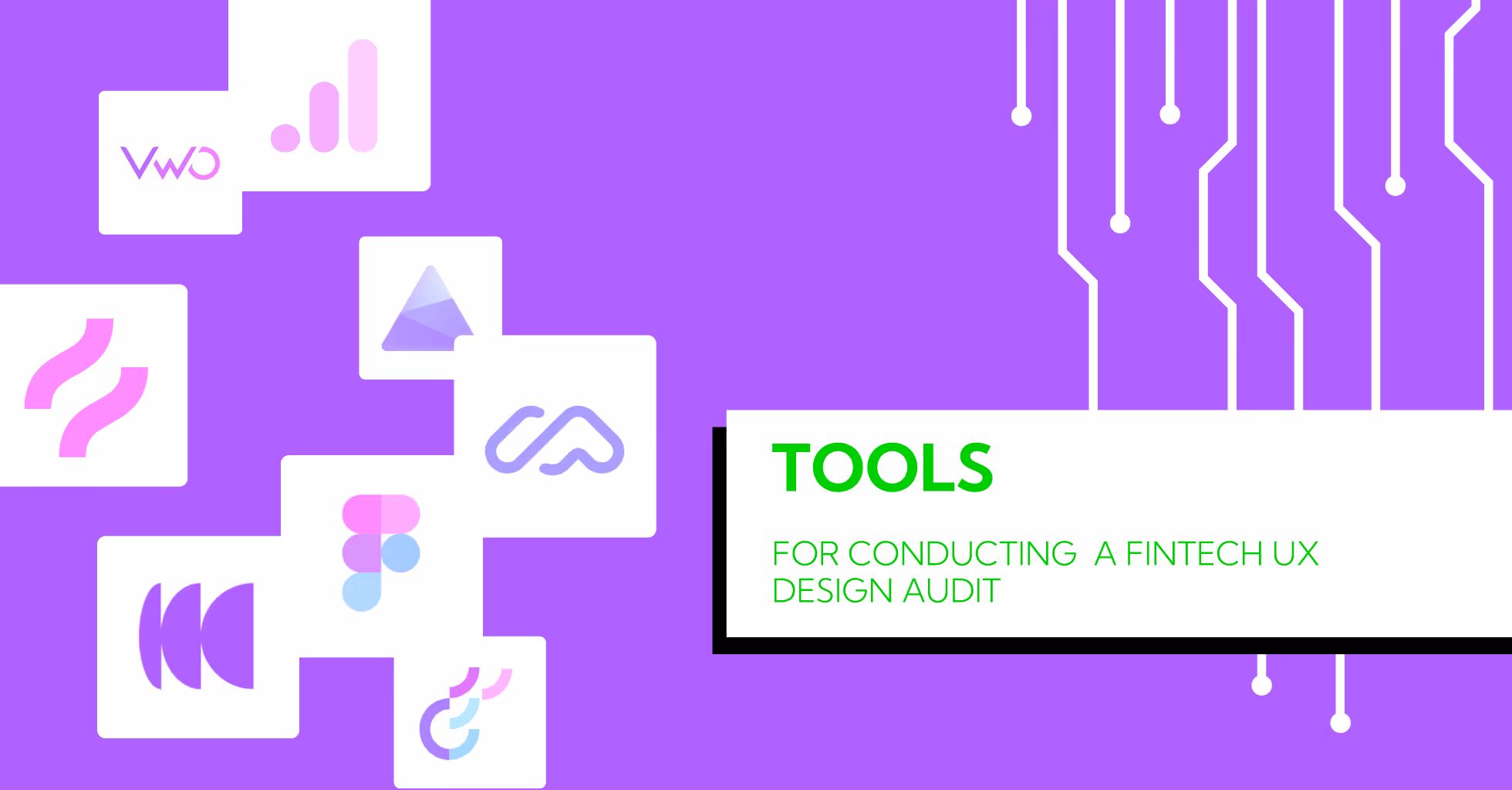
ToolPurposeHotjar / ClarityShows user behavior with heatmaps and recordings.Google Analytics (GA4)Tracks user journeys and drop-off points.FigmaDesigns and prototypes improved UI flows.Maze / UserTestingCollects real user feedback and reactions.UX Check / Heuristic ReviewIdentifies usability issues based on best practices.Optimal WorkshopTests navigation labels and menu structure.VWO / OptimizelyRuns A/B tests for conversion improvements.
Final reflection: give users a reason to stay

Its all well and good to have a bunch of features in a fintech app, but the real deal is how users perceive it all. When users are confused about navigation or the whole thing is tiring, their trust will diminish. A Fintech UX design audit is there to reveal those subtle areas of friction and to transform the users negative feelings into confidence. Are you looking for the best UI/UX company? At Yellowslice, we turn complex financial journeys into simple, meaningful experiences. Lets build an app people dont just download, but choose, trust, and return to every day with us. Contact us right now.
Founder's Insight
A story is behind every brand. What we do is make it so that the users feel they are in the story too. At Yellow Slice, we create meaningful designs that are not confusing and will satisfy your users. Kishor Fogla, Founder of Yellow Slice
FAQs about Fintech UX Design Audit for Better Conversions
- Are fintech UX audits expensive in 2025?
It's different for every agency but the majority of the fintech companies do to an improved UX and a strong ROI which is user trust, transaction ease, higher conversion, and eventually loyalty.
- Is user testing compulsory for UX audit in 2025?
Definitely yes. The feedback from the users is the only way to get a precise insight. The semantic tools can only analyze a limited spectrum of what a real user feels and reacts.
- How often should a Fintech UX Design Audit be done?
If possible, every 612 months. Fintech trends and user expectations change quickly; thus, regular audits would ensure your product is usable and also ahead of the competition.
- What is the duration of a Fintech UX Design Audit?
It generally takes about 2-4 weeks, depending on the product complexity, user journeys, and the extent of testing.


Let's create something amazing!
Let's discuss your vision and how we can bring it to life with impactful design solutions.
.avif)
Good design starts with Sliced Newsletter
Subscribe to the Sliced newsletter and get the best of research, UX writing, product psychology, CX, and design systems, right in your inbox.
