Zerodha Streak App Review 2026: UI/UX Analysis & Expert Verdict
Ritika Singh
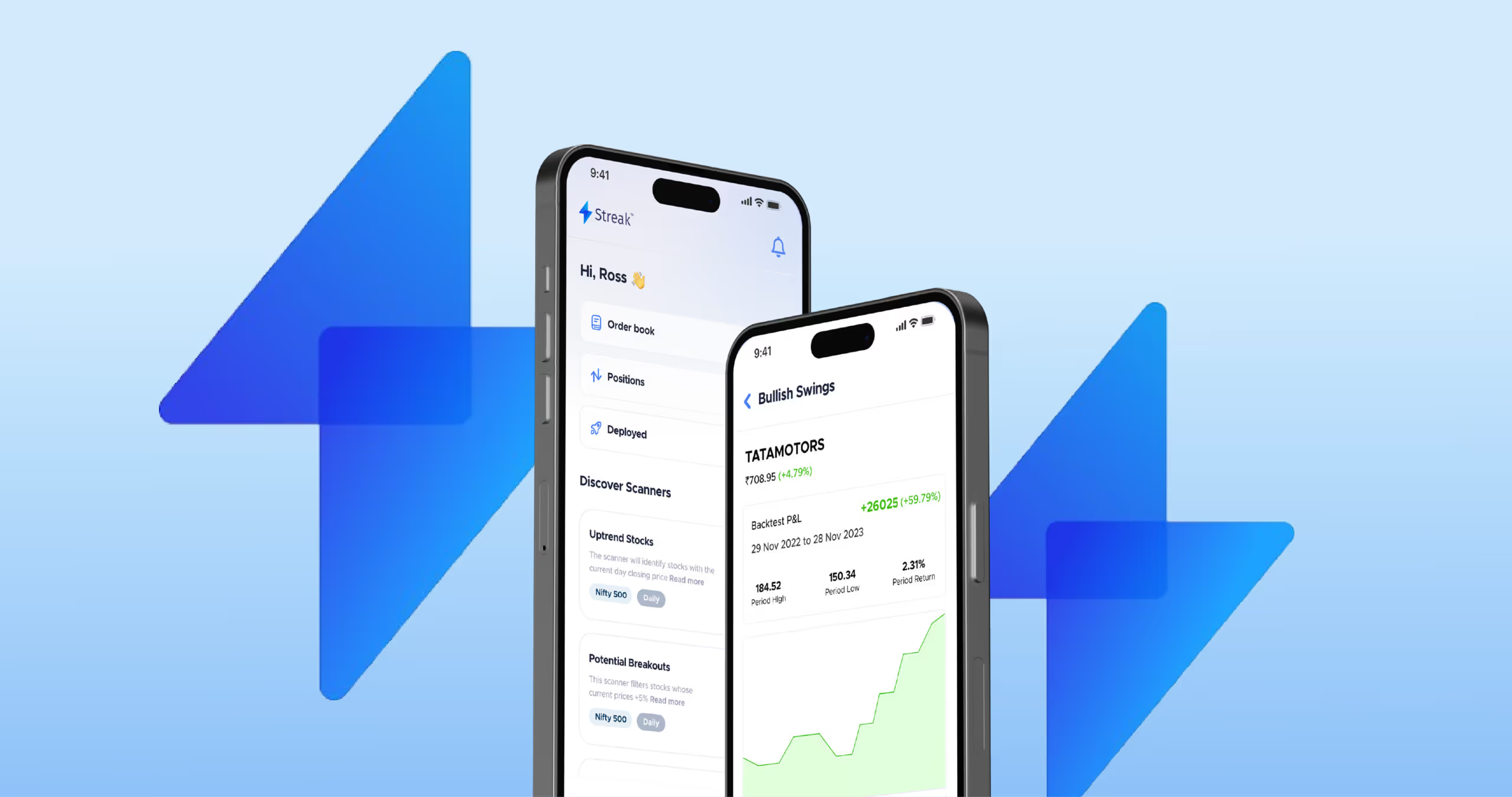
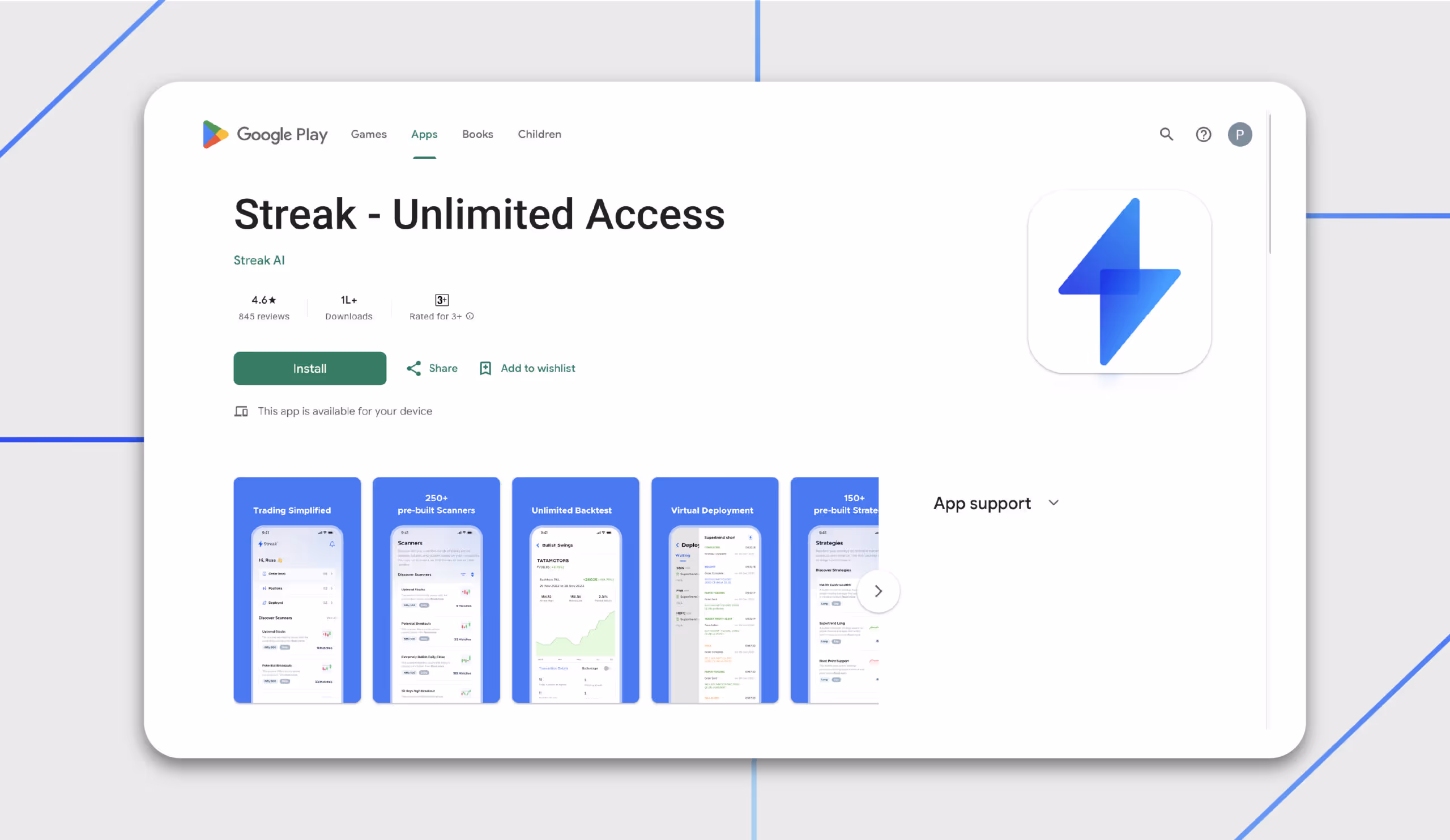
Streak is the world's fastest systematic trading platform, which was founded in 2017. They combined trading and technology to deliver an innovative solution for both novice and seasoned traders.Streak shook hands with India's leading broking firm Zerodha, and became an official partner. People using Kite could now easily log in to their Kite account and access Streak features.What features make traders love Streak? What worked in Streaks favour?Its the fact that people can manage their trades on the go on their mobile phones (iOS and Android) without needing to know any coding. They have made systematic trading accessible and affordable to all.They provide the tools required in a modern trading environment, including 250+ scanners, technical strategies, backtesting, live deployment, dynamic contracts, and more.Streak gives traders the edge they always lacked. With systematic trading, backtesting, and live deployment, they can now become more disciplined and effectively manage risk, ultimately becoming better traders than before.It doesnt just stop there; Streak also offers a 7-day free trial, allowing you to experience Streak without any long-term commitments.With a 4.7-star rating on the Play Store and 1L+ downloads, the platform designers still could use some suggestions, and thats what we are here for today.
Streak App Pricing: How Much Does It Cost? (2026)
Before signing up, this is the most common question that is asked: Is Streak free, or does it cost money? Here’s everything you need to know about it.
Free Trial
Streak offers a 7-day free trial with limited access. Zerodha users get default access with five live deployments and 15 virtual ones. This is usually enough to explore the platform and test a few strategies before committing.
⚠️ Important update: As of early 2026, Streak's Google Play listing states it is offering unlimited access to all Zerodha users. The pricing tiers above reflect the most recently published plan structure. Verify current pricing directly on their platform before subscribing, as plans may have changed.
How did Streak become so Popular?

- People were hesitant towards systematic trading because they thought coding knowledge was a must. However, with Streaks drag-and-drop interface, the need for coding knowledge is eliminated. It makes it easy for traders to automate their portfolio strategy.
- In a significant stride, Streak joined forces with Zerodha, Indias leading broking house, to democratise algo trading. This partnership further instilled a lot of trust in the users because Zerodha is a trusted name.
- New to trading? Dont worry, Streak has a strategy builder that allows traders to discover their trading potential. Its available in basic and advanced modes.
- Once you select your products, Streak enables you to set stop-loss orders and target profit levels. You can do this with multiple brokers. Once you select the required information, you can leave the rest on the platform; it will take care of your orders.
- Streak is a boon for people who are tired of being tied to their trading screen, constantly monitoring charts. Streak enables traders to test their strategies using historical data without risking real money. Thus, the Streak Advance algo trading platform frees you from the daily manual efforts to boost your portfolio.
Real User Complaints About the Streak App #UserFeedbackDecoded
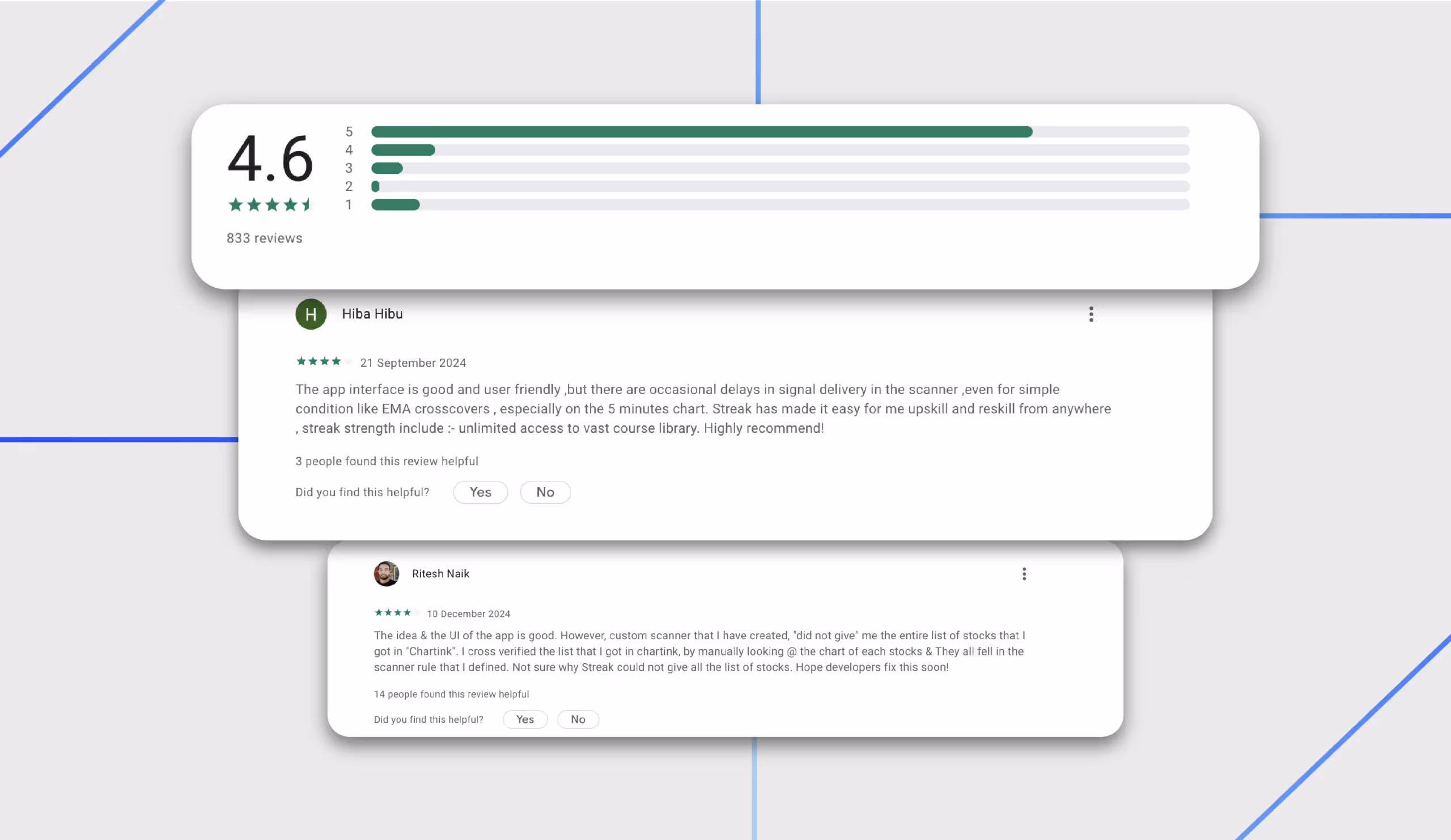
Most app reviews skim the surface. We dug into Play Store feedback, App Store reviews, Zerodha's community forum (Z-Connect), and TradingQnA to find out what real traders feel about the Streak app.
1. No in-app user guide or glossary for beginners
The concept of fintech and trading is new to a second-world country like India. Users who are located in urban areas, early professionals in their 20s, and senior citizens who know very little about finance jargon.
Many users have requested a built-in user manual or glossary within the app. Terms like "scanner", "backtest", "virtual deployment", and "dynamic contract" are used throughout the interface without explanation.
This creates a steep learning curve, and from a UX standpoint, this is an onboarding failure. Streak positions itself as a platform that’s built for traders without coding knowledge. Assuming that users understand the terminology contradicts its positioning.
Streak does maintain help documentation and a YouTube channel with tutorials, but none of this is surfaced within the app itself, where users need it most.
2. Repeated login disconnections from Zerodha/Kite
One of the most frustrating things on a platform is when you have to keep logging in every time you get on it. Streak frequently disconnects from users' Zerodha Kite accounts, requiring them to log in again every time they open the app.
Some users report being unable to log in at all. Trade alerts are time-sensitive. A missed alert can mean a missed trade or an unexecuted stop-loss. A trading app that promises automation is supposed to reliably maintain a session.
3. The Android app cannot be minimised or exited properly
On Android devices, many users report that once the app is open, it cannot be properly closed or switched away from. Even tapping "exit" does not minimise the app. Active traders monitor multiple tools simultaneously, but this hiccup makes it difficult for users to multitask.
4. Streak Pro was better; the UI was downgraded after the update
Streak used to have a subscription model for the pro version. Soon, they ended this freemium model, but multiple users on Zerodha's community forum expressed that they were not presented with a clear product roadmap for the new platform, which led to confusion among users.
When a platform evolves its UI significantly without a transition guide, experienced users bear the cost of that decision.
5. Dynamic contract (Options) support is missing or limited
Streak doesn’t have a functional contract option for option traders where they can backtest and deploy future & options strategies. This isn’t beneficial for traders who want to explore beyond basic equity trading.
Streak offers basic customisation but lacks support for multi-timeframe logic, custom candle intervals, and dynamic exit triggers, making it less suitable for traders who rely on layered or conditional setups.
6. No dedicated support channel for urgent issues
Support is available only via email at support@streak.tech and through Zerodha's general helpline. There is no dedicated live chat or ticketing system for Streak, which may delay resolution for urgent issues.
In trading, timing is everything. If a live strategy misfires or a session drops during market hours, a 24-48-hour email response window is not acceptable. Some users on Z-Connect have reported delays in getting responses.
How Did Streak Respond to User Feedback?
Users are usually directed to write a written complaint to support@streak.tech. No in-app fix or workaround has been communicated publicly. Also, Zerodha acknowledge the feedback and states they are incorporating user requests but provides no ETA on the features being restored.
Streak App Review Led By Vidushi, A Design Expert At Yellowslice.

Reviewed by:
- Vidushi
- Harshini
- Sonalika
- Samrudhi
- Aadesh
Here are the findings that the UI/UX designers found out about the Streak app,
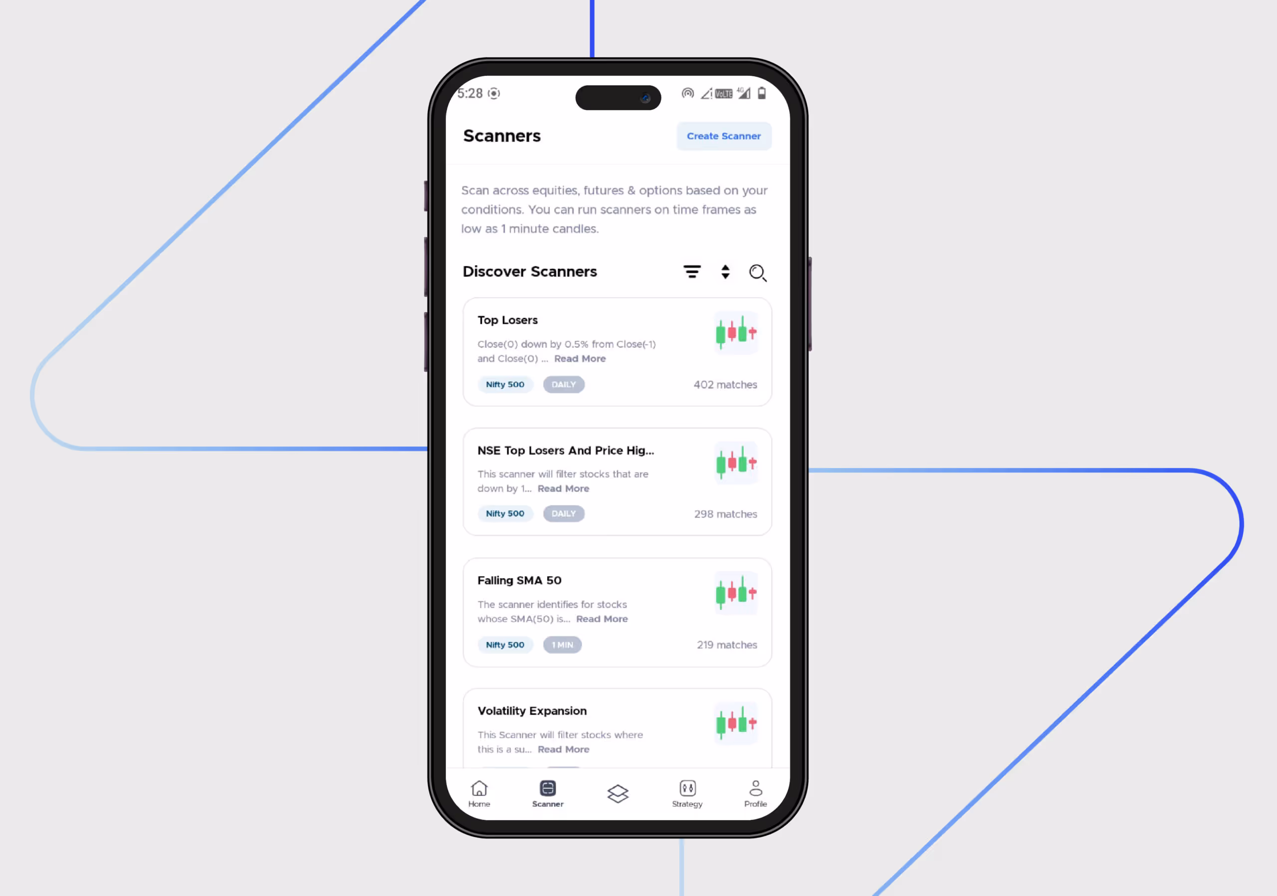
Information Overload
While the titles are informative, a true novice user might still be unsure of what a scanner or strategy is. They should not be overwhelmed with information, as they dont fully understand what it means in the context of trading.
Inconsistent Onboarding Interaction
This screen illustrates the interaction between the two onboarding screens. The onboarding interaction is not smooth.

Users may find this interaction to be jarring and inconsistent. This could raise concerns about the app's overall quality and reliability, particularly given its role in handling sensitive trading information. If fundamental interactions are problematic, users may question the app's ability to manage complex tasks.
Information Hierarchy
The information hierarchy is unclear here, which is why it cannot effectively guide users attention. For instance, the login button, one of the most crucial elements on the screen, is small and does not capture users eyes.The information is still presented in a way that might be overwhelming for a new user. Consider if the hierarchy could be improved to guide the user's attention.
Unclear Modals
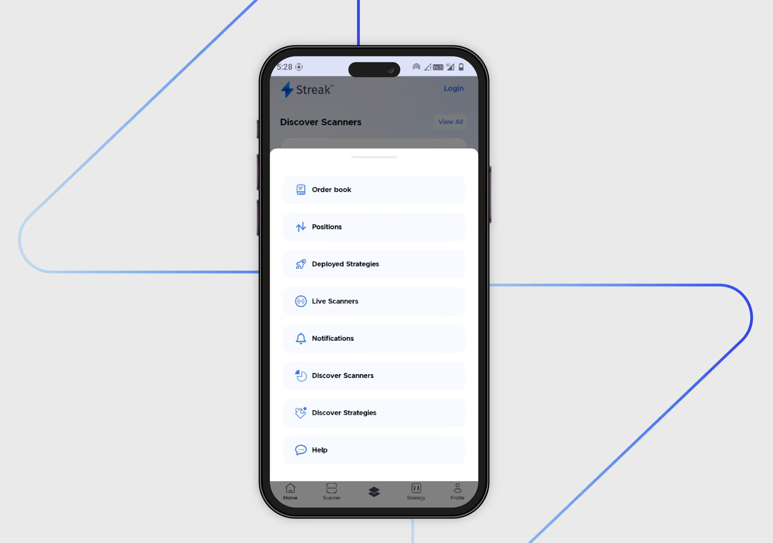
This modal appears when you click the third option in the middle of the navigation. The exact purpose of this modal is unclear. It can be for a quick access menu or a settings menu, but they are also redundant.Discover Scanners and Discover Strategies are already accessible through the bottom navigation bar. Some labels, such as Order book and "Positions," may not be immediately clear to novice users.
Higher Consumer Satisfaction = Higher Conversion Rates ??

Our designers didnt just highlight the platform's problems; they also developed solutions to improve it. Based on the problems mentioned above, the following solutions were suggested.
Clarity For New Users
There should be a brief explanation of financial terminology to help people new to stock trading. Ensure that the language used is clear and easy to understand. There should be a progressive disclosure of the information.On the first screen, focus on the core concept of scanners. More detailed information can be introduced on subsequent screens or within the app itself. Tooltips or brief explanations can be added on the homepage for more clarity after onboarding.Although there are screens that introduce more advanced concepts, such as "backtesting" and "virtual trading." They could have been explained more clearly to novice traders.
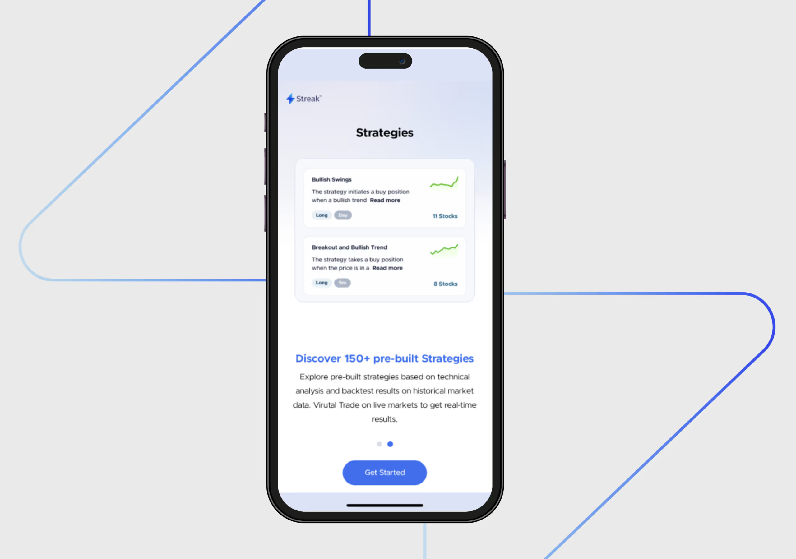
Maintain Consistency in the Onboarding Screen
To enhance the user experience, ensure that the transition between onboarding screens is fluid and captivating. While the dot indicator helps track progress, the ideal scenario is for only the screen content to change while the dot indicator and CTA maintain a consistent presence.
Maintain an Informational Hierarchy
Users could better understand information if it were presented in a better hierarchy. For instance, the difference between a heading and a subheading should be prominent so that its easy to comprehend the information on screen. Make the login button in a way that its one of the first things to catch the user's eye.
Make Modals Comprehensive
The items on modals are presented with equal visual weight. To improve the visual hierarchy, some items should be prioritised, and others should be grouped. Items that are already there in other navigation items should not be included in this section.
Expert Review by Vidushi
The UX takeaway from this audit is that Streak got the core concept right, which traders genuinely value. The gaps on the app lie in the territory of UX and product design. This is an execution problem; the platform is stumbling upon session management, onboarding clarity, and support accessibility.
Streak has partnered with Zerodha, a massive name in the trading industry; they must be doing something right. A clean, modern, and consistent design language featuring a light colour scheme is working well for them. Not only does it enhance visual appeal, but it also fosters user trust, which is crucial in a fintech app.However, as the famous saying goes, nothing is perfect. In UX, this is especially the case; designers can always strive to make it easy for users to use the platform. Looking to improve your fintech app’s UX? Contact Yellow Slice for a free audit.

FAQs- Streak User Journey Decoded
1. Why are people choosing Streak?
On the homepage itself, Streak is doing a great job; they set high expectations by showcasing that there are 250+ pre-built scanners. Mentioning the indices (NIFTY, BANKNIFTY, FINNIFTY) and timeframes (1 minute to 1 Day) further sets expectations for the app's potential.Theres a lot of consistency in terms of the design and colour palette of the app. Calls to action, such as Get Started, are displayed on the app, providing a clear next step for the user.
2. Where can the UI and UX of the Streak app be improved?
The homepage of the Streak app is not personalised for different users based on their onboarding selections or activity on the app. The small statistics charts are a good starting point, but they could be more visually appealing to capture the users attention.The data presented on several screens is presented in a dense format. Visual cues, in addition to these data points, can improve readability.


Let's create something amazing!
Let's discuss your vision and how we can bring it to life with impactful design solutions.
.avif)
Good design starts with Sliced Newsletter
Subscribe to the Sliced newsletter and get the best of research, UX writing, product psychology, CX, and design systems, right in your inbox.
