Redesigning JOY’s Digital Presence
Joy is a renowned e-commerce brand seeking to enhance the usability and navigation of its digital products.

industry
Services Provided
PLATFORMS
BUSINESS TYPE
Overview
JOY has a global customer base and offers a range of innovative, high-quality & affordable personal care solutions. The brand aimed to improve its digital experience across its website and app, enabling users to easily explore and purchase products.
.avif)
.avif)
.avif)
.avif)
.avif)
.avif)
Navigating complexity
Simplifying Navigation with UI
Redesign and simplify JOY’s website UX/UI to enhance functionality, navigation, and user experience.
The Method Behind Magic
Our Design Methodology
To ensure a smooth project flow, we adhere to the STEP process, an acronym representing Soak, Think, Execute, and Proof. Beginning with UX Research, the UX design case study progresses to strategy and concludes with impactful UI.
.avif)
.avif)
.avif)
Decoding the Ecosystem
A 360° View
We began with extensive research, analysing existing processes and workflows through interviews and market trends.
Personalisation Without Complexity
We found that most wellness apps overload users with features without connecting emotionally.
.avif)
Simplifying Flow
Existing products offered helpful features without an intuitive and clear user journey
Gamification
Users wanted to celebrate progress, not just check off goals.

Feedback
They valued visual progress tracking and meaningful feedback.
Designing for Motivation
Daily affirmations, progress visuals and rewards keep motivation alive.
Indirect Competitors
.avif)
Large FMCG and personal care brands such as Nivea, Vaseline, Dove, and Lakmé were considered indirect competitors.
- Leverage strong brand recall to build instant trust with customers.
- Product information is standardised and easy to scan across categories.
- Simple navigation helps users quickly locate familiar products.
Direct Competitors
.avif)
Digital-first personal care brands such as Mamaearth, WOW Skin Science, Plum, and Minimalist were identified as direct competitors.
- Clear product benefits and ingredients are highlighted upfront.
- Clean layouts support faster decision-making and reduce browsing friction.
- Product variants and pack sizes are clearly differentiated for easy selection.
Core problems
- Many tools miss emotional engagement, focusing only on routine.
- Users drop off when features feel repetitive or transactional.
- Personal growth feels impersonal without a human touch, like affirmation
Key Opportunities
- Design with empathy, like a coach that understands them
- Introduce gamified incentives that feel rewarding, not forced.
- Use personalisation to build an emotional connection.
- Build trust with transparent data handling
Building the Experience (UX Design)
Turning Insight into Frameworks
We redesigned the sitemap and structure to offer a more intuitive journey, ensuring users could move through the platform easily.
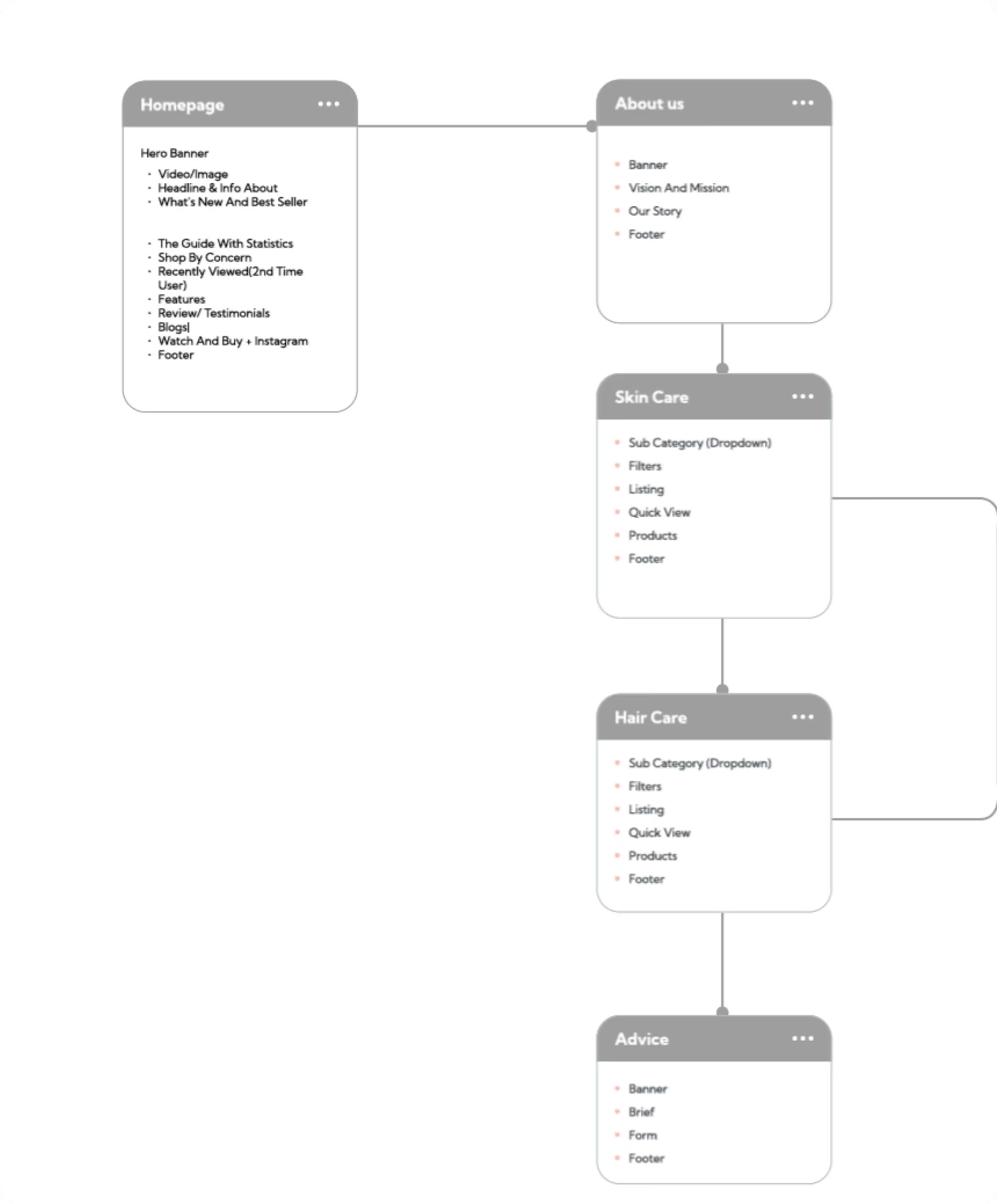
.avif)
.svg)
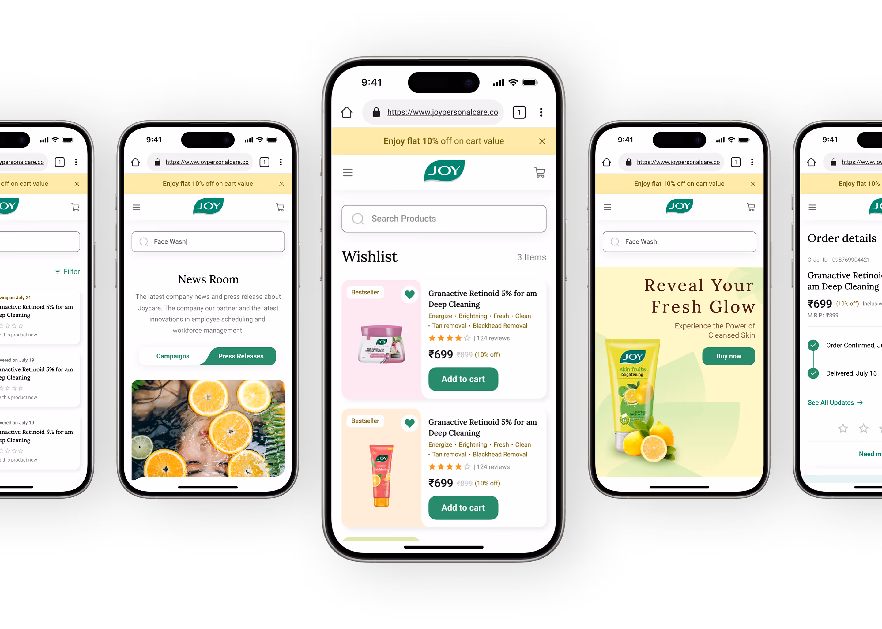
Our Solution
Simplifying Discovery & Interaction
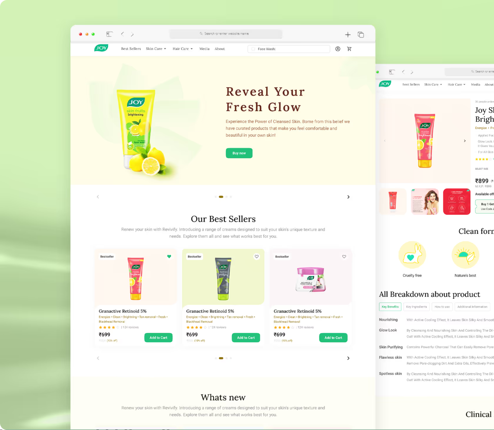
The redesigned interface clearly presents product categories and key actions.
Smarter Navigation, Better Flow
We reorganised content to let users find what they need faster with fewer clicks.
Clean Interface, Consistent Experience
A modern UI system that supports usability and brand aesthetics.
Form Meets Function
Designing Engaging Interfaces
JOY’s website combines functionality with a cohesive visual identity. Primary colors green and yellow set the tone, supported by soft secondary shades of pink, lavender, and muted green. Typography uses Lora and Roboto, while illustrations and UI components were finalized with stakeholder approval to ensure consistency.
.svg)
.svg)
.svg)
.svg)
.avif)
Success story
What happens when great design meets real problems? Our projects speak louder than buzzwords.

YellowSlice takes the time to understand our business needs. I can count on YellowSlice for fresh perspective, innovative ideas, consistency, solutions and accuracy.

More Like this
.avif)
Stop Guessing. Start Designing.
See why we’re not just a UI/UX Design agency; they see us as a strategic partner to their team.
Good design starts with Sliced Newsletter
Subscribe to the Sliced newsletter and get the best of research, UX writing, product psychology, CX, and design systems, right in your inbox.
