Designing a construction safety solution
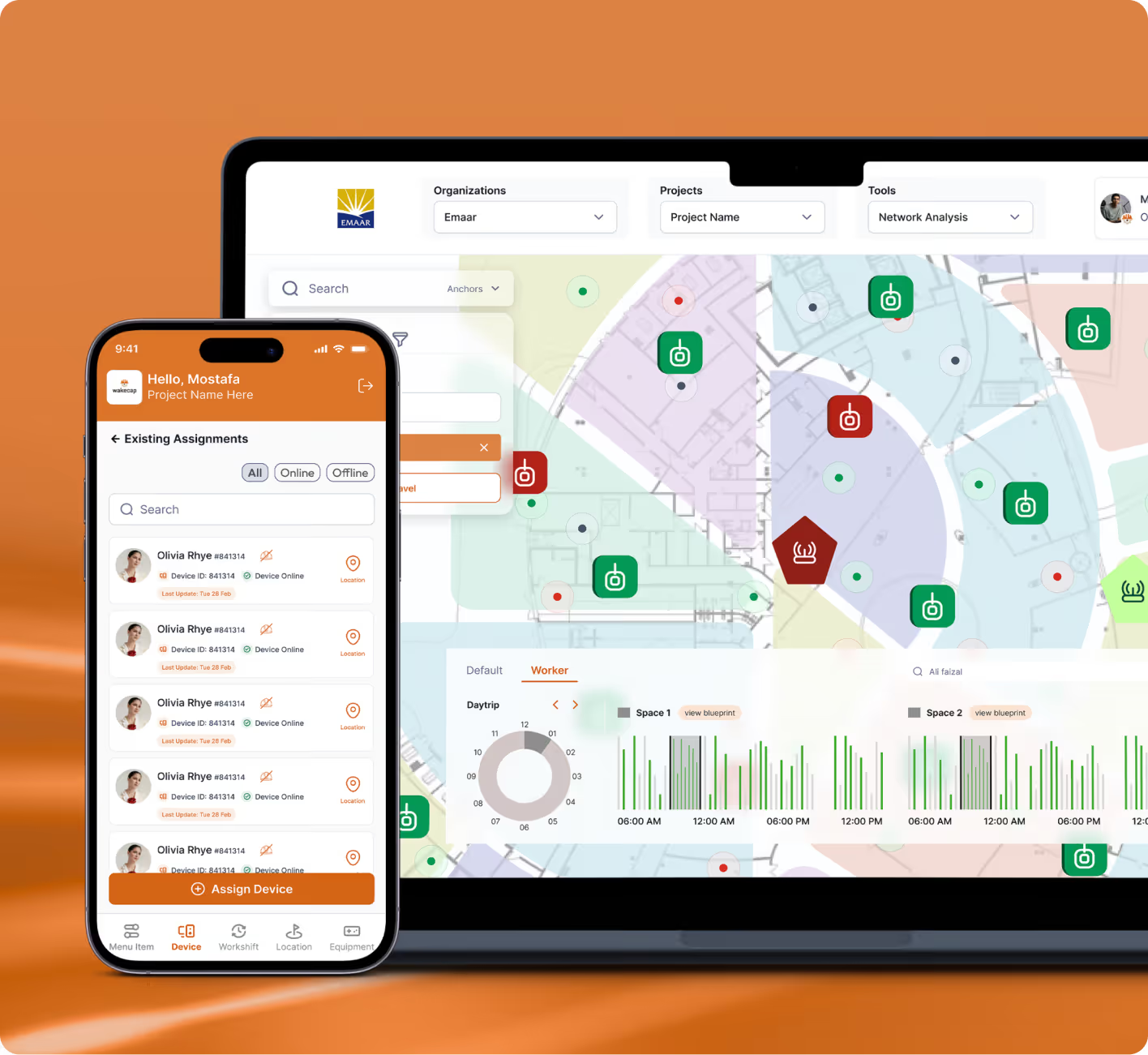
Wakecap is designed to provide heavy-duty workers with a safe working environment.


industry

Services Provided

PLATFORMS

BUSINESS TYPE
Overview
Wakecap is a smart platform that enhances safety and productivity for heavy-duty workers by tracking on-site activities and providing real-time data to boost efficiency.






Empowering Worksites
Driving Productivity Through Innovation
Redesign and modernise workforce management on construction sites to reduce human oversight, improve safety, and streamline operations, minimising downtime and operational costs.
The Method Behind Magic
Our Strategic Design
To ensure a smooth project flow, we adhere to the STEP process, an acronym representing Soak, Think, Execute, and Proof. Beginning with UX Research, the project progresses to strategy and concludes with impactful UI.

.avif)
.avif)
Decoding the Ecosystem
A 360° View
Leveraging insights from UX research and competitive analysis, Wakecap empowered teams to make proactive decisions, improve safety, and optimize construction site performance.
Workforce Management Insights
UX research revealed inefficient workforce processes, highlighting opportunities to reduce labour costs and streamline on-site task management.
.avif)
Safety Risk Analysis
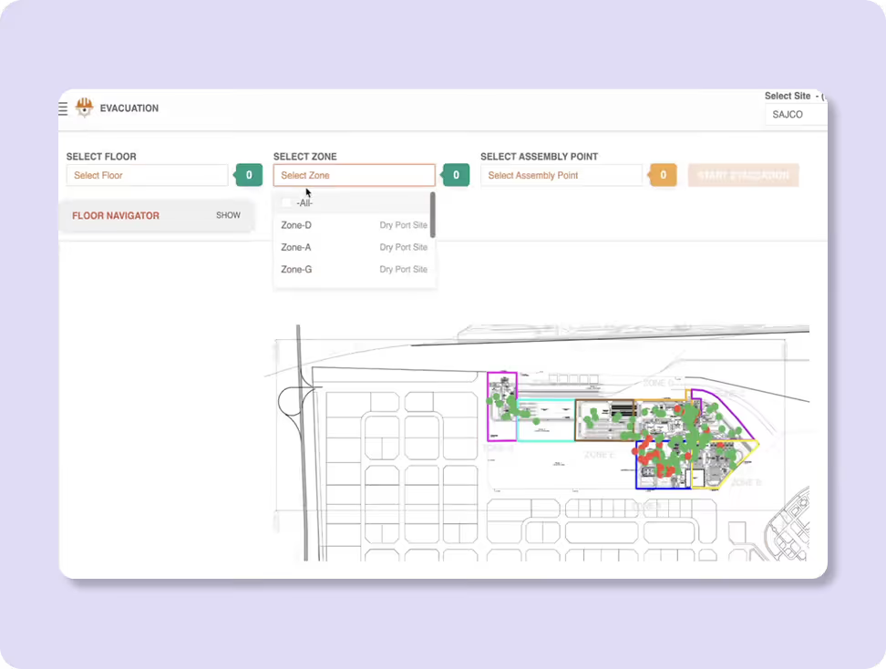
Audit uncovered gaps in preventive safety measures, enabling smarter monitoring and real-time interventions to protect workers.
Safety at a Glance
Users need to quickly understand site conditions and worker status without digging through complex data.

Clarity Drives Action
Clear visual cues and well-prioritised information help site managers respond confidently to alerts and incidents.

Effortless Monitoring
Supervisors value an interface that enables smooth, distraction-free tracking of workforce activity and safety metrics.

Indirect Competitors
- Rely heavily on manual inputs and delayed reporting, limiting real-time action.
- Information is often fragmented across multiple tools and formats.
- Interfaces are not designed for on-site, time-critical use cases.
direct Competitors
- Real-time alerts and dashboards are central to the experience.
- Clear visualisation of worker location, movement, and safety events builds trust and usability.
- Simplified navigation and prioritised data help managers respond quickly and confidently.
Core problems
- Workforce management remained inefficient, causing higher costs and delays.
- Safety risks in construction, mining, and manufacturing persisted due to minimal technology.
- Equipment breakdowns, even minor, caused long delays and higher maintenance.
Key Opportunities
- Unified interface streamlined workforce management, reducing oversight and boosting efficiency.
- Real-time safety alerts let managers respond quickly to emergencies.
- Dashboard visualized IoT data, providing managers actionable insights on operations.
Architecting Experience
From Insights to Frameworks
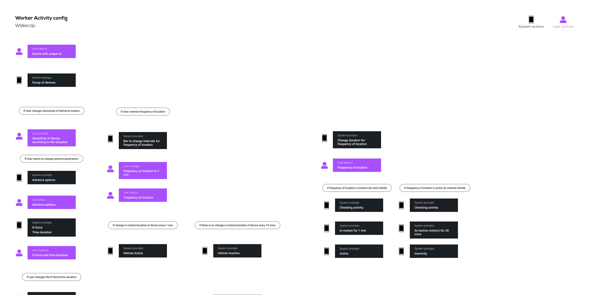
The Wakecap platform was redesigned with clearly prioritised data, intuitive task flows, and robust wireframes. This enabled site managers and safety teams to monitor workforce activity, respond to alerts faster, and make informed decisions with ease.
Solution
Intuitive Information Architecture
Organised construction intelligence into logical modules: live alerts, workforce overview, safety events, and analytics charts.
Responsive Navigation Patterns
Consistent menus and quick-access panels ensured users could move between mission-critical screens without confusion.
Purpose-Driven Visual Language
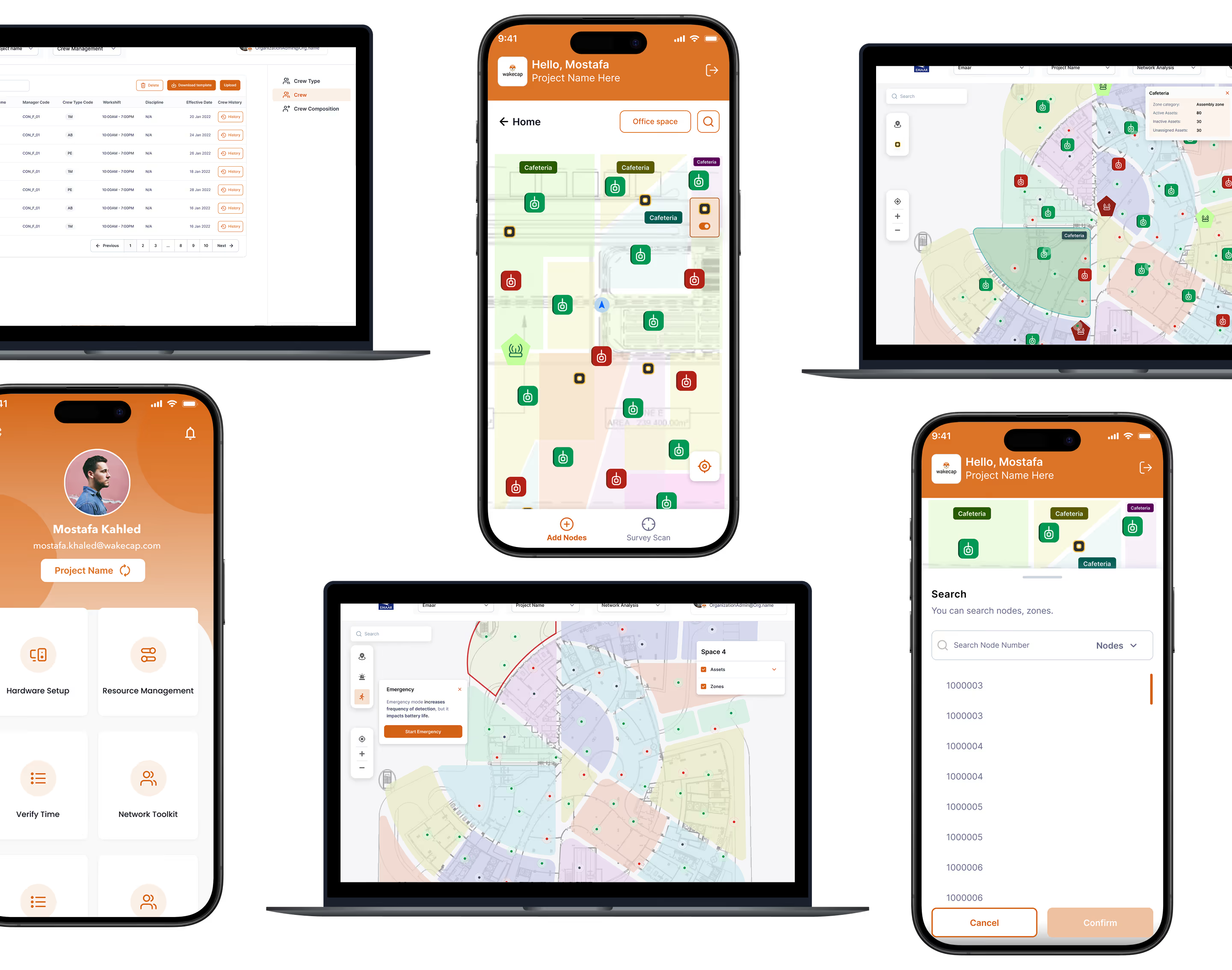
Visual elements: typography, colour cues, and icons were chosen to communicate urgency, safety status, and data insights clearly, even in high-stress environments.
Form Meets Function
Designing Engaging Interfaces
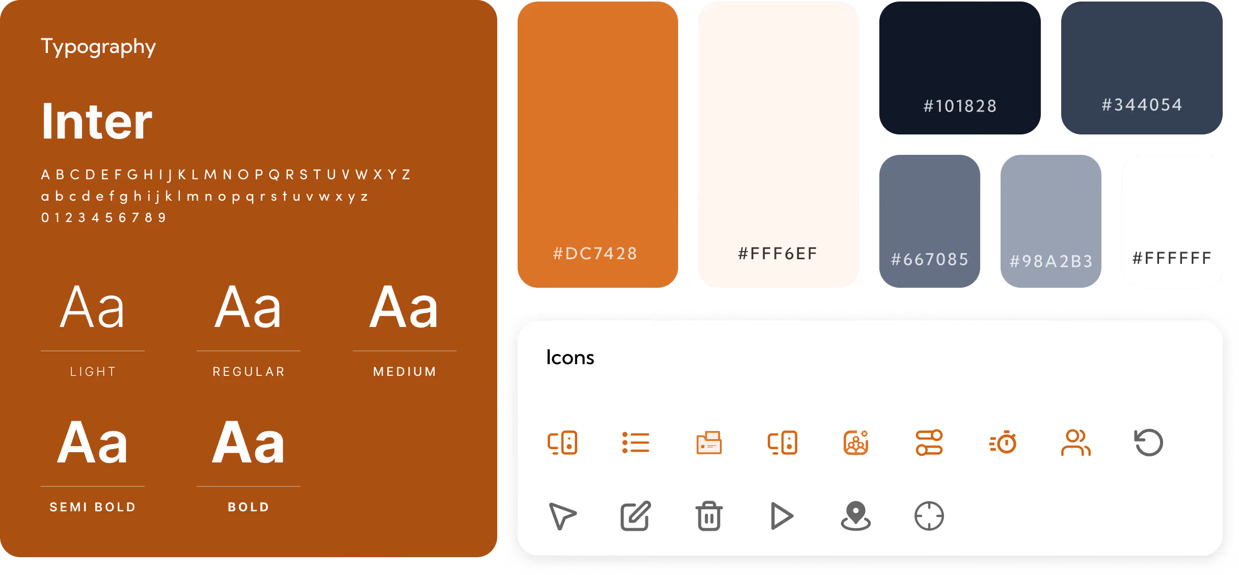
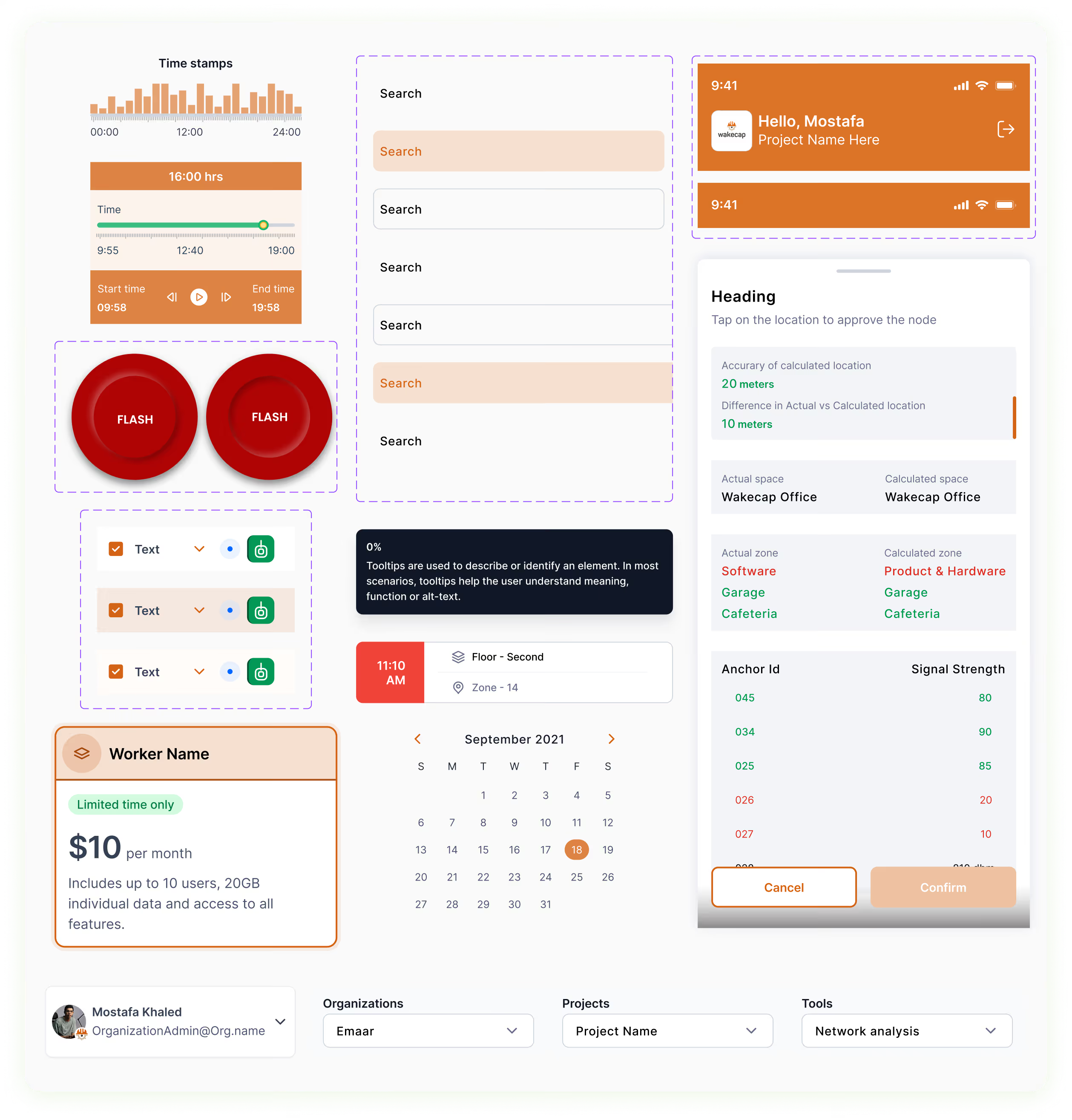
The Wakecap interface supported by clear typography for fast readability used the font, Inter. A high-contrast colour palette was used. For primary colours we used Orange, Beige and White. For secondary colours we used different shades of grey and black.

.avif)
More Like this
.avif)
Talk to Us Today!
Let’s explore how our creative expertise can transform your product into a human-centric and innovative solution.
Good design starts with Sliced Newsletter
Subscribe to the Sliced newsletter and get the best of research, UX writing, product psychology, CX, and design systems, right in your inbox.