Reimagining EdTech with My Loft’s Digital Library Platform
A UX/UI redesign to elevate My Loft’s digital content ecosystem, making academic research, reading, and content management unified and engaging.
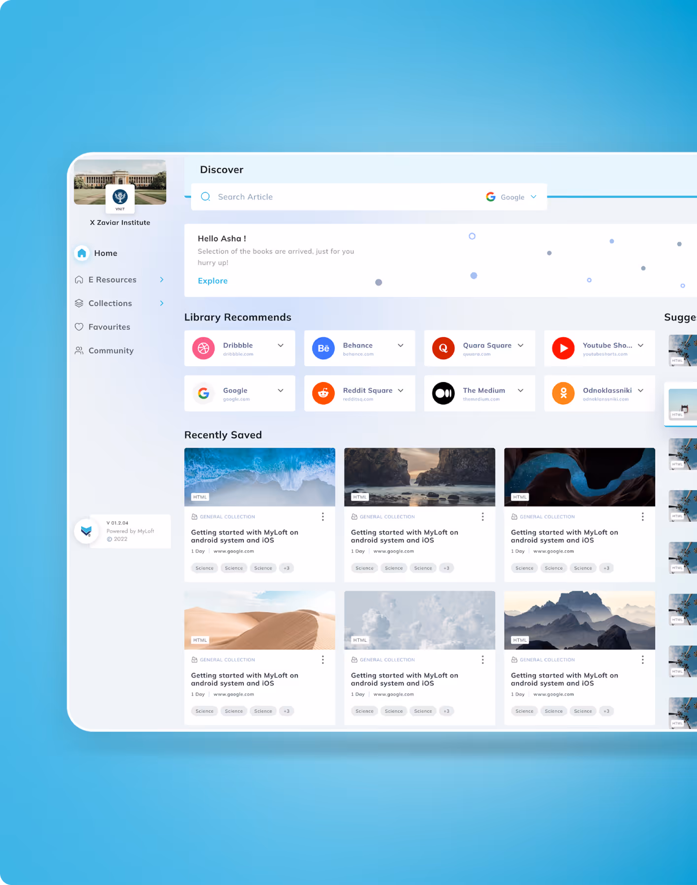
Improved Content Discovery & Reading Experience

industry
Services Provided
PLATFORMS
BUSINESS TYPE
Overview
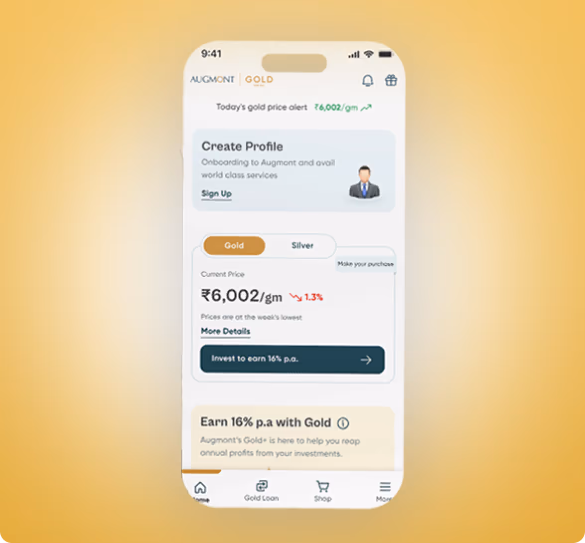
MyLOFT, or My Library on FingerTips, is a portal for academicians, educators, and students to access academic books and other resources, including research papers, journals, review reports, and more.
.avif)
.avif)
.avif)
.avif)
.avif)
.avif)
.avif)
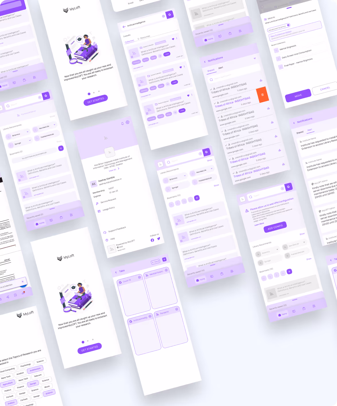
Simplifying Research & Reading
Streamlining Academic Journeys Across Devices
Our client from Eclat wanted us to redesign their mobile app and web plugin to streamline their user journey and improve the user experience. The app and plugin had similar features to their web portal, which allows students to log in, view, organise, and read library resources online & offline.
The Method Behind Magic
A Learner-Centric Design Strategy
To ensure a smooth project flow, we followed the STEP process. An acronym representing Soak, Think, Execute, and Proof.
.avif)
.avif)
Decoding the Ecosystem
A 360° View
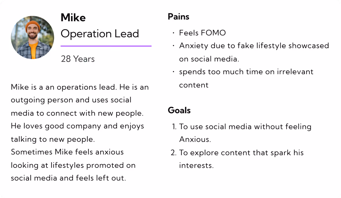
We started by conducting user interviews and frequent meetings with subject-matter experts to gather information that helped us form user personas and a typical user journey map. After using it for more than a month and reviewing it, we identified usability gaps that impact content discovery and reading journeys.
Clear & Guided Learning Journeys
The UX audit revealed friction in discovering, saving, and accessing academic resources, due to unclear navigation and limited visibility into key actions. Search, discovery, and content access flows were restructured to guide users step by step, making the journey intuitive and predictable.
Streamlined Discovery & Reading Flows
Task flows were refined to help users search resources, save content, create collections, and switch seamlessly between reading modes. Contextual prompts and visual cues surfaced at exactly the right time, when users needed guidance or next steps.
Clarity Builds Confidence
Users wanted a clear understanding of how to discover, save, and access content across devices before committing to deeper research.

Visual Simplicity Matters
Respondents preferred clean layouts and focused reading interfaces that reduced cognitive load during long study sessions.
.avif)
Consistency Fosters Trust
A transparent, consistent experience across platforms helped users feel confident in relying on My Loft for academic research and learning.
.avif)

- The platform emphasises collaboration with user groups and invitations, allowing users to work together on research.
- Offline access and cross-device sync are critical for learners.
- They made support and guidance accessible at multiple touchpoints.
.avif)
- PubMed provides article citations that can be imported into bibliography managers.
- It allows users to view related articles and sources for all its publications, along with the publication dates.
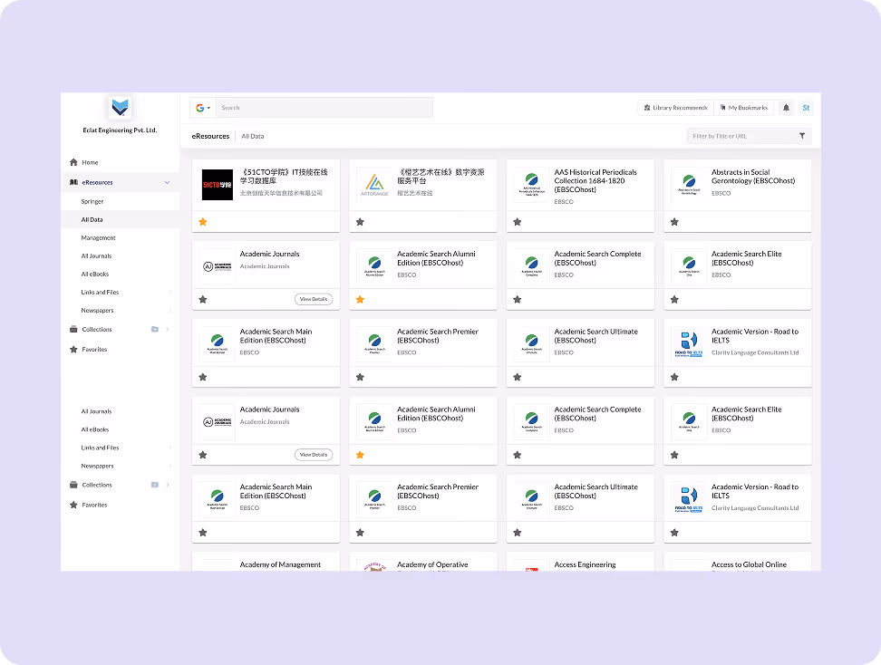
- Clear content categorisation improves find-ability.
Core problems
- Overly complex colours and some texts are too small, making it hard to use.
- Monthly or yearly payment options are too expensive for the user to afford.
- Without a weight tracker or graph, users can't see their progress.
Key Opportunities
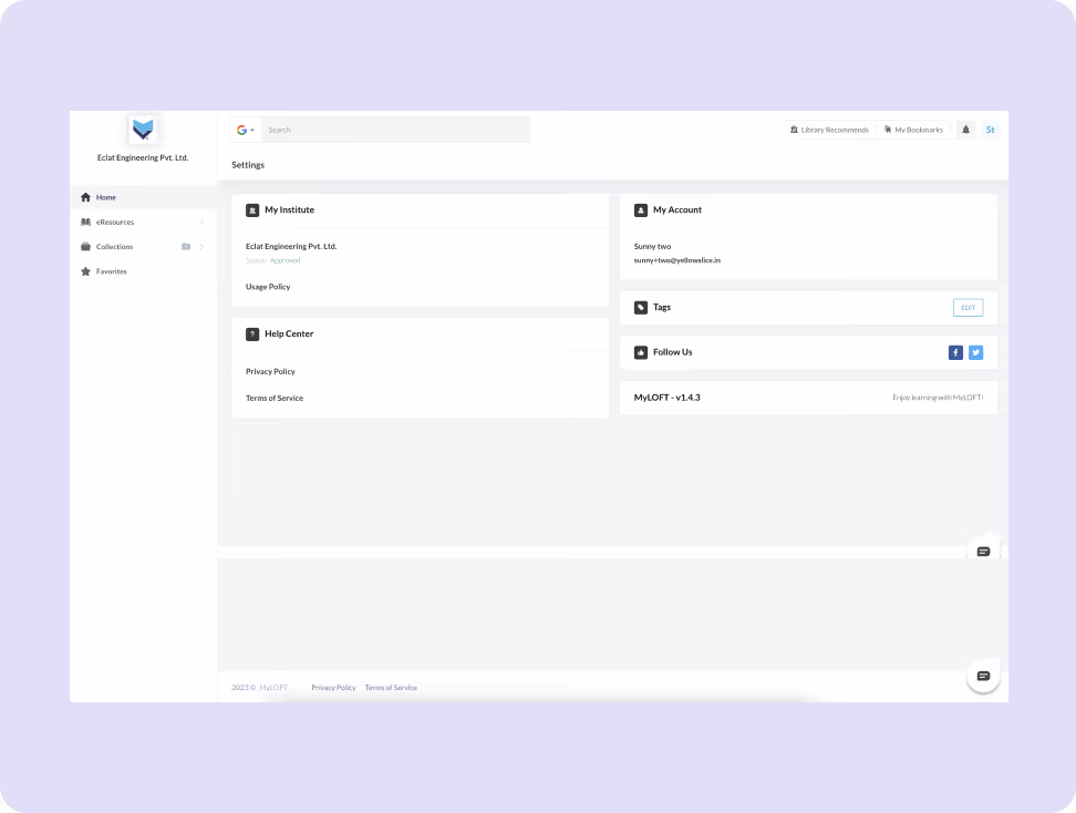
- Unify navigation with consistent UI patterns across platforms.
- Highlight core actions like save, tag, share, and offline access.
- Design onboarding walkthroughs to teach power features (e.g., text-to-speech and collections).
Architecting Experience
From Insights to Frameworks
We organised the experience around intuitive navigation, clear content hierarchy, and logical user flows to help learners discover, access, and consume academic resources with minimal friction.
.avif)
Solution
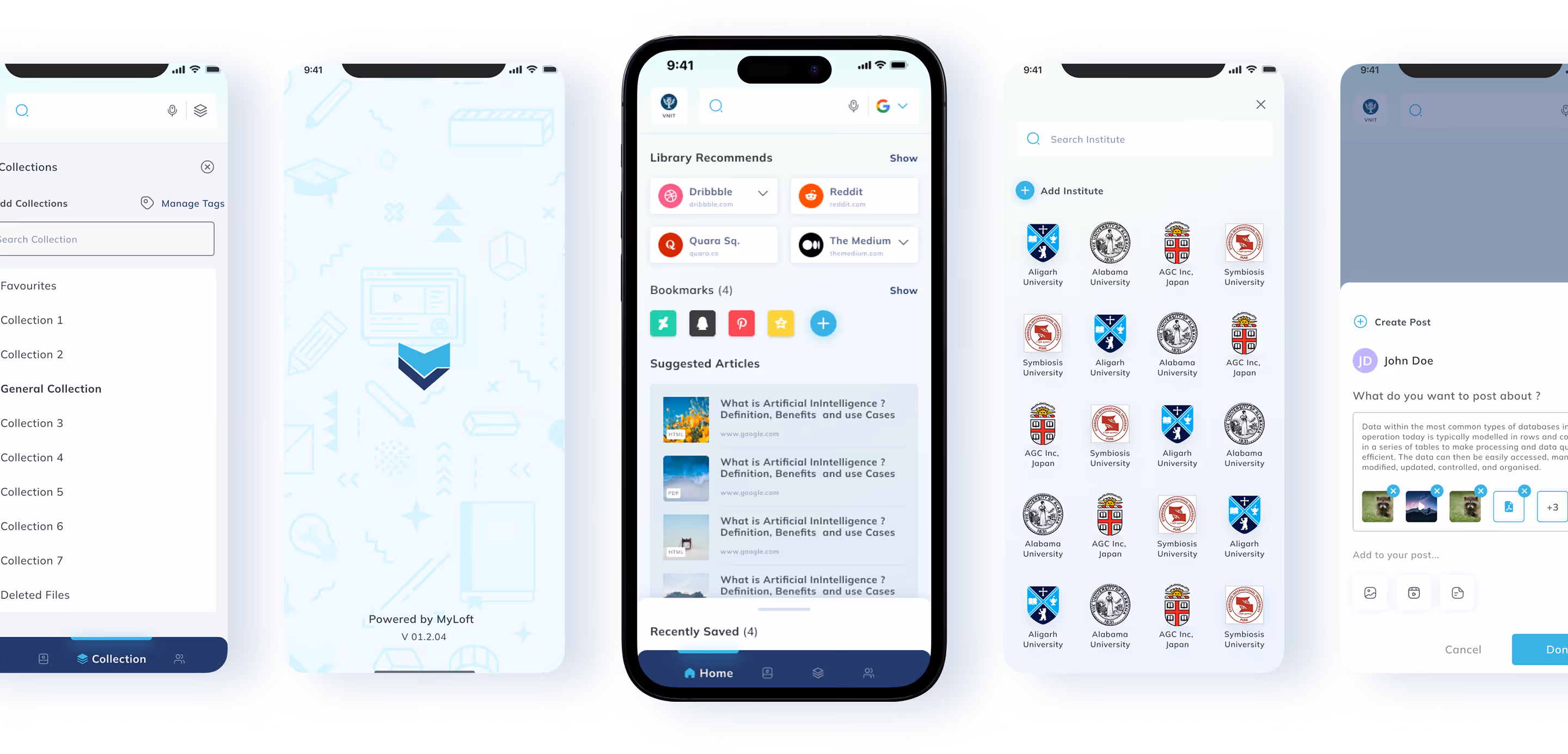
Voice-Enabled Search & Discovery
Integrated voice-enabled universal search to enhance accessibility and discoverability across large content sets.
Smart Content Collections
Improved tagging and collection tools to make saving, grouping, and revisiting academic content more effective.
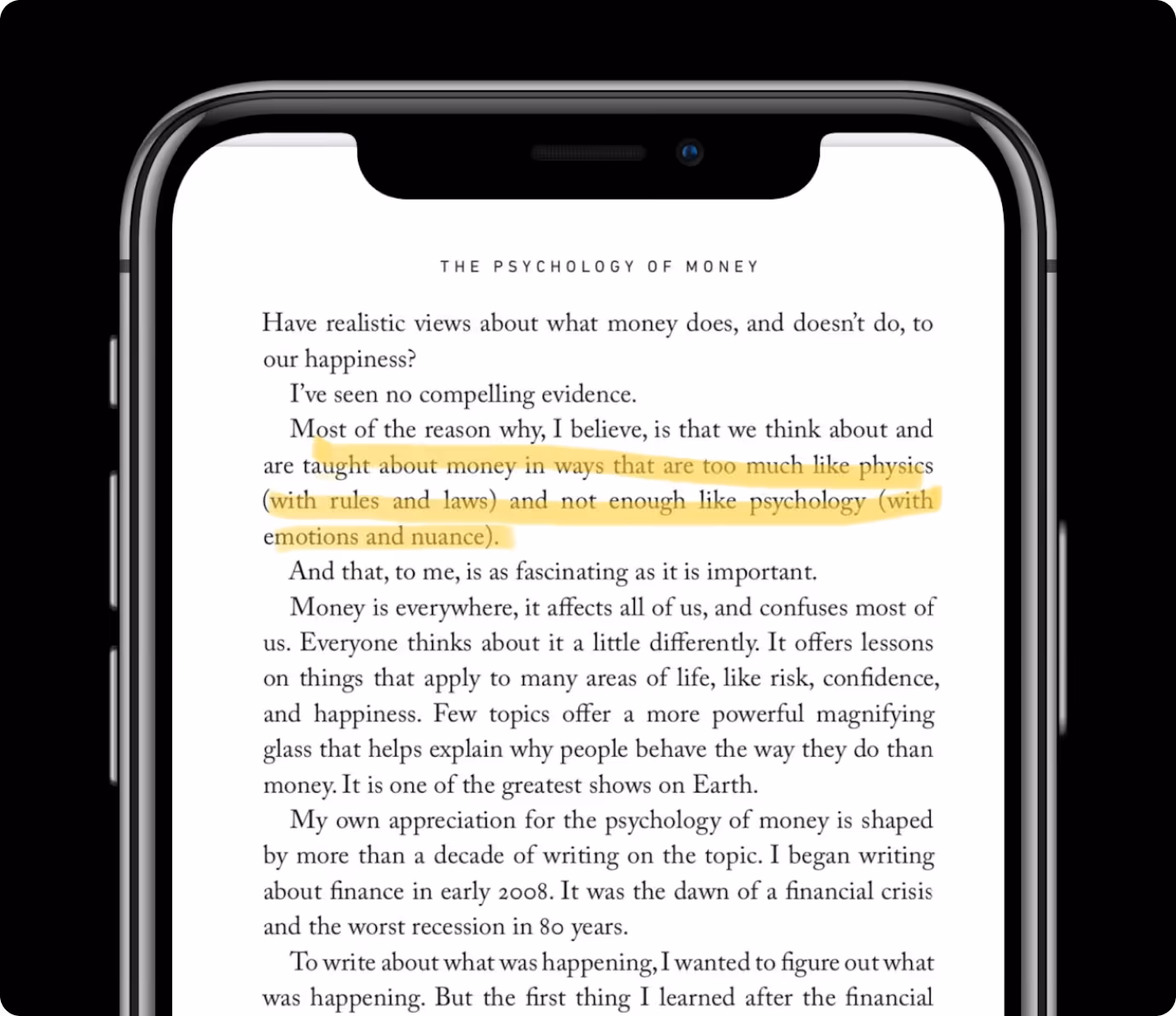
Offline & TTS Features Highlighted
Prominently surfaced offline reading, text-to-speech, and quick highlight/share actions to support varied user preferences.
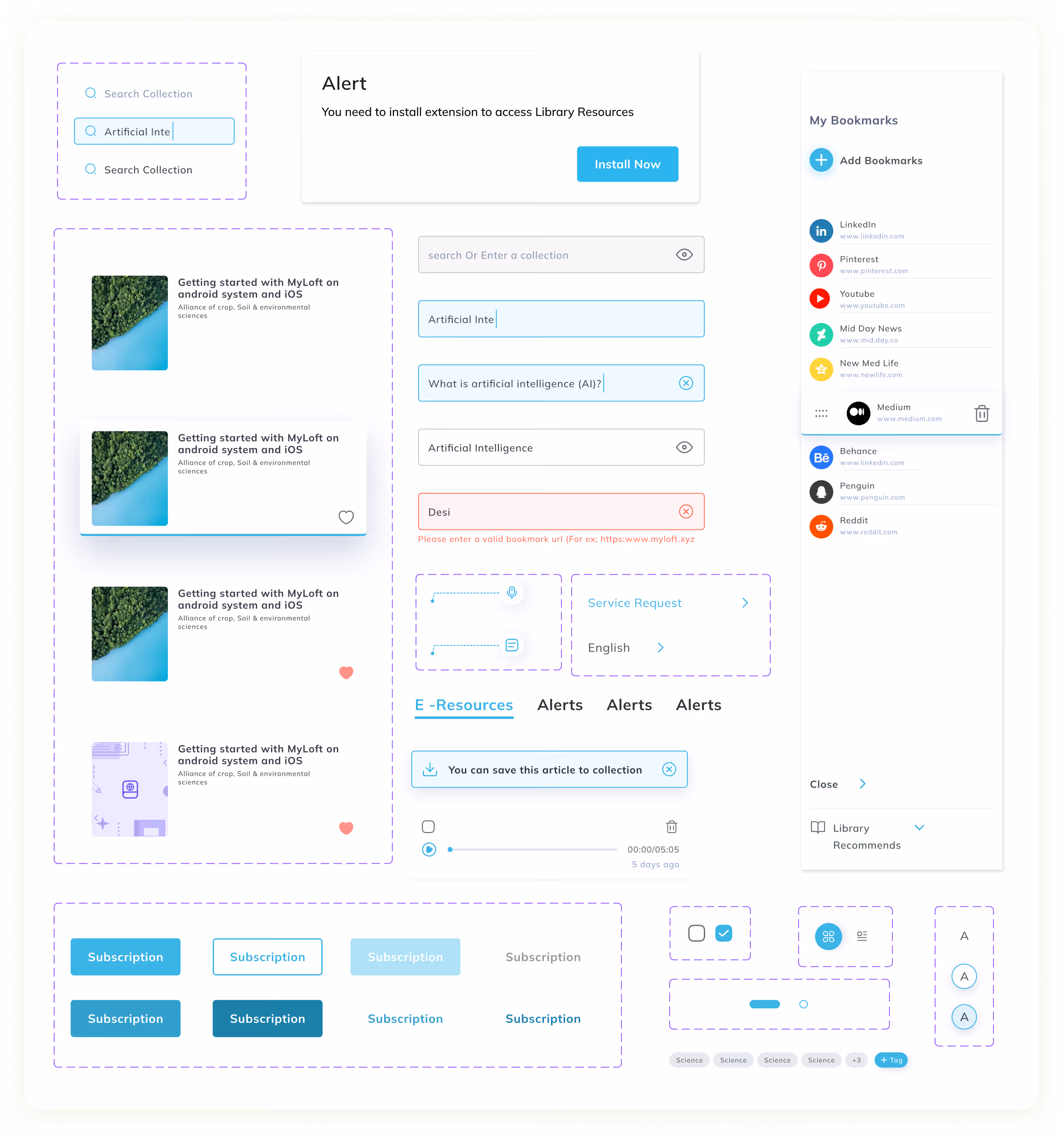
Form Meets Function
Designing Engaging Interfaces
We developed a modern, readable UI that foregrounds research content — clear typography, reduced clutter, consistent iconography, and contextual onboarding prompts ensure users aren’t overwhelmed and engage deeply with material.
.avif)
Success story
See why we’re not just a UI/UX Design agency; they see us as a strategic partner to their team.
.avif)
“YellowSlice takes the time to understand our business needs. I can count on YellowSlice for fresh perspective, innovative ideas, consistency, solutions and accuracy. “
.avif)
More Like this
.avif)
Talk to Us Today!
Let’s explore how our creative expertise can transform your product into a human-centric and innovative solution.
Good design starts with Sliced Newsletter
Subscribe to the Sliced newsletter and get the best of research, UX writing, product psychology, CX, and design systems, right in your inbox.
