How Affinity Mapping can Assist in UX Research?
Akhil Nair
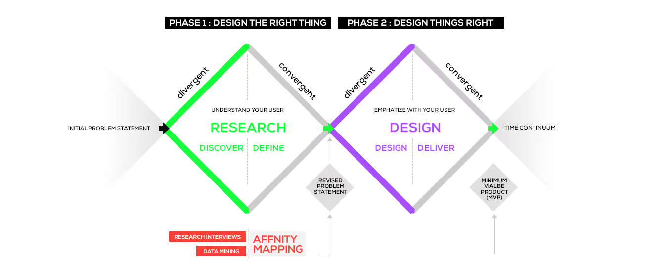
As a UX researcher, it is easy to get sucked into piles of data and lose the idea of where you are headed to. From interesting results to repeated patterns, there are tons of data to be sorted. Before you start panicking, learn how affinity mapping can become the saving grace to resolve your anxiety from information overload. So, what is affinity mapping? And how does it help one in UX research?
What is Affinity Mapping UX Research Structure?
The word 'affinity' means drawing out similarities and relationships between given things, people, data, etc. Here, affinity mapping in UX research means identifying themes and patterns in a larger, visual format.
Affinity mapping, simply put, is sorting qualitative data in boxes and then connecting the dots to reach new conclusions about a product. The 'boxes' are the themes and the connections you find are the patterns. These sets or clusters of data can evolve over time and simultaneously, we can find new insights in our UX research.
This process is also known as affinity diagramming, snowballing, collaborative sorting and thematic analysis in other words. As you chaff through your qualitative research data, patterns and themes start to form. They become vital data points for your product.
Why is this an Essential Asset in your UX Research?
Before designing any strategy for your product, it is important to have all the main ideas, themes and conclusions in place. Affinity mapping can even tell you the root of the conclusion. One wouldnt need to search their directory everytime they get skeptical about the base. Everyone on the project can chip in, even those who have not been in the UX research process, and can get powerful insights by looking into these affinity mapping. The more brain power we add, the better outcomes we get.

One can also choose to do affinity mapping individually, but it can put one at risk of confirmation bias. We can miss some key points in our peripheral vision and derive a skewed conclusion. Hence, multiple perceptions are welcome in affinity mapping ux research structures.
How do we Start with the Process?
The method sounds simple, but the elegance is in the execution. Following these affinity mapping UX research structures, you can arrange the data quickly and productively.
Step One: Procuring the Data
Pile together all the qualitative data that you have procured about the product. Be it from chat boxes, quizzes, questionnaires, e-mails, sampling, etc. Have your team sit with you through them to sort these out. The main idea is to help the team visualize and identify patterns. And that brings us to the next crucial part.
Make sure to appoint only those team members who have been through all the client meetings and UX research processes. They will be able to recognise a pattern quickly rather than having everyone around and wasting valuable resources, like time and energy, on it.
Step Two: Mode of Arranging the Data
Affinity mapping can be done in two ways Tactile and Digital.
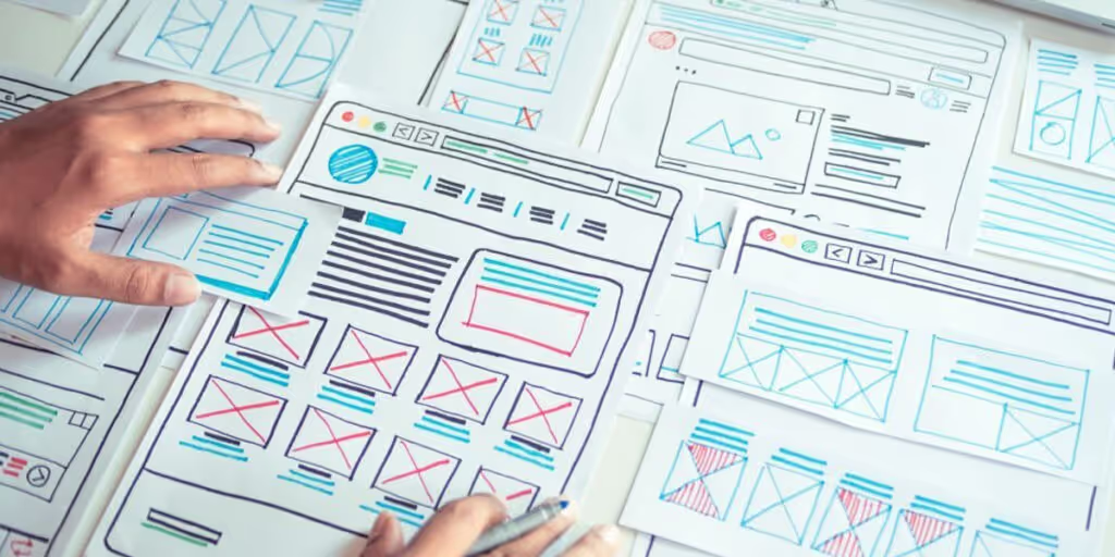
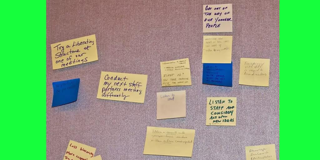
The tactile way is the most traditional way of doing this process. A UX/UI company will have a dedicated space or at least a whiteboard to pin up the ideas. Mostly, a post-it note about a common keyword would be stuck up on the wall, pin-board or a whiteboard. The disadvantage of this process is that this data isnt portable and has to be typed out into your computer for making notes.
The digital way is the new age of affinity mapping UX research structure. The data is portable and can easily be transcribed into your digital files. No one has to be in the office physically to add a sticky note of the keyword. This way, every one of your team members can add their views from anywhere and without wasting much time. You can find websites that offer affinity mapping services for free or with some premium plans.
Step Three: Colour Coding Data
The digital way of colour coding data is not far off from the traditional way. The first and foremost step is to have stick-it notes fill up your wall with every informative keyword possible.
Have your teammates and you segregate a theme and assign the traits in the same section during affinity mapping. The colour codes can be for different users (if the numbers are small), or for different methods of procuring the data -from questionnaires, e-mails, chat box queries, and more.
Eliminate extra or redundant explanations of the same keyword. Once that is done, look at each of the sections and try to make sense of each of these clusters. These clusters will start to make a theme.
Name these themes and add individual notes wherever the trait fits. You can also ask cross-functional teams to have a look at your affinity diagrams and offer any insight that could have been missed.
Step Four: Ideation
Once the map is set with all data and segregation, every key member from each team can come and brainstorm together on the biggest pain points and gain points. There has to be a mediator who would help the team not to get carried away on different tangents. This ideation process will give way for decisive actions and strategies to be presented to the stakeholders.
Are there any Other Ways of Affinity Mapping UX Templates?
The affinity mapping process can remain the same but the template can be different for different types of product research and conclusions. If you already have an idea of the cluster groups you are looking for, the mapping will start to show traits. But, one must always be keen on adding any new cluster if it comes along.

Choose any of these affinity mapping ux templates or diagrams to optimise your results:
1. New Ideas Affinity Diagram

This is efficient for generating new ideas from one category or theme of your affinity map. This comes in handy during the ideation process as well. People can also vote for the ideas they deem the best and add them to their strategy process.
2. Customer Journey Affinity Diagram

This is specifically made to chart out traits for customer journeys with predefined themes. The themes could be segregated into hopes, fears and ideas. The sticky note data can be pinned anywhere it fits.
3. Organisational Affinity Diagram

These types of diagrams are the best for sorting traits for each of the elements of data. It makes the ideation process and pin-pointing favourable traits easier.
4. Hierarchy Affinity Diagram
The top label can start off with the main area of concern and then break it down into subcategories. The idea is to naturally let the subcategories branch out into different sections and themes. Here, only the top-level category is predefined.
5. Block Affinity Diagram
Block Affinity mapping is akin to Hierarchy Affinity diagrams with a subtle difference. Here, the hierarchies are predefined on every level. The top category can hint at the ideal result. Then the next level can be segregated into metrics as well as experiences and branch out to other traits and themes.
Apart from these popular affinity mapping UX templates and diagrams, there are hundreds of others to suit your research style.
Example to Illustrate the Process and Templates

Suppose you ask your colleagues of sample size 10 about their favourite meal and they give varied answers with additional details, this is how you can fit in each of the templates for the same idea.
1. Colour Coding
Each of the users can have a colour-coded identity. The first cluster would be of data procured from them. One could talk about taste, while others would tell you how ambience changes their food preferences, some would tell you about the company and some would tell you about the specific times they like having their favourite meal. Themes would start to emerge in our affinity mapping now.
2. Using Organisational Affinity Diagram or Customer Journey Diagram
There wont be much difference in the layout of organisational and customer journey diagrams if the themes are either predefined or observed. Once the themes emerge, you can list them in plain columns to start filling in the traits.
3. Using Hierarchical Mapping
Once you have a main idea in the centre, themes start to emerge. Here, the main idea is the favourite meal which is now divided into observed factors such as time, company, preference, etc. These will continue to branch out as one sort through data.
4. Using Block Affinity
Here, the themes would be predefined and one would have to assign answers according to the given clusters.

These templates are an example of how your affinity mapping would look like and carry on. Feel free to use any of the templates and affinity mapping diagrams to your advantage.

Conclusion
The best way to arrange these data in this day and age would be digitally. But it is dependent solely on comfort, preference and even sample size. Small sample sizes can be contained on a whiteboard whereas big data collection can benefit from online segregation. We hope you have thoroughly understood what is affinity mapping ux structures is and how they can help you!
FAQs For Affinity Mapping
What is Affinity Mapping used for?
Affinity mapping is a tool used to organize ideas and information. It is often used in brainstorming sessions to help groups generate and organize ideas. The process involves writing down ideas and then grouping them together based on similarity. This can help to identify patterns and trends in the data. Affinity mapping can also be used to create mind maps or concept maps.
What are the process For Affinity Mapping In UX Research?
The process of affinity mapping involves four steps:
1. Data collection: This step involves collecting data from interviews or user testing.
2. Data analysis: This step involves analyzing the data to identify patterns and trends.
3. Data synthesis: This step involves synthesizing the data to identify key themes and insights.
4. Data visualization: This step involves visualizing the data to communicate the findings.
How do you use Affinity Diagram in UX?
An affinity diagram is a powerful tool for organizing and understanding complex data. In UX, it can be used to help identify user needs and pain points, sort and prioritize user feedback, and generate ideas for solutions.
To create an affinity diagram, start by gathering all of your data, whether it's from user interviews, surveys, or other research. Once you have all of your data, start sorting it into categories. Then, look for patterns and relationships between the data points. Finally, start grouping the data into themes.


Let's create something amazing!
Let's discuss your vision and how we can bring it to life with impactful design solutions.
.avif)
Good design starts with Sliced Newsletter
Subscribe to the Sliced newsletter and get the best of research, UX writing, product psychology, CX, and design systems, right in your inbox.
