Designing a Smoother Mutual Fund Journey for Investors
Launched in March 2017 by the Association of Mutual Funds in India (AMFI), "Mutual Funds Sahi Hai" is a major investor awareness campaign designed to educate the public and promote mutual funds as a suitable long-term investment option. It simplifies complex financial concepts, encourages SIP investments, and has successfully increased retail participation.
Helping investors explore mutual funds with confidence.



industry

Services Provided

PLATFORMS

BUSINESS TYPE
Overview
The project aimed to debunk myths, educate investors, and encourage a shift from physical savings to financial assets. The target audience is the common public, aiming to boost retail investor participation. The strategy is to go with the campaign utilising cross-media, including TV, radio, print, and digital, featuring celebrities like Sachin Tendulkar and MS Dhoni.







Elevating Engagement in a Function-Driven SaaS Environment
Turning Complex SaaS Into an Intuitive Interface
Redesigning AMFI’s website required creating a modern, intuitive experience that caters to diverse user groups, from investors to industry participants. The challenge was to optimise the UX and UI through user research.
It needed the introduction of meaningful entry points that encourage exploration, and enhance the platform with new features that improve engagement and long-term user retention.
The Method Behind Magic
Our Strategic Design
Using the STEP (Soak, Think, Execute, Proof) process, we tuned the experience in real user behaviour to simplify complex workflows and ease feature discovery. Progress cues and nudges encouraged users to explore key features. Iterative testing ensured engagement added value without compromising usability or trust.
.avif)
.avif)
.avif)
Decoding the Ecosystem
A 360° View
Our research focused on how users browse large e-commerce catalogues, discover deals, and move from exploration to purchase. We studied how users interact with categories, brand filters, trending sections, and offers to understand decision-making patterns and friction points.
Understanding Complex Workflows
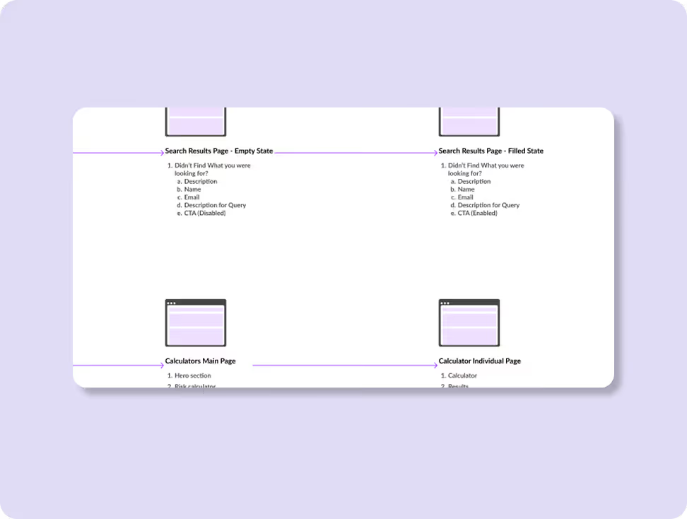
The UX audit revealed that without a clear hierarchy and visual consistency, users could get overwhelmed navigating multiple modules and functions. For the same, we conducted a 5-day sprint workshop that would give us the answers. The activity above helped us to understand different tasks and user flows.
Streamlined Navigation Paths
Navigation was structured so users could find essential features like document search, approvals, activity logs, and templates with minimal clicks.
.avif)
Core problems
- Complexity in SaaS workflows can create cognitive overload.
- Users lacked clear visual cues for sequential, multi-stage tasks.
- Cluttered documentation that’s hard to process and analyse.
Key Opportunities
- Simplify information hierarchy and visual patterns.
- Map workflows into clear, repeatable interaction flows.
- Use brand-aligned UI elements to build trust and familiarity.
Solution
Intuitive, Finance-Focused Interface
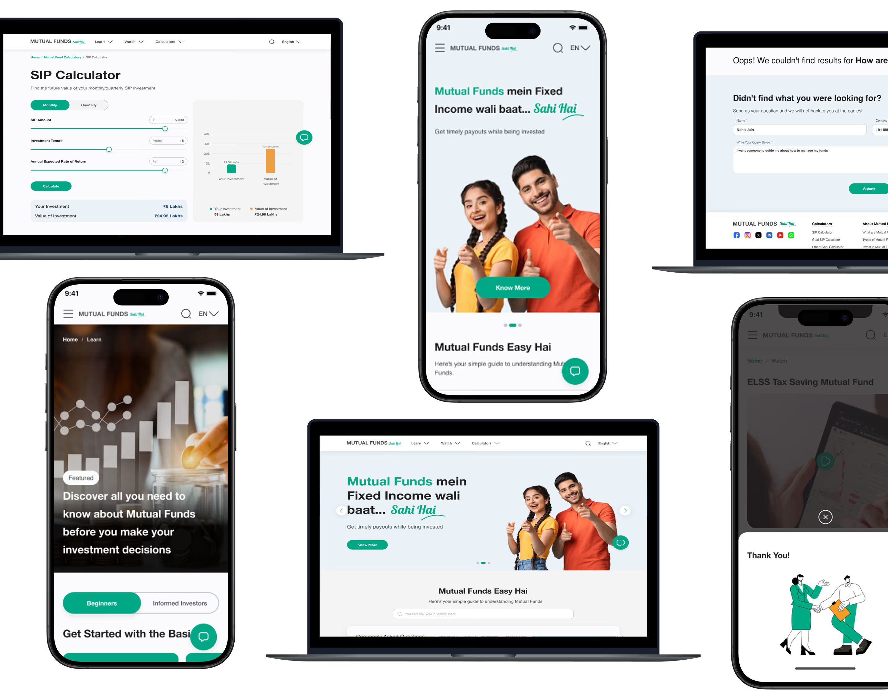
Finance-specific icons and simple visual elements were used to make complex financial information easier to understand and navigate for users with varying levels of expertise.
Consistent Experience Across Devices
Spacing, typography, and alignment were carefully optimised to ensure a seamless and consistent experience across both desktop and mobile screens.
Interactive Prototypes for Clearer Collaboration
Interactive prototypes were developed to demonstrate user flows and functionality, helping stakeholders clearly visualise the final experience before development.
Form Meets Function
Designing Engaging Interfaces
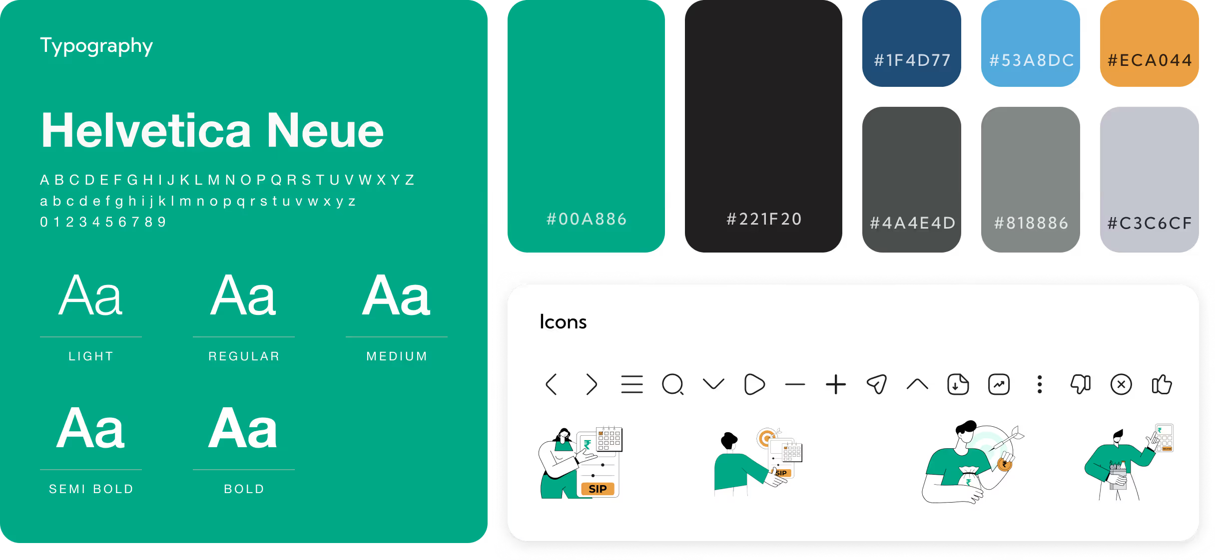
The UI design follows AMFI’s brand identity by incorporating shades of green and neutral tones, reflecting trust, growth, and professionalism. For typography we used the font Helvetica Neue and Lobster.
A minimalist, clutter-free interface ensures users can focus on essential information, creating a clean, modern experience that enhances usability and simplifies navigation.

More Like this
.avif)
Talk to Us Today!
Let’s explore how our creative expertise can transform your product into a human-centric and innovative solution.

Good design starts with Sliced Newsletter
Subscribe to the Sliced newsletter and get the best of research, UX writing, product psychology, CX, and design systems, right in your inbox.