Making Everyday Shopping Effortless for an E commerce Platform
Bajaj Hamara Mall is an ONDC platform (Open Network for Digital Commerce). It lets you explore online shopping for electronics, appliances and groceries from top brands and sellers. It offers a unique shopping experience where you can discover a wide range of products with easy EMI plans and zero down payment on selected products.
Designed for Easy Discovery and Confident Shopping


industry

Services Provided

PLATFORMS

BUSINESS TYPE
Overview
The project goal was to build a Hamara Mall Mobile app & Desktop website, through a modern and professional app with a user-friendly interface and experience.


Enhancing Discovery within an E-Commerce Platfor
Turning a Broad Marketplace into an Intuitive Shopping Journey
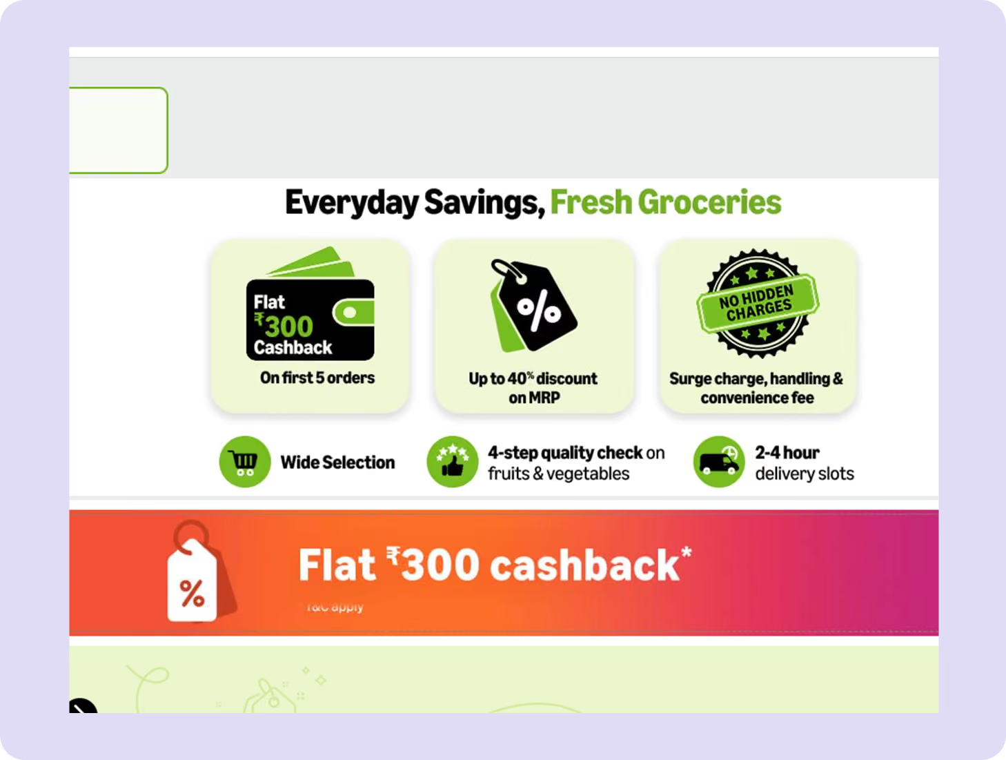
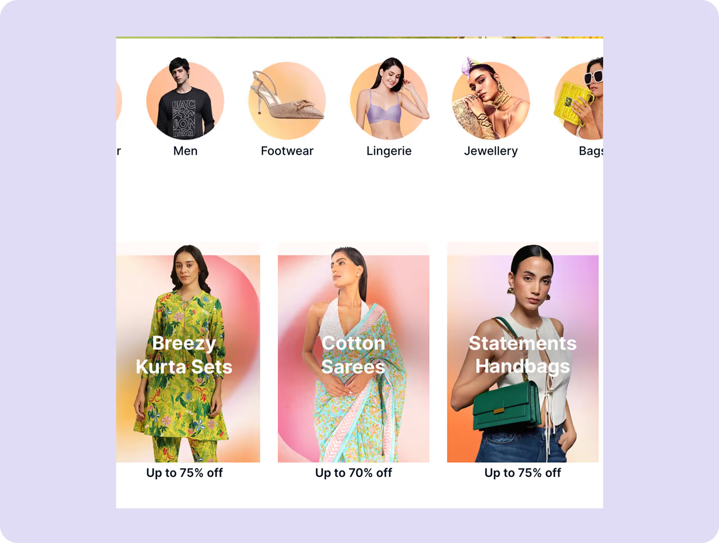
Bajaj Humara Mall brings together a wide range of product categories: sports, kids’ toys, home & kitchen, bookstore, health & wellness, beauty, stationery, and pet care. Along with this there’s also brand-based shopping, daily deals, trending-in-your-city sections, and e-gift cards.
With so much to explore, the challenge was to improve product discoverability and highlight high-impact elements like sale banners and offers. This ensured users could smoothly create profiles, add items to cart, raise support requests, and complete checkout without friction. The major challenge was the tight project timeline and a large number of screens.
The Method Behind Magic
Our Strategic Design
Using the STEP (Soak, Think, Execute, Proof) process we designed the experience to make sure everything that the platform had to offer is visible at glance. Be it the “Price of the Day,” trending products, sale banners, etc.
Interactive ad-format previews were adopted to bring attention to offers and promotions. The entire flow, from profile creation to cart and checkout, was streamlined to reduce friction, even within complex content structures.


Decoding the Ecosystem
A 360° View
Our research focused on how users browse large e-commerce catalogues, discover deals, and move from exploration to purchase. We studied how users interact with categories, brand filters, trending sections, and offers to understand decision-making patterns and friction points.
Understanding Shopping Behaviour
The UX audit revealed that discoverability dropped when offers, categories, and trending sections weren’t right there in the users’ face, prioritised. Users also faced friction when navigating across multiple categories and promotions within a single session.
Streamlined Navigation Paths
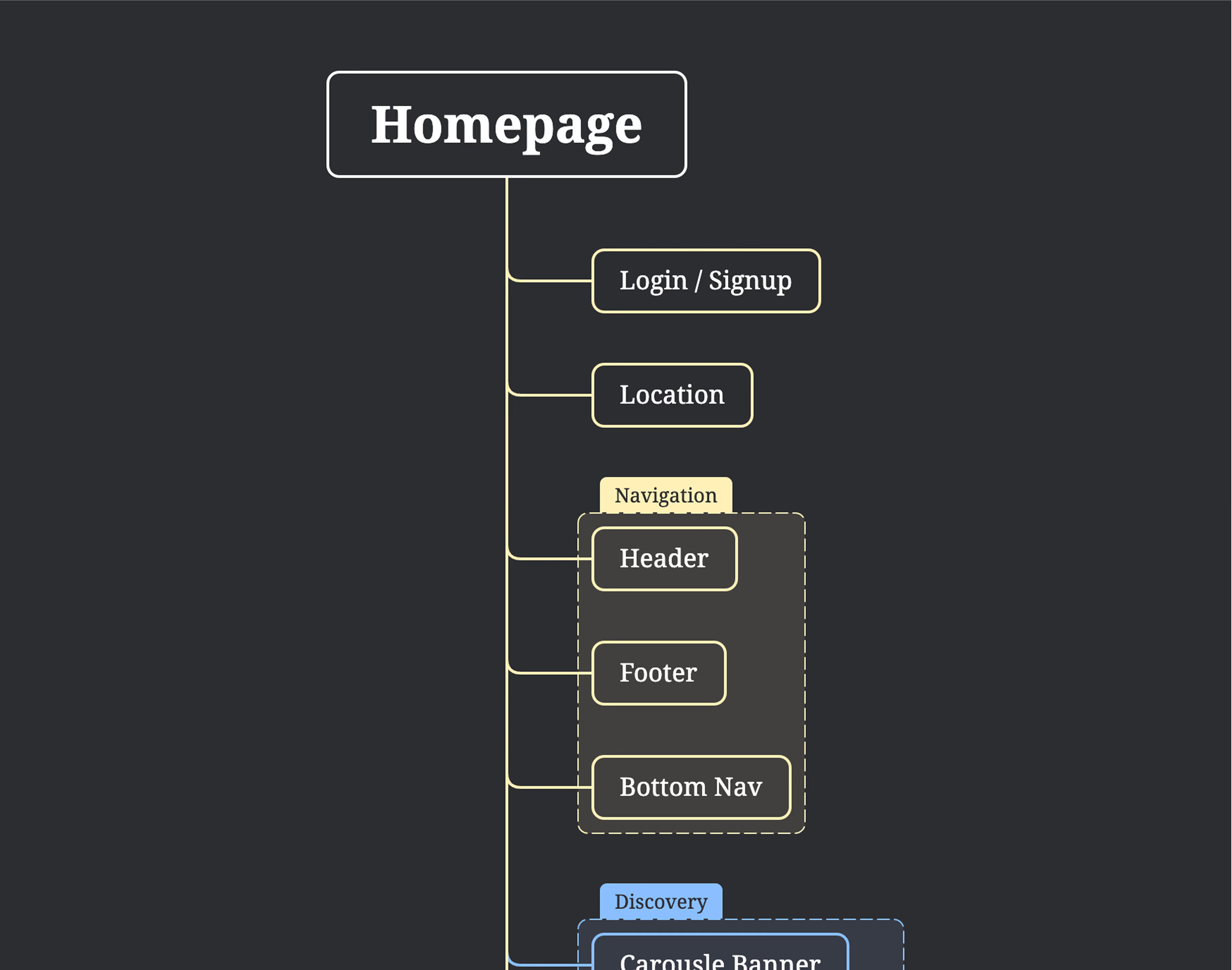
In e-commerce platforms, there’s a problem of abundance. Categories and products exist in abundance. It becomes really important that navigation is restructured so that users find what they are looking for with minimal effort.
Core problems
- Overloaded category and offer sections reduced product discoverability.
- Important promotions like sales and trending items lacked strong visual prioritisation.
- Friction in profile creation, cart flow, and checkout increased drop-offs.
Key Opportunities
- Strengthen visual hierarchy to surface deals, categories, and trending products faster.
- Create clearer browsing paths across categories and brand-based shopping.
- Simplify end-to-end shopping flows from profile creation to checkout and support.
Architecting Experience
From Insights to Frameworks
Animations were strategically created to guide user attention, reinforce interactions, and enhance the interface’s overall responsiveness and feel. Interactive elements and motion were used to guide attention toward key elements. These cues improved responsiveness and helped users quickly understand what actions to take at each stage of the shopping journey.
Solution
Discoverability-First Navigation
Users can explore categories, brands, trending items, daily deals, and sale banners with ease. Clear entry points help users find what they want faster.
Executed in Cycles
The project was delivered in cycles to handle independent components such as category browsing, offers, checkout, support flows, and profile management, allowing focused testing and iteration for each module.
Emotion-Led Shopping Journey
We designed the journey to feel exciting during discovery, reassuring during checkout, and supportive during post-purchase interactions like help requests and tracking.

Form Meets Function
Designing Engaging Interfaces
We took 3 months & 560 hours of effort to create 119 screens for the Bajaj Humara Mall project. Isometric illustrations were integrated to lend a polished, engaging look to the interface. The visual system balanced aesthetic appeal with functional clarity, even within a tight project timeline.


More Like this

Talk to Us Today!
Let’s explore how our creative expertise can transform your product into a human-centric and innovative solution.
Good design starts with Sliced Newsletter
Subscribe to the Sliced newsletter and get the best of research, UX writing, product psychology, CX, and design systems, right in your inbox.
