One Membership. 30+ Subscriptions. Endless Possibilities.
Experience the ultimate membership with Epic Pass, a Dubai-based platform bringing the future of bundled subscriptions to the present. With one yearly membership, users unlock access to multiple subscriptions and exclusive offers from 50+ trusted brands including entertainment, food, wellness, and lifestyle services.
Unlock 30+ Subscriptions and Exclusive Benefits with Epic Pass
.avif)


industry

Services Provided

PLATFORMS

BUSINESS TYPE
Overview
Starting at just @1500 for a limited period, Epic Pass members can easily sign up, activate offers, and start enjoying benefits instantly. Trusted by a growing community, Epic Pass brings together value, convenience, and variety, making everyday experiences more rewarding through one seamless platform.







Designing for Conversion in a High-Intent Purchase Journey
Transforming a Complex Pass System into an Intuitive Experience
The users faced friction during key conversion moments in the Epic Pass experience. Users faced a non-linear purchase flow, clunky membership management, and unnecessary steps for renewals and top-ups. Onboarding also felt heavy for first-time users, slowing activation and hurting overall conversion.
The Method Behind Magic
Our Strategic Design
Using the STEP (Soak, Think, Execute, Proof) process, we designed the Epic Pass experience with a strong focus on user retention, embedding renewal reminders, personalised recommendations, and seamless reactivation flows to keep users engaged beyond the first purchase.
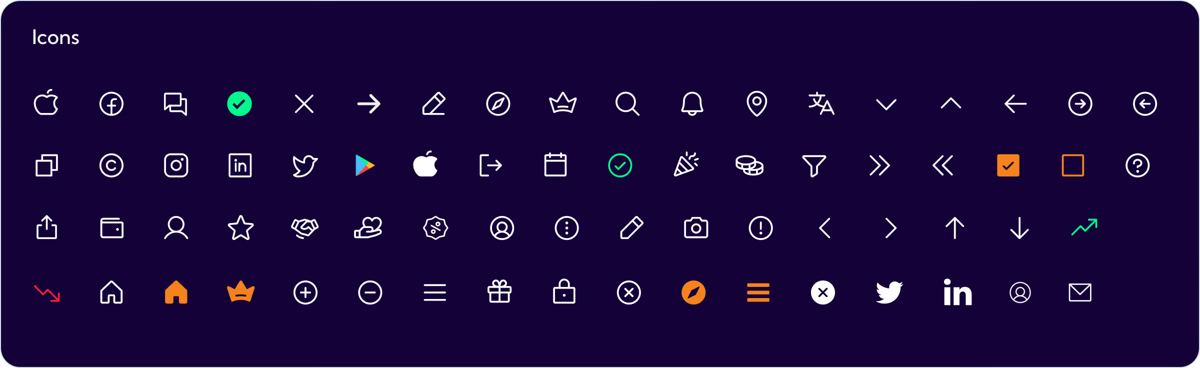
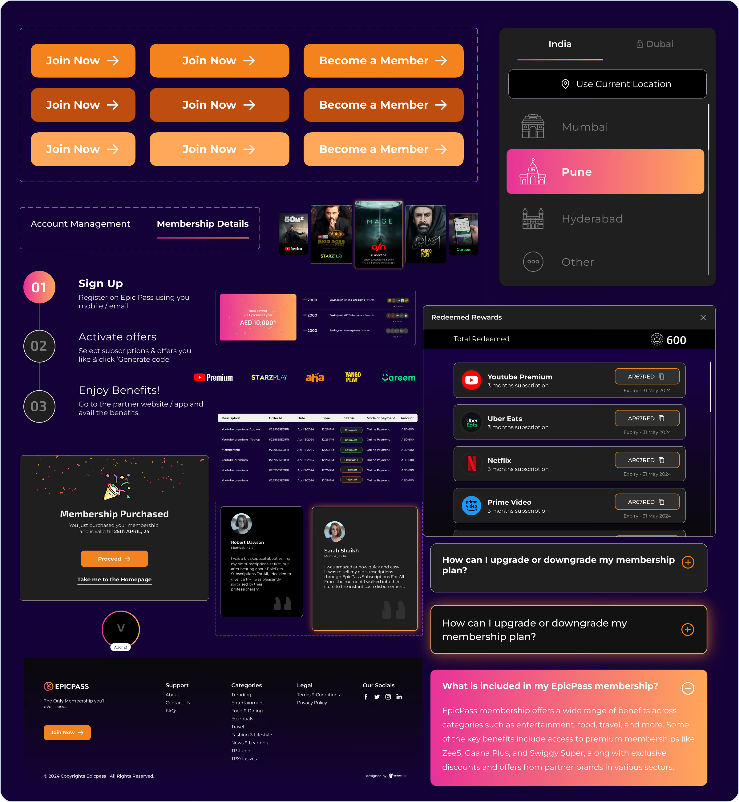
Built from scratch, the design system and wireframes prioritised cross-platform consistency across web and mobile, ensuring users experience the same intuitive journeys and interactions no matter the device they use.

.avif)
.avif)
Decoding the Ecosystem
A 360° View
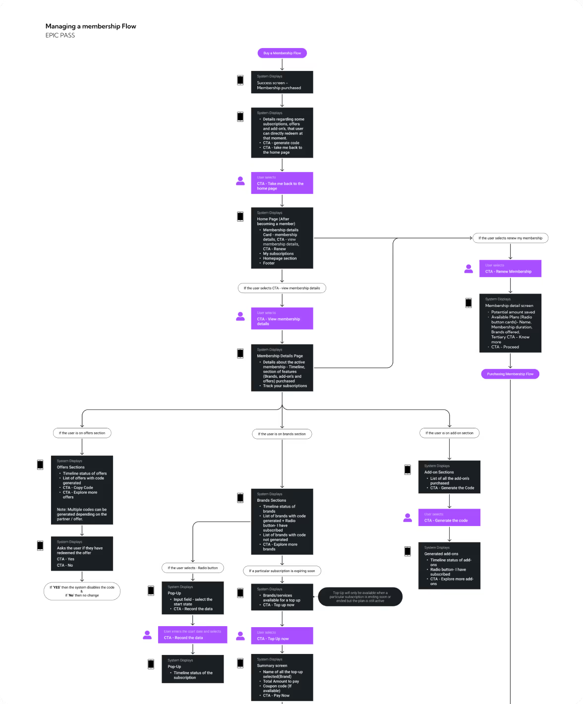
Our research focused on understanding how users manage memberships across the Epic Pass platform. We mapped user expectations across browsing, purchase, and post-purchase journeys to define best-case user journey scenarios.
Through feature listing, we established a strong foundation for the platform by including essential features with real user needs. This helped shape a user-friendly experience, with a focus on simplifying membership management and reducing friction.

- Users can access all benefits and offers through a single subscription, eliminating the need to manage multiple memberships or subscriptions.
- Subscribers have access to tools or metrics that allow them to track their Times Prime benefits.
- Times Prime could improve its community engagement features to foster interaction among members, which can enhance user retention and satisfaction.

- Ikon Pass fosters a sense of community among users through features like user reviews, forums, and social media integration.
- Ikon Pass offers renewal as well as young adult discounts. It also provides Pass Deferral policy.
- Interactive trail maps with real-time updates and features like elevation profiles enhance the user experience for planning ski trips.
Core problems
- Users experienced cognitive overload while navigating between sections, making the overall journey feel heavy and fragmented.
- Friction across browsing and checkout flows led to confusion, increasing drop-offs.
- There was a lack of bundled membership model across diverse destinations so users missed the full value of getting variety in one pass.
Key Opportunities
- Streamline access between sections to reduce cognitive load and create a smoother, more connected user flow.
- Prioritise simplicity across the journey to minimise drop-offs and improve satisfaction from discovery to checkout.
- Clearly highlight the bundled membership value to position Epic Pass as a convenient, cost-effective way to access diverse destinations in one place.
Architecting Experience
From Insights to Frameworks
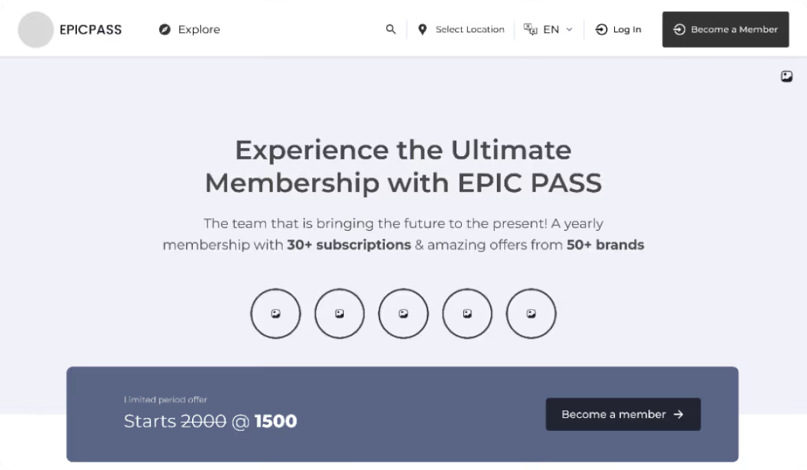
Through the testing we understood what are the key things people could remember and include that information in the prototype. Multiple iterations were made of the prototype and was tested with the participants.
Solution
Seamless Onboarding to Checkout
New users can create accounts, navigate options, and complete purchases through a streamlined checkout. This reduces friction, enhancing engagement and conversion.
Subscription Tracking and Management
Users can manage and renew memberships in one place. This feature supports retention by giving users control over their subscriptions.
Logical Organisation
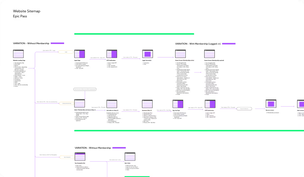
The structured sitemap established a clear hierarchy, enabling easy navigation and discovery of membership bundles.
Form Meets Function
Designing Engaging Interfaces
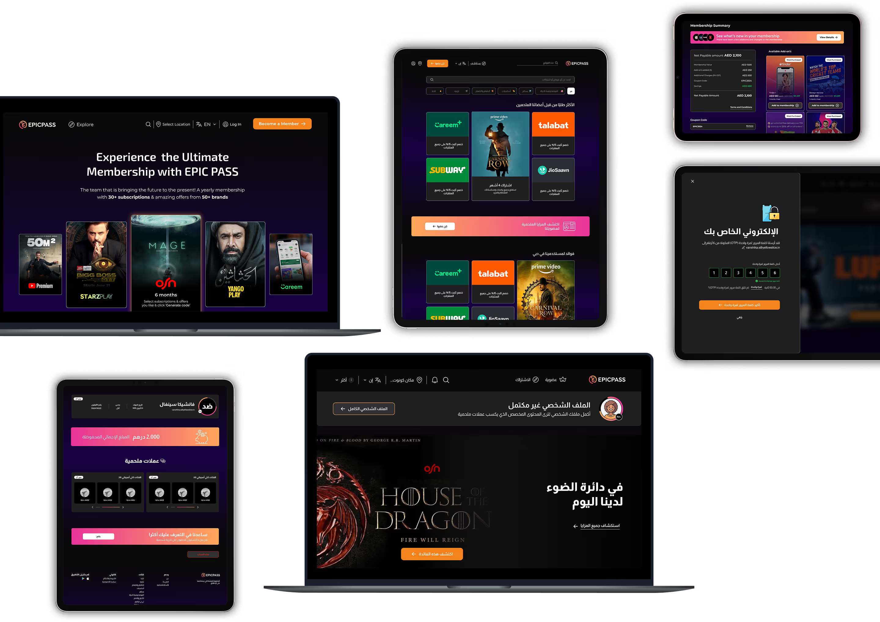
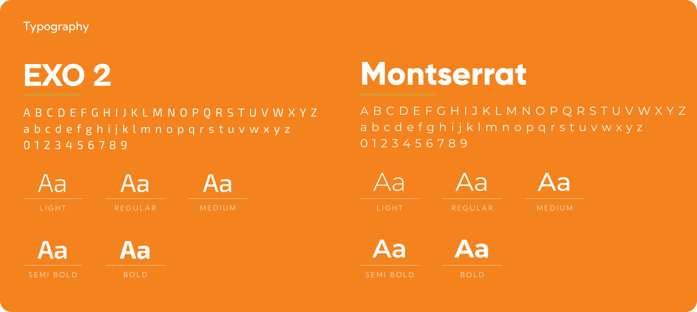
As per the project requirement, we and stakeholders finalised two themes: Minimalistic dark theme (Midnight Ease) and Glass Morphism gradients theme (CasualPulse) to work ahead with and improvise accordingly as and where required.

Success story
See why we’re not just a UI/UX Design agency; they see us as a strategic partner to their team.

We worked together to ideate and see how the solutions would solve the problem statement I had.Yellow Slice delivered their work, and the client started their development process. The team's project management was supportive and collaborative. They also brainstormed with the client to come up with solutions to their problem statement. Moreover, they understood the client's peculiarities.

More Like this
.avif)
Talk to Us Today!
Let’s explore how our creative expertise can transform your product into a human-centric and innovative solution.

Good design starts with Sliced Newsletter
Subscribe to the Sliced newsletter and get the best of research, UX writing, product psychology, CX, and design systems, right in your inbox.