Designing a Matchmaking Experience for Hum Tum Users
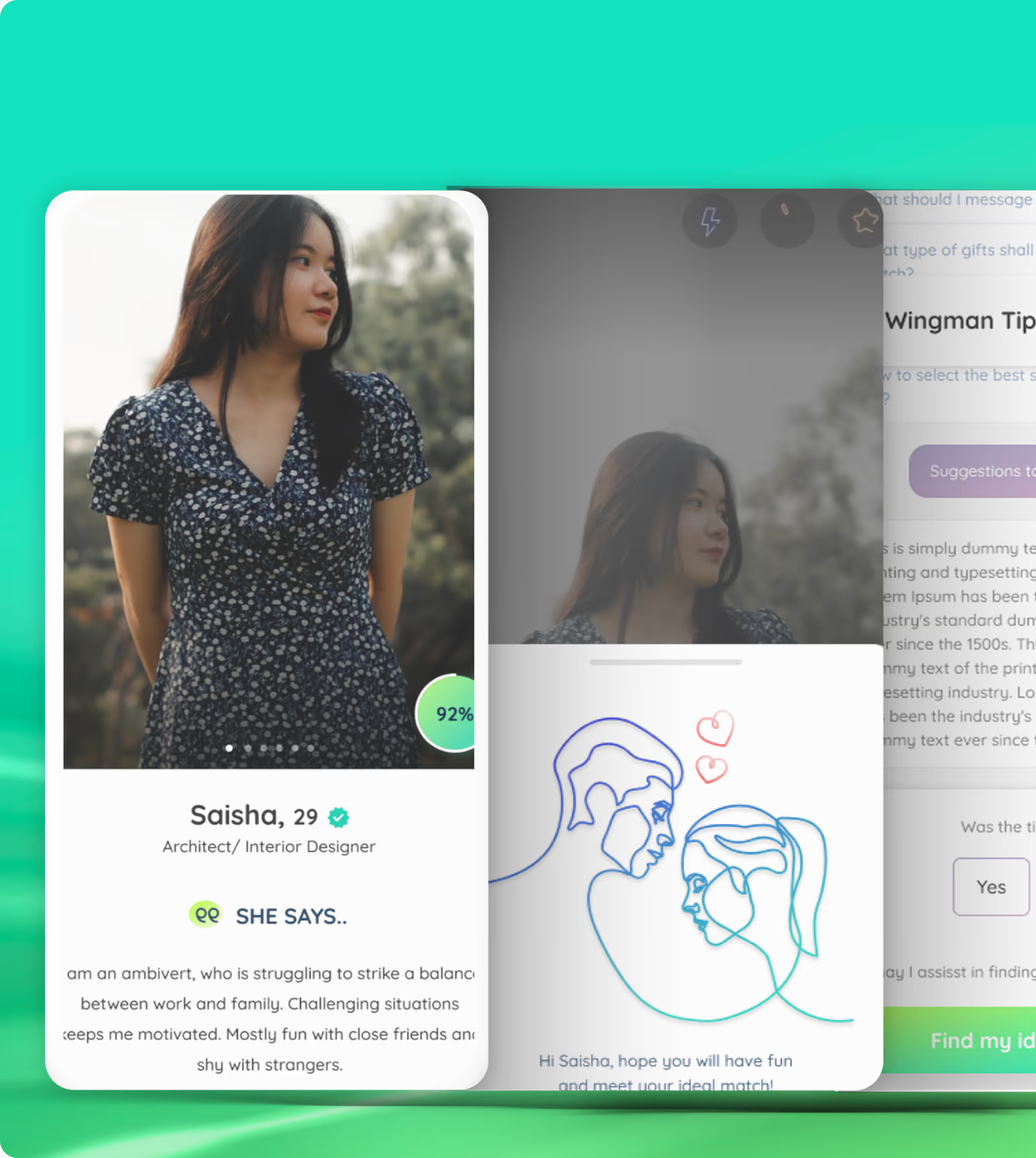
A UI/UX solution crafted to transform Hum Tum into a standout digital matchmaking platform helping users to find their romantic partners. It’s not just another dating app but incorporates entertaining features that uses the “Tree of Life” concept.
Enhanced Interactivity & Distinctive Matchmaking Flow


industry

Services Provided

PLATFORMS

BUSINESS TYPE
Overview
Hum Tum is a matchmaking app that goes beyond basic profiles and swiping. It lets users express personality traits, lifestyle choices, emotional tendencies, and even zodiac compatibility to foster deeper, more reflective connections. The goal was to create a digital experience that stood apart from mainstream apps like Tinder or Bumble.






Designing Insight-Driven Profile Discovery Experiences
Meaningful Matchmaking in a Crowded Space
The main challenge was to design an experience that not only felt intuitive but also emphasized depth over shallow interactions. The interface needed to make profile discovery engaging while allowing users to understand compatibility in a more meaningful way than conventional swipe-based platforms.
The Method Behind Magic
Our Strategic Design
We studied user behaviour patterns focused on matchmaking, how people perceive compatibility signals, and what motivates users to continue exploring connections online. Insights from this research guided the information architecture and core interface flows.
.avif)
.avif)
.avif)
Decoding the Ecosystem
A 360° View
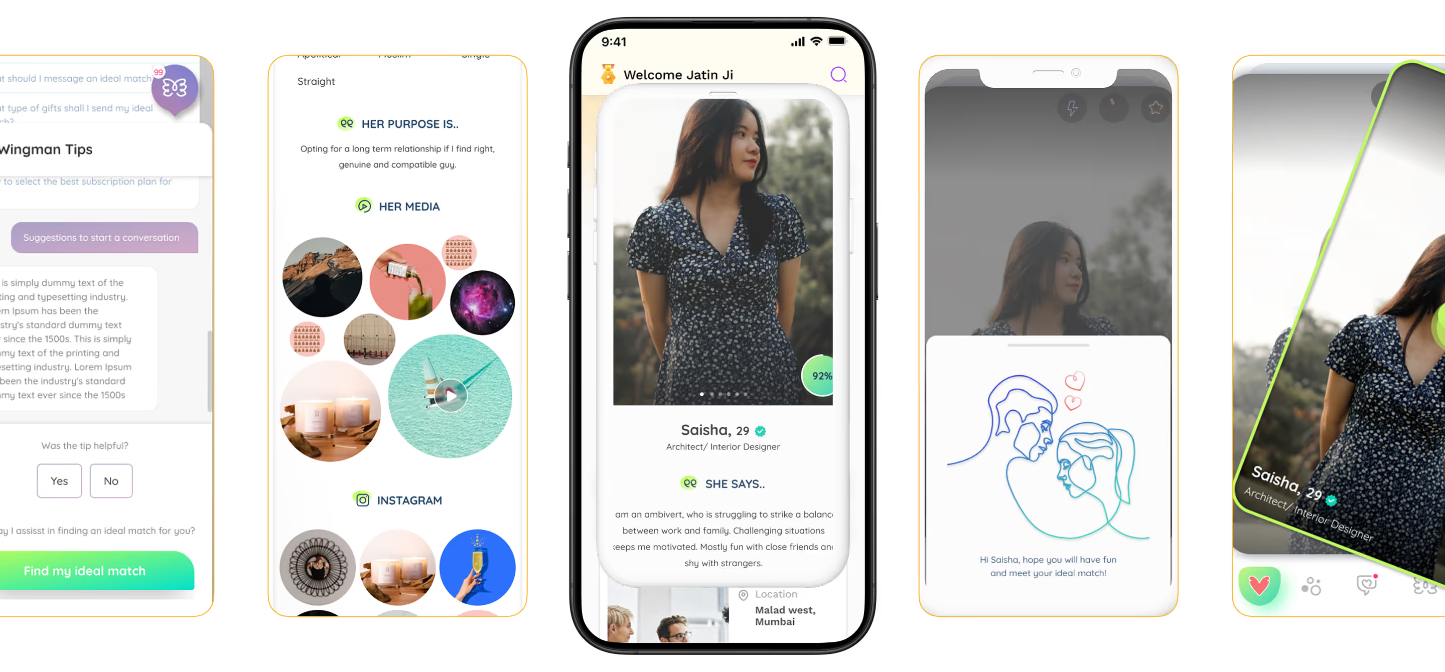
The final product delivered an engaging and less transactional matchmaking experience. Users benefited from a clean, minimal interface that highlights personality traits and preferences. The introduction of the Wingman companion and the MAYBE swipe option improved user interaction and retention by adding flexibility to the decision process.
Structuring Meaningful Match Discovery
The UX audit revealed friction caused by generic swipe patterns and limited context around profiles. We restructured discovery flows to help users understand compatibility beyond surface-level information.
.avif)
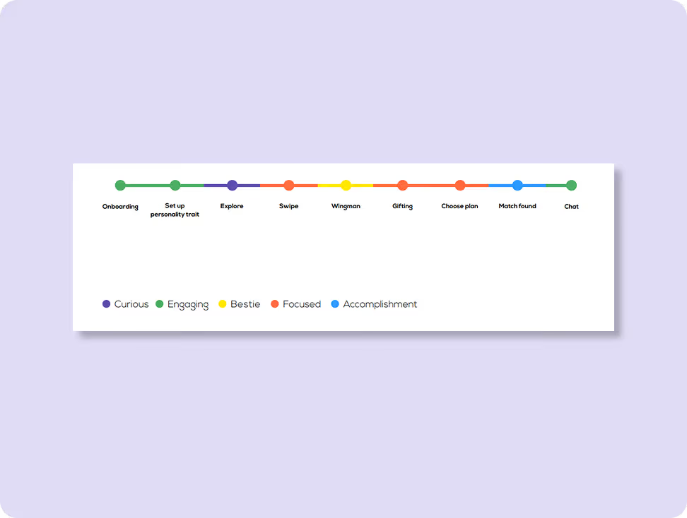
Brand Character Tonality
We understood the emotions users go through towards the journey. At different stages users experienced different emotions that needed a different kinda nudge to move forward towards the rest of the journey.
Clear Onboarding Builds Comfort
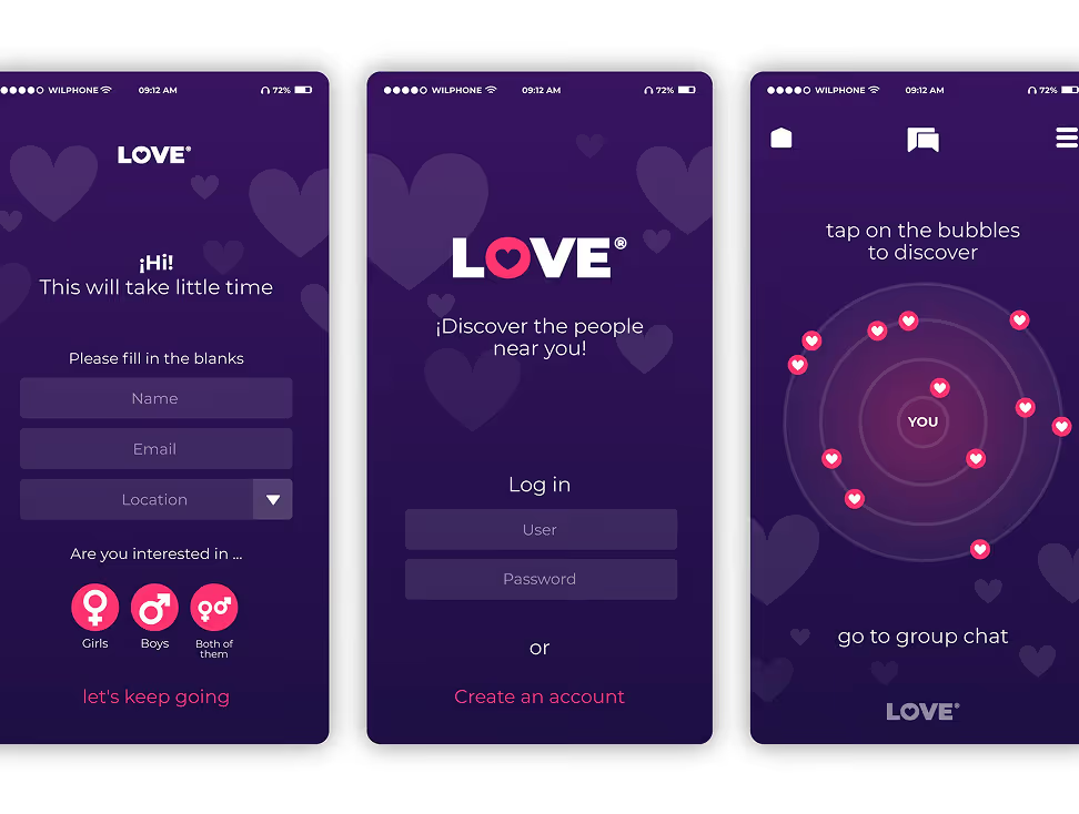
Users wanted clarity on how the app works before committing—what information they need to share, how matches are formed, and what each interaction leads to.
Visual Clarity Matters
Respondents preferred simple, distraction-free interfaces that made profiles easy to scan without overwhelming them with excessive data.
.avif)
Simplicity Fosters Trust
A transparent and predictable experience helped users feel more comfortable sharing personal details—critical for a platform centred around emotional and personal connections.

Indirect Competitors
- Over-reliance on swipe mechanics leads to shallow engagement.
- Users lacked flexibility in decision momentum.
- Experiences should feel lightweight and intuitive across devices to encourage frequent use.
direct Competitors
- Binary yes/no decisions often feel rushed and limiting.
- Highlighting compatibility factors early builds confidence in interactions.
- Transparent communication around matching logic and user actions increases trust and long-term engagement.
Core problems
- Ordinary swipe dynamics failed to represent personality depth.
- Users struggle to connect deeply when the visual identity feels generic or predictable.
- Minimal emotional context in typical interactions.
Key Opportunities
- Introduce personality-centric discovery.
- Build interactive guidance through design features.
- Enhance flexibility and reduce decision regret.Architecting Experience.
Architecting Experience
From Insights to Frameworks
We transformed research findings into navigation systems and content flows that helped users explore matches intelligently, without losing context or engagement.
.avif)
Solution
Wingman: An imaginary mascot
We created an imaginary mascot, Wingman, who would guide users through a predefined compatibility test and give results based on it. It offered a guided compatibility experience, instead of shallow swiping.
A MAYBE Option
Instead of a simple “YES” and “NO”, we decided to add an additional “MAYBE” field to add a response. The addition of the MAYBE option acknowledged user uncertainty and reduced the pressure of binary choices.
Form Meets Function
Designing Engaging Interfaces
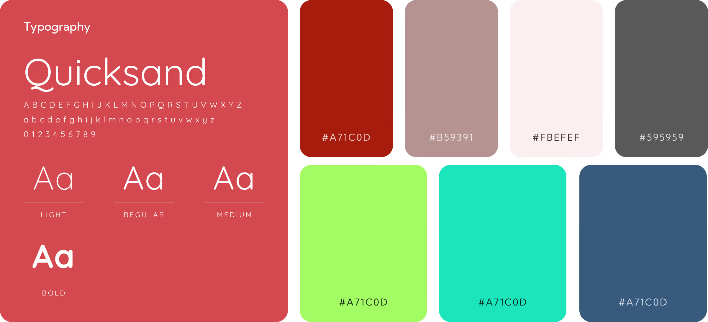
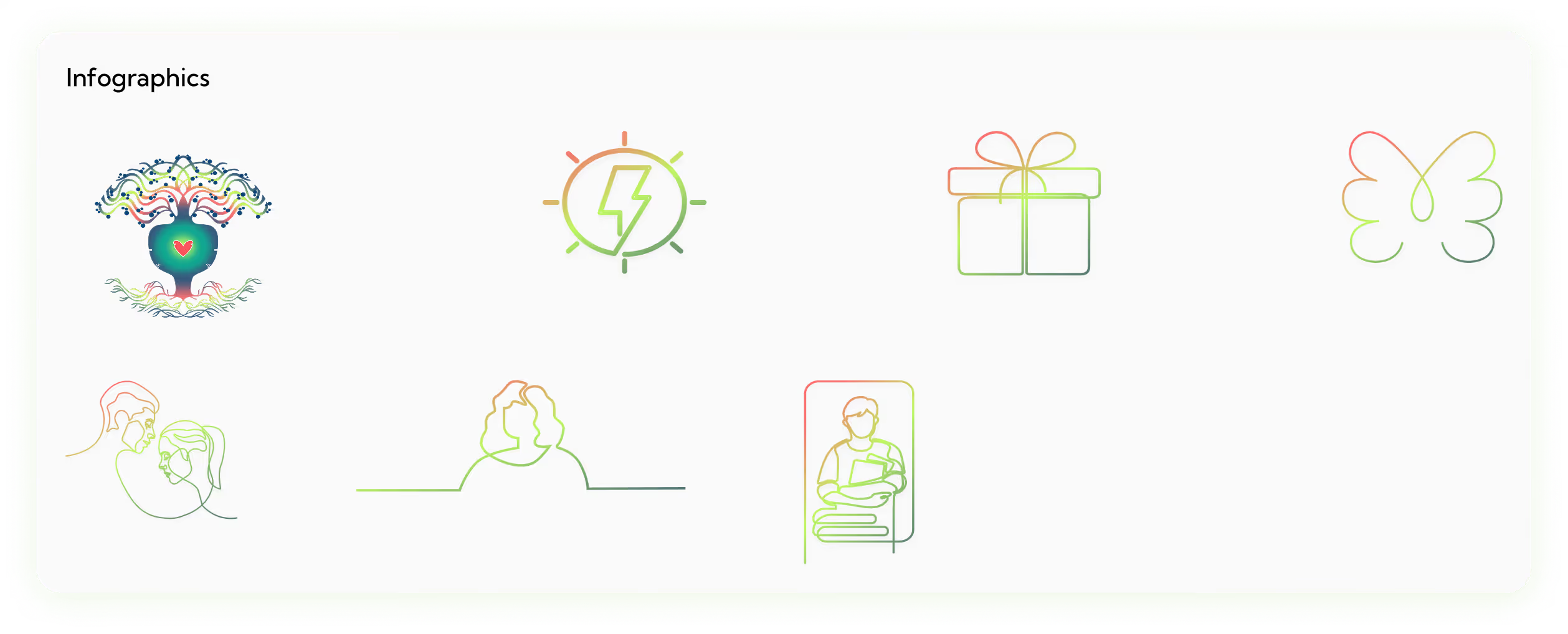
We used the Quicksand font for a clean, readable interface, paired with a red monochrome palette to symbolize love and connection. Bright multicolor gradient line icons add vibrancy while keeping the UI minimal and expressive.
More Like this
.avif)
Talk to Us Today!
Let’s explore how our creative expertise can transform your product into a human-centric and innovative solution.
Good design starts with Sliced Newsletter
Subscribe to the Sliced newsletter and get the best of research, UX writing, product psychology, CX, and design systems, right in your inbox.