Modernising Media Platforms for Faster, Clearer Content Discovery
Information Security Media Group (ISMG) is a global media organisation, they specialise in providing news, research, and education on cybersecurity, information technology, and related topics
Designing Clarity for a Content-Heavy Media Platform


industry

Services Provided

PLATFORMS

BUSINESS TYPE
Overview
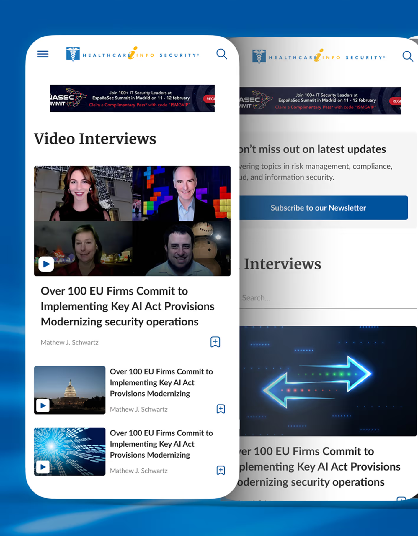
ISMG has multiple media sites across various countries. Currently they have a very outdated design with poor user experience. We were tasked with redesigning their digital platform.
.avif)
.avif)



Designing for Engagement in a Media-First SaaS Platform
Turning Information Overload into Intuitive Discovery
ISMG was looking forward to improving the overall usability of the platform while retaining or increasing their ad revenue and increasing the number of registrations on the platform. Along with that we were also required to share a design system that could be used to build multiple media sites in the future while keeping the design consistent.
The Method Behind Magic
Our Strategic Design
Using the STEP (Soak, Think, Execute, Proof) process, we made design decisions based on real user behaviour. We simplified information discovery, clarified navigation paths, and reduced friction in key user journeys.
Subtle visual cues and progressive disclosure encouraged deeper exploration of articles and resources. Iterative testing ensured engagement to be improved without disrupting ad visibility, usability, or user trust.

.avif)
.avif)
Decoding the Ecosystem
A 360° View
We understood users’ behaviours while visiting the ISMG sites and analysing live user sessions on different devices. The USA covered most of the global presence of the platform. Not a single click was noticed on Around the Network.
The heatmaps showcased that most of the users are clicking the content to access the article rather than on the thumbnail. 99% users scroll till the end of the homepage. 50% users drop by the end of the middle point. Less than 75% of users reach the end of the homepage. Less than 15% of users reach the footer of the website.
Refining Visual Hierarchy
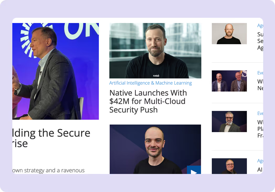
This section needs more breathing room, the elements feel too cramped. The divider lines are also inconsistent across cards and add visual clutter, so removing them will make the section look cleaner and more cohesive.
The play icon follows an outdated design style, moving it to the center of the image would feel more modern and improve visual focus
Enhancing Form and Content Layout
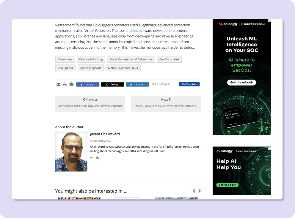
• The input field design can be improved to feel more modern and visually appealing, as the current style follows outdated design trends. The layout of the resources section also needs refinement, as the image sizes are inconsistent, which affects the overall visual balance.
Additionally, the font styling requires improvement; the line spacing feels too tight, so increasing the leading will improve readability and overall visual comfort.

- Key Takeaways: The overall design replicates the classic newspaper which makes it familiar & easy to read. The top section offers easy navigation for the reader. Bullet summary/news follow-ups allow users to get updates without clicking on the article.
- Negative: However, Supplementary tags like read time, category, and date are absent. These tags provide key additional information to the readers. Spacing between the sections is not consistent which makes the entire layout feel cluttered. The visual hierarchy that guides the reader’s eye is missing.

- Key Takeaways: Segmenting news by city in the first fold helps first-time users orient quickly and gives the page a well-organized feel. The “See More” CTA is well-placed, and the layout maintains clear visual hierarchy through text, color, and element sizing. Consistent use of brand colors creates visual separation and improves scanability.
- Negative: The layout lacks consistency in column structure across sections, which affects visual rhythm. The “Entertainment” section feels collage-like and unclear in terms of clickability, while text overlays reduce readability. Clearer color differentiation and a more structured card layout would make the section feel more organized and scannable.
Core problems
- Weak visual hierarchy made it difficult for users to scan and prioritise content.
- Inconsistent spacing between images, headings, and body text disrupted readability and flow
- Outdated dividing lines and mismatched images, content heights created visual clutter.
- Inconsistent use of primary and dropdown colours weakened brand recognition and UI coherence.
Key Opportunities
- Establish a clear visual and textual hierarchy with consistent image sizes and typographic scales.
- Replace dividing lines with thoughtful use of colour and negative space to create cleaner card differentiation.
- Align image and content heights to create structured, balanced layouts.
- Introduce a consistent brand colour system across primary and dropdown elements to improve familiarity and trust.
Architecting Experience
From Insights to Frameworks
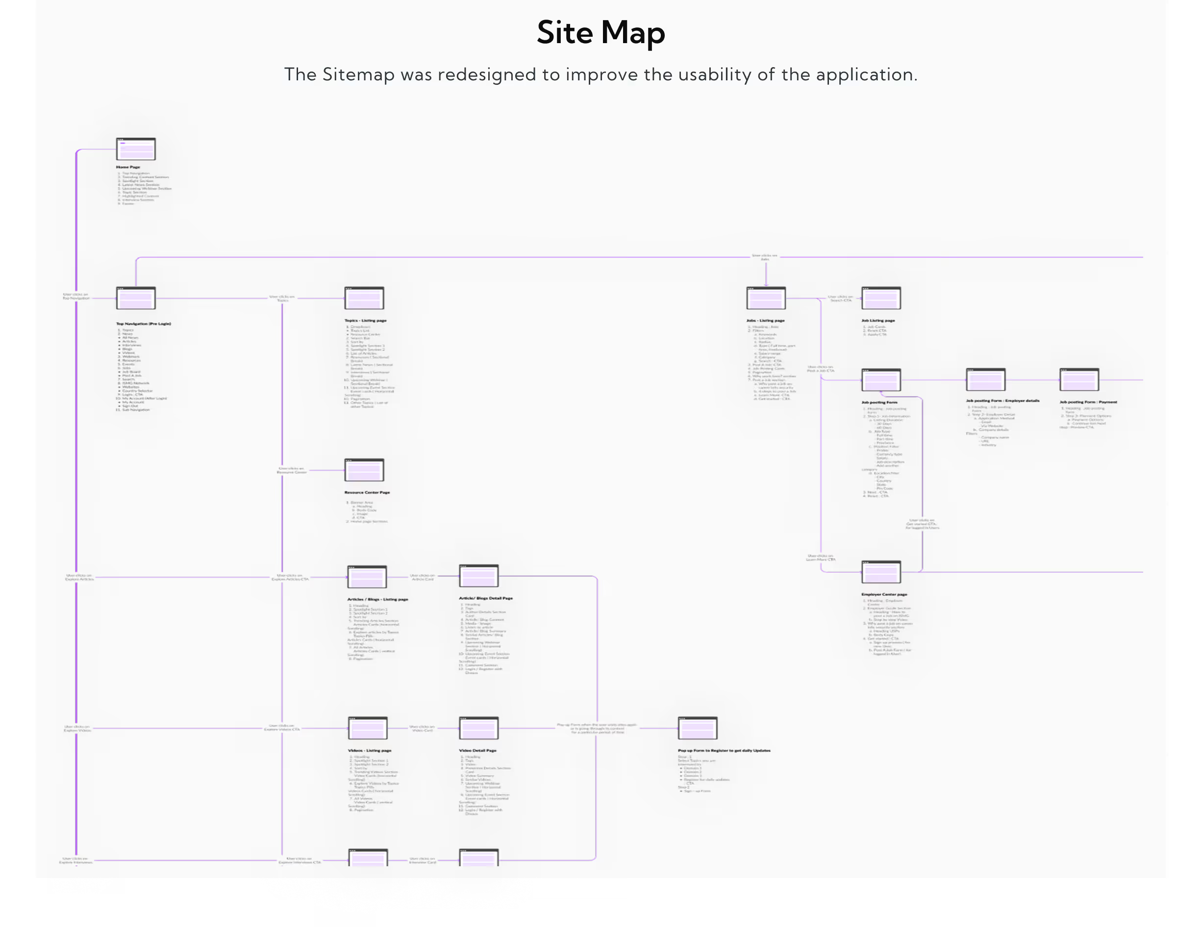
We included different laws of design while designing the ISMG’s UX experience. The law of simplicity and consistency was applied throughout the website along with Fitt’s law and Fogg’s behavior model.
Solution
Clear Structure, Strong Hierarchy
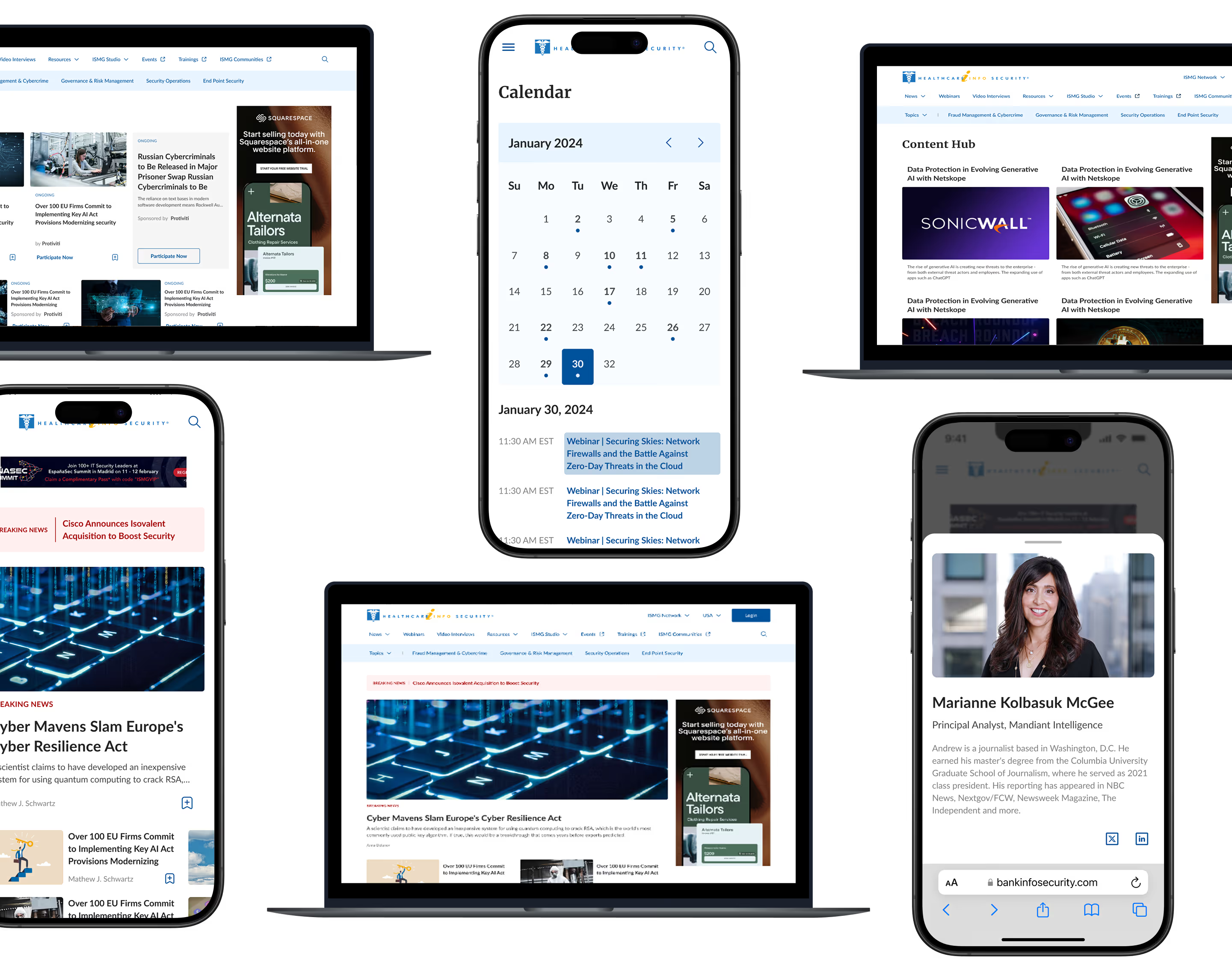
We refined the layout to improve structural clarity and maintain a consistent text hierarchy across sections. The Trending tab was given visual prominence to quickly draw user attention. By following the principle of simplicity, we ensured the experience feels intuitive and easy to use, without adding unnecessary effort for users.
Simplify the Homepage
We reduced the length of the home page to make it more concise and leveraged whitespace effectively. We utilised visual cues and animations to encourage users to scroll beyond the top section of the homepage because most people didn’t even go beyond the homepage on the screen.
Improve Scrollability
We implemented a fixed navigation bar, a "scroll to top" button for easy navigation back to the top. Providing engaging and relevant content throughout the page to maintain user interest and encouraging them to scroll.
Form Meets Function
Designing Engaging Interfaces
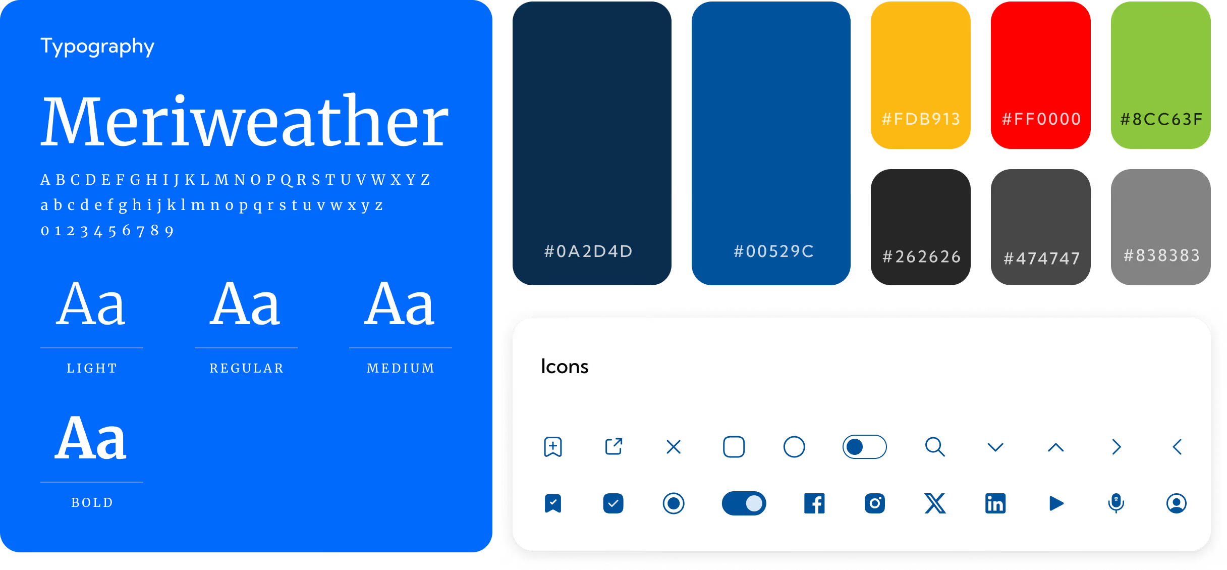
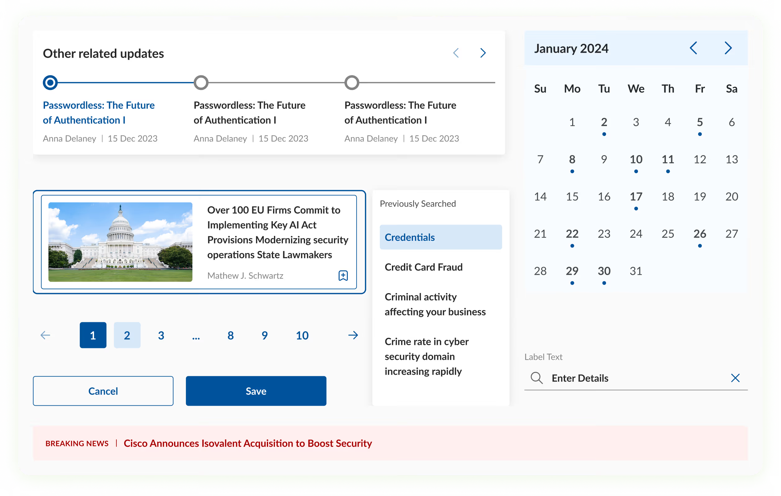
We created icons that were smaller in size and consistent throughout the website. Stroke icons gave a neat and subtle look compared to filled icons. Proper hierarchy is maintained in cards, the image size is consistent and the titles are written in three lines each which makes the section stand out.
For the title section we used bold font so that it grabs the user's attention. Images were intently used so that they match with the context and attract the user to click on the card to read the article.
More Like this
.avif)
Talk to Us Today!
Let’s explore how our creative expertise can transform your product into a human-centric and innovative solution.
Good design starts with Sliced Newsletter
Subscribe to the Sliced newsletter and get the best of research, UX writing, product psychology, CX, and design systems, right in your inbox.