Redefining Corporate Travel Management
An internal platform built to simplify travel requests, documentation, and approvals for KPIT employees.


industry

Services Provided

PLATFORMS

BUSINESS TYPE
Overview
We redesigned KPIT travel management platform to simplify travel requests and documentation to foster better coordination between employees and management.


Overview
We redesigned KPIT travel management platform to simplify travel requests and documentation to foster better coordination between employees and management.





Navigating Complex Travel Requests & Manual Approvals
Turning Challenges Into Breakthroughs
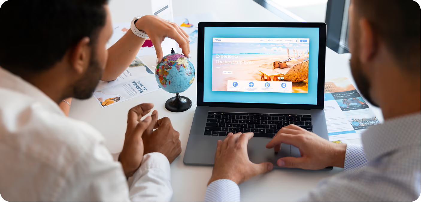
The employees face issues of documentation, human oversight, and general travel request management. They needed a new website to handle that aspect effectively and efficiently.
The Method Behind Magic
Our Strategic Design
We followed our STEP Process to get insights from UX audits and employee interviews to build a smooth, guided flow. We were able to create a functional system that supports self-service in one cohesive design


Decoding the Ecosystem
A 360° View
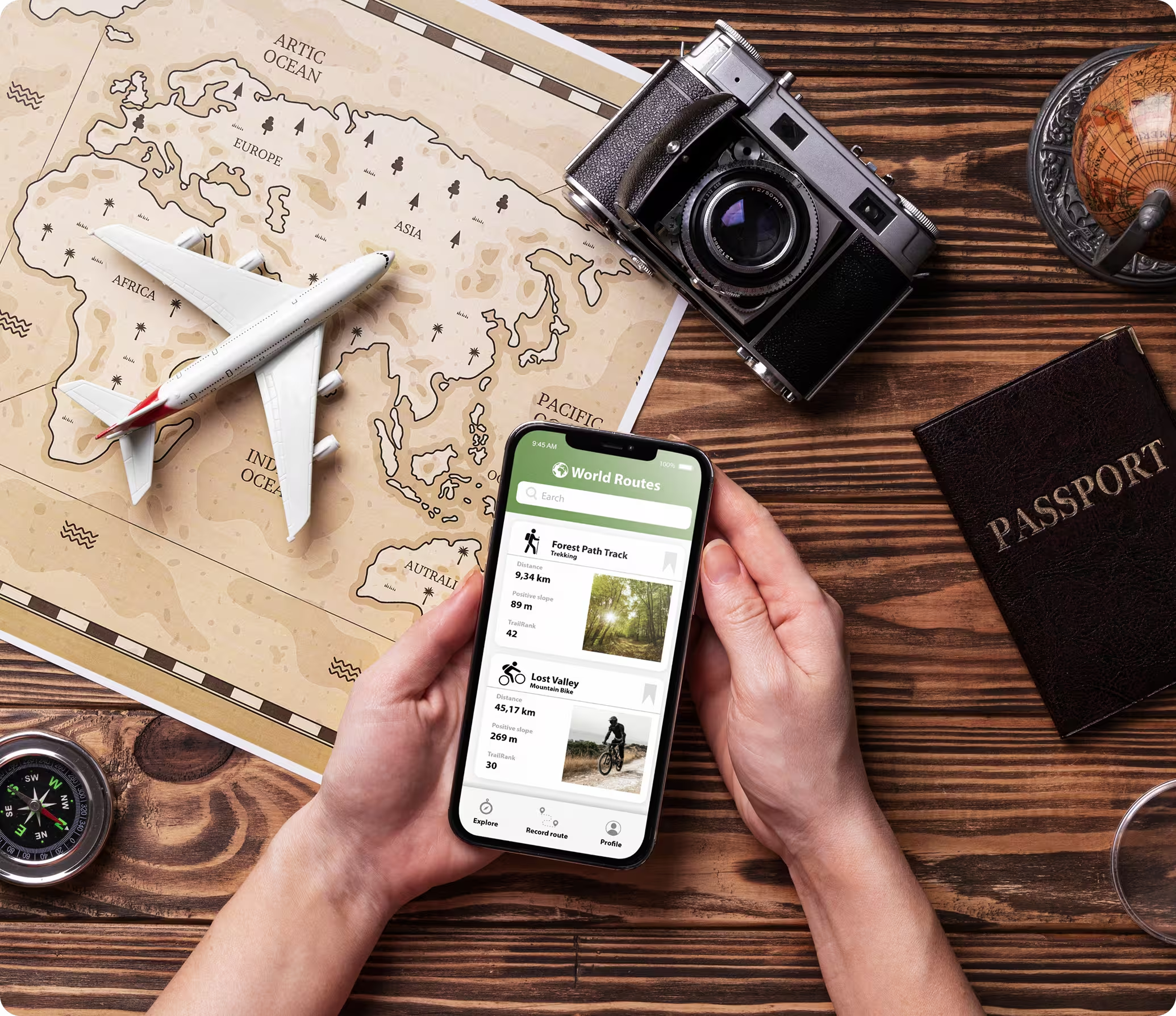
We conducted a UX audit and interviews to uncover the main usability challenges in KPIT’s internal travel platform. Our findings guided a redesign centred on clarity, consistency, and control.
Task Orientation
We covered how easy decision-making was and the logical sequence of the activities needed to complete a task
Form and Data Entry
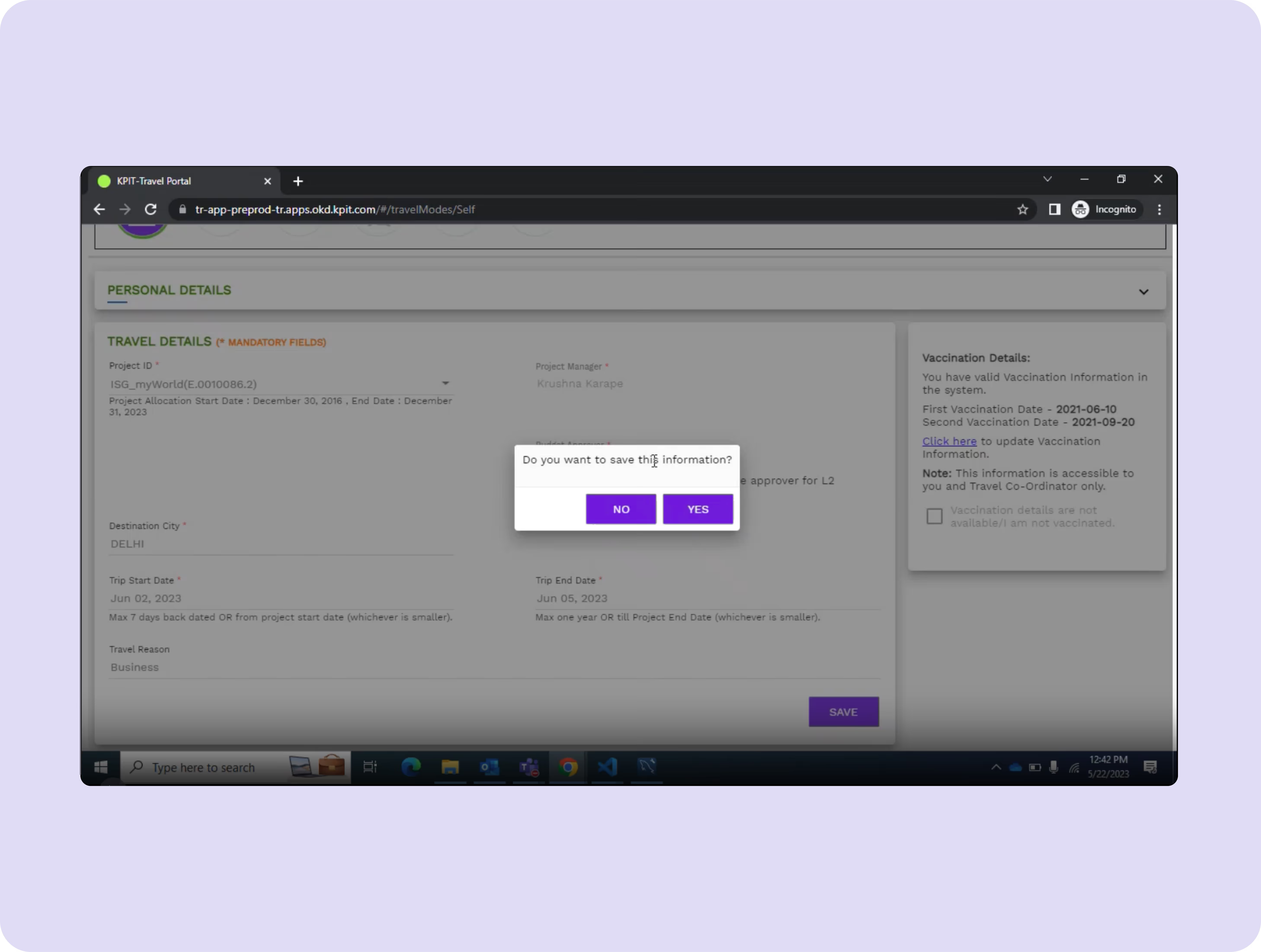
We examined the forms from different perspectives for users, such as error prevention and redundancy.
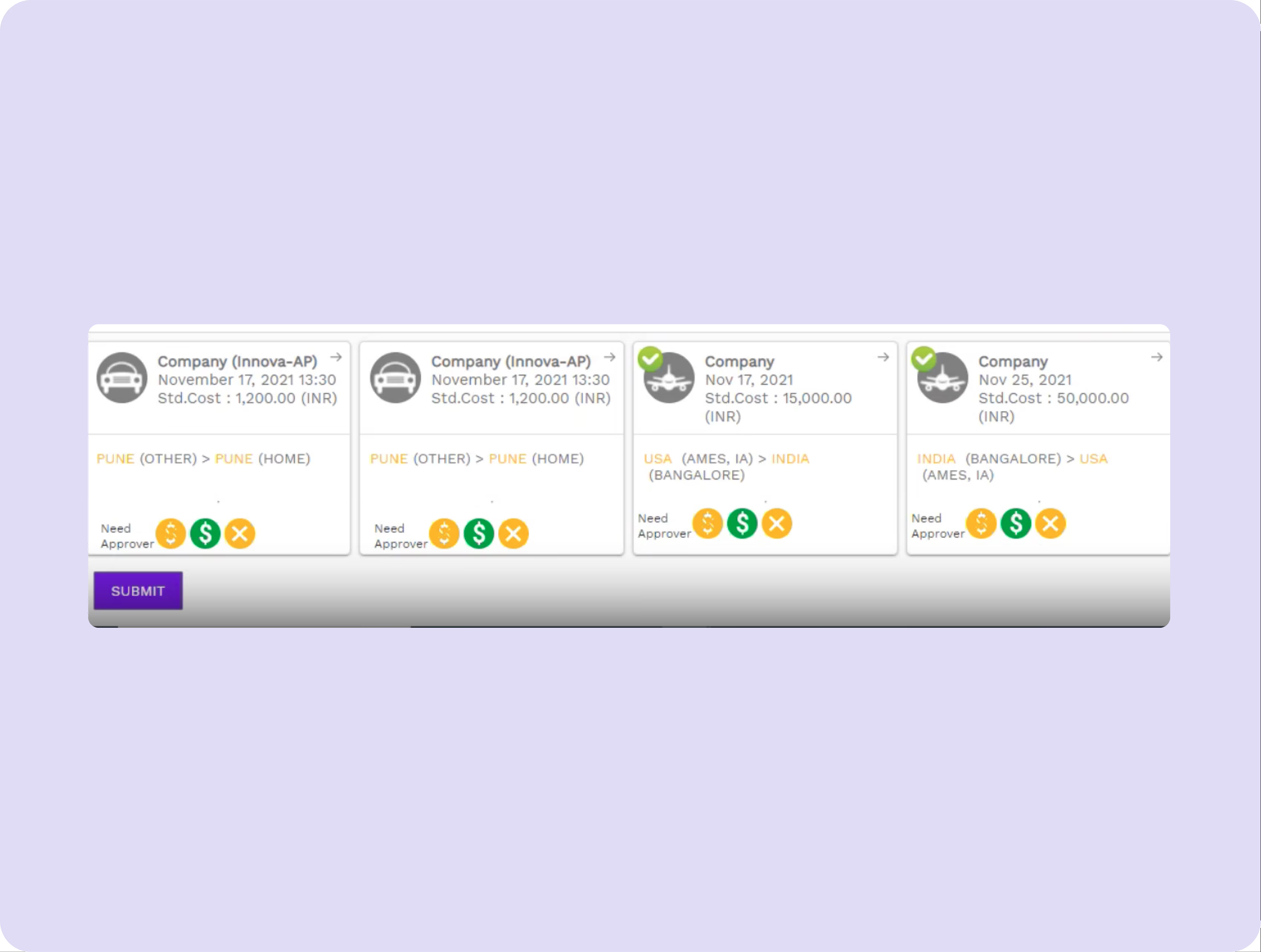
Page Layout and Visualisation
Typography was an issue, and it made users confused while reading through the copies.
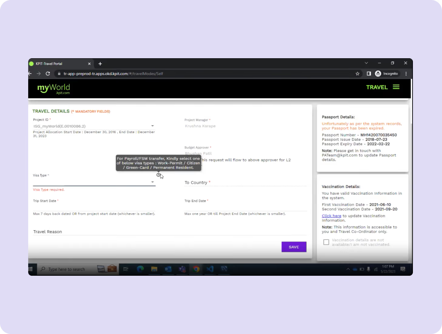
Transparency
The employees wanted transparency in approval tracking and simpler documentation processes.
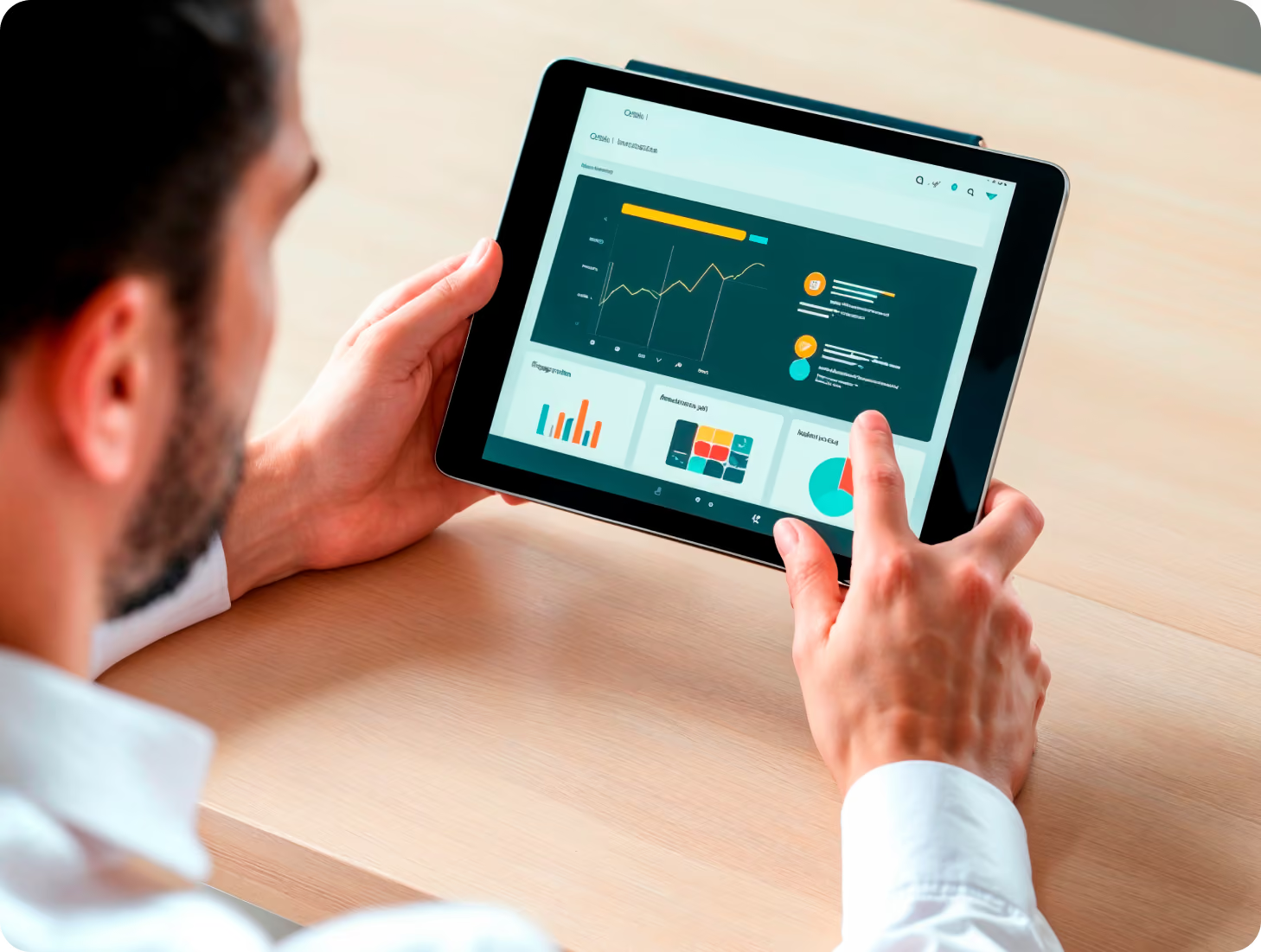
Feedback
They noted that improving communication and reducing manual oversight would save time and enhance trust in the system.

India gold

- Apple Journal prioritises privacy and intuitive journaling over community or gamification.
- Me+ inspires self-reflection through affirmations and minimalist design.
Rupeek

- Fabulous gamifies daily routines with rewards to sustain continued use.
- Gratitude nurtures consistency through journaling streaks.
- Manifestie and EnVision combine immersive experience, visualisation and sound cues for mindfulness.
Core problems
- Poor navigation flow leading to longer completion times.
- Unclear form validation and redundant data entry.
- Travel request issues took longer to be resolved.
Key Opportunities
- To correctly manage the employees' travel requests with a platform
- Improving the flow of information among employees regarding Travel requests.
- Designing a faster way to resolve issues.
building the Experience
From Insights to Frameworks
Our UX design strategy emphasised structure and ease of use. The goal was to help the employees lodge or manage requests easily and reduce information overload.


Our Solution
Website Tour for first-time users
We included a website tour to familiarise users with the features and functionalities.
Role-based UX
Customised task flows for employees and managers, each with relevant features and dashboards.
Simple Interface
We made their interface consistent and user-friendly by using components such as CTAs and Cards.

Form Meets Function
Designing Engaging Interfaces
We transformed KPIT’s interface into a seamless digital workspace. Every visual choice: colour, typography, cards, and CTAs helped reinforce clarity, consistency, and readability.


Success story
What happens when great design meets real problems? Our projects speak louder than buzzwords.

“YellowSlice takes the time to understand our business needs. I can count on YellowSlice for fresh perspective, innovative ideas, consistency, solutions and accuracy. “

More Like this

Stop Guessing. Start Designing.
See why we’re not just a UI/UX Design agency; they see us as a strategic partner to their team.
Good design starts with Sliced Newsletter
Subscribe to the Sliced newsletter and get the best of research, UX writing, product psychology, CX, and design systems, right in your inbox.
