Redesigning to Form into an Interactive Application
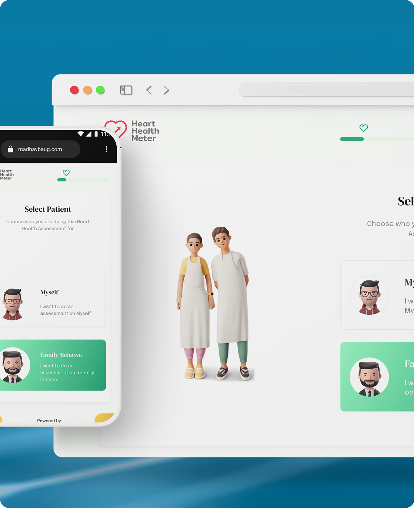
Madhavbaug HHM is a dependable option for treating heart ailments in the country. Their research-based Heart Health Meter calculates this risk and provides recommendations to manage the risk factors affecting your heart health.
Heart Health Assessment, Reimagined

.avif)

industry

Services Provided

PLATFORMS

BUSINESS TYPE
Overview
The company wanted to convert its form into an innovative and creative application. Madhavbaug HHM wanted us to redesign its form and make it more interactive and creative to increase user engagement.

.avif)
.avif)

.avif)
.avif)
Bridging the Gap Between Complex Clinical Data and Patient Treatment
Turning Static Medical Forms into
an Adaptable Risk Assessment Tool
Madhav Bauug wanted us to redesign the form into an interactive application and create a compelling user interface design to increase user engagement.
The Method Behind magic
Our Strategic Design
To ensure a smooth project flow, we follow the STEP process—Soak, Think, Execute & Proof. This project focused solely on UI design, without UX research or UX design.
We began with UI mood boards, design samples, icons, illustrations & animations to establish the app's visual theme.
.avif)
.avif)
.avif)
Decoding the Ecosystem
A 360° View
To better understand how a healthcare platform works, we started by understanding the patient journey, what confuses them, and what helps them. We understood their expectations and struggles right from the first clinic visit to daily at-home aftercare.
Customisation via Mobile App
UX Audit revealed a lack of personalisation in orders, which synced smoothly with the POS system.
.avif)
Customisation via Mobile App
UX Audit revealed a lack of personalisation in orders, which synced smoothly with the POS system.
Most patients said that they felt intimidated by the medical jargon and abbreviations on the platforms when they just wanted to understand something really basic about their health.
.avif)
Doctors, on the other hand, were of the view that patients can’t find critical features on the healthcare platform.
.avif)
upstox

India's first broker to offer free Tick-by-Tick powered NSE Charts for NIFTY F&O trading.
- Upstox offers a news feed of stocks and funds in your portfolio & Watchlist where users can stay updated on what is happening in the stocks they are interested in.
- The in-app switch lets you seamlessly transition between an investor and trader profile. This lets you meet your long-term investing goals and active trading needs within one app.
Groww

Groww claims to be India's No.1 Stock Broker, trusted by more than 10 Million active investors. It offers products for investing, trading, and payments.
- Comparing mutual funds allows users to select funds of their choice and compare them with their annual returns, their holdings, fund details, etc., with a graph showing a visual comparison.
- Groww provides pre-approved loans based on credit score and portfolio, with no paperwork or pre-closure charges.
Understanding Market Alternatives
Analysed fintech platforms and payment apps to identify gaps, features, and opportunities for differentiation.
Core problems
- Cluttered Interface: The previous design had a problem of information overload, and it was exhausting for users to take any action when there were so many options to choose from.
- Key features were hidden: Users faced a lot of friction while navigating because key features like "Daily Diet Log" and "Doctor Consultation" were not available at a glance.
- Lack of Visual Hierarchy: The typeface and color palette lacked the readability required for a healthcare application.
Key Opportunities
- Simplify interface and trading flows for faster onboarding.Visual Language as a tool: We used animations to create an engaging and calming, "non-hospital" feel.
- The "Guided Flow": Rebuild the navigational flow to be linear so that users don’t feel lost during their user journey.
- Proactive Feedback: We incorporated comprehensive health insights rather than just showing numbers.
Our Solution
UI Design
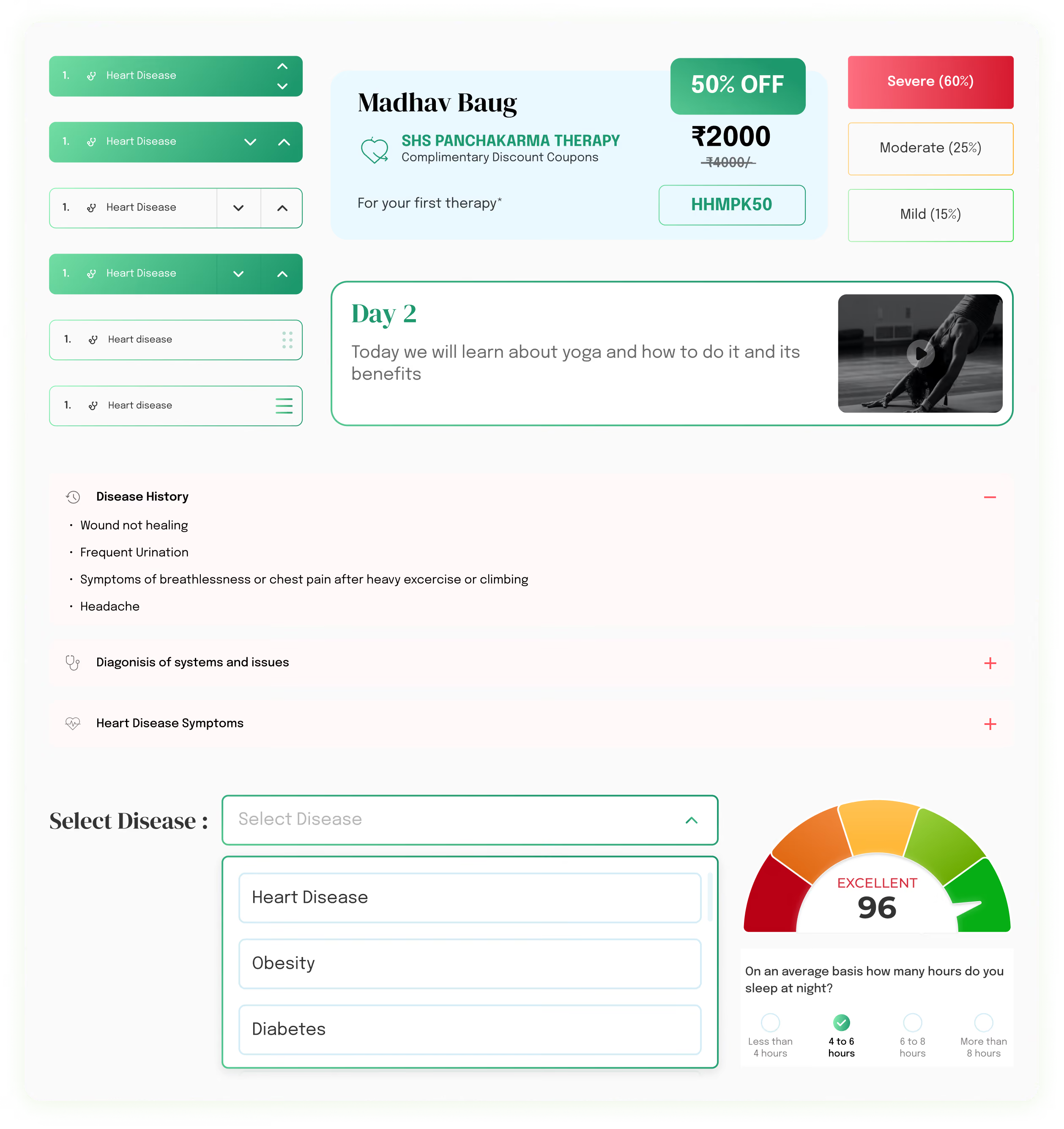
The interface design is a blend of abstract shapes, detailed graphics, a readable typeface, and natural colours that go with the brand and make the content stand out. We chose a very simple and not too modern style.
.avif)
Form Meets Function
Designing Engaging Interfaces
We created two options for UI design.
For option 1, the font we decided on is “Outfit”. Primary colours are light blue, dark blue, and yellow. Secondary colours are black and shades of grey.
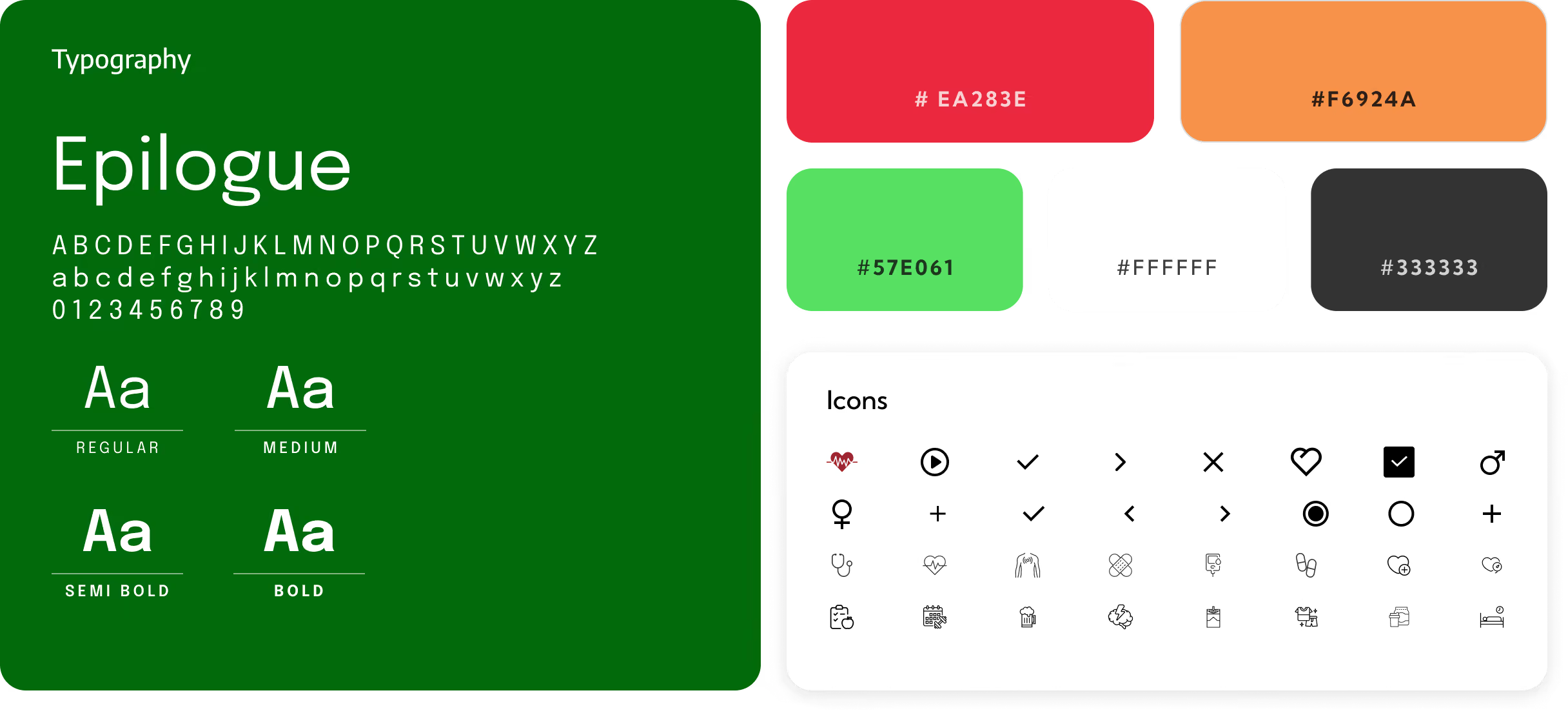
For option 2, we chose two fonts, “DM Serif Play” and “Epilogue.” Primary colours are yellow and green. Secondary colours are green, white, and black.
.avif)
Success story
See why we’re not just a UI/UX Design agency; they see us as a strategic partner to their team.

The project was a huge success, thanks to Yellow Slice's excellent design and development work. The app was also promoted and previewed worldwide in a special web series. The team delivered on time, provided regular updates, and delivered innovative solutions and great customer experience.
.avif)
More Like this
.avif)
Talk to Us Today!
Let’s explore how our creative expertise can transform your product into a human-centric and innovative solution.
Good design starts with Sliced Newsletter
Subscribe to the Sliced newsletter and get the best of research, UX writing, product psychology, CX, and design systems, right in your inbox.