Simplifying Employee Benefits Enrolment for Marsh, a Global Insurance Leader
Headquartered in New York, Marsh is a subsidiary of Marsh McLennan. It is an insurance broking and risk advisory agency with its presence across 130 countries. Their services include industry-focused broking, claim advocacy & consulting.
Helping Marsh with risk finding and mitigation in businesses
.avif)
%202.avif)

industry

Services Provided

PLATFORMS

BUSINESS TYPE
Overview
Marsh India offers employee health & benefits services for its corporate and organisational clients. BenefitMe is an initiative within the same vertical to simplify the employee enrolment process. This initiative will also allow the employees of these organisations to access crucial information about the benefits they receive.
.avif)





Helping Employees with Awareness about Benefits from the Organisation
Marsh aimed to integrate a B2C model into their already established B2B model. The portal will be used by individuals who wish to purchase insurance policies directly from Marsh India instead of going through the formalities of their organisation.
The Method Behind magic
Our Strategic Design
We followed our STEP (Soak, Think, Execute, Proof) process. We got to the base of understanding how the organisation works, defining process flow, and procuring pre-requisite data. It allowed us to understand the flow of the form-filling process for all the organisational clients of Marsh and their employees.
.avif)


Decoding the Ecosystem
A 360° View
UX researchers at Yellow Slice conducted stakeholder workshops with employees from the business and operations department. This process enlightened us about their pain points and expectations, which eventually led us to form strategies for the design process.
Core problems
- Lack of a centralised method to view, compare, and enrol in the employee benefits plan.
- An unclear user journey made it hard for users to complete the action.
- Non-linear, scattered information about policy enrolment is hard to comprehend for users.
Key Opportunities
- Created an intuitive user journey so that users can move through a structured process to enrol themselves in the plan.
- Enable plan customisation, starting with a base policy and layering in additional benefits to give users meaningful control over their coverage.
- Without stopping at just design, we designed a dynamic design system to ensure consistency and scalability, making the design future-proof.
Architecting Experience
From Insights to Frameworks
Our research findings were translated into structured flows and frameworks that formed the backbone of the BenefitMe portal. By mapping out the enrolment journey end-to-end, we ensured every design decision was grounded in real user needs and organisational workflows.


Our Solution
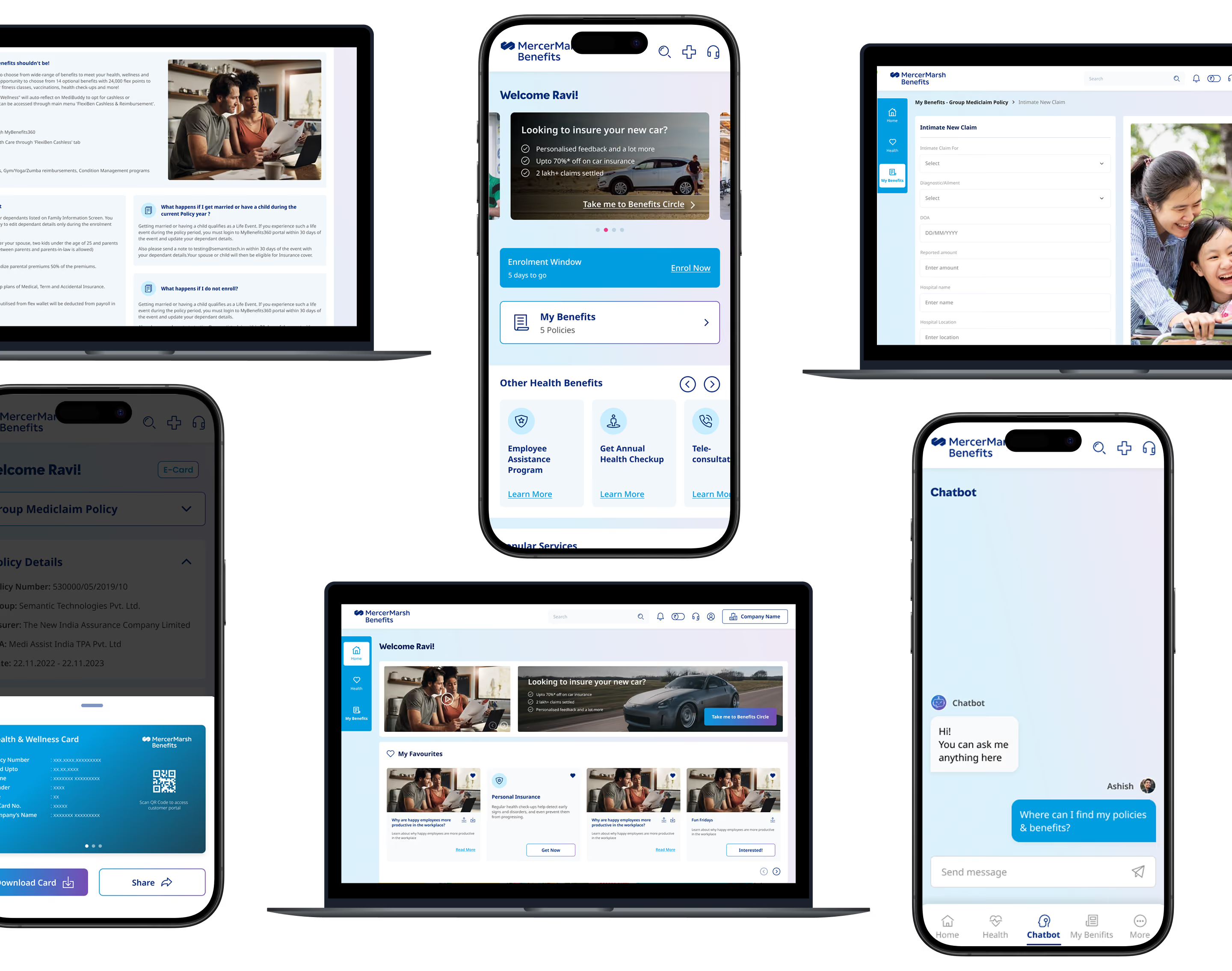
Intuitive Information Structure
The information structure is organised in a way to help users find the necessary features and data right away.
Clarity Through Clean UI
Whereas the clean user interface enables users to view and understand the information with greater ease, ensuring informed decisions.
Form Meets Function
Designing Engaging Interfaces
The primary color used for Marsh is a deep navy (#002C77), which anchors the visual identity with authority and credibility. It is complemented by a teal accent (#00A8C8) that adds energy. The complementary palette of slate grays (#37424A, #435465) brings balance and structure.
Slate Pro was chosen as the typeface to reinforce a clean look. Iconography follows a dual approach: detailed, colour-backed icons and simpler grey line icons for functional UI elements. Illustrations lean into a warm, people-first style set against the deep navy.
.avif)
.avif)
More Like this
.avif)
Talk to Us Today!
Let’s explore how our creative expertise can transform your product into a human-centric and innovative solution.
Good design starts with Sliced Newsletter
Subscribe to the Sliced newsletter and get the best of research, UX writing, product psychology, CX, and design systems, right in your inbox.