Simplifying the Learning Journey at National University, NU
National University is reshaping higher education for busy adults and working professionals. The university offers comprehensive academic, financial, career, family, and wellness support services. They empower students to succeed in the classroom, at work, at home, and beyond.
Simplifying Document Workflows with Clarity & Control
Helping Learners Explore Programs for Career-Focused Education


industry

Services Provided

PLATFORMS

BUSINESS TYPE
Overview
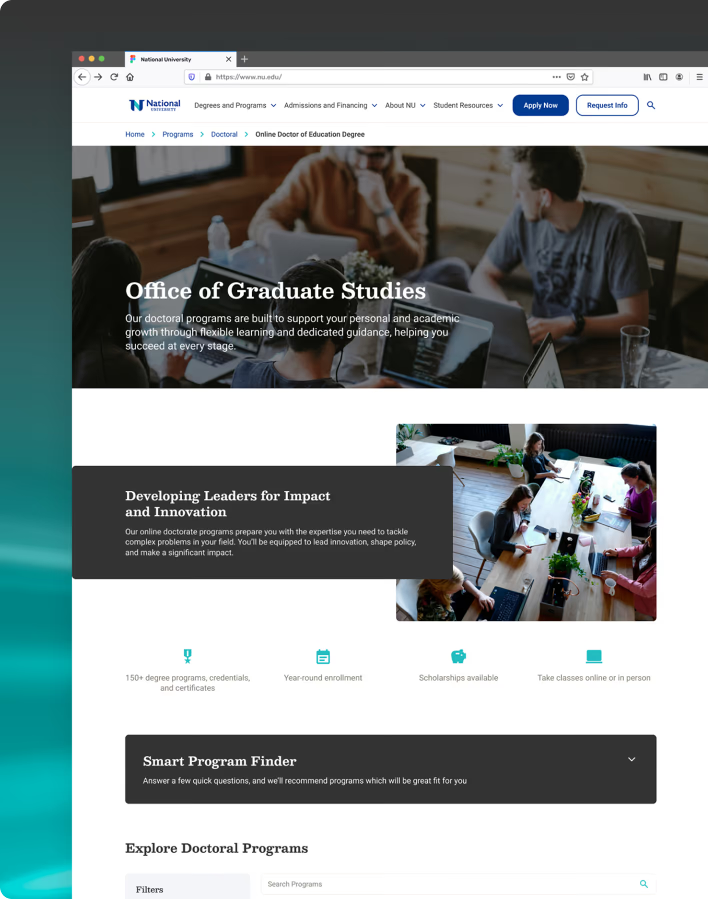
We designed an intuitive UI for National University, simplifying the learning journey. NU offers 150+ career programs, flexible course structures, and convenient online options.







Elevating Engagement in an Online Learning Experience
Turning Program Discovery into an Intuitive Journey
The challenge was to revamp its current UI and UX to provide users with a more user-friendly responsive website experience so that it stands apart from its competitors. Our focus was to improve the overall user journey by creating a clear, structured, and motivating design. It helps learners easily explore opportunities and take the next step in their career growth.
The Method Behind Magic
Our Strategic Design
Using the STEP (Soak, Think, Execute, Proof) process, we tuned the experience in real user behaviour to simplify complex workflows and ease feature discovery. Progress cues and nudges encouraged users to explore key features. Iterative testing ensured engagement added value without compromising usability or trust.

.avif)
.avif)
Decoding the Ecosystem
A 360° View
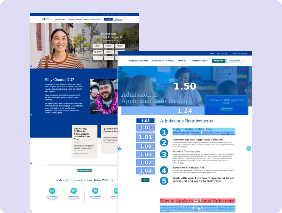
Our research focused on understanding how prospective and working adult learners discover, evaluate, and choose programs on the National University website. We analysed how users navigate program information, admissions details, and support resources to identify friction points in the journey. These insights helped us structure clearer pathways for program exploration and enrollment.
Improving Content Clarity
The UX audit revealed that several NU pages rely on long, dense paragraphs that can feel overwhelming for readers. To improve readability, we recommended using shorter, more scannable sentences and breaking complex information into bullet points.
Creating a Consistent, Benefit-Led Tone
We observed that NU’s tone often shifts between formal and conversational across different pages. To build a cohesive experience, we suggested adopting a professional yet warm tone that resonates with adult learners.
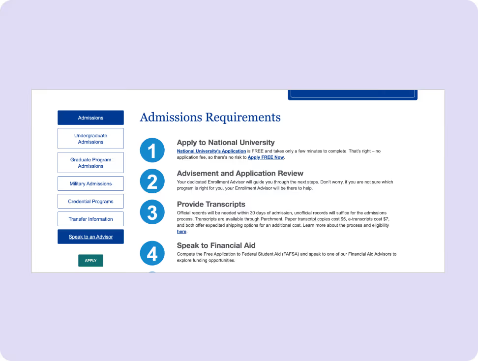

- Unlike some NU pages, WGU’s website doesn’t use long, dense paragraphs that could intimidate readers. They simplify complex ideas using brief, accessible language and clear structure.

- SNHU uses an empathetic, friendly tone that speaks directly to working professionals and adult learners. They decided on a primary tone (professional yet warm is ideal for adult learners) and stick with it across all pages, especially program and admissions content.
Core problems
- Content often relied on institution-centric language, making it harder for students to immediately see how programs benefit them.
- Many CTAs were generic, which reduced clarity around the next step users should take.
- Occasional academic jargon and complex phrasing made some program and accreditation pages harder to read and process.
Key Opportunities
- Shift to student-first language that positions learners as the hero of the journey.
- Introduce clearer, action-oriented CTAs that guide users toward meaningful next steps.
- Improve content readability with plain, accessible language to ensure information is easy to understand and globally approachable.
Architecting Experience
From Insights to Frameworks
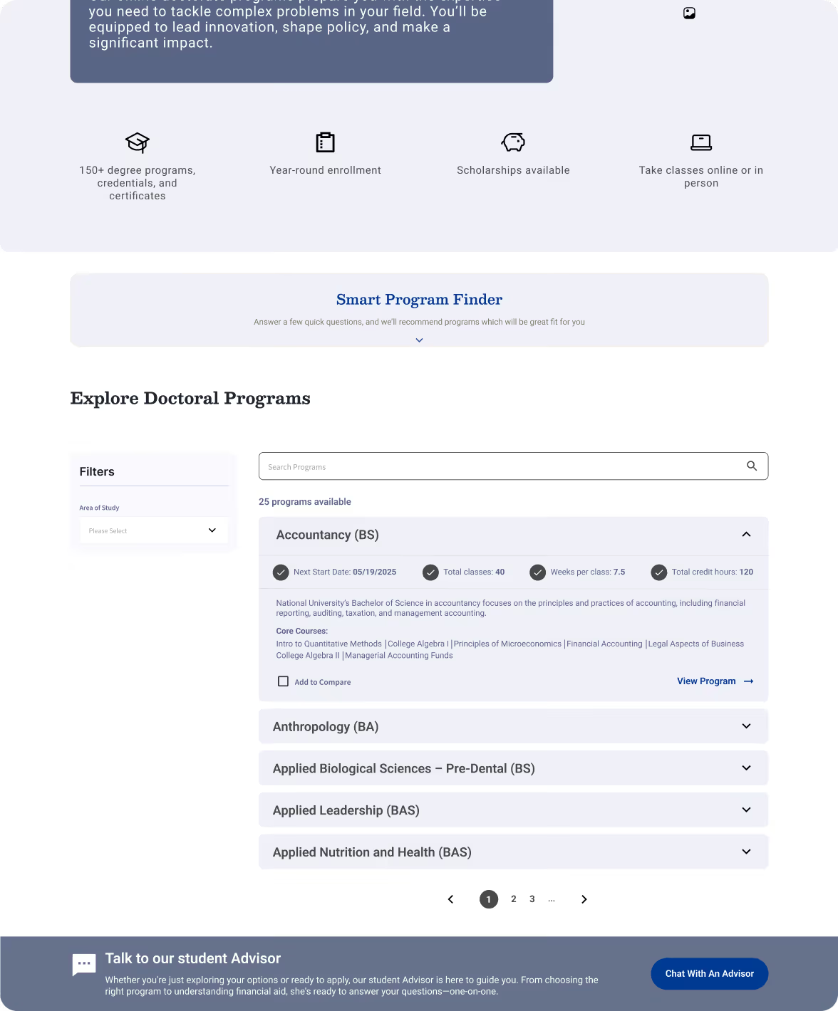
We organised interface elements and workflows into a logical structure that supports primary user goals with consistent visual elements and intuitive flows.
We organised learning modules, practice flows, and progress tracking into a logical structure that supports student goals with consistent visual patterns and intuitive navigation.
Solution
Student Testimonials and Success Stories
We incorporated authentic testimonials from current students and alumni to build trust and provide insights into the student experience and outcomes.
Comprehensive FAQ Section
We expanded the FAQ section to address inquiries about admissions, financial aid, and student services, helping students find information quickly.
Credibility
A section for the important awards and recognition NU has received over time on the home page. It ranged between 5-7 awards, certifications or recognition.
Form Meets Function
Designing Engaging Interfaces
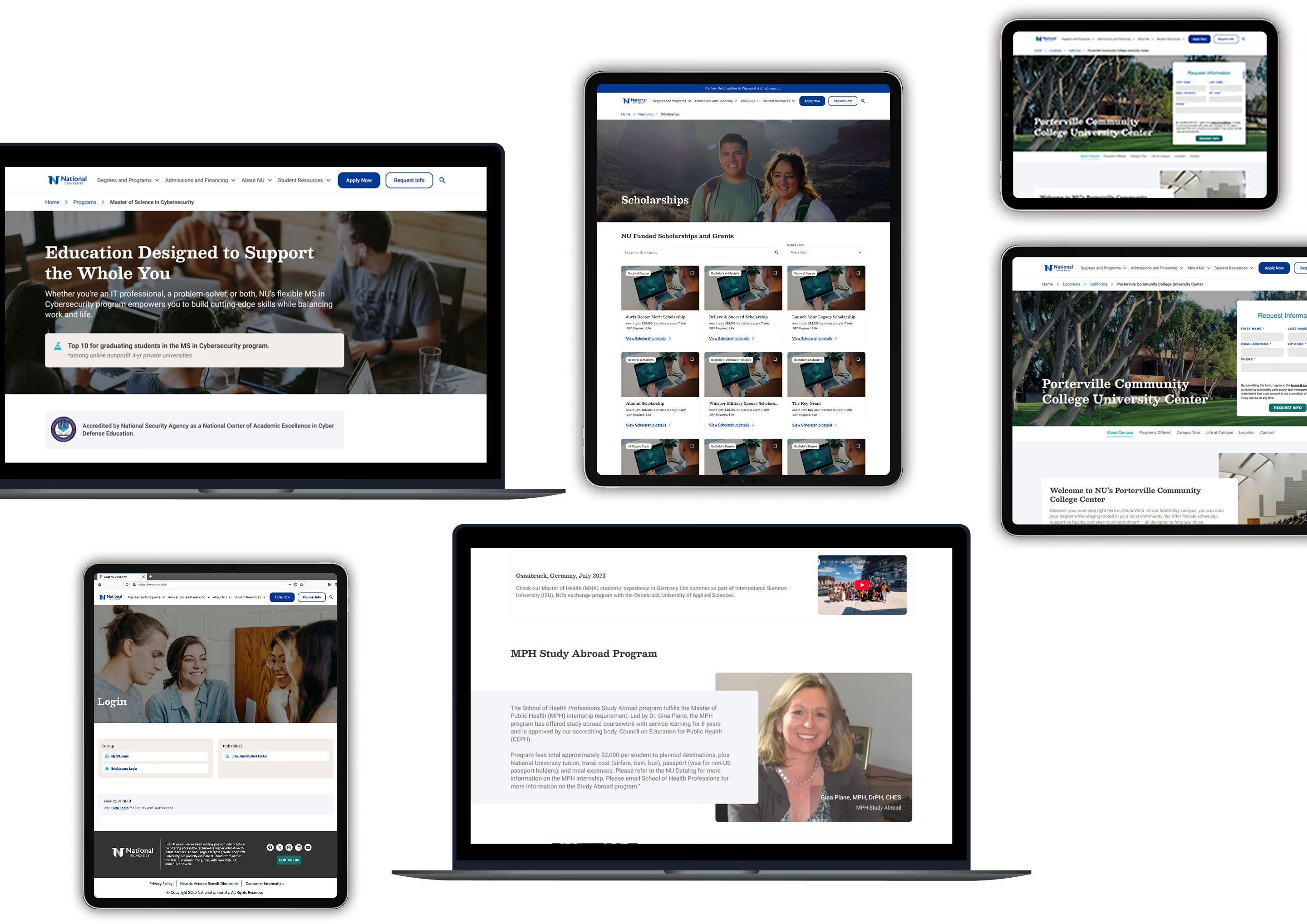
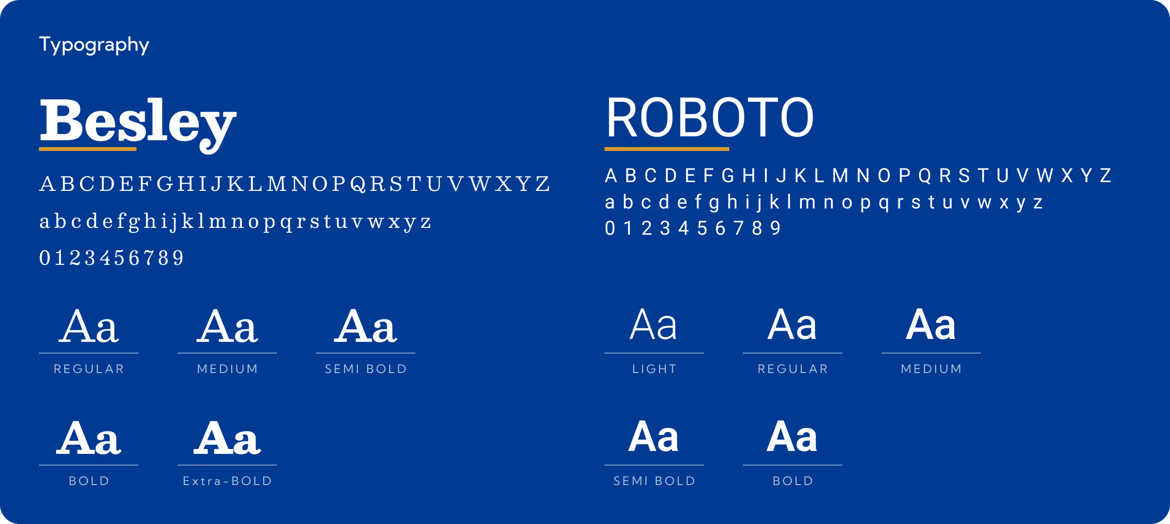
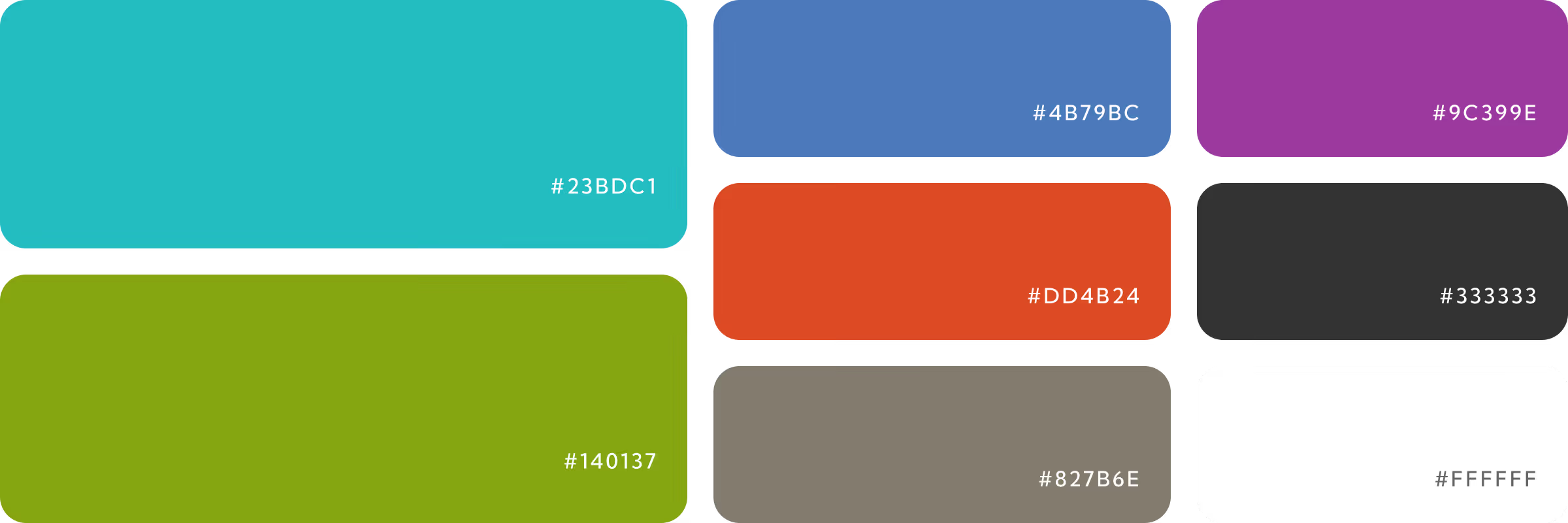
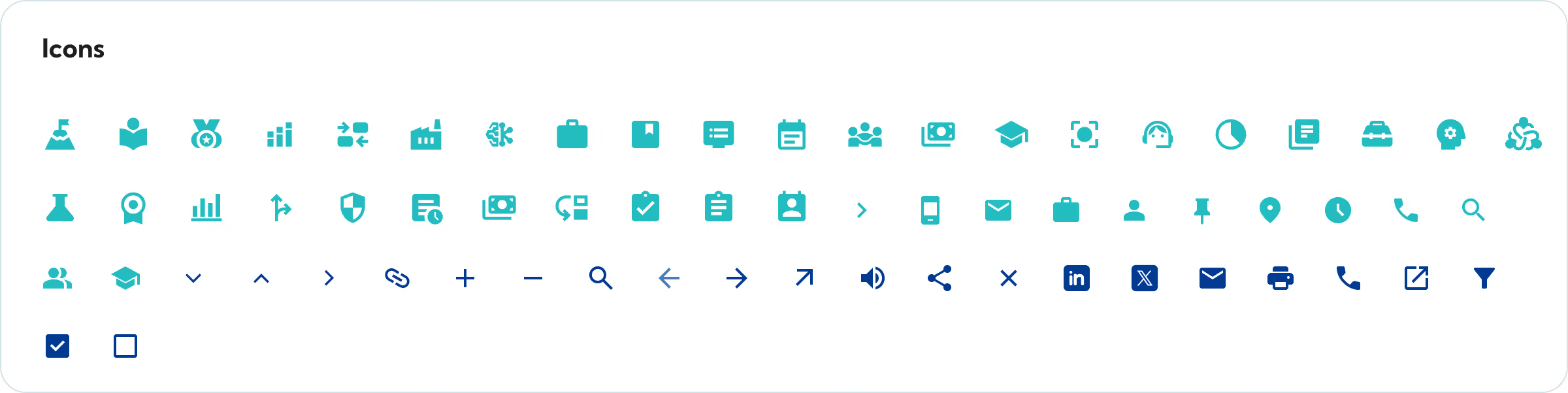
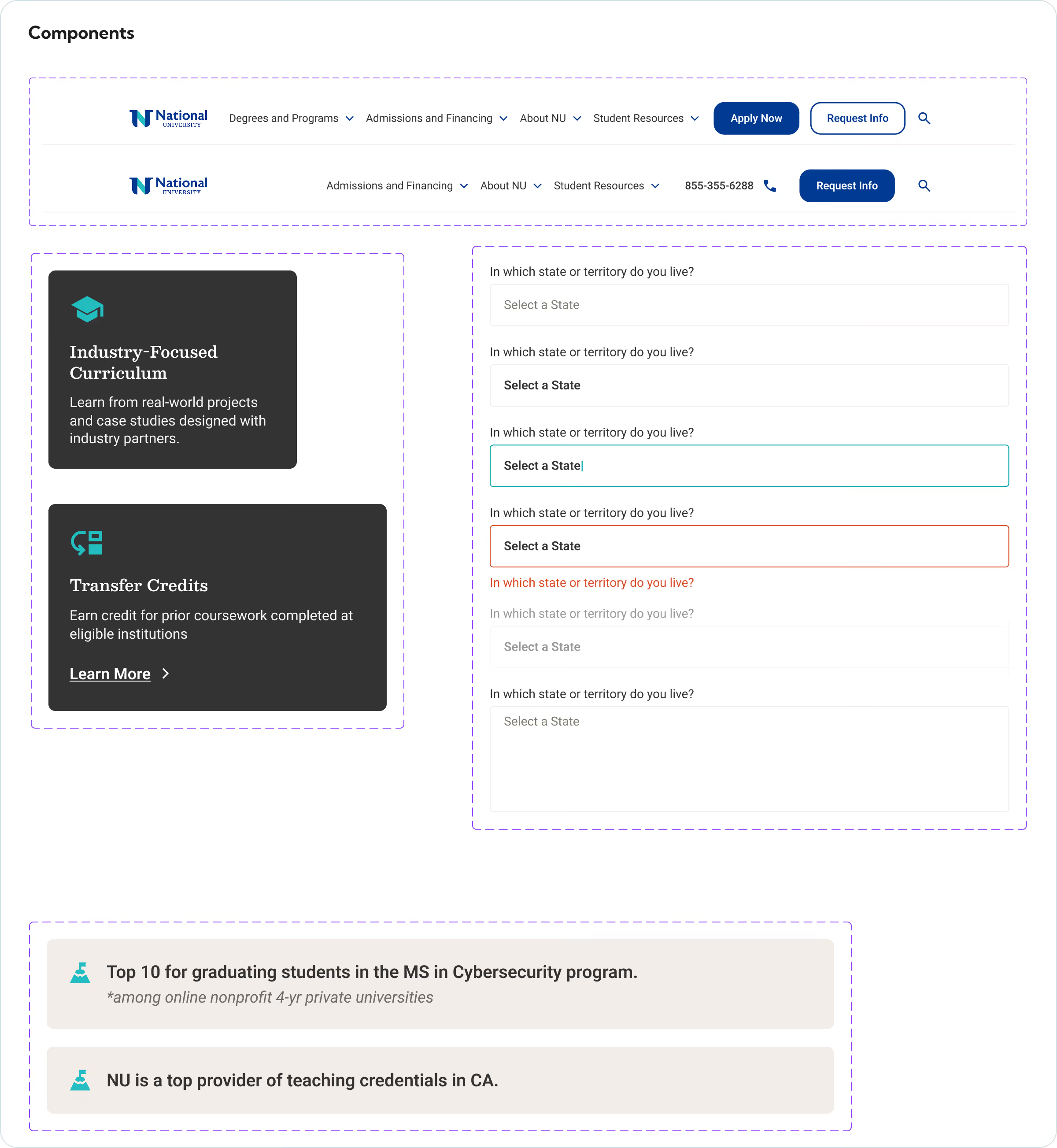
All UI screens were designed in alignment with the existing website theme to maintain visual consistency and brand familiarity. While a mobile version was not separately created, the desktop components were built with scalable elements, ensuring they can seamlessly adapt to mobile screens when required.
More Like this
.avif)
Talk to Us Today!
Let’s explore how our creative expertise can transform your product into a human-centric and innovative solution.
Good design starts with Sliced Newsletter
Subscribe to the Sliced newsletter and get the best of research, UX writing, product psychology, CX, and design systems, right in your inbox.