Your path to a smart Travel
A digital MVP that helps travellers create and manage their perfect travel itineraries with ease.

.svg)
industry
Services Provided
PLATFORMS
BUSINESS TYPE
Overview
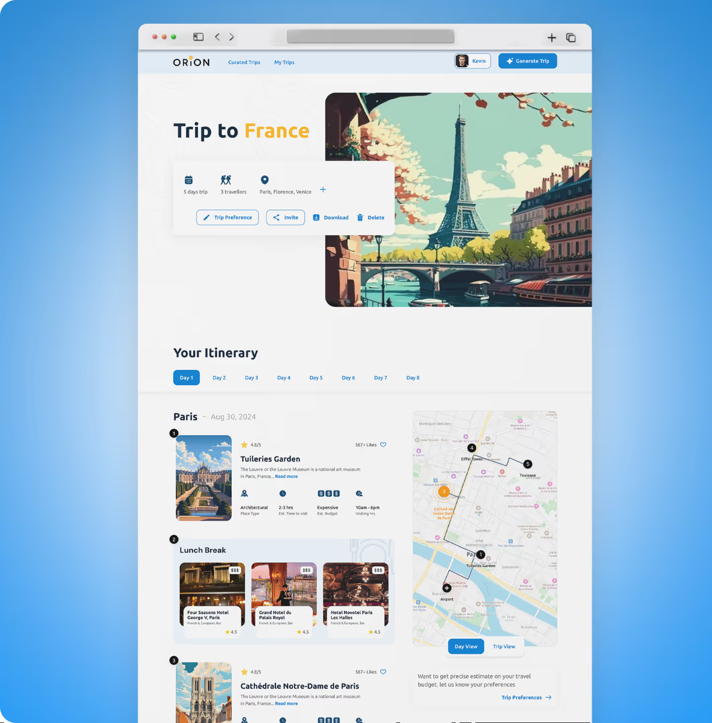
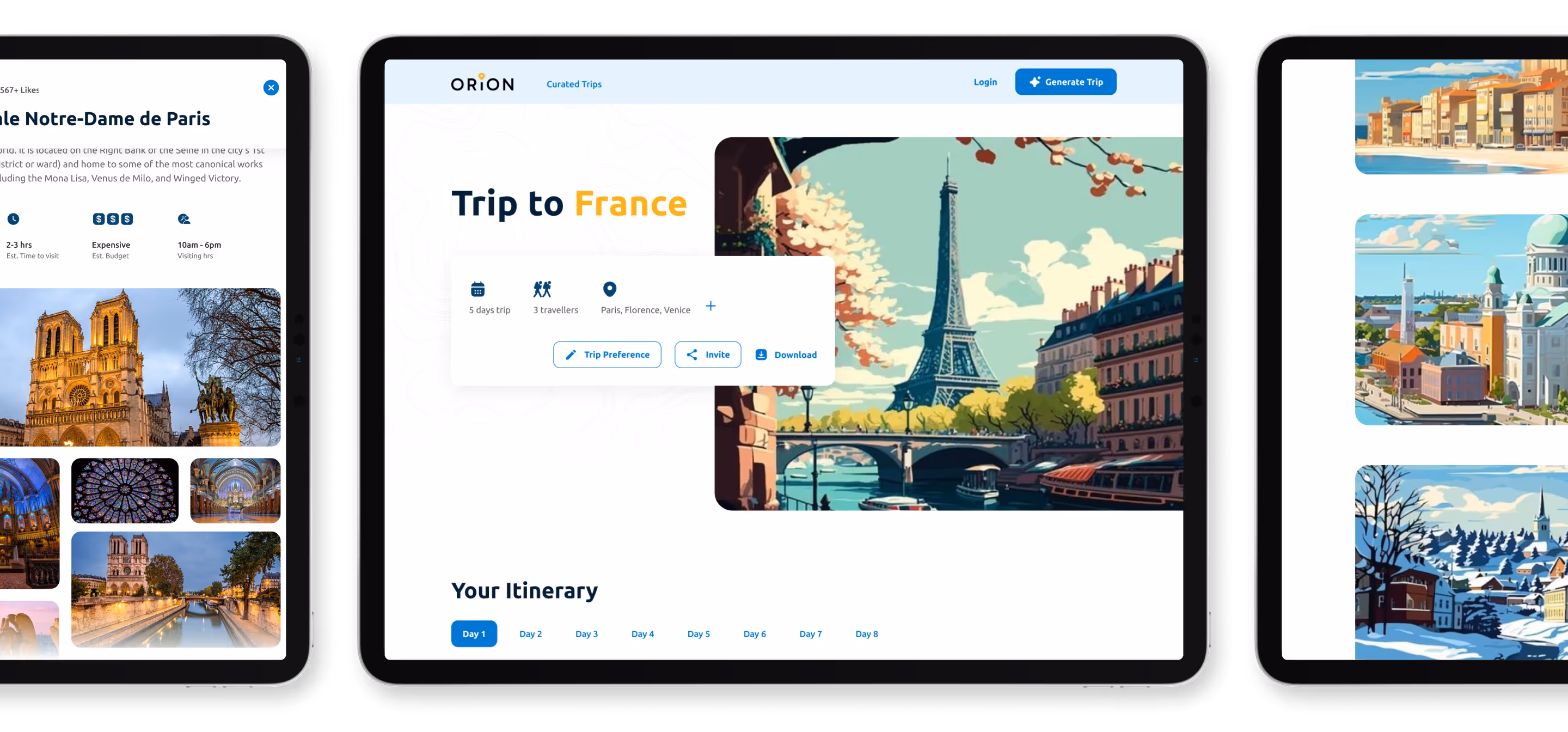
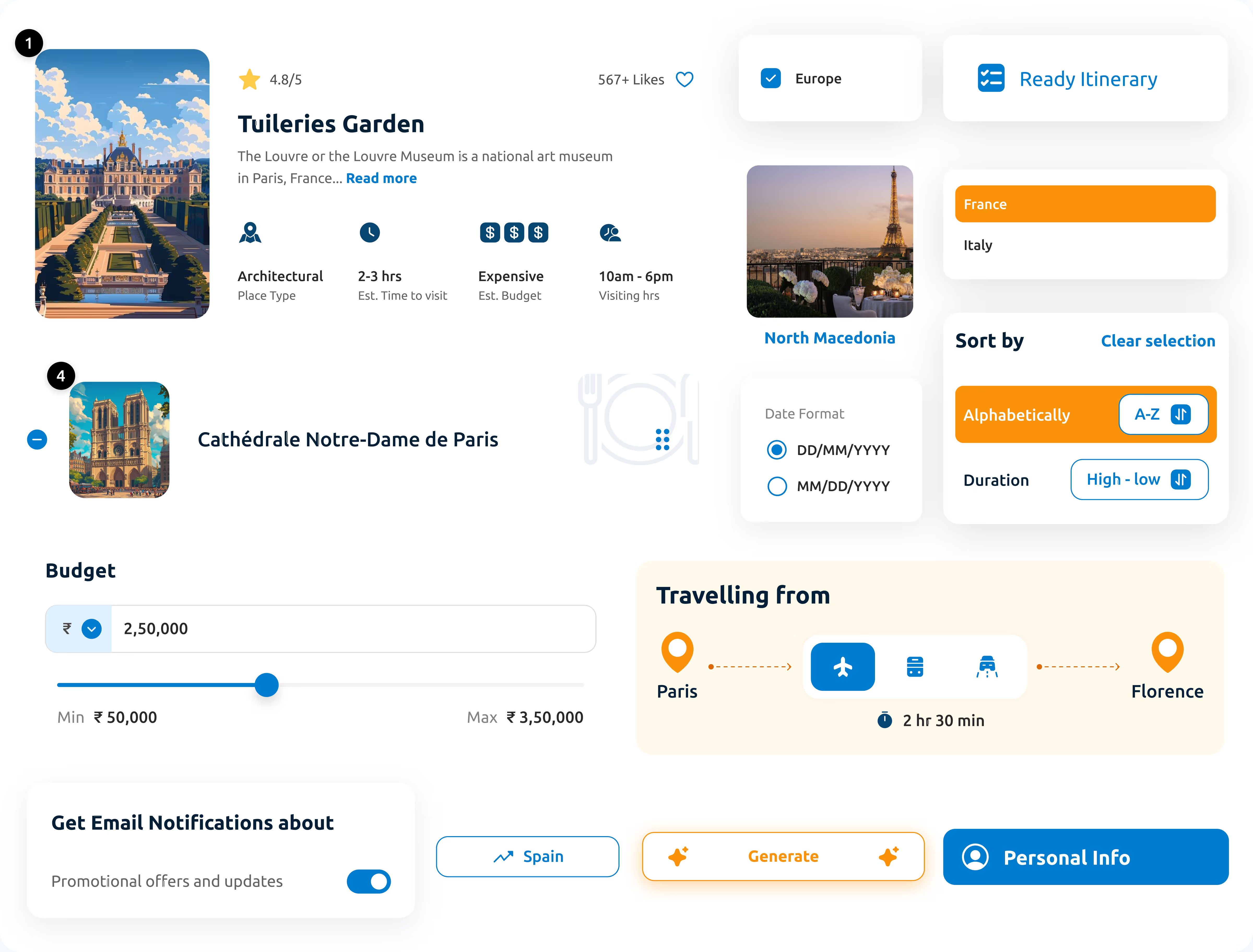
Orion is built to take the stress out of travel planning. It is an MVP Product that helps travellers to plan their itinerary, with minimal effort.
.avif)
.avif)
.avif)
.avif)
.avif)
.avif)
Navigating complexity
Turning Challenges Into Breakthroughs
Planning trips should be exciting, not exhausting. Orion needed a simplified system that keeps users focused on one thing and offers the right features to create a complete travel plan.
The Method Behind Magic
Our Strategic Design
To ensure a smooth project flow, we adhere to the STEP process, an acronym representing Soak, Think, Execute, and Proof. Beginning with UX Research, the UX design case study progresses to strategy and concludes with impactful UI.
.avif)
.avif)
.avif)
Decoding the Ecosystem
A 360° View
Before designing Orion, we conducted extensive research to understand how travellers currently plan their trips. The goal became clear: to simplify and make travel planning enjoyable.
Understanding Travel Habits
We spoke with frequent travellers who shared frustration about “decision fatigue.” They wanted platforms that saved time, not demanded it.

Feedback That Drove Design
User responses shaped our focus on minimal inputs, fewer clicks, more outcomes. This guided our approach to keep the experience lightweight yet fulfilling.
Designing for Motivation
Daily affirmations, progress visuals and rewards keep motivation alive.
Indirect Competitors
Analysing Industry PatternsWe studied travel websites and apps that prioritised sales over user experience. This confirmed Orion’s direction: focus not on transactions, but on simplicity and user control.
Efficiency and Ease
Most users valued efficient, fast itinerary creation over overwhelming options or upselling features. Focusing on creating the perfect itinerary is enough to turn users into customers.
Core problems
- Users were tired of complex forms and scattered information.
- Too many CTAs distract from the goal of itinerary creation.
- Users struggled to find an app focused purely on planning, not bookings.
Key Opportunities
- Create a lightweight MVP that puts clarity before content.
- Introduce guided user flows that turn multi-step planning into a single intuitive process.
- Use clean visuals and reduced clutter to keep users focused and relaxed while building their travel plan.
Architecting Experience
Turning Insight to Frameworks
Our UX design process prioritised simplicity and purpose, creating only the flows necessary to help travellers plan, view, and save itineraries with ease.
.svg)
.avif)
.svg)
Our Solution
Focus on Simplicity in UX
We focus on easy navigation through well-planned content placement and simple design elements.
Minimalism in Design
Minimalist design is not outdated; we used it to make the Orion website less cluttered and focus on users' essential travel needs.
Less input from Users
Since features were merged to allow for the efficient planning of their travel, easily and early.
Form Meets Function
Designing Engaging Interfaces
UI design was comprehensive enough to align with user flows and features, creating a lively theme that adds emotion and immerses users in a vacation mode.

More Like this
.avif)
Stop Guessing. Start Designing.
See why we’re not just a UI/UX Design agency; they see us as a strategic partner to their team.
Good design starts with Sliced Newsletter
Subscribe to the Sliced newsletter and get the best of research, UX writing, product psychology, CX, and design systems, right in your inbox.
